What Is a Popup Notification?
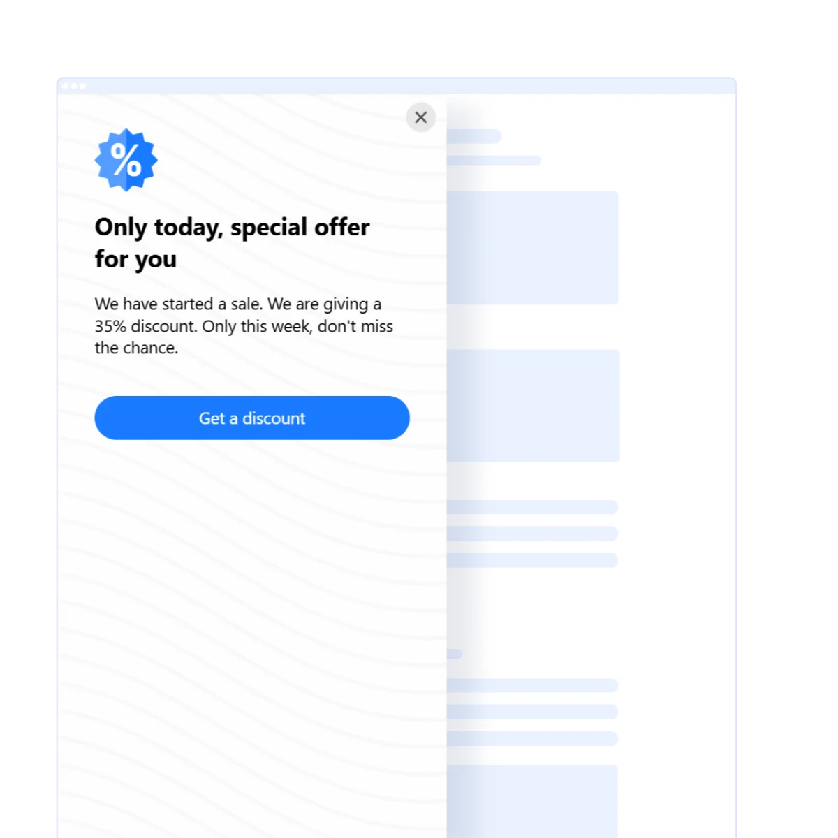
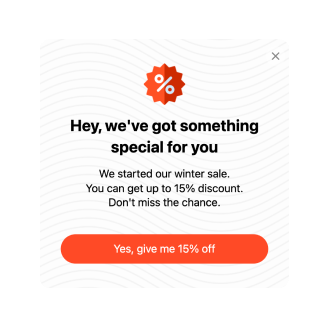
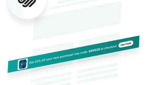
A pop up notification is a brief, visually distinct message that appears on a website to tell visitors important information. Typically, they are designed to grab the user’s attention without requiring them to leave their current activity.
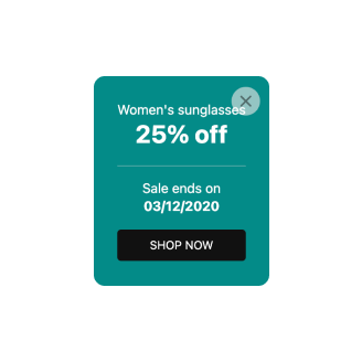
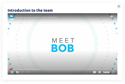
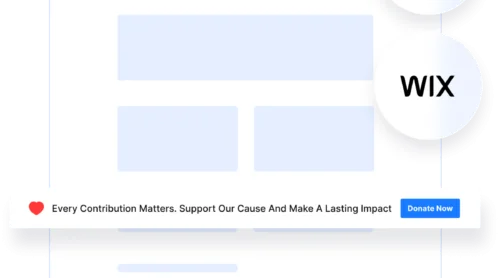
Popups come in different forms, from small banners in the corner of a website to full screen visuals that demand immediate action.
Popup notifications serve as a powerful communication tool, helping users stay informed and engaged with the website content. They are used to convey a range of information, such as alerts about security risks, promotional offers, or reminders to complete specific actions.
For businesses, they can boost user interaction by driving timely responses — like clicking on a discount link or responding to an invitation. Additionally, popup messages can enhance user experience by delivering personalized, context-relevant information.
Keep in mind, the popups’ success lies in striking the right balance between helpfulness and intrusiveness, ensuring they add value to the user’s browsing experience without becoming a source of frustration.
How to Easily Add a Popup to Any Website?
Adding a popup to your website is super easy with the Elfsight’s Popup widget. This user-friendly tool lets you create, customize, and embed popup messages in just a few simple steps, without any coding knowledge required.
Here’s the overview of the process:
- Access the widget’s editor and either pick a pre-made template or design your popup from scratch.
- Add or remove elements like images, text, headers, and buttons. Customize titles, descriptions, layout, colors, and fonts to match your website’s design.
- Save your popup, hit ‘publish’, and copy the generated HTML code.
- Insert the code into your website’s editor.
With this utility, you can add popup notifications to WordPress, Shopify, Wix, WooCommerce, and many other website CMS.
Create your own website popup and capture the audience’s attention effortlessly!
Benefits of Website Notification Popups
Website notification popups offer numerous advantages for businesses, making them an essential tool for boosting engagement and conversions. Here’s why you should consider adding them to your website:
- Instantly grab user attention. Popups are designed to stand out and catch visitors’ attention immediately. They help ensure that important messages, such as promotions, updates, or announcements, aren’t overlooked by your audience.
- Increase conversions. With strategically placed popups, businesses can guide users toward desired actions, such as subscribing to a newsletter, downloading an eBook, or making a purchase. Clear calls-to-action (CTAs) in popups make it easier to drive conversions.
- Personalized user experience. Popups can be customized based on user behavior, preferences, or location, offering tailored messages that resonate with your audience. This personalization boosts relevance and makes users more likely to engage.
- Promote offers and events. Popups are a great way to highlight time-sensitive offers, upcoming events, or limited-time discounts. This encourages users to act quickly, leveraging urgency and exclusivity.
- Collect valuable data. By integrating forms into popups, businesses can gather user feedback, emails, or other valuable information. This data can be used to refine marketing strategies and improve customer interactions.
- Enhance user engagement. Well-designed popups keep users engaged by pointing them to relevant content or features. For instance, guiding them to a special blog post or product page can reduce bounce rates and increase interaction.
Website Popup Examples
Website popups come in various forms, each designed to achieve different goals and encourage specific actions from users.
Broadly, popup messages can be categorized based on the action (how and when they appear) and purpose (the goal they serve). Additionally, some popups are interactive, adding another layer of engagement.
Pop up examples based on action
Popups in this category are defined by when and how they appear on a website. These are triggered by specific user actions. Here are some common examples:
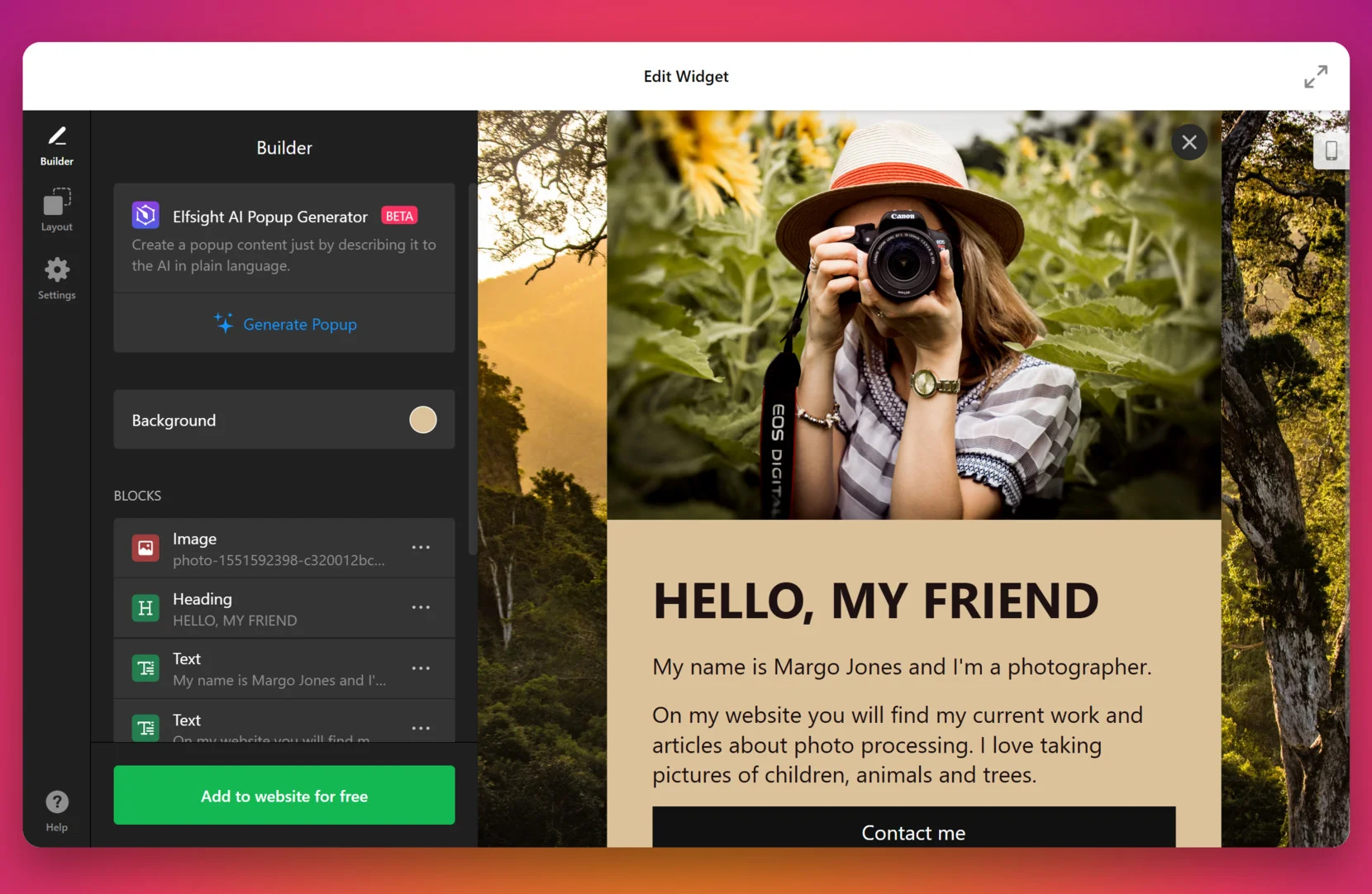
Welcome Popup
The welcome popup greets users as soon as they enter the website, making a strong first impression. It can feature a friendly message, a special offer, or a discount to immediately engage visitors. This popup encourages users to explore further and helps reduce bounce rates by capturing their attention right away.
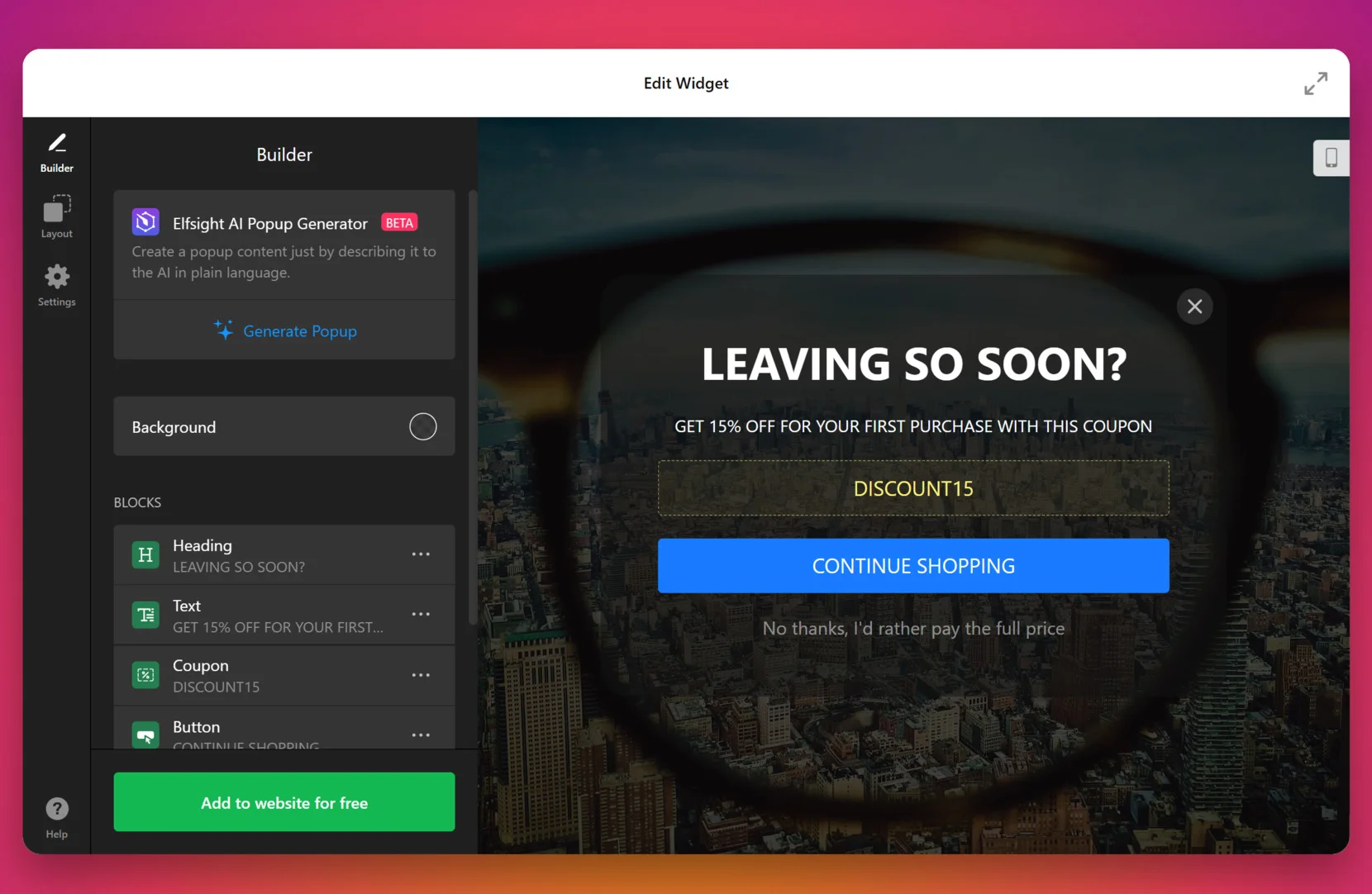
Exit-Intent Popup
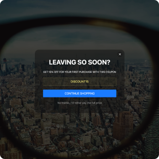
Triggered when a user is about to leave the site, the exit-intent popup acts as a last-minute opportunity to re-engage visitors. It can offer exclusive discounts, free resources, or reminders about abandoned carts to retain users. This strategy helps convert visitors who might otherwise leave without taking action, improving overall retention and conversions.
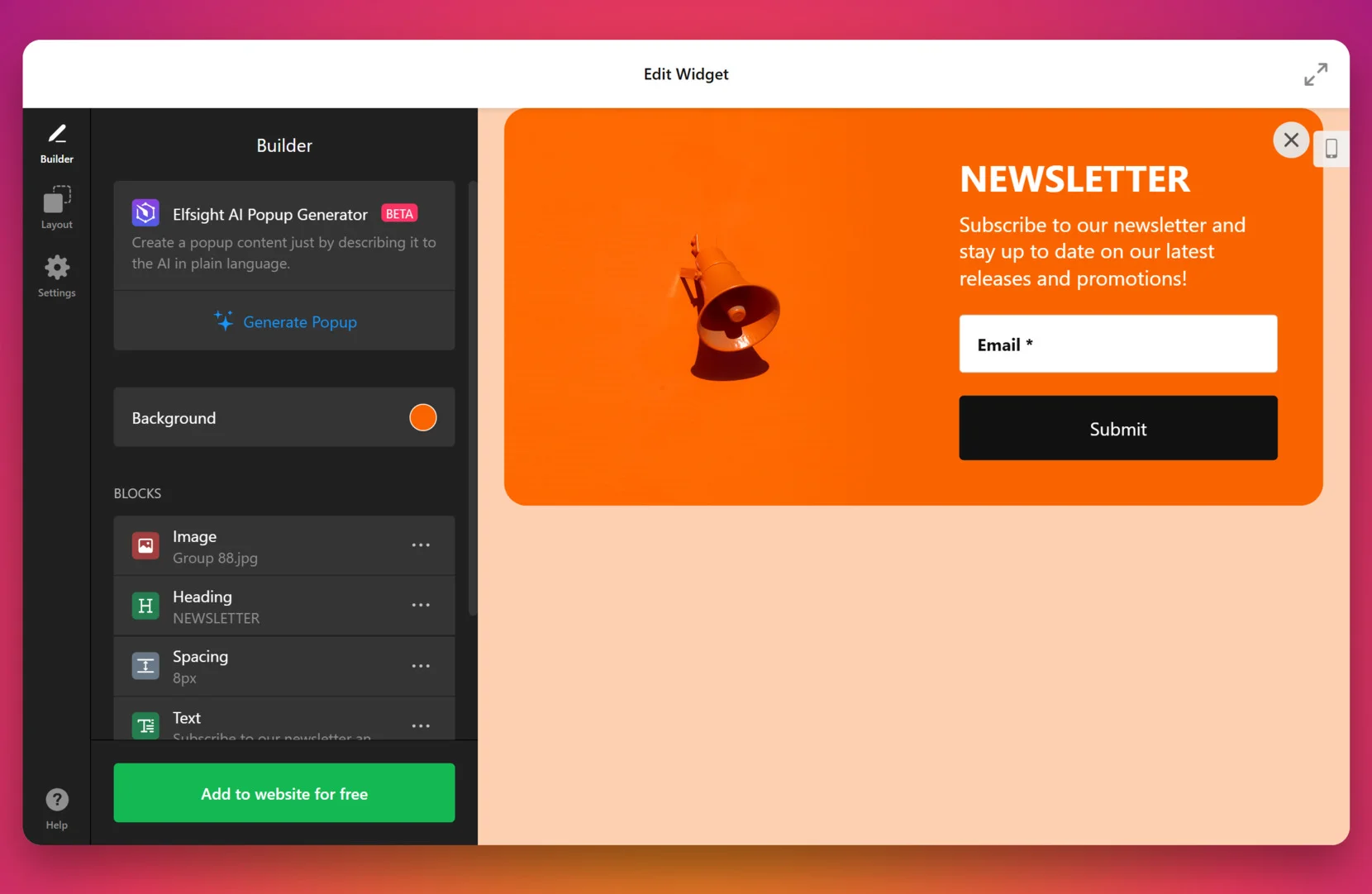
Registration or Subscription Popup
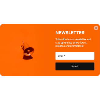
This popup example prompts users to sign up for a newsletter, create an account, or subscribe to updates. By offering value, such as exclusive content, discounts, or news, it encourages visitors to stay connected with your brand. It’s an effective way to build your email list, nurture leads, and keep users informed about future promotions or updates.
Popup examples based on purpose
These popups are designed to serve a specific business objective, such as increasing conversions, providing social proof, or offering promotions. Let’s look at some common examples:
Sales Popup
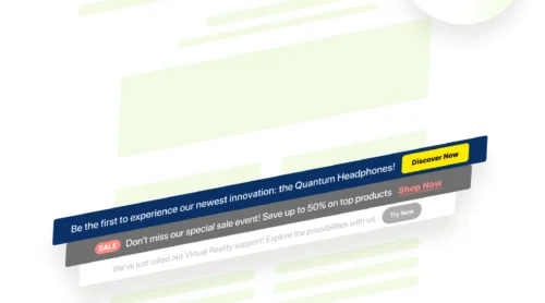
These popups showcase notifications of recent sales to create a sense of urgency and excitement. By highlighting ongoing deals, they tap into visitors’ fear of missing out (FOMO) and encourage them to act quickly. This strategy is particularly effective for boosting conversions and driving impulse purchases.
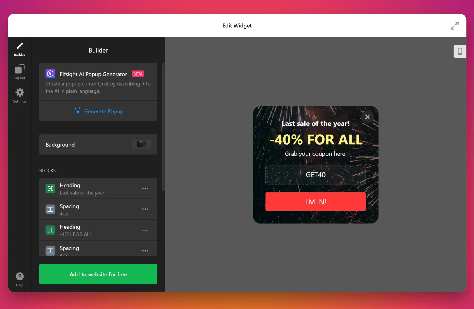
Offer Popup
The offer popups highlight promotions, discounts, or other specials to motivate visitors to make a purchase or subscribe. By presenting an attractive deal at the right time, they capture attention and encourage action. This type of popup is excellent for increasing sales and customer engagement.
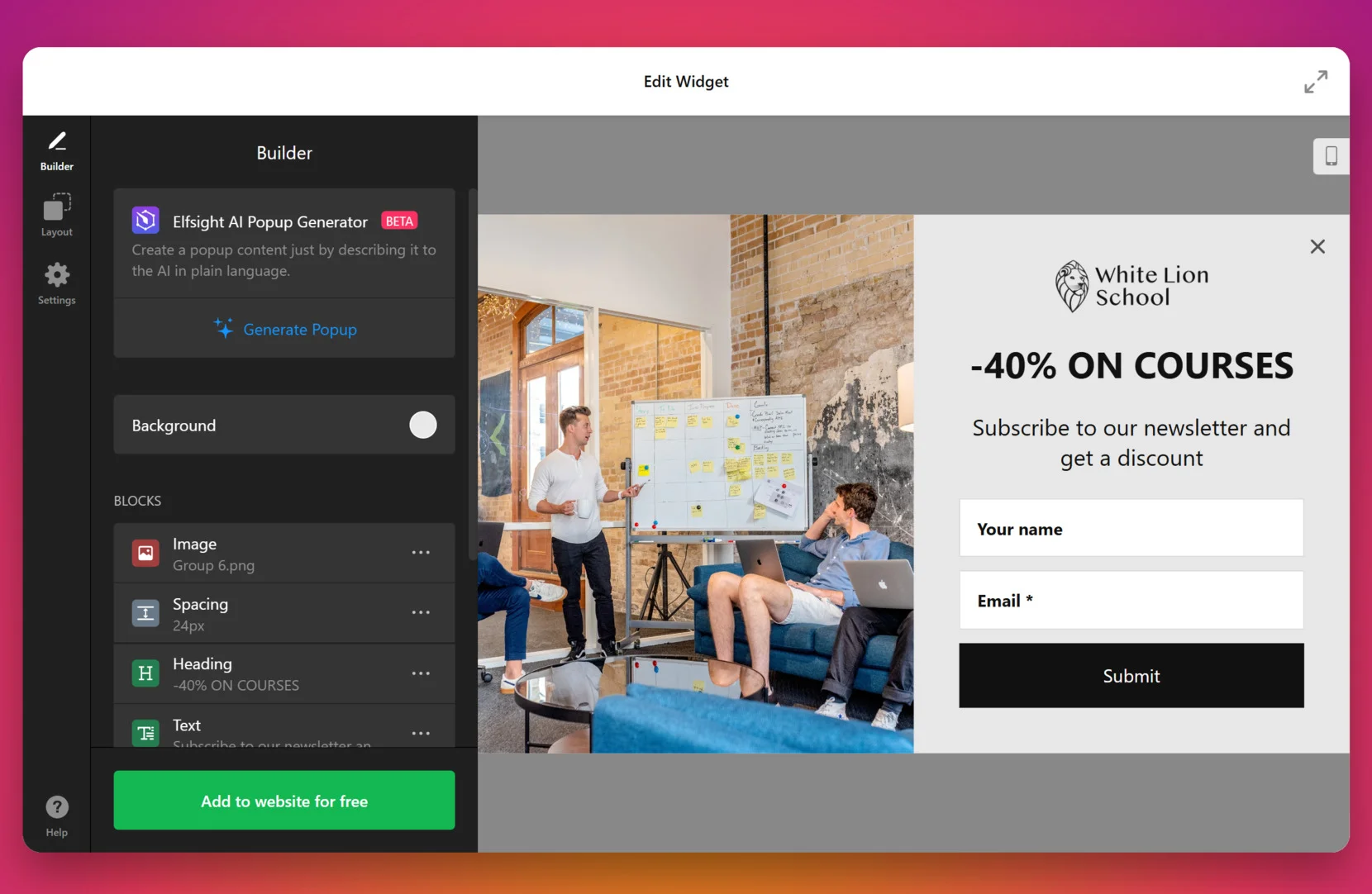
Product Launch Popup
Product launch banner popups announce new collections, items, services, or features to generate excitement and drive interest. Often paired with early access, discounts, or exclusive offers, they encourage users to explore or purchase the latest addition. This approach is perfect for creating buzz and driving conversions during a product rollout.
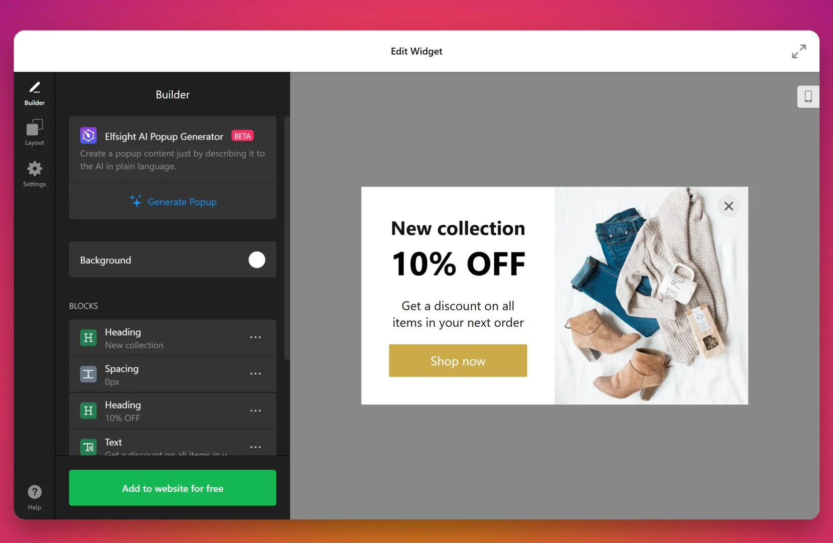
Social Proof Popup
Social proof popups display real-time activities such as customer purchases, user sign-ups, or reviews. These notifications help build trust with visitors by showing that others are actively engaging with your brand. This fosters credibility and reassures users that your business is trustworthy and popular.
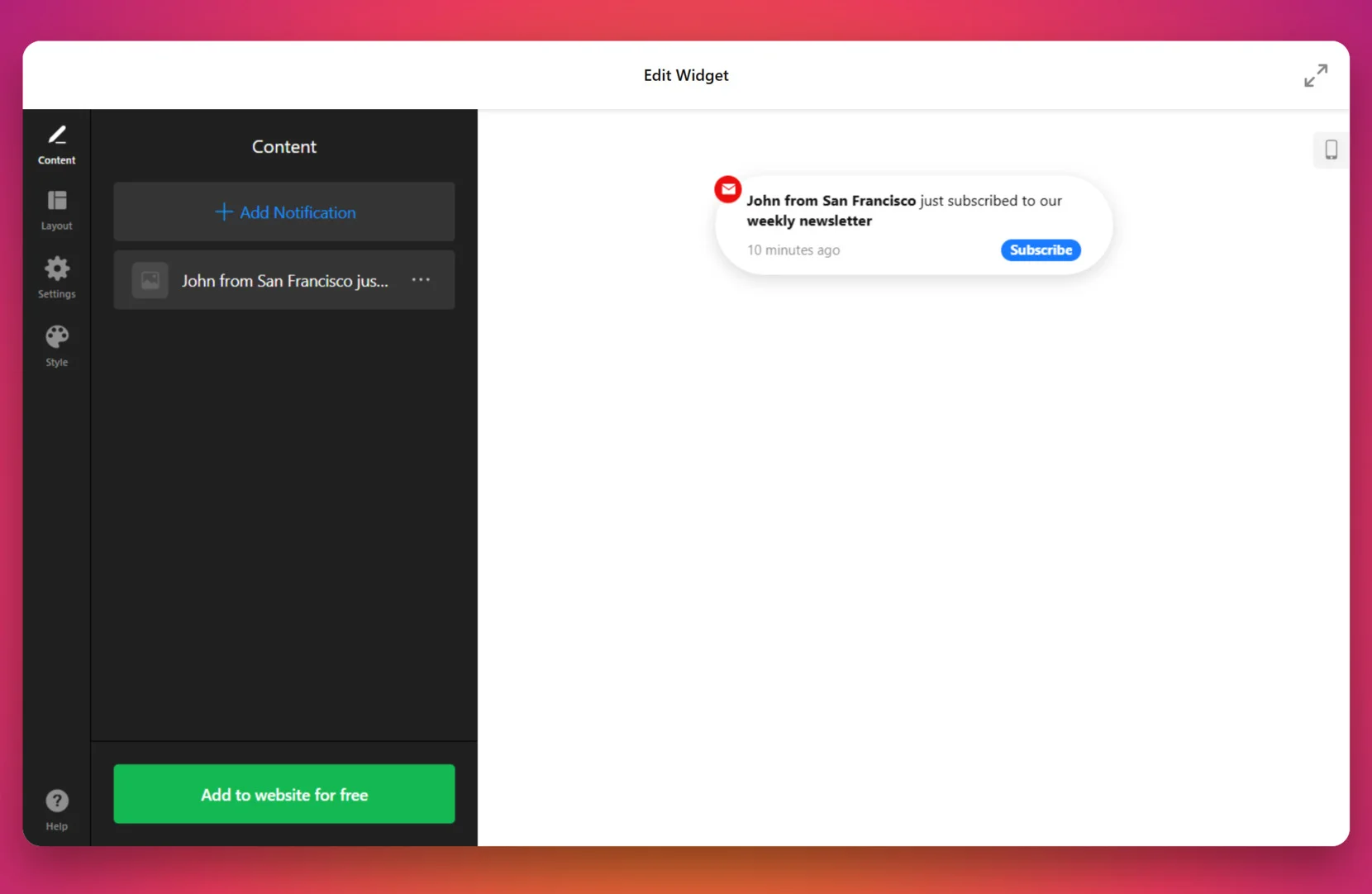
Interactive popups
Interactive popups require direct engagement from users, such as completing forms or participating in surveys. These popups facilitate active user participation. Here are examples:
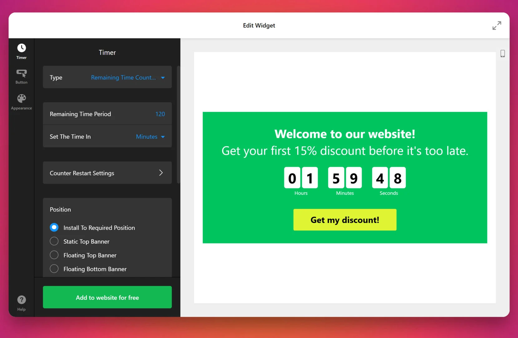
Countdown Timer Popup
Countdown timer popups feature a live countdown clock to create a sense of urgency around limited-time offers, sales, or promotions. By leveraging the fear of missing out (FOMO), they prompt users to act quickly, increasing conversions. This type of popup is perfect for flash sales, holiday promotions, or product launches.
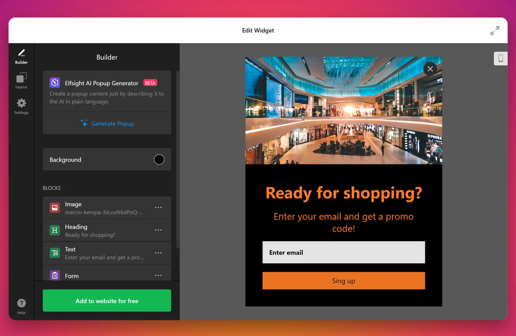
Form Popup
This popup encourages users to fill out forms on the website for purposes such as email subscriptions, lead generation, or feedback collection. These popups often offer value in exchange for participation, such as discounts, exclusive content, or free resources. They are highly effective for building email lists, gathering leads, or collecting valuable customer information.
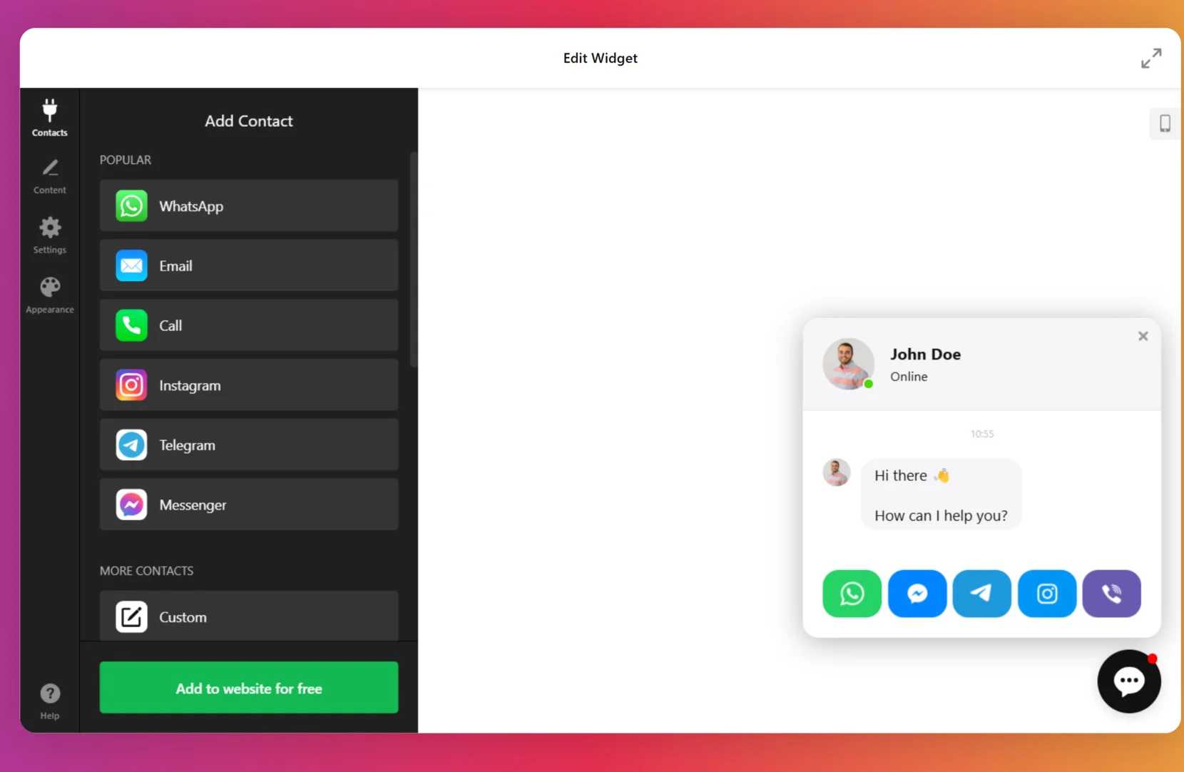
Live Chat Popup
A live chat on the website invites users to interact with a support agent or chatbot in real-time, offering instant answers or assistance. It improves customer experience by addressing concerns promptly and guiding users through their journey. This popup is particularly effective for increasing customer satisfaction, resolving issues quickly, and driving conversions.
Explore 100+ Popup templates
How to Create an Effective Popup: Best Practices
Creating an effective popup requires balancing user engagement with a seamless browsing experience. When done right, popups can become a valuable asset in driving business success. Here are some best practices for designing effective popups:
- Timing is key. Avoid overwhelming visitors with popups as soon as they open your website. Instead, consider using time-delay triggers, such as after 10-15 seconds, or when a user scrolls a certain percentage of the page. Exit-intent popups can also be used effectively to re-engage users before they leave the site.
- Keep it relevant and targeted. Ensure that your popups deliver relevant content based on the user’s behavior. For example, offer discounts to returning visitors or promote specific content related to what they’re browsing. Personalization increases the likelihood of the user taking action.
- Design for clarity and simplicity. A cluttered or complex popup can easily frustrate users. Keep your popup’s design simple, focusing on one clear call-to-action (CTA). Use concise text and visually appealing design elements that align with your brand’s style. Make sure the message is easy to read and the CTA button stands out.
- Ensure mobile friendliness. With a significant portion of web traffic coming from mobile devices, your popups must be mobile-optimized. They should appear correctly on smaller screens and allow users to interact with the popup without causing frustration. Hint: all Elfsight’s widget are mobile-friendly.
- Use an enticing offer. Make the popup worth the user’s attention. Whether it’s a discount, a free resource, or access to exclusive content, offer something that provides value. This can encourage users to take action.
- Provide a clear exit option. Always give users the option to easily close the popup without frustration. A visible and accessible “X” button or “No thanks” option allows users to dismiss the popup quickly if they’re not interested. Forcing users to see the popup they don’t want can create a negative experience.
- Test and optimize. Regularly test different popup designs, timing, and offers to see what works best for your audience. A/B testing can help you find the most effective approach for increasing conversions. Analyze metrics like conversion rate, bounce rate, and user engagement to refine your popup strategy.
By following these best practices, you can create popups that capture attention, drive conversions, and enhance user experience without being intrusive.
Mistakes to Avoid When Creating Popups
Popups are a great tool for engaging your visitors and increasing conversions, but if not used appropriately, they can have the opposite effect. Understanding and avoiding common mistakes can help you create popups that are effective and don’t frustrate your users.
Mistake 1. Overloading users with too many popups
The solution:
- Limit the frequency of popups. Ideally, show only one popup per session to prevent annoying the user.
- Use time delays, exit-intent triggers, or scroll triggers to control when the popup appears, ensuring it doesn’t overwhelm the user.
- Consider showing different types of popups at different stages of the user journey to maintain variety and avoid redundancy.
Mistake 2. Failing to target the right audience
The solution:
- Segment your audience based on factors like behavior, location, and visit history. For example, show special offers or discounts to returning visitors or promote abandoned cart reminders to users who haven’t completed their purchase.
- Behavioral triggers are essential for relevance. Consider showing a popup with a welcome offer to new visitors, while showing a product recommendation to those who’ve viewed similar items.
- Personalization is key: a popup offering a discount on a product the visitor was viewing has a higher chance of conversion than a generic popup.
Mistake 3. Poor timing of popups
The solution:
- Exit-Intent Popups: These popups activate when a user is about to leave the site, which gives you one last chance to capture their attention with an offer or reminder before they exit.
- Time-Based Triggers: Set a delay of around 10-15 seconds after the page loads to avoid bombarding users as soon as they enter the site. This gives them time to browse and engage.
- Scroll-Depth Triggers: Activate the popup once the user scrolls a certain percentage of the page, indicating interest in the content. This ensures you’re not interrupting them too early.
Mistake 4. Intrusive or hard-to-close popups
The solution:
- Always make the close button clearly visible. A large, easy-to-find “X” or “Close” button is crucial for allowing users to dismiss the popup quickly and continue their browsing experience.
- Avoid forcing actions before a user can close the popup, such as requiring them to fill out a form or accept an offer. Allow them the option to say “no thanks” or skip the offer without consequence.
- Don’t cover important content or features on your page with popups that users can’t easily dismiss. Make sure the popup doesn’t take up the entire screen if it’s unnecessary.
Mistake 5. Overcomplicating the design
The solution:
- Simplify your design: Use a clean layout with one clear objective. Focus on a single, compelling CTA (e.g., “Get 20% Off Now” or “Subscribe for Updates”).
- Use a clear, bold font that’s easy to read, and choose colors that complement your site’s design but also make the popup stand out.
- Limit the amount of text. Users should instantly understand the value proposition without having to read long paragraphs.
- Whitespace is important: Leave some empty space around your CTA to make the popup feel less cluttered and more inviting.
By understanding and avoiding these common popup mistakes, you can create a more positive user experience while effectively capturing attention and driving conversions. Make sure to focus on relevance, timing, design simplicity, and continuous optimization to get the best results from your popup campaigns.
FAQ
What is the difference between push notifications and pop-up notifications?
On the other hand, pop-up notifications appear within a browser window or app while the user is actively engaged with the website or application. Popups are often used to grab the user’s attention and prompt an action, such as signing up for a newsletter or taking advantage of a limited-time offer.
What is the difference between an alert and a popup?
A popup, on the other hand, is an interactive element that appears on the website or app, designed to prompt a user to take specific actions, such as completing a form, making a purchase, or receiving a discount. Unlike alerts, popups can be designed with more customization and allow for greater interaction with buttons, forms, or other elements.
How does a popup blocker work?
Conclusion
Pop-up notifications, when used strategically, can be powerful tools to engage visitors, increase conversions, and enhance user experience. By understanding the different types of popups, following best practices, and avoiding common mistakes, businesses can create popups that capture attention without overwhelming users.
With the right targeting, timing, and design, popups can effectively guide users through their journey on a website, encouraging actions like sign-ups, purchases, or content interaction. Just remember to keep it relevant, non-intrusive, and user-friendly for maximum impact.
Need More Info?
We hope you found this article informative and helpful. Reach out to us to discover more about adding a popup notification to your website. Our aim is to ensure your experience is seamless and successful. At Elfsight, we’re dedicated to providing complete, no-code widget solutions for your business.
Become a part of our lively Community, where ideas and knowledge are exchanged. We always welcome your feedback and suggestions for improvements — don’t hesitate to add them to our Wishlist!


