- Why Most Chatbots Underperform
- The Three Types of Chatbot KPIs
- Efficiency Metrics: Is the Bot Doing Its Job?
- Customer Experience Metrics: Are Visitors Satisfied?
- Business Impact Metrics: Is It Worth the Investment?
- How to Calculate AI Chatbot ROI
- The Variable That Determines Every Metric
- What Chatbot Success Looks Like in Practice
- Chatbot KPI: Common Questions
- Where to Start
Most businesses get the deployment part right. They pick a chatbot, train it on some content, embed it on their website, and move on. The part that usually falls off is everything after that: the measurement, the review, the iteration. Without a clear set of chatbot KPIs, the bot sits on your site doing something, but whether that something is helping or quietly driving visitors away is anyone’s guess.
This guide is built around a practical question: how to measure chatbot success when you don’t have a data team, an enterprise analytics platform, or hours to spend on dashboards. The framework covers the metrics that matter, realistic benchmarks grounded in actual research, and a straightforward ROI calculation you can run with the tools you already have.
- A three-category framework for chatbot success metrics
- Sourced benchmarks for each KPI, adjusted for SMBs (not enterprise)
- A step-by-step AI chatbot ROI calculation with a real example
- Why knowledge base quality is the single variable that shapes every other metric
- What to track first when your chatbot has limited built-in analytics
Why Most Chatbots Underperform (and How to Find Out if Yours Does)
“While 73% of customers use self-service at some point in their customer service journey, it’s concerning to see that so few fully resolve there.” — Eric Keller, Gartner Customer Service & Support Practice
Most businesses assume a chatbot is working unless they hear complaints. The problem is that most unhappy users don’t complain – they leave. A Five9 survey found that about 2 in 5 consumers would stop doing business with a company after a single bad service experience. No angry email, no support ticket –just gone.
The gap between usage and resolution is where chatbots quietly fail. Gartner’s research found that 9 in 10 customer journeys that start in self-service end up requiring another channel. The most common reason? 43% of customers couldn’t find content relevant to their issue. The chatbot was technically available, but the answers it needed weren’t in its training data.
Sentiment reflects this tension, too: only 51% of customers say they’d be willing to use a GenAI assistant for service. The businesses that earn that missing trust are the ones that measure, identify gaps, and fix them. High-maturity companies track AI-driven metrics at roughly 3x the rate of low-maturity peers (66% vs. 21%). The difference isn’t better AI – it’s knowing what’s happening in conversations and fixing the gaps.
The Three Types of Chatbot KPIs
Chatbot success metrics fall into three categories, each answering a different question about your AI chatbot’s performance:
| Category | What It Measures | Key Metrics |
|---|---|---|
| Efficiency | Is the bot handling conversations mechanically? | Containment rate, fallback rate, average handling time |
| Customer Experience | Are visitors getting helpful, satisfying answers? | CSAT, return visitor rate, conversation depth |
| Business Impact | Is the bot contributing to revenue or reducing costs? | Leads captured, ticket deflection, conversion rate |
These categories build on each other. A chatbot with a high containment rate but low CSAT is deflecting questions without actually solving them – that’s a frustration loop, not efficiency. A chatbot with great satisfaction scores but no measurable impact on leads or support workload might be pleasant but unproductive.
The most useful picture comes from tracking at least one metric in each category, which gives you both the “what’s happening” and the “so what” in a single view.
Efficiency Metrics: Is the Bot Doing Its Job?
Before worrying about satisfaction or ROI, you need to know whether the chatbot is actually handling conversations and how often it falls short.
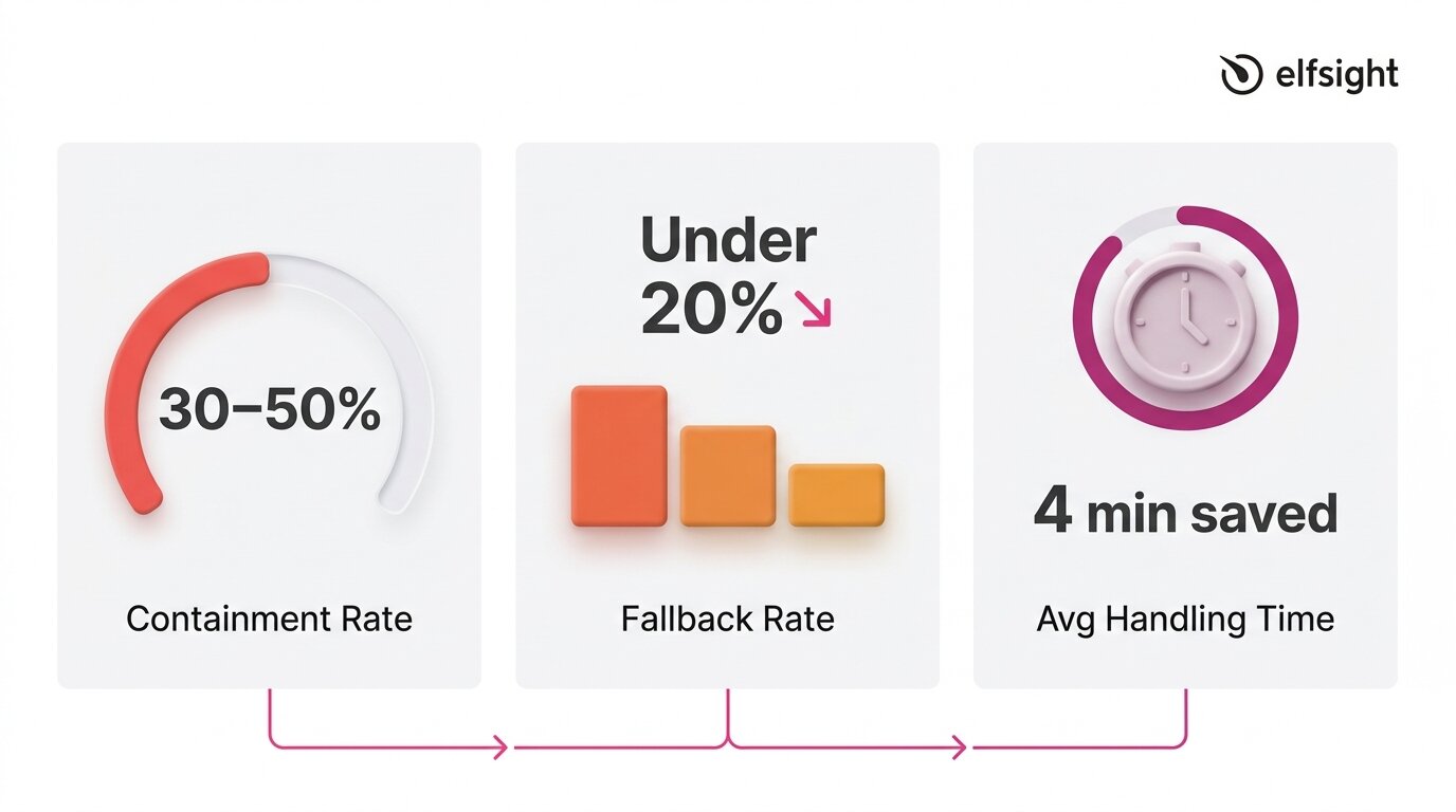
Containment Rate
Containment (automation) rate measures the share of conversations a chatbot resolves without human escalation. It’s the most widely used KPI because it directly shows how much workload the bot absorbs. A conversation is “contained” when the visitor gets an answer and doesn’t need to reach a human through another channel.
Benchmarks for this metric vary widely depending on what you’re measuring and who’s doing the measuring. Some sources suggest companies using AI chatbots resolve 30–50% of Tier 1 tickets automatically, which is a realistic initial target for SMBs deploying a knowledge-base chatbot.
Enterprise-grade deployments with dedicated optimization teams sometimes report higher numbers (70% and above), but those figures reflect significant investment in training data, workflow design, and ongoing tuning.
Fallback Rate
Fallback rate measures how often a chatbot fails to understand or answer a query, when it replies with something generic like “I’m not sure I understand” or redirects without resolving the question. A high fallback rate is a clear sign of gaps in training data, and it aligns with Gartner findings that 43% of self-service failures stem from missing or irrelevant content.
This metric is especially useful because it’s diagnostic. Every fallback response points to a specific gap:
- A topic the knowledge base doesn’t cover,
- A question phrased in a way the bot doesn’t recognize,
- Or a product detail that was never included in the training content.
Tracking fallback patterns over time turns your chatbot from a static tool into one that improves with each review cycle.
Average Handling Time
Average handling time tracks how long a chatbot conversation takes from the first message to resolution. Shorter isn’t always better: a three-message exchange that solves a complex issue is more valuable than a quick dead end. Over time, this metric shows whether your chatbot is becoming more efficient as its knowledge base improves.
Research backs the impact: Juniper Research estimates chatbots save about four minutes per enquiry compared to human support, while HubSpot’s State of Service report finds teams using AI chatbots save an average of 2 hours and 20 minutes per day.
If your chatbot tool doesn’t surface handling time directly, you can estimate it by reviewing transcripts: note the timestamp of the first visitor message and the last bot response in each conversation, then average across a sample of 20–30 interactions.
Customer Experience Metrics: Are Visitors Satisfied?
A chatbot can handle high volume and still frustrate users. Experience metrics capture whether it feels helpful, builds trust, and meets expectations. They matter because success isn’t just throughput – it’s whether the interaction encourages people to engage with your business.
Customer Satisfaction Score (CSAT)
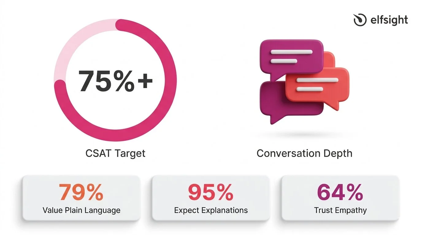
CSAT is the most direct measure of visitor satisfaction. It’s typically collected via a post-chat prompt – a thumbs-up/down, a star rating, or a short survey, and expressed as a percentage of positive responses.
The American Customer Satisfaction Index reported a national average of 76.9 out of 100 in 2025, which serves as a broad benchmark. For chatbot interactions specifically, aggregated data indicates that around 80% of users who interacted with AI chatbots report a positive experience, while SaaS and e-commerce benchmarks hover around 78–80%.
A reasonable target for an SMB chatbot is 75%+ CSAT, with 80%+ indicating strong performance. For context, a Zendesk case study on Vagaro reported 92% CSAT, 44% automated resolution, and an 87% reduction in resolution time – an enterprise example, but a useful benchmark when the knowledge base and setup are strong.
Consumer expectations add an important layer to this metric:
- 79% of consumers value plain-language reasoning in AI
- 95% expect explanations for AI decisions
- 64% trust AI more when it shows empathy
CSAT doesn’t just reflect answer accuracy: it reflects tone, clarity, and whether the visitor felt understood.
Return Visitor Rate and Conversation Depth
CSAT tells you whether a single interaction was satisfying. Return visitor rate and conversation depth indicate whether visitors trust the chatbot enough to return and engage in longer, multi-turn conversations. These are secondary indicators, but they’re valuable signals, especially when your chatbot doesn’t have a built-in survey mechanism.
The Zendesk CX Trends 2026 report highlights why continuity matters: 81% of consumers want agents to be able to continue conversations without backtracking, and 74% are frustrated when they have to repeat information.
If your chatbot maintains context across messages and visitors return with follow-up questions instead of switching to email or phone, that’s a strong signal of trust. Track it by reviewing transcripts for returning visitors and noting the average number of messages per conversation over time.
Business Impact Metrics: Is It Worth the Investment?
Efficiency and experience metrics show whether the chatbot is working. Business impact metrics show whether it’s worth it. For most SMBs, this comes down to three questions: is the bot generating leads, is it reducing the support workload, and is it contributing to conversions?
Leads Captured
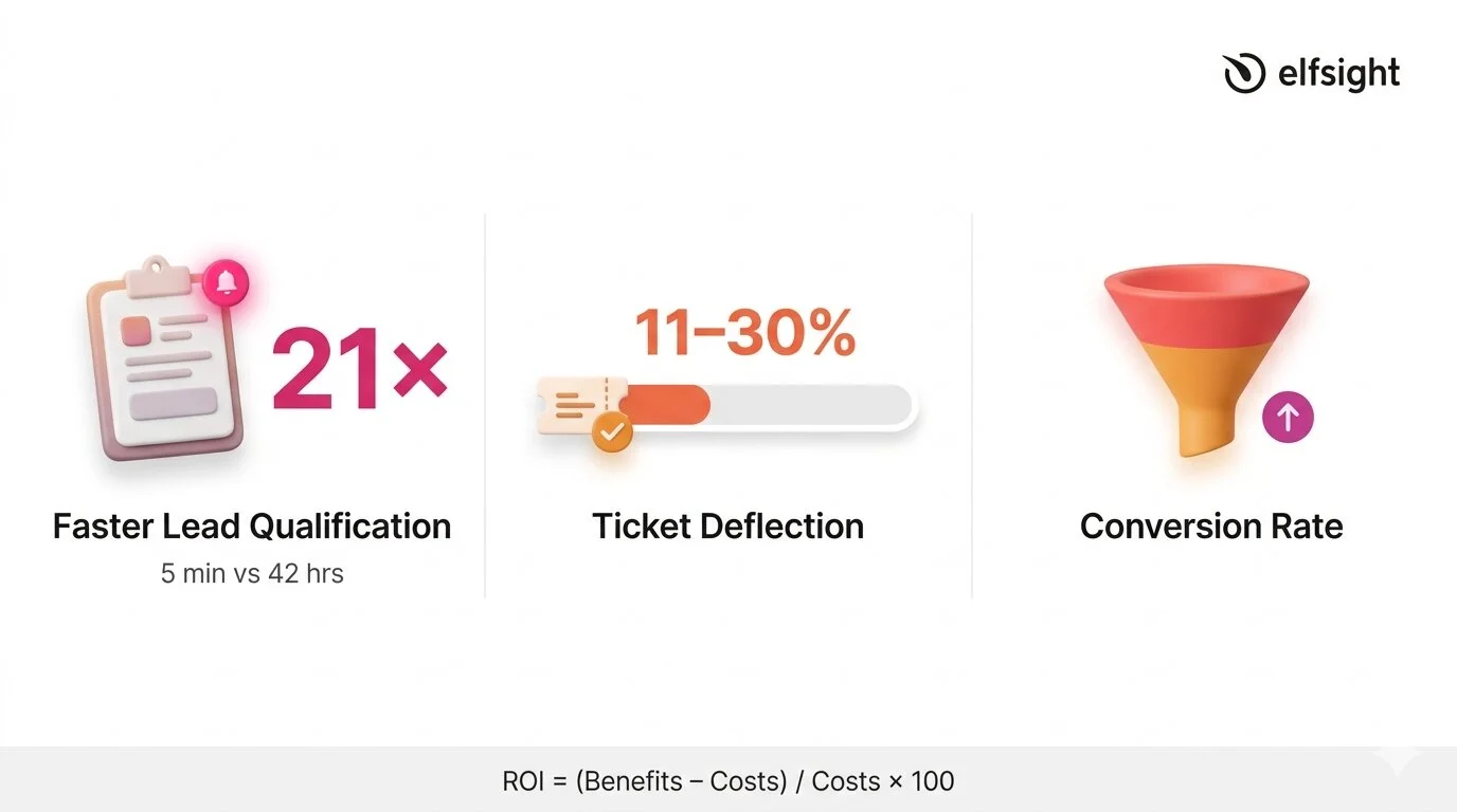
The simplest business impact metric is the count of contact form submissions collected through the chatbot. If the bot has a built-in form that captures names, emails, or phone numbers during conversations, every submission is a measurable lead that wouldn’t have existed without the chatbot interaction.
What makes this metric especially powerful is the speed advantage. A widely cited Harvard Business Review / MIT study on lead response times found that companies responding within 5 minutes were 21 times more likely to qualify the lead than those that waited 30 minutes. According to HubSpot, the average B2B lead response time is 42 hours. A chatbot responds in seconds. That gap between 42 hours and instant is where the lead generation value of a chatbot becomes hard to argue with, even if the bot does nothing else.
Ticket Deflection
Ticket deflection measures how much of the human support workload the chatbot absorbs. Every conversation the bot resolves is one fewer email, phone call, or support ticket your team has to handle. As per HubSpot’s report, AI resolves 11–30% of support volume for teams that have adopted it, and 86% of service leaders reported that AI positively impacted their CSAT scores.
Even when the chatbot can’t fully resolve an issue, partial containment still saves time. Capturing basic information upfront, such as the customer’s name, the nature of their issue, and relevant account details, reduces the subsequent interaction time by up to one-third. A chatbot that gathers context before handing off to a human is still deflecting work, even if the conversation doesn’t end in the chat window. This is an important nuance for understanding the real cost picture of a chatbot investment.
Conversion Rate
Conversion rate tracks whether chatbot interactions lead to a desired outcome – a sale, a booking, a form completion, or another goal your website is optimized for. This is the hardest metric to measure for SMBs without attribution tracking, because isolating the chatbot’s contribution from other factors (page design, traffic source, pricing) requires more analytics infrastructure than most small businesses have.
A practical workaround is to compare conversion rates on pages where the chatbot is active versus pages where it isn’t, or to track form submissions that originate from within the chat versus from standalone page forms. Neither method is perfectly controlled, but both give you a directional signal, and a directional signal is far more useful than no signal at all.
How to Calculate AI Chatbot ROI
The challenge isn’t the math. It’s about plugging in realistic numbers rather than inflated marketing figures. The standard formula for AI chatbot ROI is straightforward:
ROI = [(Total Benefits − Total Costs) / Total Costs] × 100On the benefits side, three inputs matter most:
- Support time saved — multiply the number of conversations the bot resolves monthly by the average time each would have taken a human, then multiply by your hourly support cost.
- Leads captured — multiply the number of chatbot-generated leads by your average lead value (or estimated close rate × average deal size).
- After-hours availability — if the chatbot handles conversations outside business hours that would otherwise go unanswered, estimate the value of those interactions based on lead capture or support deflection during those windows.
On the cost side, include the chatbot subscription fee plus the time your team spends maintaining the knowledge base each month. If you’re spending 2 hours per month on transcript review and KB updates at $25/hour, that’s $50 in maintenance labor to add to the subscription cost.
Worked Example
Suppose you’re on a chatbot plan that costs $10–$20/month. Your bot handles 200 conversations per month and resolves 30% without escalation – that’s 60 contained conversations.
If each would have taken a team member five minutes, that’s 5 hours of support time saved. At $25/hour, that’s $125/month in labor savings alone – already a clear return on a $10–$20 subscription, before counting lead capture or after-hours value.
Modern AI-powered chatbots may have different cost profiles depending on model usage and pricing structure, but the order-of-magnitude difference between chatbot and human costs holds consistently across sources ($0.01–0.70 vs ~$5–15+).
The Variable That Determines Every Metric
“Service and support leaders are eager to deploy conversational GenAI, but they cannot ignore existing issues with knowledge management.” — Kim Hedlin, Gartner Customer Service & Support Practice
Every metric covered above: containment rate, CSAT, fallback rate, lead capture, even ROI, traces back to one variable: the quality of your chatbot’s knowledge base. A chatbot with a comprehensive, well-structured, and up-to-date knowledge base will perform well by default. One with thin, outdated, or conflicting content will produce poor results, no matter how advanced the underlying AI model is.
The research underscores this forcefully: a Gartner survey of 187 customer service leaders found that 61% have a backlog of knowledge articles to edit, and more than one-third have no formal process for revising outdated content. Recall the finding from earlier: 43% of self-service failures trace back to missing or irrelevant content. The knowledge base isn’t a secondary consideration – it’s the primary one.
For SMBs, this is actually encouraging. You don’t need better AI, a more expensive plan, or a dedicated analytics team to improve chatbot performance. You need a well-maintained knowledge base that covers the questions your visitors actually ask.
What Chatbot Success Looks Like in Practice
With the metrics defined, here’s a consolidated view of realistic targets – based on cited research and adjusted for SMBs running knowledge-base chatbots on their websites:
| Metric | Realistic SMB Target | Strong Performance |
|---|---|---|
| Containment rate | 30–50% | 50%+ |
| CSAT | 75%+ | 80%+ |
| Fallback rate | Under 20% | Under 10% |
| Lead response time | Under 1 minute | Instant (seconds) |
| Ticket deflection | 10–30% | 30%+ |
Looking ahead, these targets will shift. Agentic AI is projected to autonomously resolve 80% of common customer service issues by 2029, though the same analysis notes that 2026 remains a foundation-building year, with realistic autonomous resolution targets of 40–50%. The businesses measuring today are building the baseline that makes future optimization possible.
Chatbot KPIs: Common Questions
How to measure effectiveness of a chatbot?
What is a good chatbot automation rate?
How do you calculate chatbot ROI?
What CSAT score should a chatbot achieve?
Why is my chatbot not performing well?
How often should I review chatbot performance?
Where to Start
The 14% resolution rate that opened this article isn’t a reason to avoid chatbots – it’s a reason to measure their success (or failure). Most businesses deploy a chatbot and never check if it’s actually resolving issues, capturing leads, or meeting expectations.
Pick one metric from each of the three categories and track them for a month:
- Efficiency — count contained conversations vs. those requiring human follow-up
- Experience — enable response ratings or add a post-chat satisfaction prompt.
- Business impact — track chatbot-generated form submissions as your lead capture count.
Then review your fallback patterns, update your knowledge base for the most common gaps, and measure again. That cycle is the system that turns a chatbot from a set-it-and-forget-it widget into a tool that compounds in value every month.
Primary sources
- Gartner, “Only 14% of Customer Service Issues Are Fully Resolved in Self-Service” – https://www.gartner.com/en/newsroom/press-releases/2024-08-19-gartner-survey-finds-only-14-percent-of-customer-service-issues-are-fully-resolved-in-self-service
- Zendesk CX Trends 2026 – https://www.zendesk.com/newsroom/press-releases/contextual-intelligence-becomes-the-new-standard-for-exceptional-customer-experience-in-2026/
- HubSpot State of Service 2024 – https://www.hubspot.com/hubfs/2024%20HubSpot%20State%20of%20Service.pdf
- Juniper Research, Chatbot Cost Savings – https://www.juniperresearch.com/press/chatbots-a-game-changer-for-banking-healthcare/
- American Customer Satisfaction Index, Q4 2025 – https://unthread.io/blog/customer-satisfaction-score-statistics/
- Fullview, CSAT by Support Channel Statistics 2026 – https://unthread.io/blog/customer-satisfaction-score-statistics/
If you’ve searched for a chatbot for your business recently, you’ve probably noticed a shift: tools that were called “chatbots” a year ago are now labeled “AI agents.” The interfaces look similar, the features often overlap – what should be a clear distinction between two categories has been blurred by a wave of rebranding.
The confusion isn’t accidental. The agentic AI market is growing fast, and many products adopt the “agent” label, whether their capabilities justify it or not. This article breaks down what actually separates AI agents from chatbots, why the distinction is getting harder to see, and how to choose based on what the tools do – not what they’re called.
- What chatbots and AI agents actually are, and the spectrum between them
- Why “agentwashing” is flooding the market with misleading labels
- When a chatbot is enough for your website, and when you genuinely need an agent
- How to evaluate tools based on what they do, not what they’re called
What Do These Terms Actually Mean?
The confusion starts with definitions. “Chatbot,” “AI chatbot,” “AI agent,” “conversational agent,” and “virtual assistant” are used interchangeably across marketing pages, product reviews, and even analyst reports. These terms describe different levels of capability, and understanding the differences helps you evaluate what you’re actually buying.
Chatbots: From Scripts to Language Models
A chatbot is software that conducts a conversation with a visitor, typically through a text-based interface on a website. That’s the broad definition, and it covers a wide range of sophistication.
At the simpler end, rule-based chatbots follow decision trees and keyword matching. They respond to specific inputs with pre-written answers – think “type 1 for pricing, type 2 for support.” These are still common on many small business websites and work fine for narrow, predictable interactions.
At the more capable end, AI-powered chatbots use natural language processing, LLMs, and knowledge bases to handle open-ended conversations – a significant step up from scripted flows. You can ask them a question in your own words, and they’ll generate a relevant response based on the content they’ve been trained on.
AI Agents: Autonomy Is the Dividing Line
An AI agent, in the most rigorous sense, is a system that can autonomously pursue goals, make decisions, take actions across multiple systems, and adapt its behavior without constant human direction. This is fundamentally different from even a sophisticated AI chatbot, which responds to prompts within a single conversational interface.
Gartner’s framework is the clearest available. They draw an explicit hierarchy:
- AI assistants simplify tasks, but depend heavily on human input
- AI agents can perform complex, end-to-end tasks with task specialization and a degree of autonomy
- Agentic AI ecosystems are networks of coordinated agents managing workflows across systems
A Spectrum, Not a Binary
In practice, most products don’t fall neatly into “chatbot” or “agent.” They sit on a spectrum, and recognizing where a product falls helps you evaluate it more accurately than any category label:
- Rule-based chatbots follow decision trees and keyword matching. No AI involved. Still effective for simple, predictable interactions like store hours or basic FAQs.
- AI-powered chatbots use NLP and large language models combined with a knowledge base to handle open-ended questions. They can answer things they weren’t explicitly programmed for.
- Enhanced AI chatbots with agent-like features handle conversation and take limited actions — triggering a form, routing to WhatsApp, offering action buttons, or escalating to a human with full context.
- True AI agents work autonomously across multiple backend systems, make decisions, execute multi-step workflows, and adapt without a human prompt.
For most small and mid-sized businesses, the relevant decision is between tiers 1 and 2/3. Tier 4 is primarily an enterprise play, and the gap between “enhanced chatbot” and “true agent” is where a lot of marketing language gets creative.
Why So Many “AI Agents” Are Really Chatbots
“Most agentic AI projects right now are early-stage experiments or proof of concepts that are mostly driven by hype and are often misapplied.” — Anushree Verma, Senior Director Analyst, Gartner
Understanding the spectrum helps explain why the market is so confusing right now. The AI agent category is growing quickly, with estimates around $7–8B in 2025 and projections reaching $50–200B by the early 2030s. That level of growth creates strong incentives to reposition products under the “AI agent” label.
Agentwashing
Gartner has given this pattern a name: agentwashing. Their research found that roughly 130 “agents” deliver genuine agentic capabilities. The issue is when the label creates expectations that don’t match the product’s actual functionality, which makes it harder for buyers to compare options clearly. AI agents also sit at the “Peak of Inflated Expectations” on Gartner’s 2025 Hype Cycle for AI, which typically signals that the technology is real, but market expectations have outpaced current capabilities.
What does this mean in practice? Gartner predicts that over 40% of agentic AI projects will be canceled by the end of 2027 – mainly due to rising costs, unclear business value, or weak risk controls.
How to Distinguish
For SMBs evaluating tools, the takeaway is simple: focus on what a product can actually do, not the category it claims to be in. A few signals help you assess agentic capabilities:
- It can execute multi-step tasks across different systems without requiring a human
- It makes decisions based on data from multiple sources, not just a single knowledge base
- It adapts its behavior based on outcomes, not just updated training data
- It can initiate actions proactively – not just respond to prompts
If a product requires a human to start every interaction and operates entirely within a chat window, it’s a chatbot. That’s perfectly fine for most website use cases, but understanding what you’re buying helps you set the right expectations and budget.
Chatbot vs AI Agent: Key Differences
With the agentwashing context in mind, a clean side-by-side comparison helps separate the real differences from the marketing noise. This table focuses on AI-powered chatbots (tier 2–3) versus true AI agents (tier 4), since that’s the comparison driving the search.
| Dimension | AI Chatbot | AI Agent |
|---|---|---|
| Scope | Operates within a single conversational interface | Works across multiple systems and tools |
| Autonomy | Responds to user prompts; needs a human to initiate | Pursues goals independently; can initiate actions |
| Decision-making | Retrieves and presents information from a knowledge base | Evaluates options, makes choices, and executes based on goals |
| Integration depth | Connects to a knowledge base; may trigger basic actions (forms, links) | Deep integration with CRMs, databases, APIs, and backend systems |
| Adaptation | Improves when the knowledge base is updated manually | Learns from outcomes and adjusts behavior over time |
| Typical deployment | Website widget, messaging channel, support portal | Enterprise workflows, IT operations, complex service environments |
| Best for | FAQs, lead capture, product questions, basic support | Multi-step workflows requiring autonomous decision-making |
Self-sufficiency
The most important row is autonomy. A chatbot, even a very good one, waits for a visitor to ask something. An AI agent can identify that a problem exists, decide how to solve it, and execute the solution across systems without being prompted.
That’s the clearest test for whether a product is genuinely agentic, and it’s the dimension most often obscured by agentwashing.
Scale & Limits
Scope is the second differentiator. Chatbots live inside a conversation window. Agents operate across your tech stack, pulling data from a CRM, updating a database, triggering an API, and circling back to the customer with a resolution.
This cross-system orchestration is what makes agents powerful for complex enterprise processes, but also what makes them expensive and technically demanding to deploy.
When a Chatbot Is Enough (and When It Isn’t)
Understanding the spectrum and consumer expectations makes the practical question easier to answer: which type of tool does your website actually need?
A Chatbot Covers Most Website Use Cases
For the majority of SMB websites, an AI-powered chatbot handles the interactions that matter most. Product questions, business hours, shipping and return policies, lead capture, basic troubleshooting, appointment booking – these are high-volume, well-defined interactions where a knowledge-trained chatbot delivers immediate value.
The chatbot draws on your own content, responds in seconds, and handles multiple conversations simultaneously. This aligns with Gartner’s practical guidance: use assistants for simple retrieval, automation for routine workflows, and reserve agents for situations where autonomous decisions are genuinely needed.
If 80–90% of your visitor questions fall into predictable categories, a chatbot trained on your actual business content will handle them accurately without requiring enterprise infrastructure or enterprise pricing.
When You Genuinely Need AI Agent Capabilities
AI agents earn their complexity when the task involves multi-step, cross-system processes in which autonomous decision-making delivers measurable ROI. An IT support agent that checks a user’s device status in one system, resets their VPN in another, updates the ticket in a third, and schedules a follow-up – all without human intervention – is doing something a chatbot architecturally can’t.
Enterprise customer service provides another clear example: handling a refund that requires verifying the order in one system, checking inventory in another, processing the payment reversal in a third, and sending a confirmation. Gartner projects that by 2029, agentic AI will autonomously resolve 80% of common customer service issues without human intervention.
Yet for a 10-person e-commerce shop, that level of orchestration is usually neither necessary nor cost-effective today. The following table maps common scenarios to the right tool tier:
| Scenario | Recommended Tool | Why |
|---|---|---|
| Answering product questions, FAQs, business hours | AI chatbot (tier 2) | Knowledge-based retrieval — exactly what AI chatbots are built for |
| Capturing leads and routing to sales via WhatsApp or email | Enhanced AI chatbot (tier 3) | Requires conversation + action-taking within a single interface |
| Escalating complex issues to a human with full context | Enhanced AI chatbot (tier 3) | Context handoff is an agent-like feature many chatbots now support |
| Processing a refund across order, payment, and shipping systems | AI agent (tier 4) | Multi-system orchestration requiring autonomous decision-making |
| IT support: diagnose, fix, and follow up across tools | AI agent (tier 4) | Multi-step workflow across backend systems without human intervention |
Where Elfsight AI Chatbot Fits on the Spectrum
Elfsight’s AI Chatbot sits at tier 2–3 on the spectrum – an AI-powered chatbot with agent-like features. It runs on ChatGPT-5 mini, trains on the user’s own business content, and handles open-ended conversation without requiring any code to set up.
What it can do:
- Train on up to 200 web pages, uploaded files, and custom Q&A pairs
- Recognize which page a visitor is on and adjust responses to match that context
- Capture leads mid-conversation with a built-in contact form and deliver full chat transcripts
- Trigger contextual actions via Action Buttons (opening WhatsApp, redirecting to a URL, etc.)
- Route visitors to a real person through the Contact Human feature
- Maintain conversation memory and cross-page continuity so visitors don’t repeat themselves
What it doesn’t do:
- Execute autonomous workflows across backend systems (CRMs, databases, payment platforms)
- Make independent decisions or take actions without a visitor’s prompt
- Connect to external APIs or orchestrate multi-step processes across tools
For most website use cases, such as answering questions, capturing leads, and routing to a human, the capabilities in the first list are what matter. The second list describes enterprise agent territory, and it’s the signal that you’ve outgrown a chatbot-tier tool.
Common Questions
What is the main difference between an AI agent and a chatbot?
Is an AI chatbot the same thing as an AI agent?
What is agentwashing?
Do customers prefer chatbots or human agents?
When does a small business need an AI agent instead of a chatbot?
What is a conversational agent vs. a chatbot?
Seeing Through the Noise
The AI agent vs chatbot distinction is real. Agents can orchestrate across systems in ways chatbots architecturally can’t, and that capability will reshape enterprise customer service over the next several years.
The market has made the comparison harder to navigate than it needs to be. When most “agents” are enhanced chatbots, and most websites need the capabilities that enhanced chatbots already provide, the label on the product becomes the least reliable way to evaluate it.
Focus on what the tool demonstrably does: whether it answers from your actual content, responds quickly, remembers context, captures leads, and routes to a human when it should. If a well-configured chatbot covers those needs, you’ve solved the problem your visitors actually have – without paying for enterprise agent infrastructure you don’t need yet.
Primary sources
- Gartner, “Gartner Predicts Over 40% of Agentic AI Projects Will Be Canceled by End of 2027” – https://www.gartner.com/en/newsroom/press-releases/2025-06-25-gartner-predicts-over-40-percent-of-agentic-ai-projects-will-be-canceled-by-end-of-2027
- Zendesk, CX Trends 2026 Report – https://www.zendesk.com/newsroom/press-releases/contextual-intelligence-becomes-the-new-standard-for-exceptional-customer-experience-in-2026/
- Gartner, “Gartner Predicts 40% of Enterprise Apps Will Feature Task-Specific AI Agents by 2026” – https://www.gartner.com/en/newsroom/press-releases/2025-08-26-gartner-predicts-40-percent-of-enterprise-apps-will-feature-task-specific-ai-agents-by-2026-up-from-less-than-5-percent-in-2025
- Fortune Business Insights, Agentic AI Market Size – https://www.fortunebusinessinsights.com/agentic-ai-market-114233
- Gartner, “Gartner Predicts Agentic AI Will Autonomously Resolve 80% of Common Customer Service Issues by 2029” – https://www.gartner.com/en/newsroom/press-releases/2025-03-05-gartner-predicts-agentic-ai-will-autonomously-resolve-80-percent-of-common-customer-service-issues-without-human-intervention-by-20290
- SurveyMonkey, Customer Service Statistics – https://www.surveymonkey.com/curiosity/customer-service-statistics/
You’re comparing AI chatbots, and after the third product page, they all start to sound kind of the same. Every feature list highlights 24/7 availability, seamless CX, and human-like conversations. But what does a “good” chatbot really look like?
Consumer research points to three things users care about: fast, accurate answers, an easy handoff to a human, and not having to repeat themselves. Most chatbots still underdeliver on all three counts. This article breaks down the must-have features in a chatbot that fix those gaps, with practical criteria to evaluate each one and make an informed decision.
- Which chatbot features consumers rank highest
- Why knowledge base quality is the strongest technical differentiator
- How to evaluate key AI chatbot features during trial
- Features of a good chatbot that consistently get overlooked
- A quick-reference checklist for comparing chatbots feature by feature
What Consumers Actually Expect From Chatbots
Before getting into specific AI chatbot features, it’s worth considering what people on the other side of the chat window actually want. The data here is more nuanced than you’d expect.
Consumer favorability toward AI in customer experience reached 67% in 2025. At the same time, a Gartner survey of 5,728 customers found that 64% would prefer no AI in service at all, and 53% would consider switching to a competitor over it.
Contradictory? Not really. These measure different things. If you ask abstractly, “Would you rather deal with AI or a person?”, most will say a person. But when the alternative is waiting on hold for 20 minutes, the answer flips. Customers don’t love AI – they love fast, convenient problem-solving. AI is just how it’s delivered.
Research from Zoom and Morning Consult puts numbers to this by measuring the gap between what consumers expect from chatbots and what they actually get:
| Expectation | % Who Expect It | % Who Experience It | Gap |
|---|---|---|---|
| Short wait times | 85% | ~51% | 34 pts |
| Bot-to-human escalation | 81% | 38% | 43 pts |
| Remembers past interactions | 74% | 28% | 46 pts |
| Proactively anticipates needs | 74% | 30% | 44 pts |
The biggest gaps aren’t in flashy AI capabilities – they’re in basics like remembering what you said, letting you talk to a person, and not making you start over. The features that close these gaps are the ones worth paying attention to. The rest of this guide is organized around that principle.
Features Your Visitors Care About
These are the chatbot features that directly shape the visitor’s experience and the ones tied to the biggest expectation gaps in the data above. If a chatbot nails these, your visitors notice. If it doesn’t, they leave.
Knowledge Base and Training Data
Every other AI-based chatbot feature on this list depends on one thing: whether the chatbot gives accurate, relevant answers. And that’s determined almost entirely by what it’s been trained on – its knowledge base.
Modern AI chatbots use Retrieval-Augmented Generation (RAG): instead of relying only on the model’s training, the chatbot first pulls relevant information from your business content, then generates a response grounded in that material. Without this step, you get generic answers at best and confidently wrong ones at worst.
When comparing products, the specifics of how training works matter a lot:
- Supported data sources: Can you feed it your web pages, PDFs, docs, and custom Q&A pairs? More source types mean a more accurate representation of your business.
- Volume limits: How many pages or documents can it ingest? Some products cap at a handful, others handle hundreds.
- Content freshness: Does it automatically re-scan your content when it changes, or do you need to hit “retrain” manually? Most platforms rely on manual updates: if you forget, your chatbot can quietly serve outdated answers.
- Page awareness: Can it detect which page a visitor is browsing and adjust its response? This saves visitors from having to explain what they’re looking at.
Human Handoff and Escalation
This is where the biggest expectation gap shows up: 81% of consumers expect chatbots to hand them off to a human when needed, but only 38% say that actually happens. That 43-point gap is the largest in the data, and it explains why the top concern in the Gartner survey was losing access to a real person (cited by 60% of respondents).
The same research identified the three biggest frustrations people have with chatbots:
- The chatbot fails to resolve their issue (43%)
- They get stuck in a loop with no way out (38%)
- They have to repeat everything to a human after the bot fails (37%)
All three are escalation problems. The bot didn’t know its limits, didn’t offer a way forward, or didn’t carry context to the next step.
Chatbot-to-human paths
Not every chatbot handles escalation the same way, and the difference matters when you’re comparing products:
- In-chat live handoff: A human agent joins the same chat session and picks up where the bot left off. Platforms like Intercom, Zendesk, and Tidio support this. Smoothest experience, but it requires a staffed team monitoring the chat channel.
- External-channel redirection: The chatbot directs the visitor to email, WhatsApp, phone, or another channel. Lighter-weight widgets typically use this approach. Works well for small teams that don’t run a live chat queue.
Neither is inherently better – they serve different setups. What matters is that a path to a human exists, it’s easy to find, and the conversation context carries over, so the visitor doesn’t start from scratch.
Personalization and Conversation Memory
The second-largest expectation gap is memory. 74% of consumers expect chatbots to remember past interactions, and only 28% say they’ve experienced it. The demand goes beyond memory, too: 61% of consumers expect more personalized service when AI is involved, and 83% of CX leaders say memory-rich AI agents are key to personalized experiences.
For website chatbots, personalization plays out in a few concrete ways:
- Name recognition — The chatbot remembers the visitor’s name within and across sessions.
- Cross-page continuity — The conversation follows the visitor as they navigate your site, without resetting or losing context.
- Page-aware responses — The chatbot knows which page the visitor is on. Someone on your pricing page gets pricing-relevant help without having to ask “what are your prices?”
- Conversation history — Visitors can pick up where they left off instead of starting fresh every time.
Multilingual Support
For businesses with international audiences, multilingual support is a core requirement, but the quality gap between platforms is significant. 87% of consumers want chatbots to communicate naturally, and that expectation applies to every language the chatbot claims to support.
The details matter more than the headline claim. Auto-detection vs manual language selection is a big one: if a visitor writes in French and gets a reply in English, the experience breaks regardless of the answer quality. Another nuance is instruction language: some LLM-powered chatbots perform better when instructed in English, even when they respond in other languages.
When testing multilingual support, go beyond the “supports 50+ languages” claim:
- Write to the chatbot in your target language and check whether it detects it automatically or requires manual selection.
- Ask a real question, not just “hello,” and see if the response reads naturally or like it was run through a translator.
- Test in your most important non-English language specifically. Quality can drop noticeably for less common languages.
Proactive Engagement
The expectation gap here is substantial: 74% of consumers want chatbots to anticipate their needs, but only 30% have experienced it. Most chatbots sit in the corner of the page waiting for the visitor to make the first move. Proactive engagement flips that.
In practice, this means the chatbot initiates based on context rather than waiting for a question:
- Welcome messages — A greeting when the visitor arrives, signaling help is available without requiring them to click first.
- Quick-reply buttons — Predefined questions displayed as tappable options. These lower the friction of the first message and guide visitors toward common topics.
- Page-based triggers — The chatbot opens or sends a specific message when the visitor hits a high-intent page, such as pricing, checkout, or a product comparison.
- Follow-up messages — Automated messages after a period of inactivity, re-engaging visitors who might be stuck or undecided.
Features That Drive Business Results
The features above shape the visitor’s experience. These next two are less visible to the person in the chat window — but they connect chatbot activity to actual business outcomes.
Lead Capture and Contact Collection
This is one of the key features of a chatbot that often gets overlooked during evaluation, even though a large share of chatbot deployments serve sales and marketing goals, not just support. For SMBs and B2B marketers, a chatbot that captures leads mid-conversation – rather than redirecting to a separate form – is a meaningful advantage.
What to look for:
- Built-in vs. external form — Does the chatbot collect details inside the chat, or send the visitor to another page? In-chat forms reduce friction.
- Customizable fields — Can you pick which fields to show (email only, email + phone, etc.) and add consent checkboxes for compliance?
- Conversation context delivery — When a lead comes in, does the notification include the full chat transcript? That context makes follow-up significantly more effective.
- Trigger conditions — Can you control when the form appears — after a certain number of messages, when the visitor mentions pricing, or right at the start?
Analytics and Reporting
AI chatbot features that handle conversations are half the picture. The other half is understanding what those conversations tell you. Analytics isn’t a nice-to-have anymore – it’s how you know whether the chatbot is actually working.
For SMBs, the question isn’t “do we need advanced dashboards?” — it’s “which metrics are actually useful?” The ones that tend to matter most:
- Total conversations and message volume: Basic usage data showing whether visitors are engaging at all.
- Most-asked questions: Reveals what visitors can’t find on your site and where your knowledge base has gaps.
- Contact form completions: Connects chatbot activity directly to lead capture — the most tangible business metric for most SMBs.
- Resolution and satisfaction signals: Response ratings, repeat contacts, escalation frequency –some indication of whether the chatbot is actually helping or just generating conversations.
Features That Make It Work for Your Team
A chatbot can have every visitor-facing feature on this list, but if your team can’t set it up, customize it to match your brand, or trust it with customer data, it won’t get deployed. These features determine whether a chatbot works in practice, not just in a demo.

Customization and Branding
A chatbot lives on your website, which makes it part of your brand experience, whether you think about it that way or not. 72% of CX leaders expect AI agents to reflect their brand identity, and a generic-looking bot that clashes with your site’s design can undermine trust before the conversation even starts.
What to look for in design controls:
- Color and font controls — At minimum, accent color and font selection. Better platforms let you customize individual elements.
- Avatar and display name — A custom profile image and name make the chatbot feel intentional rather than default.
- Chat bubble positioning — Adjustable placement to prevent the widget from covering important page elements.
- Theme options — Pre-built themes that adapt to your brand color speed things up. Custom CSS gives full control if you have design resources.
- Responsive behavior — The chatbot should look and work properly on mobile, tablet, and desktop without separate configuration.
🚀 See what it looks like in an interactive visual editor
Security and Data Privacy
The Gartner survey found that 34% of consumers worry about data security when interacting with chatbots. And Zendesk’s 2026 CX Trends data shows the pressure from the business side too: 80% of CX leaders say transparency is non-negotiable for customer-facing AI, but only 37% currently explain how their AI makes decisions.
For SMBs, the practical security questions are less about enterprise certifications and more about the basics that affect customer trust:
- Data storage — Where is conversation data stored? Is it encrypted?
- AI training on your data — Is the provider using your conversations to train its models? This matters for competitive sensitivity and customer privacy alike.
- Consent collection — Does the chatbot support consent checkboxes or disclosure notices, especially for GDPR-relevant markets?
- Customer data handling — What happens to contact info collected through the chatbot? How is it delivered, and who has access?
No-Code Setup and Ease of Use
For most SMBs, setup complexity is a dealbreaker. If a chatbot requires coding, API configuration, or a developer to get running, it’s probably not getting deployed, no matter how good the other features are. The best chatbot features are the ones you can actually use, and that starts with onboarding designed for non-technical teams.
What to check before committing:
- Time to first live chatbot — Can you go from signup to a working chatbot in minutes, or does it take days? The fastest platforms use your website URL to auto-generate instructions and pull training content.
- Visual editor — A no-code configurator where you adjust behavior, design, and training without touching code.
- Platform compatibility — Does it work with your CMS? Broad support across WordPress, Shopify, Squarespace, Wix, Webflow — ideally through a simple embed code rather than a platform-specific plugin.
- Templates — Pre-built setups for common use cases (support, lead gen, e-commerce) that get you started faster.
- Testing and preview — The ability to test in a sandbox before going live, so you can catch issues before your visitors do.
How to Evaluate Chatbot Features: Quick Checklist
Everything above covers what to look for. This table condenses it into specific things to test during a free trial or demo – one row per feature, designed for quick side-by-side comparison.
| Feature | What to Test | Red Flag |
|---|---|---|
| Knowledge base | Ask 10–15 real customer questions, including edge cases. Check accuracy against your actual content. | Vague or hallucinated answers on topics your content clearly covers. |
| Human handoff | Ask something the bot can’t answer. Does it offer a clear path to a human? | Bot loops, dead ends, or no escalation option visible. |
| Personalization | Chat on one page, navigate to another. Close browser, return. Does context persist? | Conversation resets on page change or session end. |
| Multilingual | Write in your target language. Ask a real question (not just “hello”). | Responds in wrong language, or reply reads like machine translation. |
| Lead capture | Trigger the contact form. Check what the notification includes. | Form redirects outside the chat, or notification lacks conversation context. |
| Proactive engagement | Visit a high-intent page. Does the chatbot initiate? Is the message relevant? | No trigger options, or the same generic greeting on every page. |
| Customization | Match the chatbot to your brand colors and fonts. Check mobile rendering. | Limited to accent color only, no font control, broken on mobile. |
| Analytics | Run 20+ test conversations. Check what the dashboard reports. | No reporting at all, or metrics limited to basic message counts. |
| Security | Review the vendor’s data handling policy. Check for consent options. | No clear policy, no consent mechanism, or undisclosed AI training on data. |
| Setup | Time yourself from signup to working chatbot. Note where you get stuck. | Requires developer involvement, takes longer than a day, or no testing mode. |
Elfsight AI Chatbot: How It Covers These Features
Elfsight’s AI Chatbot is a no-code website widget that covers most of the features outlined above – built for small and mid-sized businesses that need a capable chatbot without a full support platform. Here’s how it maps to the feature set, including its limitations.
| Feature | Elfsight AI Chatbot | Notes |
|---|---|---|
| Knowledge base | Web pages (up to 200 URLs), files (PDF, DOCX, JSON, etc.), Q&A pairs, text blocks | Sitemap training pulls up to 200 pages during initial setup. Manual retrain required when source content changes. |
| Human handoff | External-channel redirection (email, WhatsApp, phone, URL) | The Contact Human feature redirects visitors to external channels with profile info and contact buttons. |
| Personalization | Name recognition, cross-page continuity, page-aware responses, conversation history | Maintains context across pages and sessions. Detects which page the visitor is on for contextual answers. |
| Multilingual | Localized for 76 countries, editable text strings | The AI model responds in the visitor’s language when instructed. Primary language is set in settings. |
| Lead capture | Built-in contact form (name, email, phone, consent checkbox) | Collects leads mid-conversation. Form can be required. Submissions delivered via email with full chat transcript. |
| Proactive engagement | Welcome messages, quick-reply buttons, follow-up messages, display triggers | Follow-up delay is adjustable. Display triggers on page load or after configurable delay. |
| Customization | 6 themes, accent color, per-element color control, font/size settings, custom CSS, custom avatar | Pre-built templates for diverse use cases. Granular design controls. Responsive across devices. |
| Analytics | Message limit tracker, chat transcripts via email | No built-in analytics dashboard, the widget connects to Google Analytics instead. Chat transcripts are the primary reporting mechanism. |
| Security | Consent checkbox in contact form, footer for legal disclaimers | Supports disclosure notices and data consent links. Consult Elfsight’s data policy for specifics on storage and processing. |
| Setup | Visual editor, sitemap training, auto-generated instructions, embed code | Works on all major CMS platforms. Can go from signup to live chatbot in minutes. |
Elfsight is a strong fit if you need a knowledge-trained chatbot with lead capture and visual customization, especially if you don’t have the resources for a full support platform. For more chatbot options and side-by-side feature comparisons, see our guide to the best AI chatbots for websites.
Frequently Asked Questions
What features should a chatbot have?
What makes a good chatbot?
What is the most important chatbot feature for small businesses?
How do I test a chatbot before buying?
Do AI chatbots learn from conversations?
Can a website chatbot capture leads?
Where to Start
The best chatbot features aren’t a spec sheet to check off – they’re the ones that close the gap between what your visitors expect and what they actually get. That gap, as consumer research consistently shows, comes down to three things: accurate answers, easy access to a human, and interactions that feel personal rather than generic.
Start with your biggest gap. If visitors leave because they can’t get answers after hours, knowledge base quality and availability come first. If your team drowns in repetitive questions, training depth and proactive engagement are the priority. If people browse and leave without a trace, lead capture is your first move.
Pick one gap, evaluate chatbot products against that specific need, and expand from there. The cost of most platforms is low enough to test before you commit – use that trial time deliberately.
Primary sources
- Gartner Customer AI Preference Survey — https://www.gartner.com/en/newsroom/press-releases/2024-07-09-gartner-survey-finds-64-percent-of-customers-would-prefer-that-companies-didnt-use-ai-for-customer-service
- Zoom/Morning Consult Consumer Expectations Research — https://www.zoom.com/en/products/contact-center/resources/customer-support-expectations/
- Salesforce State of Service Report (7th Edition) — https://www.salesforce.com/blog/state-of-service/?bc=OTH
- HubSpot State of Service Report — https://www.hubspot.com/hubfs/2024%20HubSpot%20State%20of%20Service.pdf
- Zendesk CX Trends 2026 Report — https://cxtrends.zendesk.com/
- AWS “What is RAG?” — https://aws.amazon.com/what-is/retrieval-augmented-generation/
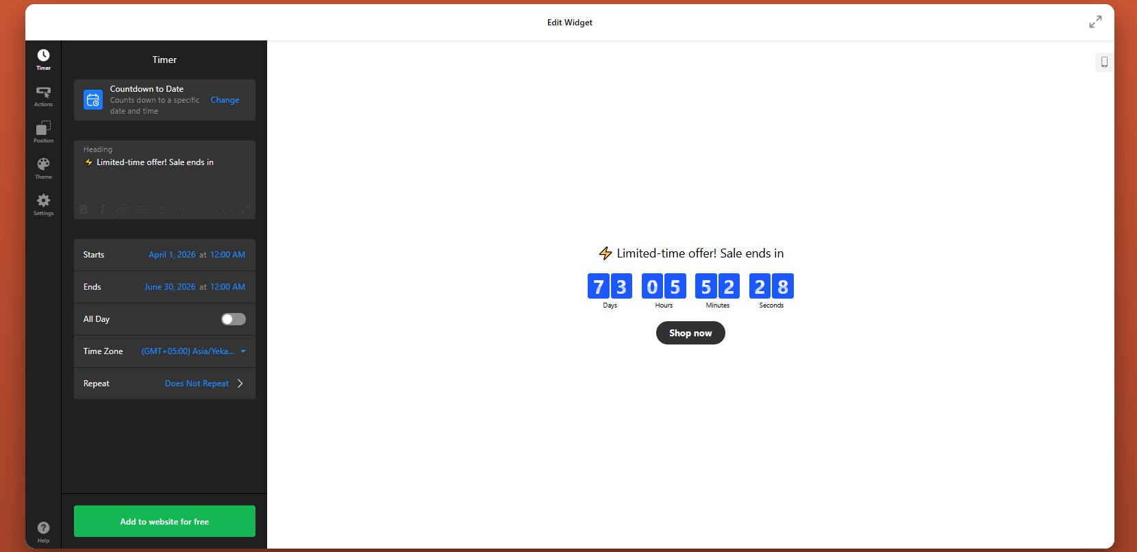
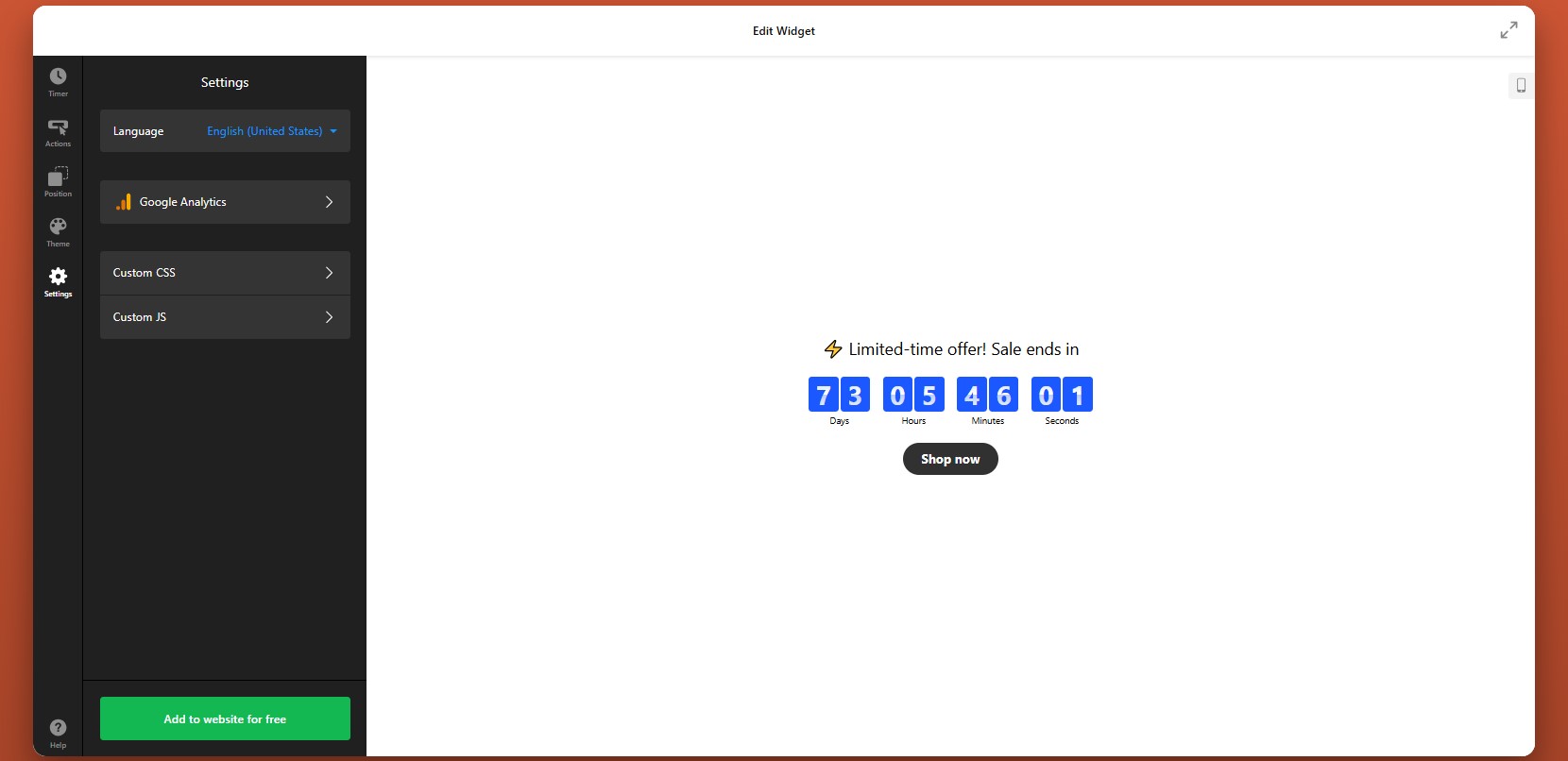
- Quick Start: Add Countdown Timer to HTML
- Why Embed Countdown Timer on HTML Website
- Core Features of Countdown Timer Widget
- Step-by-Step: Embed Countdown Timer on HTML
- Other Ways to Integrate Countdown
- Optimization Tips for Your Timer
- Real-World Example: Dental Website
- Frequently Asked Questions
- Conclusion
On a custom HTML website, every feature – from layout to functionality – has to be built or integrated manually. While this gives you full control, it also means elements like countdown timers require extra effort to implement. Without urgency, visitors often delay decisions, which can lead to lower engagement and missed conversion opportunities.
The Elfsight Countdown Timer widget provides a simple way to integrate a countdown into your HTML website without developing it from scratch. Elfsight lets you create, customize, and add a timer to your website in minutes, helping you introduce urgency and guide users toward faster action.
- A simple way to embed Countdown Timer on HTML without coding
- Why countdown timers increase urgency and conversions
- Alternative methods to add a timer and their limitations
- Optimization tips to improve performance and results
We’ll start with a quick implementation method so you can get your timer live immediately.
Quick Start: Add Countdown Timer to HTML
If you want a fast way to embed countdown timer on HTML, follow these simple steps:
- Open the Countdown Timer editor and choose a template
- Set your countdown type, time, and behavior
- Click “Add to website for free” to generate the embed code
- Paste the code into your HTML file where you want the timer to appear
Generate your Countdown Timer in our live editor and embed it instantly!
Why Embed Countdown Timer on HTML Website
Adding a countdown timer to a custom HTML website directly influences how users behave and how quickly they take action. Since HTML websites are often static by default, a countdown introduces a dynamic element that can significantly improve engagement and conversions.
⏳ Create a clear sense of urgency
Without a deadline, users tend to postpone decisions or leave your website to “come back later.” A countdown timer introduces a visible time limit, encouraging visitors to act before the opportunity expires.
📈 Improve conversion rates on key actions
Placing the timer near buttons, forms, or offers can significantly increase clicks and completions. It gives users a reason to act now instead of delaying.
🎯 Support campaigns and launches
Countdown timers are especially effective for promotions, product releases, or event registrations where timing matters. They make your campaigns feel more immediate and relevant.
🔄 Add dynamic behavior to static pages
HTML pages are often static and don’t change unless updated manually. A countdown introduces movement and real-time updates, making the page feel more interactive and engaging.
🧠 Reinforce scarcity and value
A visible countdown signals that something is limited—whether it’s time, availability, or access. This increases perceived value and makes your offer more compelling.
📍 Guide user attention and flow
Timers naturally draw attention due to their motion and ticking behavior. This helps guide users toward important sections, such as CTAs or promotional areas.
Core Features of Countdown Timer Widget
Before you start using a free HTML Countdown Timer embed widget, here’s what you can expect, the right set of features that allow you to control timing, appearance, and behavior:
| Feature | Practical Use |
| Countdown modes | Choose between fixed deadlines, personal timers, or number-based counters depending on your campaign |
| Flexible time control | Set exact dates, durations, and time zones for accurate countdown behavior |
| Multiple layouts | Display the timer as inline content, banners, or floating bars |
| Action triggers | Add buttons, links, or actions like redirects and form openings |
| Post-countdown behavior | Decide what happens when time ends (hide, show message, redirect) |
| Visual customization | Adjust colors, fonts, sizes, and styles to match your HTML design |
| Animation effects | Add subtle motion to increase visibility and engagement |
| Responsive design | Ensure the timer works across all screen sizes without extra coding |
| Easy HTML embedding | Insert the widget anywhere using a simple embed code |
| Analytics integration | Track clicks and interactions using tools like Google Analytics |
These features allow you to go beyond a basic timer and create a fully interactive element that adapts to different pages and goals. Instead of just displaying time, Elfsight helps you structure user behavior, guiding attention, reinforcing urgency, and helping visitors take action.
For more detailed characteristics, visit the features page.
Step-by-Step: How to Embed Countdown Timer on HTML
Now that the key features are clear, the next step is to configure your timer and place it into your HTML website where it can support clicks, sign-ups, or purchases most effectively.
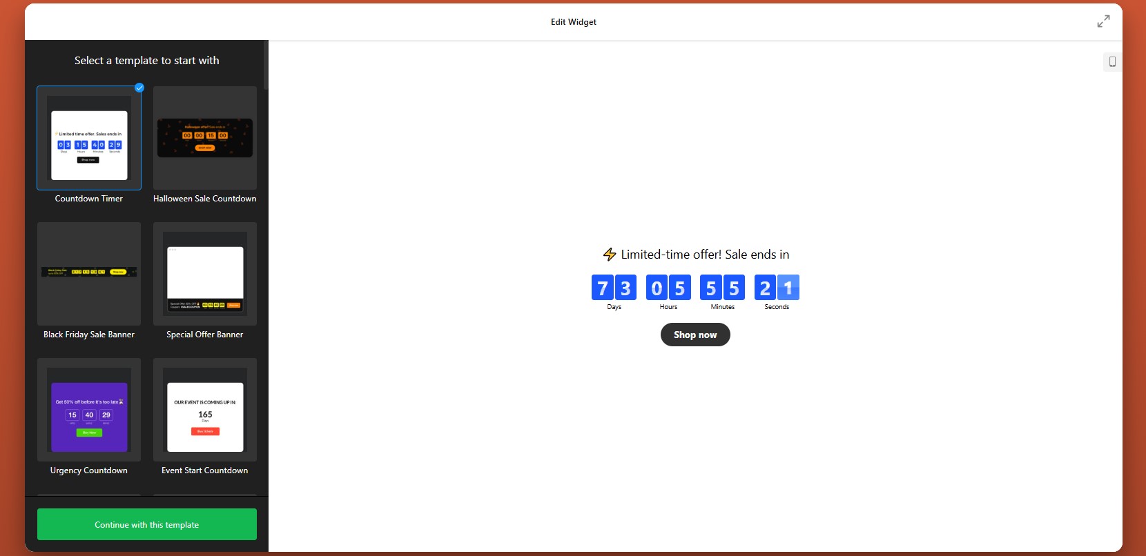
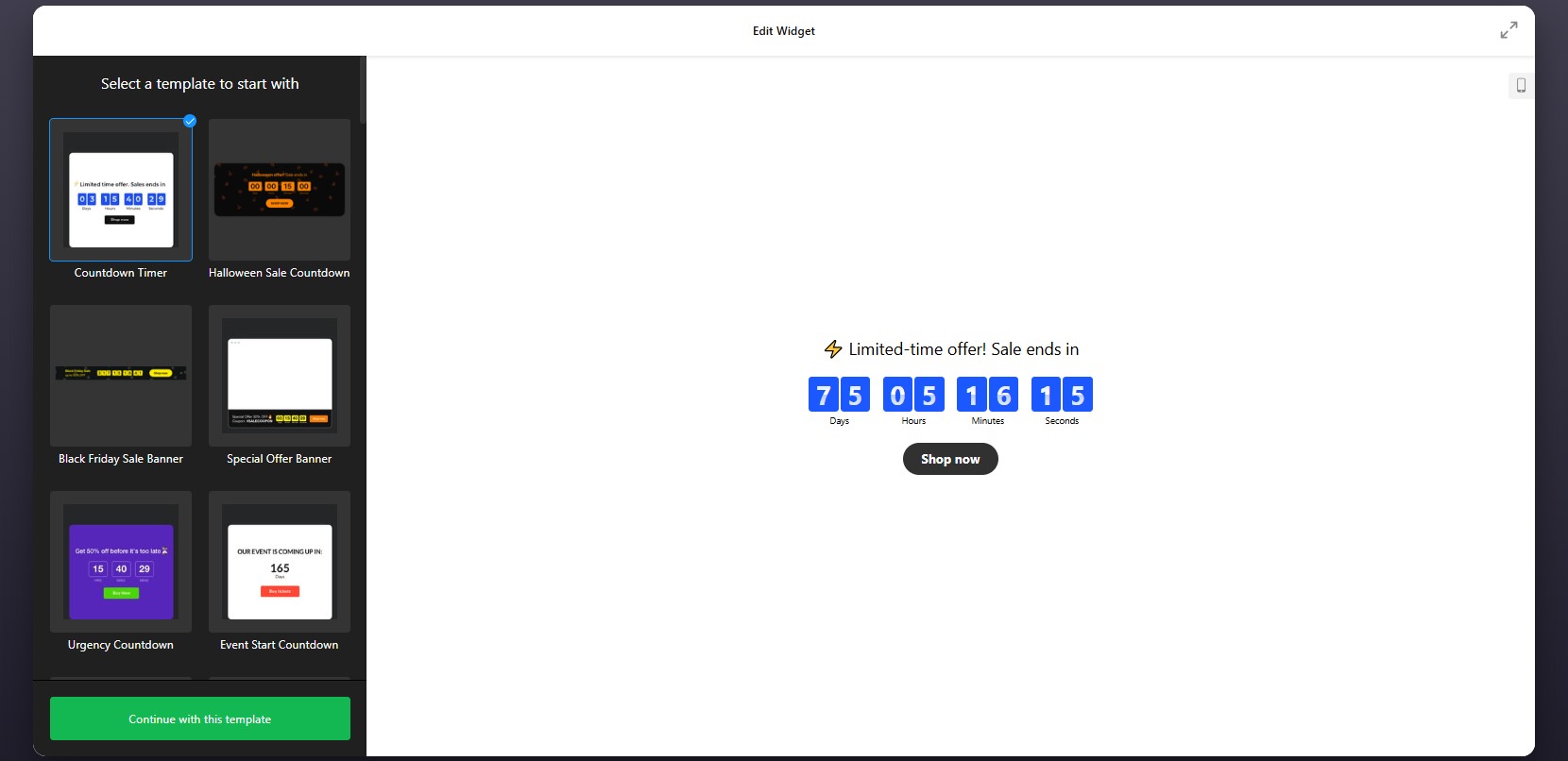
Step 1: Choose a Template
Open the Elfsight editor and choose one of ready-made templates designed for different goals and placements.
At this point, focus on choosing the structure that best matches your page layout and campaign objective. You’ll still be able to adjust the visuals and behavior later.
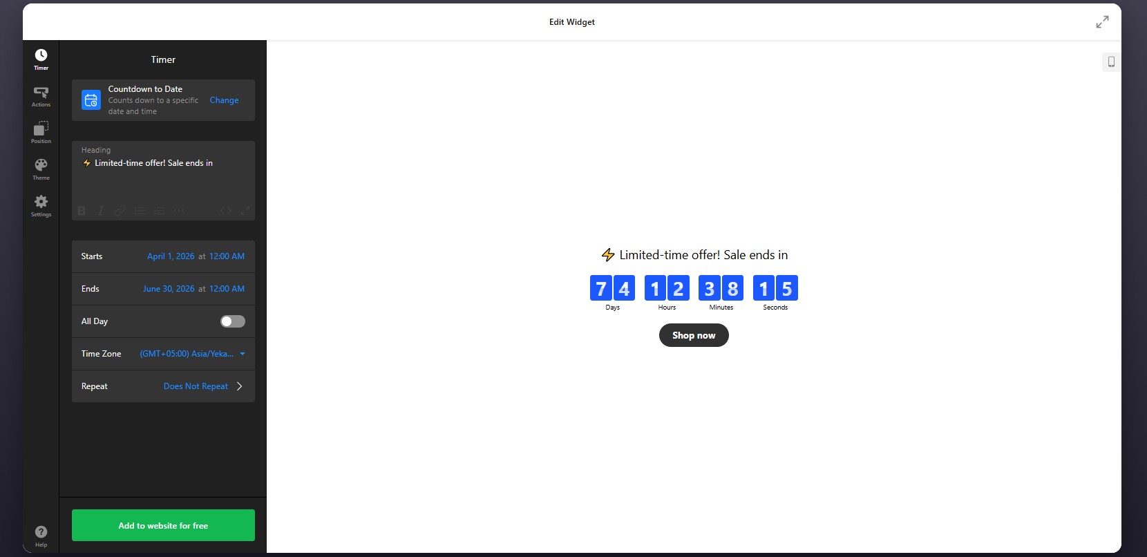
Step 2: Set the Timer Type and Countdown Logic
Once the template is selected, configure how the timer should actually work. This is where you decide whether the countdown is tied to a fixed deadline, personalized per visitor, or used as a numerical counter.
After choosing the mode, set the date, duration, and any time-related options such as time zone behavior. This step determines the urgency structure users will see when they open the page.
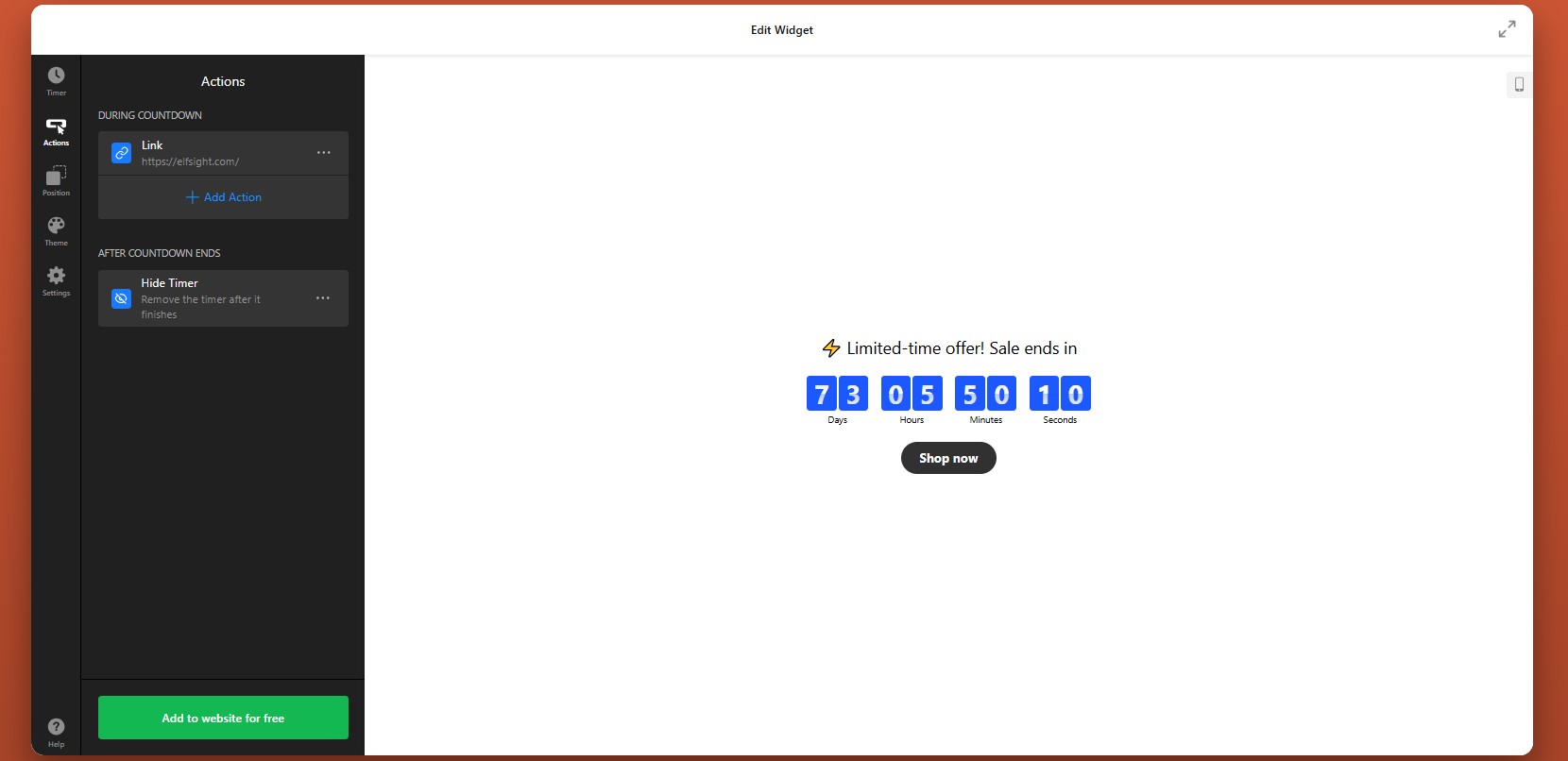
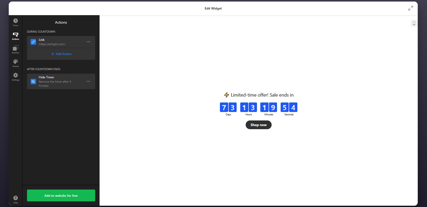
Step 3: Configure Actions During and After the Countdown
In the Actions tab, choose what the widget should do while the countdown is active and what happens when time runs out.
During the countdown, you can connect the timer to actions such as opening a form, sending users to a URL, or helping them add an event to their calendar. This is useful if the countdown is tied to a registration page, a booking flow, or a limited-time promotional page.
You can also define the post-countdown behavior. For example, when the timer reaches zero, you may want it to disappear, display a custom message, or redirect users to another page. This is especially helpful when an offer expires or when you want to change the next step automatically.
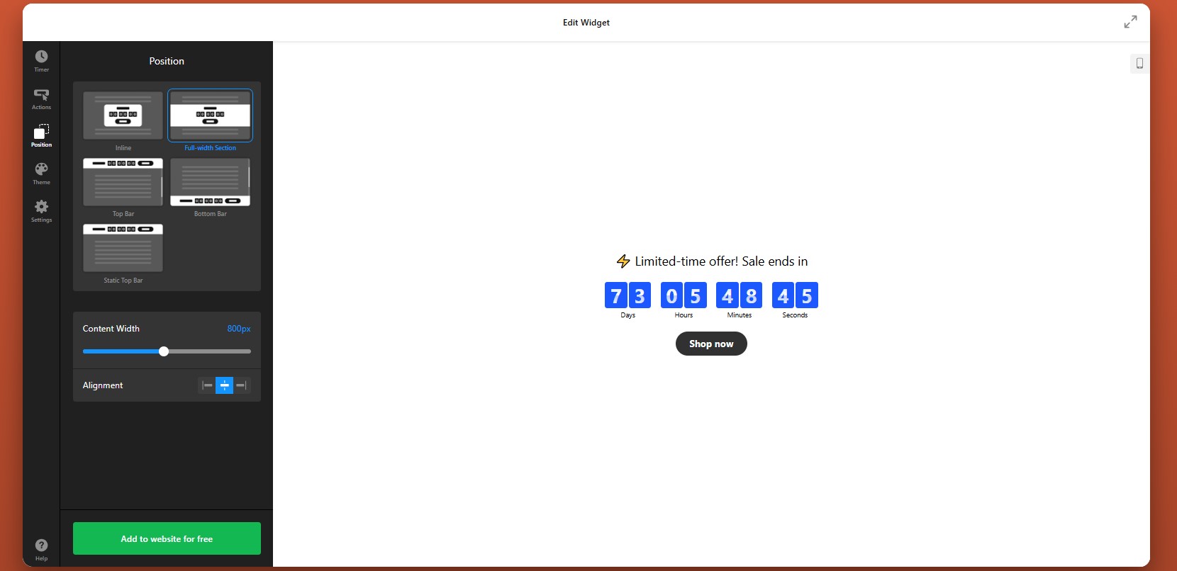
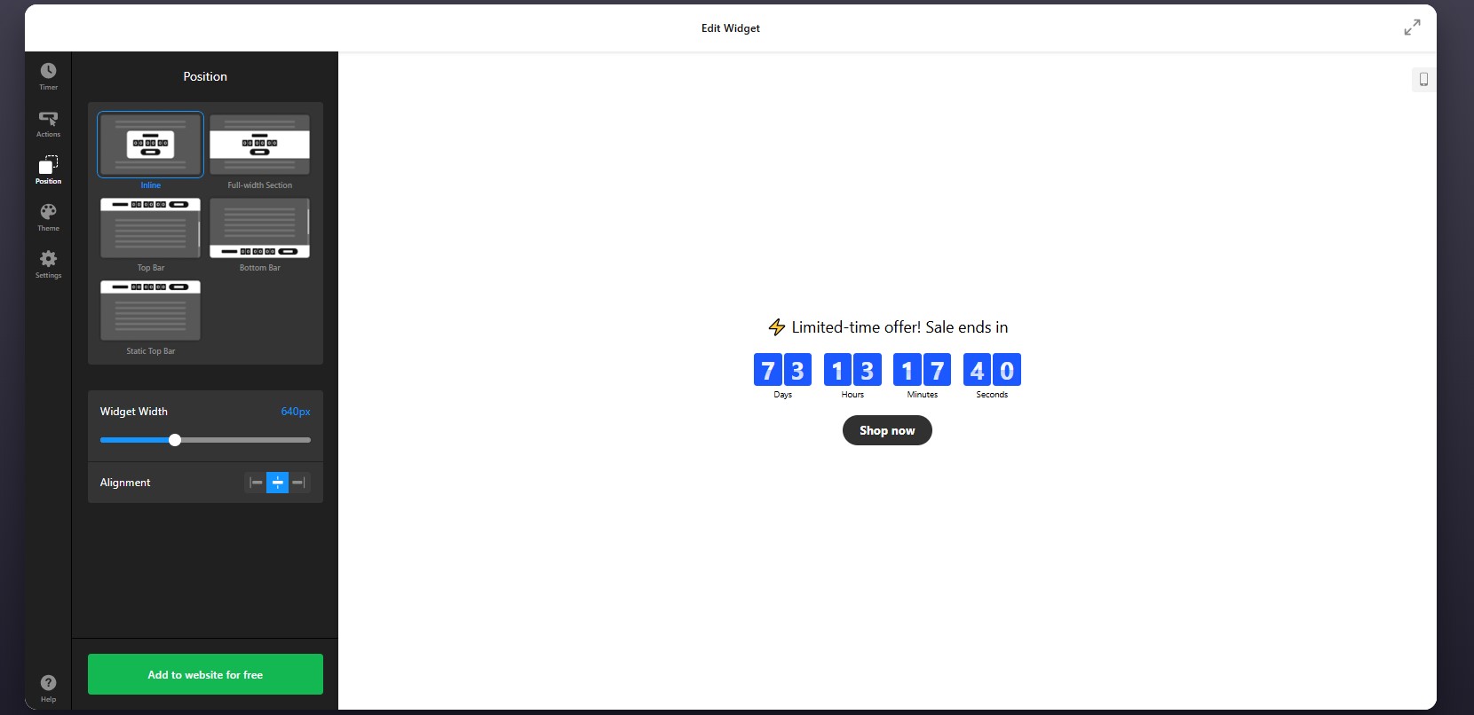
Step 4: Adjust Position and Display Rules
Next, open the Position tab to decide where the countdown appears and how it behaves within your HTML website. Think about where urgency matters most and make the countdown highly visible without making it intrusive.
You can also control whether the timer should show globally or only in selected sections of the website, depending on how your HTML structure is organized.
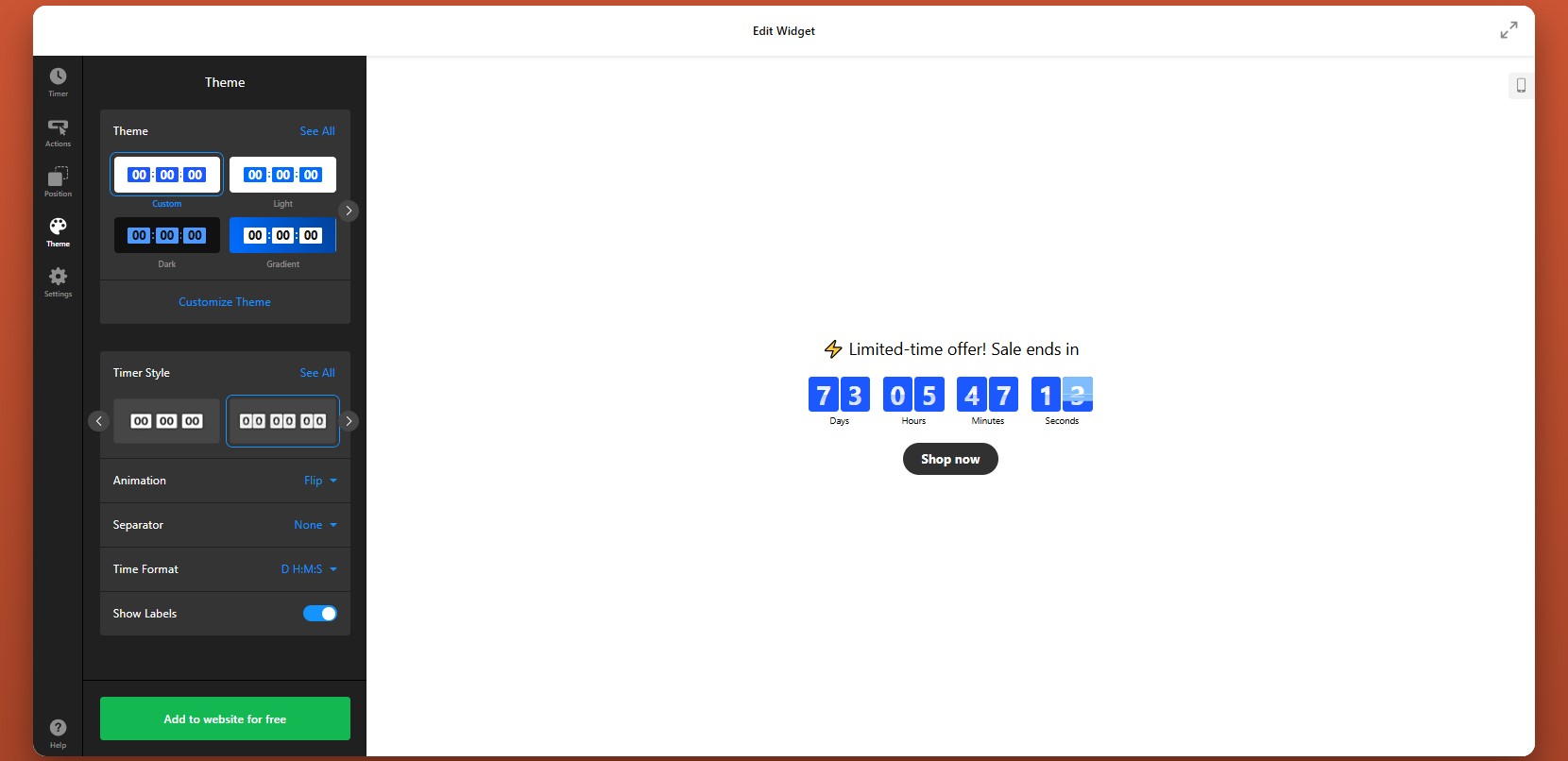
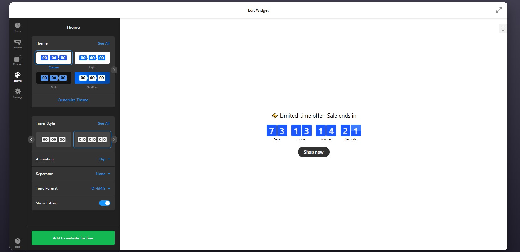
Step 5: Customize the Theme and Visual Style
Align the widget with your website design and make sure it stands out for the right reasons.
Animations can be useful here, but they should stay subtle. A small motion can draw attention to the timer, while aggressive effects may distract from the message itself.
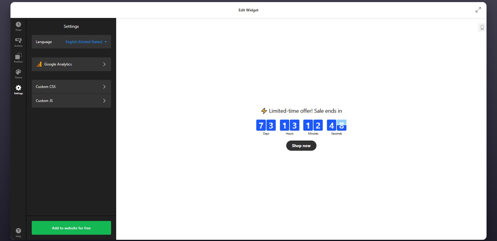
Step 6: Configure Additional Settings
Finally, go to the Settings tab to adjust the final options that affect usability and tracking.
If your website serves a multilingual audience, make sure the timer labels match the page language. If you want to measure performance, connect the widget with Google Analytics so you can track clicks and interactions.
Step 7: Generate the Embed Code
Once your timer is fully configured, click “Add to website for free” to generate the embed code.
Copy the entire code snippet exactly as it appears. This code contains the widget loader and all the settings you’ve just applied. Your countdown is ready for installation.
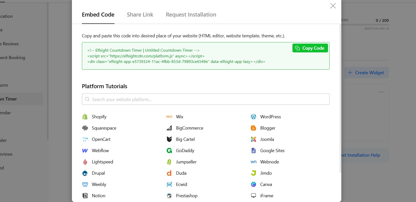
Step 8: Paste the Code into Your HTML Website
Now add the countdown timer to your HTML file by placing the embed code in the correct location:
- Open your HTML file in your code editor.
- Locate the section where you want the countdown timer to appear (usually inside the <body> tag).
- Paste the embed code exactly where the timer should be displayed.
- Save your changes to the file.
- Upload the updated file to your server or publish it using your deployment workflow.
- Open the live page in your browser to verify that the timer appears correctly.
- Test the countdown on both desktop and mobile devices to ensure proper layout and functionality.
This approach gives you full control over placement, allowing you to position the timer exactly where it supports your content and conversion goals.
- If the timer doesn’t appear, confirm that the full embed code was pasted into the HTML file and that the updated file was uploaded correctly.
- If the time looks wrong, recheck your countdown mode and time zone settings.
- If the widget looks compressed, review the width of the surrounding container.
- If it behaves differently across devices, test the responsive layout and adjust nearby styling if needed.
By following these steps, you can add a fully functional Countdown Timer to your HTML website without building one from scratch, while still keeping full control over how it looks, behaves, and supports your campaign goals.
Other Ways to Integrate a Countdown into HTML
There are several ways to embed a countdown timer on HTML, but they differ in setup complexity, flexibility, and long-term usability. Below are the most common approaches, along with how to implement each one.
Custom JavaScript Countdown Timer
You can build your own countdown timer using JavaScript for full control over functionality and design.
To do this:
- Write or copy a JavaScript countdown script
- Add the script inside your HTML file (usually before the closing </body> tag)
- Create an HTML container where the timer will display
- Style it using CSS
- Requires coding skills
- Time-consuming to build and maintain
- Needs manual updates for changes
Open-Source Countdown Scripts
You can use pre-built countdown scripts from GitHub or other developer resources. These scripts can be copied and embedded into your HTML file.
This approach is faster than building from scratch and often provides basic functionality out of the box. But it still has some limitations.
- Limited customization without editing code
- May require debugging or adjustments
- No visual editor
Iframe-Based Countdown Tools
Some services provide countdown timers that you can embed using an iframe.
To implement it:
- Generate a countdown timer using an external tool
- Copy the iframe embed code
- Paste it into your HTML where you want the timer to appear
- Limited control over design and behavior
- Hard to fully match your website style
- May depend on external service performance
Each method can help you implement a countdown on your HTML, but they vary in effort and effectiveness. Here’s a feature-based comparison table to make the differences clearer and easier to scan.
| Feature | Elfsight Countdown Timer | Custom JavaScript | Open-Source Scripts | Iframe Tools |
| Ease of setup | Very easy | Hard | Medium | Easy |
| Coding required | No | Yes | Partial | No |
| Design customization | High | Very high | Medium | Low |
| Dynamic countdown | Yes | Yes | Yes | Yes |
| Countdown modes (fixed/personal) | Yes | Custom-built | Limited | Limited |
| Actions & triggers | Yes | Custom-built | Limited | No |
| Mobile responsiveness | Yes | Depends on code | Depends on script | Limited |
| Maintenance effort | Low | High | Medium | Low–Medium |
| Scalability | High | Medium | Medium | Low |
If you want a free Countdown Timer that combines ease of use with customization and reliable performance, Elfsight is the best option. It minimizes manual work while still fitting seamlessly into your website.
Optimization Tips for Your Countdown Timer
Once you’ve added your timer, a few strategic adjustments can make a significant difference in how users respond to it. A well-placed and well-configured countdown doesn’t just show time – it actively drives engagement and conversions.
- Place the timer near key actions: Position it close to buttons, forms, or pricing sections so users see urgency exactly when they’re about to decide.
- Clearly explain the purpose: Add a short message like “Offer ends in…” or “Registration closes in…” to give context and avoid confusion.
- Use the right countdown mode: Fixed timers work best for global campaigns, while personal timers are more effective for individualized offers.
- Keep the design clean and visible: Use contrast to make the timer noticeable, but avoid overly complex styles that distract from your content.
- Limit the duration strategically: Shorter countdowns typically create stronger urgency and encourage quicker action.
- Align the timer with your campaign: Make sure the countdown reflects a real deadline and matches the offer it supports.
- Test different placements: Try placing the timer in headers, inline sections, or near CTAs to see what performs best.
- Track performance and refine: Use analytics to monitor clicks and conversions, then adjust timing, messaging, or placement accordingly.
These optimizations help ensure the plugin actively contributes to better engagement and measurable results.
Real-World Example: Dental Website Improves Engagement and Clarity
David Drew runs a dental practice website where keeping information up to date and guiding patients toward booking decisions were key challenges. Like many service-based businesses, he needed a way to keep content fresh while clearly communicating availability and encouraging timely action.
Before using Elfsight
Frequent need to manually update website content
Difficulty pulling and displaying reviews dynamically
No clear, unified way to communicate appointment availability
With Elfsight widgets
“We now keep the website live:
- Instagram Feed, it constantly feels fresh, and is now updated automatically.
- All-in-one reviews ensure we have got rich search results.
- Countdown banner ensures our CTA has a clear deadline.”
David introduced multiple widgets to streamline content updates and improve communication. The Instagram Feed kept the website visually fresh without manual effort, while the All-in-One Reviews widget helped strengthen credibility through search visibility.
The Countdown banner helped clarify timing around key actions, making it easier for visitors to understand when they should book or respond.
The result
The website became easier to maintain and more effective at guiding users. Visitors could quickly access relevant information, see up-to-date content, and understand when to act – resulting in a clearer and more engaging user experience.
By combining dynamic content and time-based elements, David turned his website into a more structured and action-driven platform without increasing workload.
Frequently Asked Questions
Why does my countdown timer show different times for different users?
Can I use multiple countdown timers on one HTML website?
Can I track clicks and performance of my countdown timer?
What happens when the countdown reaches zero?
Can I localize the countdown timer for different languages?
How do I update or change an existing countdown timer?
Conclusion
Adding a Countdown Timer to an HTML website is one of the most effective ways to introduce urgency and make your pages more action-oriented. Instead of relying on static content, you create a dynamic element that encourages visitors to respond within a clear timeframe.
The Elfsight Countdown Timer widget simplifies the entire process. You can customize its appearance, control how it behaves, and quickly embed it on your website – all without building complex scripts or managing manual updates. This makes it an effective tool for boosting engagement and driving conversions.
- Quick Start: Add Countdown to Squarespace
- Why Add Countdown Timer to Squarespace
- Core Features of Countdown Timer Plugin
- Full Guide: How to Add a Countdown Timer
- Alternative Ways to Add Countdown Timer
- Optimization Tips for Your Countdown Timer
- Countdown Timer Embedding Use Case
- Frequently Asked Questions
- Conclusion
Creating urgency is one of the most effective ways to drive action – whether it’s promoting a sale, launching a product, or collecting sign-ups. People browse, compare, and often leave postponing their decisions, especially when there’s no clear reason to act now. The challenge is that Squarespace doesn’t offer advanced countdown functionality out of the box.
The Elfsight Countdown Timer makes it easy to add a Countdown Timer to Squarespace without coding. You can create visually engaging timers, customize their appearance, and embed them anywhere on your website.
- A quick way to add countdown timer to Squarespace without coding
- Why countdown timers increase urgency and conversions
- Alternative methods and their limitations
- Optimization tips to maximize performance and impact
Quick Start: Add Countdown to Squarespace
If you’re looking for a straightforward way to add countdown timer to Squarespace, you can set everything up in just a few steps:
- Open the Elfsight editor and choose a template
- Set your countdown date, time, and behavior
- Click “Add to website for free” to generate the embed code
- Paste the code into your Squarespace page using a Code Block
Launch your Countdown Timer in minutes with the live editor!
Why Add Countdown Timer to Squarespace
Adding a countdown directly influences how visitors perceive your offer. When used strategically, it becomes a powerful behavioral trigger rather than just a visual element.
⏳ Turn passive browsing into immediate action
Most visitors don’t act on their first visit. A countdown introduces a clear deadline, which reduces procrastination and encourages users to make decisions while the opportunity is still available.
📈 Strengthen conversions across key pages
Placing the Countdown Timer near product sections, pricing blocks, or sign-up forms can significantly increase clicks and purchases. It removes uncertainty and gives users a reason to act now instead of later.
🎯 Make promotions and launches more effective
Countdown timers are especially useful for limited-time offers, seasonal campaigns, or product launches. They highlight urgency in a way that static text simply can’t, making your campaigns feel more dynamic and time-sensitive.
🔄 Add movement and freshness to your content
Unlike static elements, a countdown is constantly changing. This subtle motion draws attention and makes your website feel more active, which helps keep visitors engaged for longer.
🧠 Reinforce perceived value and scarcity
A visible timer signals that something is limited – whether it’s time, availability, or access. This increases perceived value and makes your offer feel more exclusive.
⚡ Guide users through the decision process
By combining urgency with clear messaging, Countdown Timer helps users move from consideration to action more quickly. Instead of leaving your website to “think about it,” they’re more likely to complete the intended action immediately.
With the Elfsight Countdown Timer, you can shape user behavior and create a stronger, more action-driven experience across your website.
Core Features of Countdown Timer Plugin
Before you add a Countdown Timer to Squarespace, it’s important to understand how the plugin goes beyond a simple ticking clock. The right features allow you to control not just the timer itself, but how it influences user behavior and fits into your website experience.
Below is a breakdown of the key capabilities and how they apply in practice:
| Feature | Practical Use |
| Countdown modes | Choose between timer types based on your goal – set a fixed deadline, create a personalized countdown, or count up/down between values |
| Multiple display formats | Show timers as inline sections, banners, or floating or static bars, depending on placement |
| Custom time settings | Control time zones, start/end triggers, and expiration behavior |
| Call-to-action integration | Add buttons directly within the timer to drive clicks and conversions |
| Flexible positioning | Place the countdown anywhere on your Squarespace website or display it globally |
| Visual customization | Adjust colors, fonts, labels, and layouts to match your branding |
| Device responsiveness | Ensure the timer looks and works properly across desktop, tablet, and mobile |
| Behavior controls | Decide what happens when the timer ends (hide, redirect, or display message) |
These features allow you to use the Countdown Timer in different ways across your website. For detailed characteristics of the plugin, visit the features page.
Now let’s move on to the full setup process and see exactly how to embed it on a Squarespace website step by step.
Full Guide: How to Add a Countdown Timer to Squarespace
Here is the full guide to set it up and place it on your Squarespace website where it can create the most impact.
Step 1: Select a Template
Start by opening the Countdown Timer editor. Inside, you’ll find a variety of pre-designed templates tailored for different use cases such as promotions, announcements, or lead generation.
Focus on choosing a layout that fits your goal. This initial choice defines how the countdown will integrate into your Squarespace layout, but you’ll still be able to adjust all details later.
Step 2: Set the timing
You can define a fixed deadline for events like sales or launches, or create a personalized timer that starts individually for each visitor. You also have control over time zones to ensure accuracy across different regions.
Step 3: Configure Actions
After setting the timer, move to the Actions tab, where you define what happens during and after the countdown – whether the timer disappears, displays a message, or redirects users to another page.
This step is essential if your countdown is tied to a campaign or user flow.
Step 4: Set Position and Display Rules
Go to the Position tab to control where and how the plugin appears on your website.
to ensure the timer appears exactly where it has the most impact – without disrupting the layout.
Step 5: Customize the Visual Design
Refine the appearance of the timer so it matches your Squarespace branding. In the Theme tab, you can customize timer style and layout, animation effects, and time format.
Step 6: Configure Settings
Open the Settings tab to adjust additional options.
Here you can:
- Set the plugin language to localize your timer.
- Connect Google Analytics for tracking interactions and measure its performance.
Step 7: Generate the Embed Code
When your countdown timer is fully configured, click the “Add to website for free” button to generate your embed code.
Copy the entire code snippet exactly as provided. This code contains all the settings and configurations you’ve just applied.

Step 8: Add Countdown Timer to Squarespace
Finally, open your Squarespace editor and navigate to the page where you want the timer to appear.
Insert a Code Block in the desired section of your page and paste the embed code into it. Once you save and publish your changes, the countdown timer will be visible on your live website.
After publishing, check how the timer looks within your layout. Make sure it appears in the right position and aligns well with surrounding content.
- If the timer doesn’t appear, ensure the code is pasted into a Code Block and the page is published.
- If the timing looks incorrect, review your time zone settings.
- If layout issues occur, adjust the container width or placement within your page structure.
By following these steps, you can successfully integrate a countdown timer into your Squarespace website, customize its appearance, and position it where it creates urgency and drives action.
Alternative Ways to Add Countdown Timer to Squarespace
Squarespace doesn’t include a built-in countdown timer feature, which means most solutions rely on external tools or custom implementations. While there are several ways to add a countdown clock to a Squarespace website, they differ significantly in terms of flexibility, ease of use, and long-term maintainability.
Squarespace Announcement Bar (Native Workaround)
Squarespace offers an Announcement Bar that can be used to display time-sensitive messages like “Sale ends soon” or “Limited-time offer.”
To implement this, you enable the announcement bar in your website settings and manually update the message as needed.
This approach works for simple notifications, but it doesn’t provide a real countdown experience.
- No dynamic timer or automatic countdown
- Requires manual updates
- Limited visual customization
Custom JavaScript via Code Injection
You can build or integrate a countdown timer using custom JavaScript and place it in a Code Block or through header/footer code injection.
This gives you full control over how the timer behaves and looks, especially if you’re comfortable editing scripts or working with developers.
However, this method is more technical and requires ongoing maintenance.
Third-Party Countdown Scripts
Another option is to use pre-built countdown scripts from external providers and embed them into Squarespace using a Code Block.
This method is quicker than writing custom code and doesn’t require deep technical skills.
However, most scripts are limited in functionality and customization.
- Basic design and layout options
- Limited control over behavior and triggers
The table below highlights the key differences so you can decide which solution best fits your Squarespace website.
| Method | Best For | Requirements |
| Elfsight Countdown Timer | Scalable, customizable timers with no coding | Copy-paste embed code |
| Squarespace Announcement Bar | Simple time-based messages or basic urgency | Built-in feature, manual updates |
| Custom JavaScript (Code Injection) | Fully custom behavior and advanced control | Coding knowledge or developer support |
| Third-Party Scripts | Quick setup for basic countdowns | Embed external script |
Squarespace offers only limited native options for countdown timers. While some approaches are quick to implement, they may lack automation or customization, while others offer more control but require additional effort.
Elfsight offers the solution that balances usability with flexibility without introducing unnecessary technical overhead.
Optimization Tips for Your Countdown Timer
Once your timer is live, small adjustments in placement, messaging, and behavior can significantly improve how users respond to it and make decisions.
- Place the timer where decisions happen: Add it near CTAs, pricing sections, or booking forms so users see urgency at the exact moment they’re considering action.
- Clearly explain what the Countdown is for: Pair the timer with a short message like “Offer ends in…” or “Booking closes in…” so visitors instantly understand its purpose.
- Use realistic and relevant deadlines: Timers work best when they reflect real constraints. Overly long or unclear countdowns reduce urgency and impact.
- Choose the right countdown mode: Use fixed timers for global campaigns and personal timers for user-specific offers to match your conversion goals.
- Keep the design noticeable but balanced: Use contrast to make the timer visible, but avoid overly aggressive colors or animations that distract from your content.
- Limit distractions around the timer: Keep surrounding elements clean so the Countdown Timer stands out and remains easy to understand.
- Test different placements and formats: Try banners, inline timers, or popups to see which format performs best for your audience and page layout.
- Monitor performance and adjust: Use analytics to track clicks and conversions, then refine timing, messaging, or placement based on real user behavior.
Real-World Example: Dental Website Uses Countdown Timer to Drive Appointments
David Drew runs a dental practice website where keeping content fresh and encouraging patients to take action quickly were ongoing challenges. Like many service-based businesses, he needed a way to clearly communicate availability and motivate visitors to book appointments without constant manual updates.
Before using Elfsight
Frequent need to update website content manually
Difficulty displaying dynamic reviews and maintaining SEO-rich content
No clear way to communicate urgency around appointment availability
With the Countdown Timer plugin
“We now keep the website live:
- Instagram Feed, it constantly feels fresh, and is now updated automatically.
- All-in-one reviews ensure we have got rich search results.
- Countdown banner ensures our CTA has a clear deadline.”
David implemented a countdown alongside other widgets to highlight time-sensitive calls to action. Instead of relying on static messaging, the countdown created a visible deadline that encouraged visitors to book appointments sooner.
At the same time, other widgets like Instagram Feed and All-in-One Reviews kept the website automatically updated, reducing the need for manual content changes and making the website feel active and current.
The result
The website became easier to manage and more effective at guiding users toward action. Elfsight helped introduce urgency into the booking process, while the overall setup reduced time spent on updates.
Frequently Asked Questions
Can I show different timers on different pages?
Can I track how users interact with the Countdown Timer?
What happens when the countdown reaches zero?
Can I use the Countdown Timer for recurring campaigns?
Conclusion
Adding a countdown timer to your Squarespace website is one of the simplest ways to introduce urgency and guide visitors toward action. Instead of leaving decisions open-ended, you give users a clear reason to act now, whether it’s booking an appointment, making a purchase, or signing up for an offer.
The Elfsight Countdown Timer plugin makes it easy to implement this without technical complexity. You can choose different countdown modes, customize the design to match your branding, and control how the timer behaves – all from a single interface. If you’re looking for a reliable countdown clock to add to your Squarespace website, this approach gives you the flexibility to adapt your timer to different campaigns while keeping everything easy to manage.
Did you know? 97% of online shoppers check reviews before trusting a business, making customer feedback one of the strongest decision-making factors on any website.
If you manage a WordPress website, showcasing customer reviews can significantly improve how visitors perceive your business. The issue is that WordPress doesn’t always offer a straightforward way to display reviews from multiple platforms in a clean, organized format. As a result, many website owners look for better ways to add reviews to their WordPress website beyond static testimonials or manual content.
The Elfsight All-in-One Reviews plugin provides a simple solution to showcase reviews on a website without coding. It allows you to gather feedback from different platforms, customize how it looks, and place it exactly where it supports user decisions.
- The simplest way to add reviews to a WordPress website without technical setup
- How reviews influence trust and help visitors make decisions
- Alternative approaches and when they might be useful
- Practical tips to make your reviews more effective
To keep things clear and actionable, we’ll start with the quickest method to get reviews live.
Quick Start: Embed Reviews on WordPress
If you’re looking for a quick way to embed reviews on your web page, you can get everything running in just a few steps:
- Open the All-in-One Reviews plugin editor and select a template.
- Connect your review sources (Google, Facebook, etc.).
- Click “Add to website for free” to generate the embed code.
- Paste the code into your WordPress page using a Custom HTML block
This approach works whether you’re adding a small review section or building a more structured layout across multiple pages.
Build your own reviews plugin in our live editor right now!
Why Add Reviews to WordPress Website
Integrating reviews into your website does more than fill space, it changes how visitors evaluate your business and whether they feel confident enough to take the next step. When used strategically, reviews become a key part of your decision-making flow.
🧠 Help visitors make decisions faster
Most users arrive with questions: Is this reliable? Does it work? Can I trust this business? Reviews answer these questions immediately, reducing the need for extra research and helping users move forward without hesitation.
🔍 Provide real-world context to your offer
Descriptions explain what you do, but reviews show how it actually works in practice. Feedback from real customers adds context, showing outcomes, experiences, and specific benefits that static content can’t fully capture.
📊 Strengthen credibility with consistent proof
When visitors see multiple reviews across different topics – service, quality, support – it creates a pattern of trust. This consistency is often more convincing than a few highlighted testimonials.
⚡ Reduce friction in key moments
Placing reviews near actions like contacting you, booking a service, or purchasing a product removes doubt at critical points. Instead of leaving your website to check external platforms, users find the reassurance they need right where they are.
🔄 Keep your website aligned with customer sentiment
As your business evolves, so does customer feedback. By displaying up-to-date reviews, your website reflects current experiences rather than outdated messaging, making your content more relevant and reliable.
🌐 Bring external credibility onto your website
Reviews from platforms like Google or Facebook already carry recognition. When you display them directly on your WordPress website, you transfer that credibility into your own environment without sending users away.
📱 Improve accessibility of feedback
Instead of making users search for reviews elsewhere, you present them in a clear, structured format. This makes it easier to scan, compare, and understand feedback, especially on mobile devices.
With the Elfsight All-in-One Reviews, you’re creating a layer of proof that supports every interaction and helps visitors move from interest to action with more confidence.
Core Features of All-in-One Reviews Plugin
Before you add reviews to your website, it’s helpful to understand what makes All-in-One Reviews effective in real use – not just displaying feedback, but organizing it in a way that supports decisions and fits your website structure.
These are the key features of the Elfsight All-in-One Reviews and how they translate into practical value:
| Feature | Practical Use |
| Multi-platform aggregation | Combine reviews from 60+ platforms, like Google, Facebook, Yelp, and other sources into a single display |
| Automatic synchronization | New reviews appear on your WordPress website without manual updates |
| Flexible filtering | Show only selected reviews based on rating, keywords, or relevance |
Layout variations | Display reviews as grids, sliders, lists, or compact badges depending on placement |
| AI-powered summaries | Present key insights from multiple reviews to help visitors quickly understand feedback |
| Translation support | Make reviews accessible to a broader audience by displaying them in different languages |
| Custom styling controls | Adjust colors, fonts, and layout to match your WordPress theme |
| Mobile-ready design | Ensure reviews are easy to read and interact with on any device |
These features allow you to go beyond basic testimonials and create a structured review section that works across different parts of your website. To explore the detailed plugin characteristics, visit the features page.
Step-by-Step: How to Add Reviews to WordPress Website
Want the full setup flow with customization tips along the way? This section covers everything from choosing the right layout to placing the Elfsight widget on your WordPress website most effectively.
Step 1: Choose a Template That Fits Your Goal
Start by opening the Elfsight editor and selecting a pre-made template. Common layout directions include:
- Grid for showing volume and credibility at a glance
- List for longer, more detailed reviews
- Slider / Carousel for saving space while still displaying multiple reviews
- Badge or compact layout for subtle trust signals in smaller areas
At this stage, think less about colors and styling and more about where the widget will appear. A homepage section may benefit from a grid or slider, while a sidebar or footer usually works better with a compact badge.
The goal of this step is to choose a structure that matches both your page layout and the amount of review content you want to show.

Step 2: Connect Your Review Sources
Open the Source tab and connect the platforms you want to pull reviews from. Depending on your setup, you may be adding sources such as Google, Facebook, Yelp, or many other supported review platforms
To do this, paste your business profile link or search for your business directly inside the editor. To show reviews from more than one platform, add multiple sources.

Step 3: Decide Which Reviews Should Be Displayed
Not every review has to appear on your website. After connecting the sources, refine what visitors will actually see.
This step helps you control the message by filtering reviews based on things like:
- Rating, such as showing only 4-star and 5-star reviews
- Keywords, if you want to highlight certain strengths
- Text presence, so you can hide empty ratings without comments
For example, if your customers often mention fast delivery, excellent communication, or product quality, you can prioritize those reviews and make your strongest points more visible.
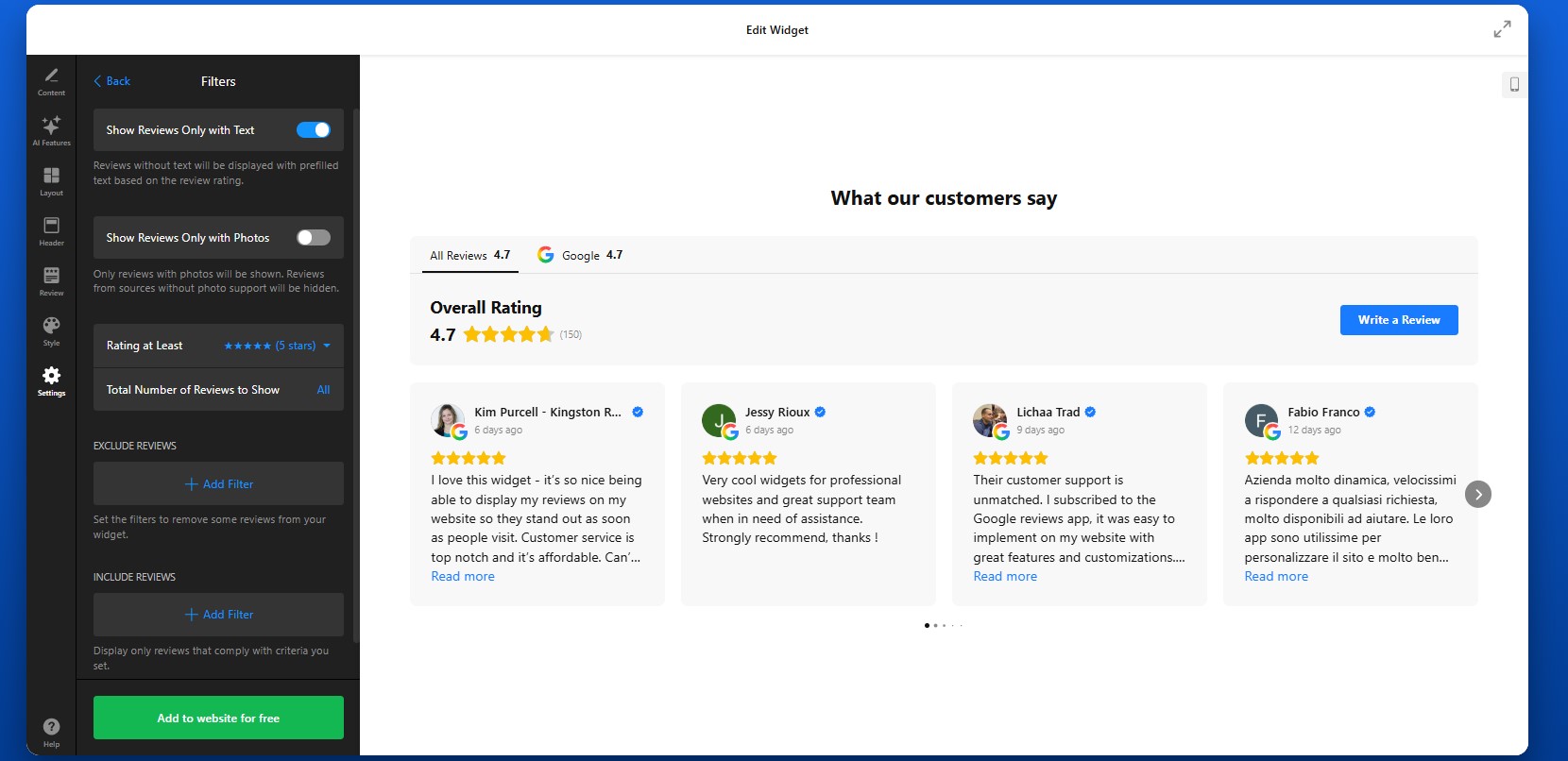
Step 4: Customize the Layout and Review Flow
Now move to the Layout tab to control how the reviews are arranged on the page. You can adjust the number of visible reviews, spacing, navigation style, and scrolling behavior.

Step 5: Adjust the Header and Navigation Elements
The Header settings help you define how the review section is introduced and how visitors move between sources.
If you enable the Write a Review button, visitors can leave feedback through your connected review platforms. This is useful if you want the plugin not only to display reviews, but also to help generate new ones over time.
Here, you can also customize tabs and source grouping. By default, each source can appear in its own tab. If you prefer a cleaner structure, you can group sources by platform, which combines reviews from the same platform under one tab and calculates an average rating.

Step 6: Match the Design to Your WordPress Theme
Customize the visual style so the widget feels like part of your WordPress website rather than an external block. A visually consistent design makes the section feel intentional and polished.
Try to keep the review section aligned with the rest of your design system. If your WordPress theme is minimal, keep the reviews clean and lightweight. If your design is more expressive, you can use stronger visual framing without losing readability.
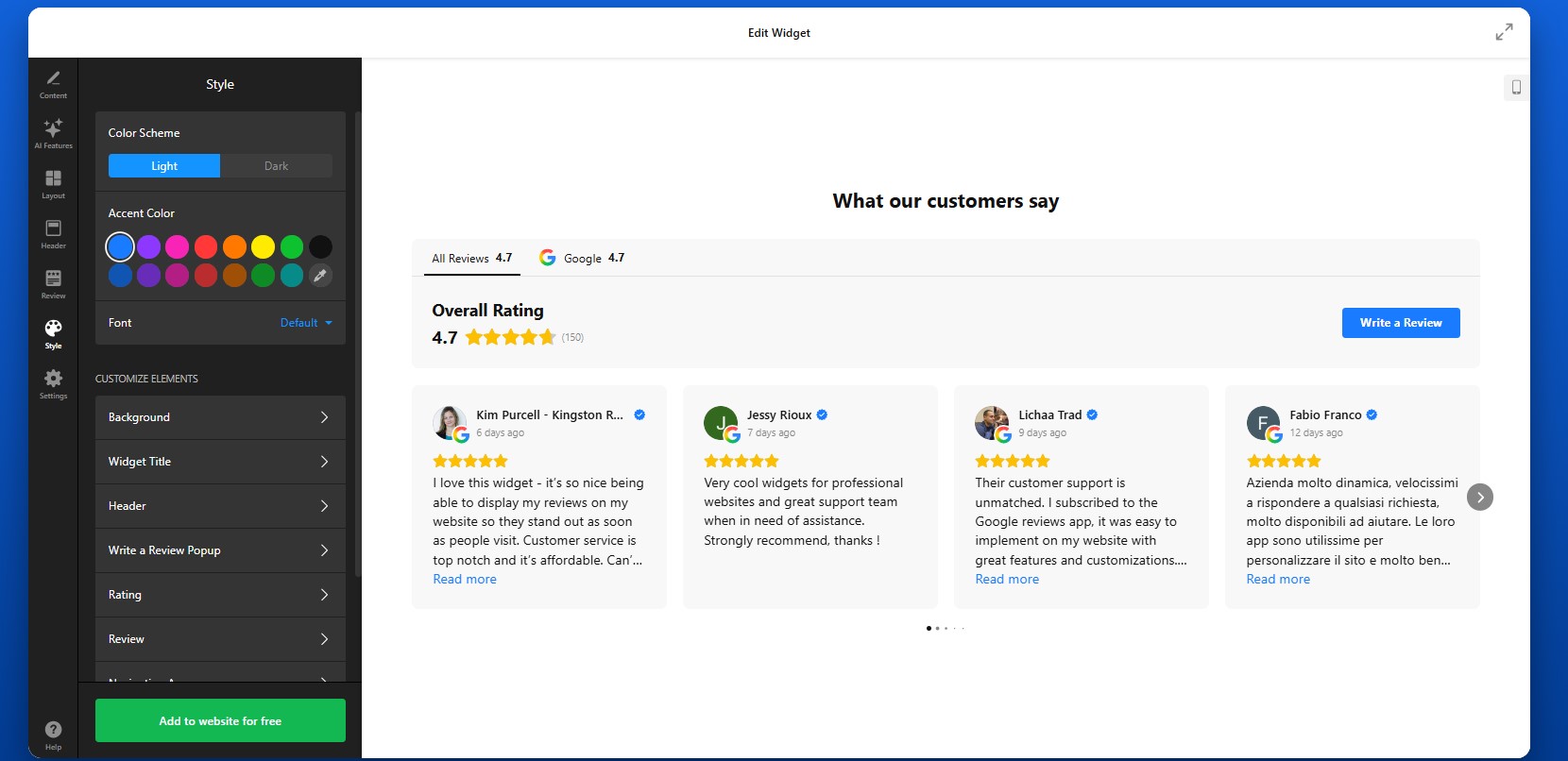
Step 7: Finalize Settings and Extra Options
Before publishing, check the remaining settings that affect how the widget behaves behind the scenes.
Depending on the widget, this may include:
- Language settings
- Translation options
- Schema markup
- Link behavior
- Advanced display settings
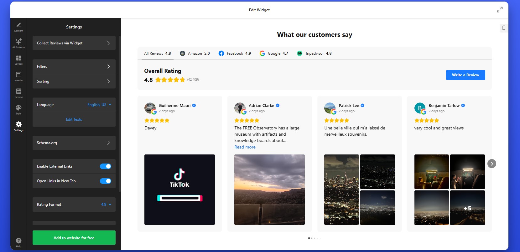
Step 8: Copy the Embed Code
When everything looks right, click “Add to website for free” to generate the embed code.
Copy the full code snippet exactly as it appears. Avoid trimming or partially copying it, since missing part of the code can prevent the widget from loading correctly on your WordPress website.
At this point, the plugin is fully configured and ready to be installed.

Step 9: Embed Reviews in WordPress
To embed reviews on your WordPress website, open the page, post, or widget area where you want the reviews to appear.
From there:
- Add a Custom HTML block in the WordPress editor
- Paste the full embed code into that block
- Save or publish the page
If you want reviews to appear globally, you can also place the code into a reusable block, theme area, or site-wide section depending on your setup.
After publishing, check the live page and review the result carefully. Make sure the reviews are loading correctly, the layout looks balanced, and the section appears in the right place relative to your content and calls to action.Also test the page on desktop and mobile to confirm the widget looks good across different screen sizes.
- If reviews don’t appear, first confirm that the full embed code was pasted into a Custom HTML block rather than a paragraph block.
- If the layout looks compressed, check the width of the container where the widget is placed.
- If reviews seem outdated, allow time for synchronization or verify the connected source.
- If something looks off on mobile, preview the page on smaller screens and adjust the surrounding layout if needed.
By following these steps, you can create a review section that is functional, well-placed, visually consistent, and genuinely useful for helping visitors trust your business.
Other Ways to Display Reviews on WordPress
WordPress gives you more flexibility than most website builders, but that also means there are several different ways to integrate reviews into a WordPress website, each with its own level of control, effort, and scalability.
WordPress Review & Testimonial Plugins
One of the most common approaches in WordPress is using dedicated plugins for testimonials or reviews.
To implement this:
- Install a plugin from the WordPress repository.
- Create review entries inside your dashboard.
- Display them using blocks, shortcodes, or widgets.
This method fits well into the WordPress ecosystem and is easy to manage for basic use cases.
- Reviews are usually entered manually, not synced from platforms
- Limited support for multi-platform aggregation
- Advanced layouts and filtering often require premium versions
Gutenberg Blocks or Page Builder Sections
If you prefer not to use plugins, you can build review sections manually using Gutenberg blocks or page builders like Elementor or WPBakery.
This typically involves creating styled sections with text blocks, star icons, and images to simulate testimonials. You can design these sections exactly how you want and place them anywhere on your pages.
This approach gives full design control but relies entirely on manual work.
- Requires manual creation and updates
- No dynamic or real-time review syncing
- Hard to maintain consistency across multiple pages
Embedding Reviews via Iframe or External Code
Another way to embed reviews on WordPress is by using iframe code from platforms like Google Maps or other third-party services.
To do this, you copy the embed code and paste it into a Custom HTML block, widget area, or even directly into theme files if needed.
This method is quick to implement and works across most WordPress setups, including custom themes.
- Very limited control over design and layout
- Typically shows only a portion of available reviews
- No filtering, sorting, or customization options
Theme-Level Integration (Advanced Method)
For more advanced setups, WordPress allows you to add review content directly into theme files such as header.php, footer.php, or custom templates.
This gives you full control over placement and behavior, especially if you want reviews to appear globally across your website.
However, this method is more technical and usually requires familiarity with WordPress theme structure.
To better understand which approach fits your needs, here’s a quick comparison of the main methods:
| Method | Best For | Requirements |
| Elfsight All-in-One Reviews | Automated, scalable review display from multiple platforms | No coding, embed code placement |
| WordPress Plugins | Basic testimonials managed inside WordPress | Plugin installation and manual setup |
| Gutenberg / Page Builder | Fully custom-designed review sections | Manual creation and design work |
| Iframe / External Embed | Quick display of reviews from a single source | Copy-paste HTML code |
| Theme-Level Integration | Advanced, site-wide placement control | Technical knowledge or developer support |
WordPress offers more ways to add reviews than most platforms but not all of them are equally efficient.
If your goal is to add reviews to WordPress in a way that stays updated, looks consistent, and scales with your content, it’s important to choose Elfsight’s approach which minimizes manual work while still giving you control over presentation.
Optimization Tips for Your Reviews
Once your reviews are displayed on your WordPress website, small improvements in placement, structure, and presentation can significantly increase their impact on user decisions.
- Place reviews close to conversion points: Add them near product descriptions, pricing sections, or contact forms so visitors see social proof exactly when they’re deciding.
- Focus on meaningful reviews: Prioritize feedback that mentions specific results, experiences, or benefits rather than generic comments. This makes reviews more persuasive.
- Use layouts that match your content: A grid works well for showcasing volume, while sliders are better for compact sections. Choose based on how much space you have.
- Keep design consistent with your theme: Align fonts, colors, and spacing with your WordPress design so reviews feel like a natural part of the page.
- Avoid overwhelming users: Display a manageable number of reviews at once. Use “Load more” or sliders to keep the section easy to scan.
- Show reviews across multiple pages: Don’t limit them to one section. Add smaller review blocks on key pages to reinforce trust throughout the user journey.
- Keep content up to date: Fresh reviews build credibility. Make sure your setup reflects recent feedback rather than outdated testimonials.
- Test placement and performance: Experiment with different locations and layouts to see where reviews drive the most clicks, inquiries, or conversions.
These adjustments help ensure your reviews actively contribute to trust, clarity, and better decision-making.
Real-World Example: Beauty Website Builds Trust with Reviews
Andrew Chin manages a beauty services website where showcasing results and building trust are essential for converting visitors into clients. In this industry, potential customers rely heavily on visual proof and real feedback before booking a service.
Before using Elfsight
- Limited customization options in the website builder led to a generic look
- Difficulty displaying reviews and visual content without cluttering pages
- Challenges organizing content in a way that was easy for visitors to navigate
With the All-in-One Reviews widget
“I needed a custom solution to better represent my wife’s beauty business and showcase all her great work. Elfsight made it easy to add testimonials, photos, and organize content in a way that made the site both beautiful and functional.”
Andrew added a compact review badge that displays Google and Yelp feedback directly on the homepage. This approach allowed him to present real customer opinions without taking up too much space, while still keeping reviews visible at key moments.
Instead of isolating reviews on a separate page, he integrated them into the browsing experience alongside visual elements like photo galleries and service timelines. This made it easier for visitors to connect customer feedback with actual results.
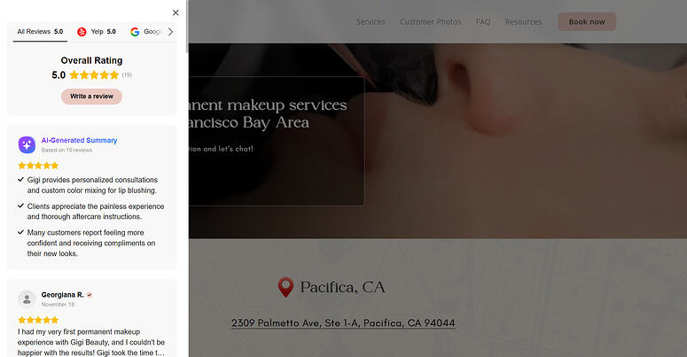
The result
The website became more engaging and easier to navigate, with reviews reinforcing trust throughout the user journey. Visitors could quickly see proof of service quality, understand the process, and feel confident about booking.
With the Elfsight All-in-on Reviews, Andrew transformed customer feedback into a core trust-building element, making the website more persuasive without adding complexity or clutter.
Frequently Asked Questions
Can I display reviews in different layouts on different WordPress pages?
Is it possible to group reviews by platform in one widget?
Can visitors leave new reviews through my website?
Can I display reviews from multiple locations in one place?
Will All-in-One Reviews work with WordPress page builders like Elementor?
Conclusion
Adding reviews to your WordPress website is one of the most effective ways to strengthen credibility and guide visitors toward action. Instead of relying only on your own messaging, you bring real customer experiences directly into the decision-making process.
The Elfsight All-in-One Reviews plugin simplifies this completely. You can pull feedback from multiple platforms, control how it’s displayed, and place it exactly where it supports conversions without dealing with manual updates or complex setup. With features like multi-source aggregation, flexible layouts, filtering, and automatic updates, it helps you turn reviews into a structured, high-impact element of your website.
Did you know? 97% of consumers read reviews when searching for a local business, and 93% say online reviews influence their purchasing decisions, making them one of the most powerful trust signals you can add to your website.
If you’re running a Wix website, reviews are one of the fastest ways to build trust and turn visitors into customers. Without visible feedback, users rely only on your messaging, which often isn’t enough to convince them. The challenge is that Wix’s native tools don’t always make it easy to display reviews from multiple platforms or present them in a structured, high-impact way. That’s why many website owners look for better ways to add reviews to a Wix website and showcase real customer experiences.
The Elfsight All-in-One Reviews app gives you a flexible way to embed reviews on Wix from sources like Google, Facebook, Yelp, and more. You can customize the layout, filter content, and display reviews exactly where they influence decisions.
- How to add reviews to Wix website using a ready-made app.
- Why reviews matter for trust, conversions, and decision-making on Wix pages.
- Alternative ways to add reviews to Wix website and where they fall short.
- Proven optimization tips to make reviews more persuasive and visible across your website.
To make this easy to follow, we’ll begin with the fastest way to get reviews live on your Wix website. After that, we’ll go deeper into customization, placement strategies, and practical ways to turn customer feedback into a conversion driver.
Quick Start: Add Reviews to Wix Website
If your goal is to quickly embed reviews on your Wix website without dealing with complex setup or manual work, this streamlined approach will get you there in just a few minutes:
- Open the All-in-One Reviews app editor and select a template.
- Connect your review sources (Google, Facebook, etc.).
- Click “Add to website for free” to generate the embed code.
- Paste the code into your Wix website using the Embed element.
This method works for both simple use cases, like adding a small review section, and more advanced setups where you want to display reviews across multiple pages.
Create your reviews app now in the live editor!
Why Add Reviews to Wix Website
Adding reviews to your Wix website directly shapes how visitors evaluate your business and whether they feel confident enough to take action. When used strategically, reviews become one of the most persuasive elements on your pages.
⭐ Turn visitor hesitation into confidence
When users land on your website, they’re often comparing options. Without reviews, they rely only on your messaging, which can feel one-sided. Showing real customer experiences gives them independent validation and reduces uncertainty at key decision points.
📈 Increase conversions across key pages
When you add reviews in places where users are deciding, such as product pages, service descriptions, or contact sections, you remove friction. Reviews answer unspoken questions and help users move forward without needing additional research.
🔄 Keep your website content dynamic
Static testimonials quickly become outdated. By using a solution that automatically pulls new reviews, your website stays current without manual updates. Fresh content signals that your business is active and continuously delivering value.
🎯 Highlight what matters most to customers
Not all reviews carry the same weight. Some mention speed, others focus on support or results. By filtering and displaying the most relevant feedback, you can emphasize the strengths that matter most to your audience and reinforce your positioning.
🌐 Build credibility across multiple platforms
Customers often recognize platforms like Google or Facebook. When you embed reviews Wix from these sources, you extend their credibility directly onto your website, making your content feel more trustworthy than standalone testimonials.
📱 Improve readability and user experience
Well-structured review layouts – whether grids, sliders, or lists – make feedback easy to scan and digest. Visitors can quickly browse multiple opinions without feeling overwhelmed, especially on mobile devices.
⏱️ Reduce reliance on external platforms
Instead of sending users to external review platforms where they can get distracted or leave your website, embedding reviews keeps them focused on your content. This increases time on page and gives you more control over the user journey.
Overall, when you embed customer reviews on your Wix website, you’re not just adding content – you’re strengthening your credibility, improving decision-making, and creating a more persuasive experience from the first visit.
Core Features of All-in-One Reviews App
Before integrating reviews into your web page, it’s important to understand what makes All-in-One Reviews truly effective. A simple list of testimonials can help, but a feature-rich app allows you to control how reviews are collected, displayed, and experienced across your website.
These are the key capabilities of the Elfsight Reviews app and how they translate into practical value for your Wix setup:
| Feature | Practical Use |
| Multiple review sources | Pull reviews from Google, Facebook, Yelp, and other platforms into one unified display |
| Automatic updates | New reviews appear automatically, keeping your website fresh without manual edits |
| Smart filtering options | Display only high-rated, relevant, or keyword-specific reviews to highlight your strengths |
| Layout flexibility | Choose between grid, slider, list, or badge formats depending on your page structure |
| AI-generated summaries | Automatically highlight key takeaways from multiple reviews, helping visitors grasp feedback faster |
| Review translation | Translate reviews into different languages to make your content accessible to a broader audience |
| Custom styling | Match colors, fonts, spacing, and card styles to your Wix branding for a seamless look |
| Responsive design | Ensure reviews display properly on all devices, including mobile and tablets |
These features give you full control over how reviews appear and function on your website. To see all characteristics, visit the features page.
Step-by-Step: How to Add Customer Reviews to Wix Website
Ready for deeper dive into setup and customization of your own widget? Here’s how to add your reviews to your website, from design to embedding it exactly where it will have the most impact.
Step 1: Choose a Template
Start by opening the Elfsight editor. You’ll see a variety of ready-made templates designed for different use cases, including grids, sliders, badges, and lists.
Each layout serves a different purpose. A grid works well for showcasing volume and credibility, while a slider is better when you want to highlight a few key reviews without taking up too much space. Badges are useful for subtle trust signals in headers or footers.
At this stage, focus on choosing a structure that matches where you plan to place reviews on your Wix website. You can always adjust the design later.
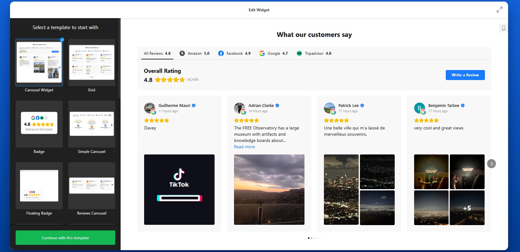
Step 2: Connect Your Review Sources
In the Source settings, connect your review platforms. This is where your content comes from.
You can add sources such as Google, Facebook, Yelp, or other supported platforms by pasting your business profile links. Once added, Elfsight will automatically pull in reviews and keep them updated over time.
Make sure you select the correct business profile if multiple options appear. This ensures that the app displays accurate and relevant reviews.
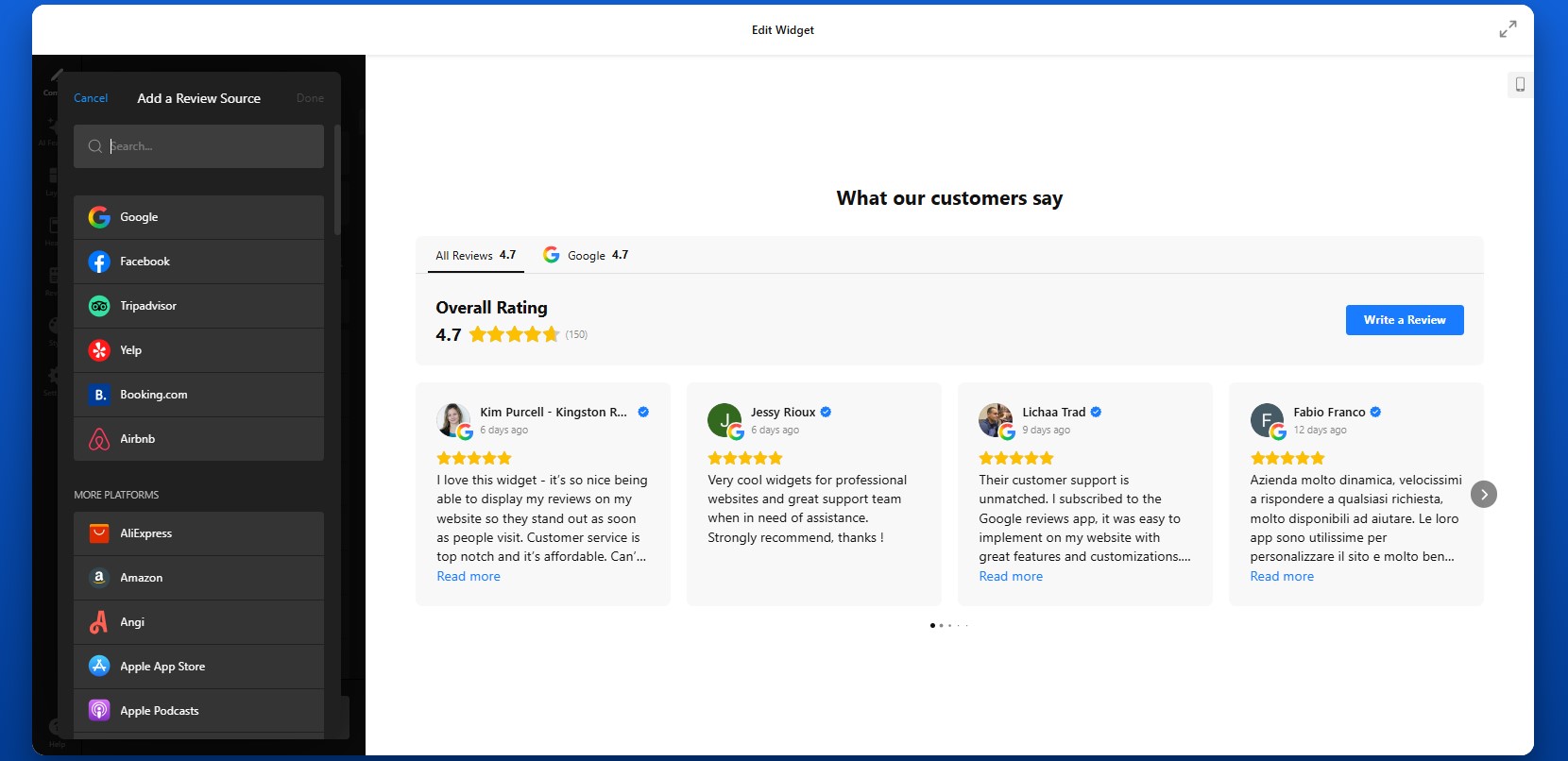
Step 3: Filter and Control Which Reviews Appear
Not every review needs to be shown. With Elfsight, you can control exactly what visitors see.
In the Settings tab, you can filter reviews by star rating to show only high-quality feedback, or use keyword filtering to highlight reviews that mention specific strengths like “fast delivery” or “great support.” You can also hide reviews without text or those that don’t add meaningful value.
This step helps you create a focused and persuasive review section rather than overwhelming visitors with too much content.

Step 4: Customize Layout and Structure
To define how reviews will appear on your Wix website move to the Layout settings.
You can adjust the number of visible reviews, choose between grid, slider, or list formats, and control spacing between elements. You can also enable navigation features such as arrows, pagination, or scrolling.
Think about how visitors will interact with your reviews. A compact slider works well for smaller sections, while a grid layout is better for dedicated review sections where you want to show volume.
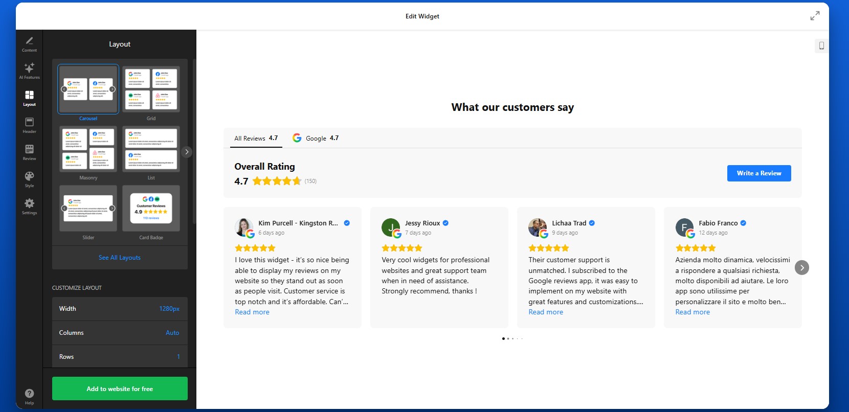
Step 5: Customize the Header and Navigation Elements
The header section allows you to control key elements such as the main heading, overall rating, and the total number of reviews displayed. This is where you can add context like “What our customers say” to immediately communicate the purpose of the section. You can also enable a “Write a Review” button, which gives visitors a direct way to leave feedback on your connected platforms. If you prefer to focus only on displaying reviews, you can hide this button.
Below the header, you can customize tabs that help organize reviews from different sources. Choose to display each source separately or group them by platform. Adjusting the header and tab settings helps structure your review section, making it easier to scan and more visually consistent with the rest of your Wix website.
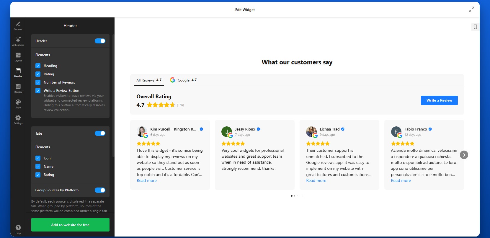
Step 6: Match the Design to Your Wix Website
To make your reviews feel integrated, customize the visual design so it aligns with your Wix website.
You can adjust colors, fonts, card styles, and spacing. The goal is to ensure that reviews look like a natural part of your page rather than an external element.
If your website uses a minimal design, keep the review layout clean and simple. If your brand is more visual, you can use cards, shadows, and richer layouts to make reviews stand out.
Consistency in design improves trust and keeps the user experience smooth.

Step 7: Generate the Embed Code
Once your widget is fully configured, click “Add to website for free” to generate your embed code. This code includes everything needed to display your reviews.
At this point, your widget is ready to be added to your Wix website.

Step 8: Embed Reviews on Your Wix Website
- To embed your reviews, open your Wix editor and navigate to the page where you want the reviews to appear.
- Add an “Embed HTML” element to your layout, then paste the code into the field.
- Position the element where it fits best – below a product section, near a contact form, or on your homepage.
- After publishing your website, the reviews will appear instantly.
It’s a good idea to preview the page and check how the reviews look across different screen sizes to ensure everything displays correctly.
- If reviews are not showing, confirm that the embed code is pasted correctly into the Wix Embed element and that the page is published.
- If the layout looks compressed, adjust the width of the container.
- If reviews don’t update, allow time for syncing or verify your source links.
By following these steps, you can fully control how to add customer reviews to your Wix website, customize their appearance, and place them exactly where they support user decisions the most.
Alternative Ways to Add Reviews to Wix Website
There are several ways to embed reviews on Wix, but most native or manual methods come with limitations in flexibility, automation, or scalability. Here’s how the main options work and what to expect from each.
Wix Testimonials App
Wix offers a built-in Testimonials app that lets you manually add and display customer feedback directly inside the editor. To use it:
Install the Testimonials app from the Wix App Market.
Add it to your page.
Manually enter customer reviews one by one.
Customize basic layout elements and display them in a structured format.
This approach works for simple use cases where you only need a small number of static testimonials.
- No automatic updates from external platforms
- Limited layout and design flexibility
- Manual effort required to maintain content
Manual Copy-Paste Reviews
Another common method is copying reviews from platforms like Google or Facebook and pasting them directly into your Wix website.
To do this, you simply copy the text of a review, add it into a text block or section, and format it manually. You can repeat this process for multiple reviews across different pages.
This method gives you full control over what content is displayed, but requires constant manual work.
- You’ll need to update reviews manually every time
- No connection to real-time customer feedback
- Hard to maintain consistency across pages
Wix HTML Embed (Iframe Method)
You can also use external embed codes (for example, from Google Maps or other review tools) and insert them into Wix using the Embed HTML element.
To implement this, open your business profile on Google Maps, for example, click “Share,” then “Embed a map,” and copy the iframe code. Paste this code into a Wix Embed HTML element to display the reviews section.
This is a quick way to show real reviews from a trusted source.
- Usually supports only one source at a time
- Limited control over layout and styling
- No filtering or content customization
Before choosing a solution, it’s helpful to compare how these approaches perform across key criteria:
| Feature | Elfsight All-in-One Reviews | Wix Testimonials | Manual Copy | Wix HTML Embed |
| Auto updates | Yes | No | No | No |
| Multiple platforms | Yes | No | No | No |
| Custom design | High | Medium | Low | Low |
| Ease of use | Easy | Easy | Medium | Medium |
| Review filtering | Yes | No | No | No |
| Scalability | High | Low | Low | Low |
| Maintenance | None | Medium | High | Medium |
| Mobile responsiveness | Built-in | Yes | Depends | Yes |
Each method can work for basic scenarios, but they vary significantly in terms of effort and long-term usability.
If you want to add reviews to Wix in a way that is scalable, customizable, and easy to maintain, Elfsight offers a more complete solution while keeping your workflow simple.
Optimization Tips for Your Reviews
Once your reviews are live, the way you present and position them can significantly influence how visitors perceive your business and whether they take action.
- Place reviews where decisions happen: Don’t isolate reviews on a separate page. Add them near product descriptions, service sections, pricing blocks, or contact forms—places where users are deciding whether to move forward.
- Prioritize high-impact feedback: Focus on reviews that mention specific results, benefits, or experiences. Feedback that tells a short story or highlights outcomes is more persuasive than generic comments.
- Choose layouts based on context: Use grids to show volume and credibility, sliders to highlight selected reviews without clutter, and compact badges for subtle trust signals across your Wix website.
- Keep the design consistent: Match colors, typography, and spacing with your Wix layout. When reviews feel like part of your website rather than an add-on, users are more likely to trust them.
- Balance quantity and readability: Avoid overwhelming visitors with too many reviews at once. Display a manageable number and use features like “Load more” or sliders to keep the section clean and easy to browse.
- Use multiple placements strategically: Instead of showing reviews only once, repeat them across key pages. For example, add a small review section on your homepage and a more detailed one on product or service pages.
- Leverage automatic updates: Keep your content fresh by allowing the widget to sync new reviews. Regular updates signal that your business is active and continuously receiving feedback.
- Test and refine over time: Monitor how users interact with your reviews. Try different placements, layouts, and filtering options to find what drives the best results for your Wix website.
Real-World Example: Hair Salon Grows Customers with Reviews on Wix
Sina Fehringer runs a hairdressing business and website where attracting new clients and building trust was a constant challenge. Like many service-based businesses, she needed a way to stand out, prove quality, and convert visitors into bookings directly on her website.
Before using Elfsight
- Low online visibility and limited user interaction
- Difficulty attracting new customers through the website
- Strong competition with little differentiation
- A need to build trust with potential clients quickly
With All-in-One Reviews on her website
“I was looking for a solution to integrate Google Reviews into my website and, at the same time, a button to generate new feedback. That’s how I came across Elfsight. The widget far exceeded my expectations in terms of customization options.”
Sina integrated the All-in-One Reviews widget directly into key sections of her website, including a floating badge that expands into a scrollable list of detailed reviews. This allowed her to showcase real customer feedback without taking up too much space, while still making it easily accessible to visitors.
She also used multiple layouts across the website, combining compact review displays with more detailed sections, to highlight feedback exactly where potential customers were making decisions.
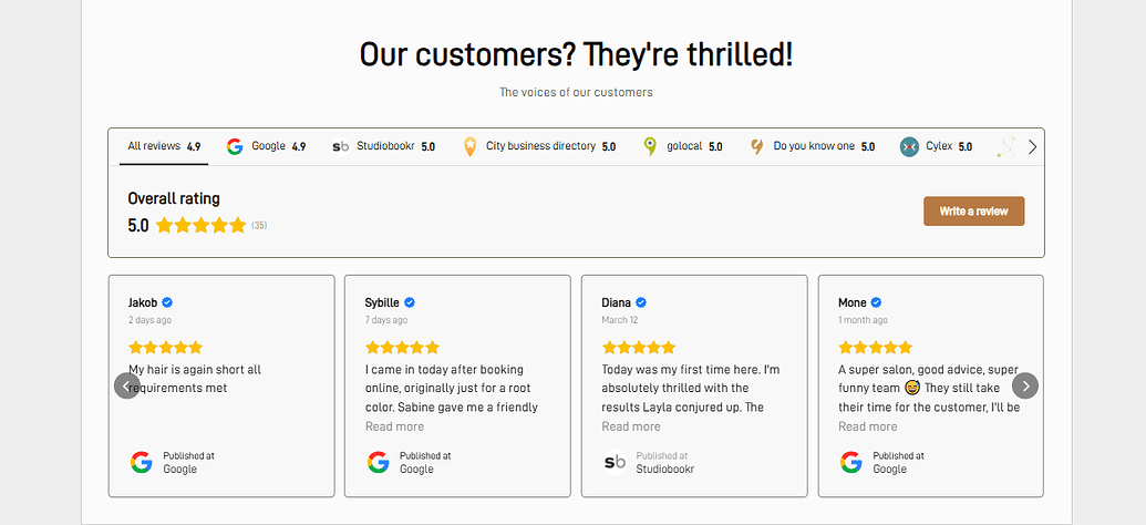
The result
Her website became a central conversion tool rather than just a showcase. Visitors could instantly see reviews, gain confidence, and move forward without needing additional research or direct communication.
The impact was measurable: a 1.5× increase in customers, driven primarily by improved trust and visibility through reviews and other interactive elements. By choosing to add reviews to her website in a structured and visible way, Sina turned customer feedback into a core part of her growth strategy making her website more persuasive, interactive, and effective at converting visitors into real clients.
Frequently Asked Questions
Can I combine reviews from multiple platforms into one widget?
Is it possible to manage reviews from multiple business locations?
Can I control which reviews appear in the app?
Can I collect new reviews directly from my Wix website?
Will updates I make in the editor appear on my website automatically?
Can I add reviews from a platform that isn’t supported by default?
Final Thoughts
Adding reviews to your Wix website is one of the most effective ways to turn visitor interest into real customer action. Instead of relying solely on your own messaging, you bring in authentic feedback that answers questions, reduces hesitation, and builds confidence at every stage of the user journey.
The All-in-One Reviews widget makes it easy to do this at scale. You can collect and display reviews from multiple platforms, highlight the most relevant feedback, and present everything in a layout that fits naturally into your Wix design.
If your website includes age-restricted content, there’s a common problem many businesses overlook: visitors can access everything immediately, even when they shouldn’t. This not only creates compliance risks but can also lead to trust issues and potential penalties. Trying to fix this manually often results in clunky user experiences, limited control, or ongoing maintenance headaches.
The Elfsight Age Verification widget solves this by giving you a ready-to-use, customizable age gate that works across any website. You can quickly add Age Verification to your website, control access rules, and create a smooth, branded experience – all without touching code.
- How to add age verification to website quickly without coding
- Why age verification is important for compliance and trust
- How to set up and customize your age gate
- Alternative solutions and when to use them
- Best practices for balancing compliance and user experience
We’ll start with the fastest way to get your age verification live so you can implement a working solution right away, then move into full setup and optimization.
Quick Start: Add Age Verification to Website
If you’re looking for a simple and efficient way to embed Age Verification on your page, here’s the fastest method to get everything up and running:
- Open the Age Verification widget editor and select a template
- Customize age rules, text, and design
- Click “Add to website for free” to generate the embed code
- Paste the code into your website and publish
Build your Age Verification popup in our live editor right now!
Why Add Age Verification to Website
Adding an age gate to your website directly affects how your business operates, how visitors perceive your brand, and whether you meet legal requirements in your industry. When implemented properly, it becomes a seamless part of your user experience rather than a barrier.
🔒 Ensure regulatory compliance
Many industries require verification of users’ age before they can view content or make purchases. Whether you sell alcohol, CBD, or other restricted products, adding Age Verification helps you meet these requirements and avoid potential legal consequences.
🛡 Protect your business from risk
Without a proper age gate, your website may be exposed to fines, restrictions, or reputational damage. Age Verification acts as a safeguard, showing that you’ve taken steps to prevent underage access and operate responsibly.
🎯 Filter visitors early in the journey
An age check works as a first layer of filtering. Visitors immediately understand whether your content is relevant to them, which reduces confusion and ensures that only the right audience continues browsing your website.
💬 Build trust and credibility
A well-designed Age Verification popup signals professionalism. It shows that your business follows industry standards and respects regulations, which can increase confidence among legitimate customers.
📈 Improve user flow and clarity
Instead of introducing restrictions later in the journey – such as at checkout – Age Verification sets expectations upfront. This creates a clearer browsing path and helps users understand what to expect from your website.
📱 Deliver a smooth experience across devices
Modern age verification solutions are optimized for both desktop and mobile. Visitors can quickly confirm their age and proceed without unnecessary friction, making the process feel natural and unobtrusive.
Overall, adding Age Verification to your website is not just a compliance measure but also a strategic step that helps protect your business while creating a more structured and transparent experience for your visitors.
Core Features of the Age Verification Widget
Before you implement an age gate, it’s important to understand what makes a solution actually effective. A basic popup might block access, but a well-designed widget gives you control, flexibility, and a smooth user experience across your entire website.
Below is a breakdown of the key features and how they translate into practical use:
| Feature | Practical Use |
| Multiple verification methods | Choose between yes/no confirmation, date of birth input, or age selection depending on your compliance needs |
| Custom messaging | Clearly explain why verification is required and align the text with your brand voice |
| Redirect options | Send underage visitors to a safe page, homepage, or external URL |
| Cookie-based memory | Remember verified users so they don’t need to confirm their age on every visit |
| Design customization | Match colors, fonts, and layout to your website for a seamless look |
| Flexible display conditions | Show the popup on the entire website or only on specific pages |
| Mobile responsiveness | Ensure the popup works smoothly across all devices and screen sizes |
For the complete feature breakdown, visit the widget features page.
Now that you understand what the widget can do, let’s move on to the detailed setup process and see exactly how to implement Age Verification on your website step by step.
Step-by-Step: How to Add Age Verification to Website
Now let’s go through the full integration process, from choosing the right verification format to embedding it on your website and making sure it works smoothly for your visitors.
Step 1: Choose a Template
Start by opening the Elfsight editor and selecting a template that fits your use case. You’ll see several various formats designed for different types of businesses.
At this point, focus on choosing the structure that best matches your goals. You’ll still be able to customize the content, design, and behavior later.
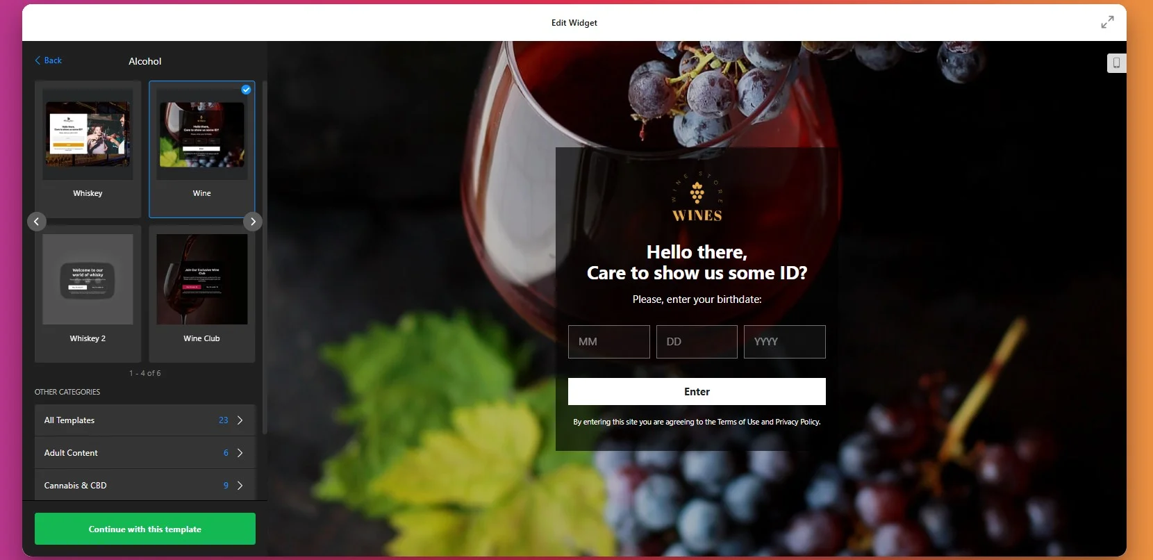
Step 2: Select the Verification Method
Choose how visitors will confirm their age. This is one of the most important decisions in the setup process because it affects both compliance and user experience.
You can choose a simple yes/no confirmation if you want the fastest interaction possible. This works well for websites that need a visible restriction but don’t require detailed age input. If you need more precise verification, you can use date-of-birth entry or age selection instead.
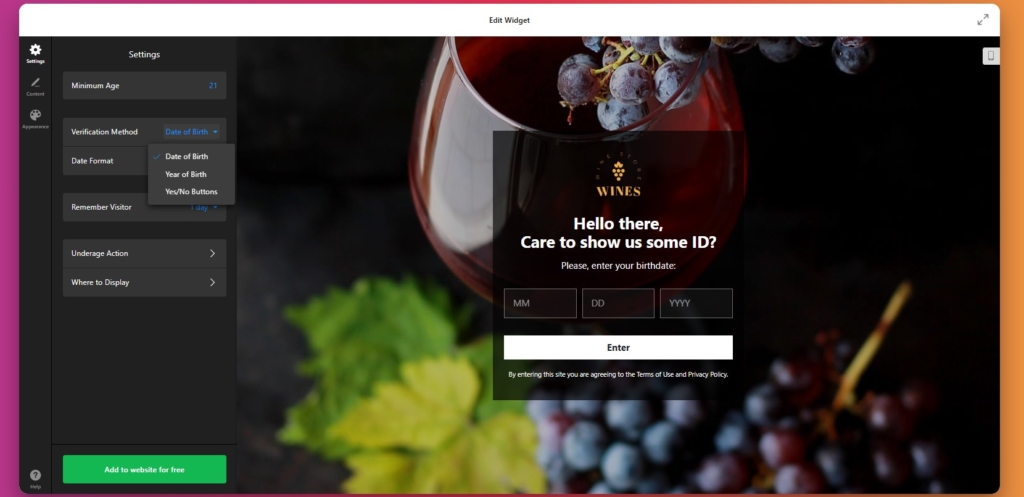
Step 3: Adjust Memory for Returning Visitors
Now, configure how the popup behaves for returning visitors. With return visitors memory enabled, users who have already passed the check won’t need to repeat the process every time they revisit the website.
The ideal cookie duration depends on how you want to balance convenience with caution. A shorter duration is stricter, while a longer one makes repeat visits smoother.
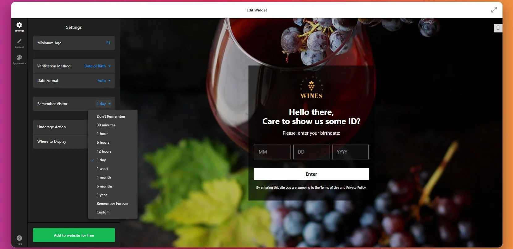
Step 4: Set Actions for Denied Visitors
Choose what happens after a user interacts with the popup. For users who do not qualify, you can show a custom message or redirect them to another page, such as your homepage or a general information page.
You can also decide whether the popup applies to the entire website or only specific sections. Some businesses need a full-website gate, while others only want to restrict access to selected pages or product categories.
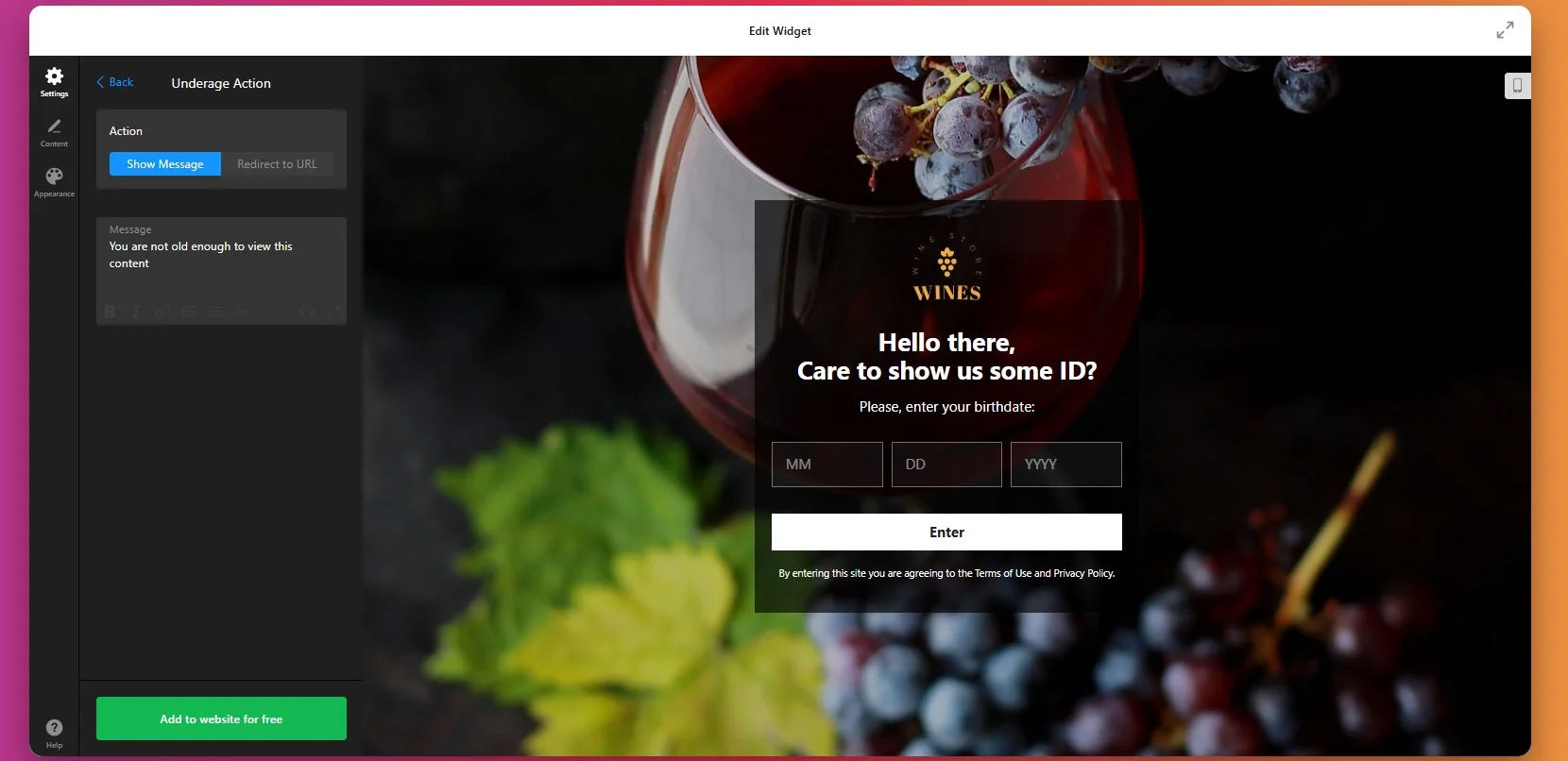
Step 5: Customize the Popup Text and Buttons
Once the verification method is in place, customize the wording shown inside the popup. This includes the heading, supporting text, confirmation button, and additional information.
Your message should explain the purpose of the popup clearly and quickly. Visitors should immediately understand that the website contains age-restricted content or products and that verification is required before proceeding.
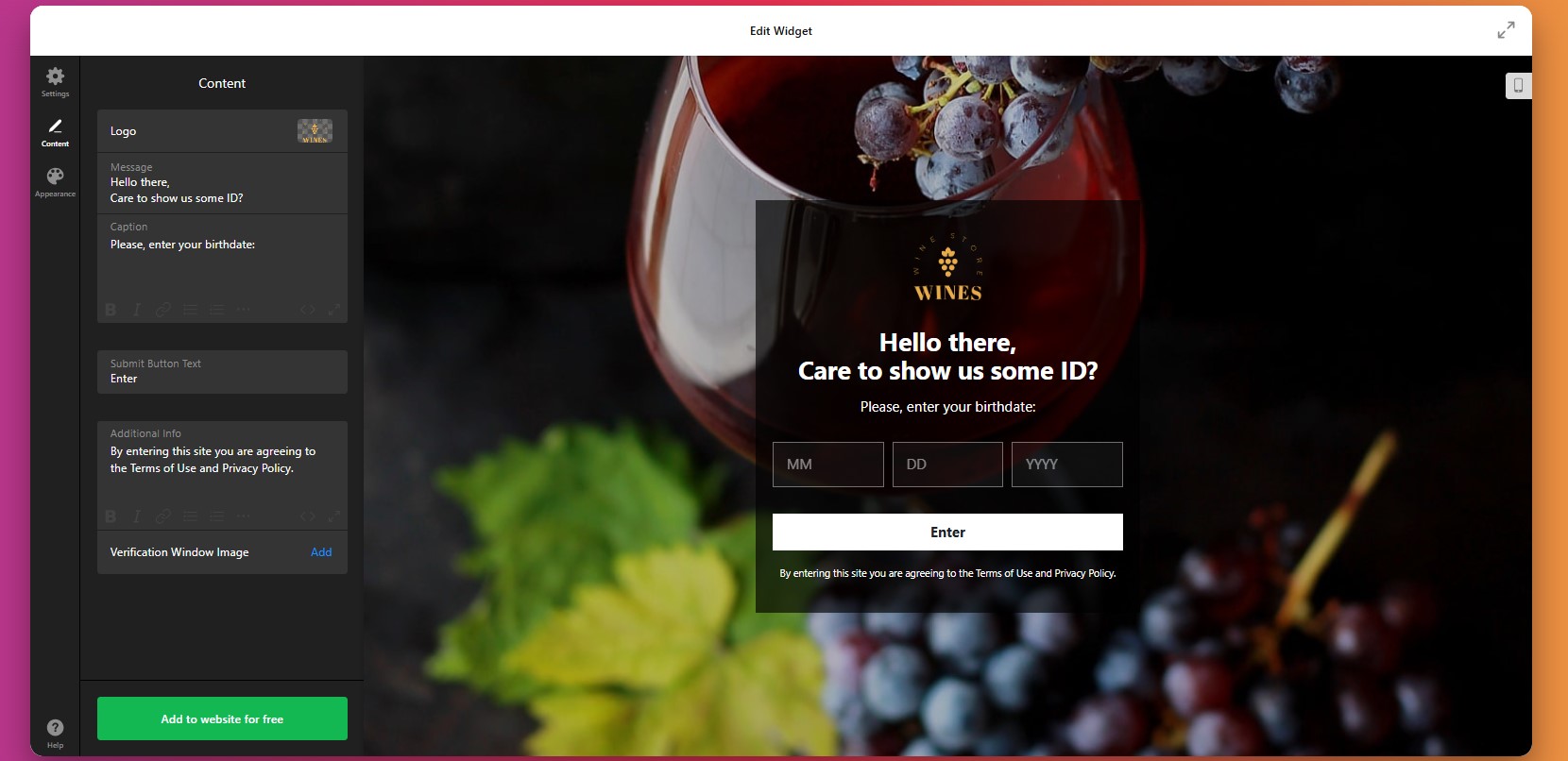
Step 6: Personalize the Design
Next, move to the design settings and adapt the popup so it looks like part of your website rather than an external overlay.
Make sure the text is easy to read, the buttons are clearly visible, and the popup is comfortable to use on both desktop and mobile.
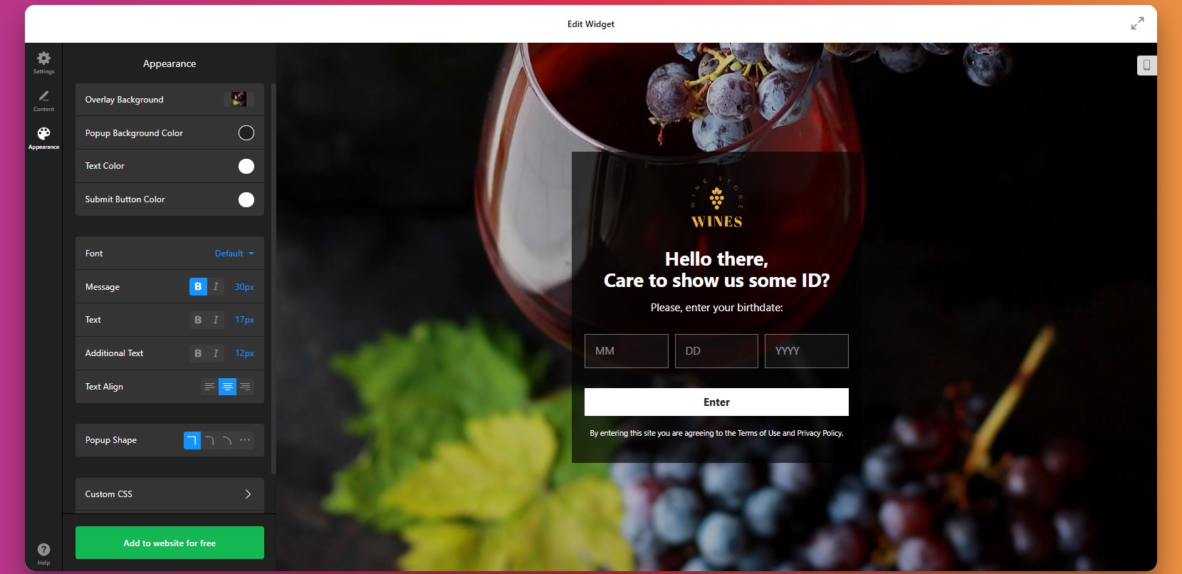
Step 7: Generate the Embed Code
Once your settings are ready, click “Add to website for free” to generate the embed code. This code connects your configured age gate to your website.
At this point, the setup inside the editor is complete and the widget is ready to be installed.

Step 8: Embed the Age Verification Widget on Your Website
- Open your website backend or CMS
Navigate to the section where custom code or HTML can be added. This is typically your theme settings, global scripts area, or page builder. - Paste the embed code
Insert the full code snippet into the appropriate section. Make sure it’s not truncated or modified, as this may prevent the popup from loading. - Decide where the age gate should appear
If you want the popup to apply across your entire website, place the code in a global area such as the main template or site-wide settings.
If you only need it on specific pages, add the code only within those pages’ content or sections. - Save and publish your changes
Once the code is added, update your website so the widget becomes active.
After saving your changes, open the live website and test the full experience. It’s also important to test the widget on desktop and mobile devices so you can confirm that the layout, buttons, and display timing all work as expected.
- If the popup doesn’t appear, first make sure the full embed code was added to the correct website section and that your changes were published.
- If returning visitors keep seeing the age check, review the cookie memory settings.
- If the layout looks broken, check for conflicts with your website styles or narrow containers.
- If redirects or blocked access aren’t working properly, recheck the rules you set inside the widget editor.
Alternative Solutions to Implement Age Verification for Websites
There are several other ways to add age verification to a website, but each comes with trade-offs in flexibility, usability, and long-term maintenance. While these methods may work for simple setups, they often become limiting as your needs grow.
Custom JavaScript Popup
One option is to build your own age verification popup using JavaScript and embed it directly into your website.
To implement this, you create a script that triggers a popup when a user lands on your website. The script collects input (such as a yes/no confirmation or date of birth) and then controls access based on the response. You then place this script in your website’s HTML or global code section.
This method gives you full control over functionality, but requires development skills and ongoing maintenance.
- Requires coding knowledge to build and maintain
- Time-consuming to implement correctly
- No visual editor for easy updates
CMS Plugins or Platform Apps
If your website is built on a CMS like WordPress, Shopify, or Wix, you can install plugins or apps that provide basic age verification functionality. To implement this:
- Go to your platform’s plugin or app marketplace.
- Search for “age verification”.
- Install a suitable option, and configure the popup settings inside the plugin interface.
This approach is convenient, but it often comes with limitations in customization and control.
- Limited design and layout customization
- Advanced features often locked behind paid plans
- Platform-dependent (not portable across websites)
Basic Popup or Lightbox Workaround
Another approach is to use a standard popup or lightbox tool and adapt it for age verification:
- Create a popup using your website builder or a popup plugin.
- Add a simple message asking users to confirm their age.
- Include buttons that allow them to continue or leave. You can trigger this popup on page load.
Before deciding which method to use, it’s helpful to compare them based on real-world needs such as ease of use, flexibility, and scalability.
| Feature | Elfsight Age Verification | Plugins/Apps | Custom Code | Basic Popup |
| Ease of setup | Easy | Easy | Hard | Easy |
| Customization | High | Medium | High | Low |
| Design control | Full | Limited | Full | Limited |
| Cookie memory | Yes | Limited | Custom | Rare |
| Maintenance required | None | Medium | High | Medium |
| Automatic updates | Yes | Yes | No | No |
| Compliance flexibility | High | Medium | Custom | Low |
Each approach comes with its own trade-offs, from simplicity to flexibility and long-term maintenance requirements. The right choice depends on how much control you need and how much time you’re willing to invest in setup and ongoing management.
If your goal is to combine straightforward implementation with advanced customization and room to grow, Elfsight offers a practical balance without introducing unnecessary technical overhead.
Optimization Tips for Your Age Verification
Once your age verification is in place, refining how it behaves and appears can make a noticeable difference in both compliance and user experience.
- Choose the right level of verification: Match the verification method to your needs. Simpler confirmations reduce friction, while stricter methods like date of birth provide stronger compliance.
- Keep messaging clear and purposeful: Explain why the age check is required in one or two concise sentences. Clear intent reduces confusion and helps users complete the process faster.
- Align the popup with your design: Use your website’s colors, fonts, and spacing so the age gate feels like a natural part of your layout rather than a separate layer.
- Use cookie memory to reduce repetition: Allow verified users to skip the popup on return visits. This creates a smoother experience, especially for frequent users.
- Test placement and timing carefully: Display the popup immediately on entry for strict compliance, or adjust timing if you want to soften the interruption while still controlling access.
- Optimize for mobile usability: Make sure buttons are easy to tap, text is readable, and the popup doesn’t interfere with navigation on smaller screens.
- Limit friction to improve completion: Avoid adding unnecessary steps or fields. The faster users can verify, the less likely they are to leave your website.
- Review performance and adjust regularly: Monitor how users interact with the popup and refine settings over time to improve both compliance and user flow.
Frequently Asked Questions
Can I control how long the age verification is remembered for each visitor?
Can I update the Age Verification rules without reinstalling the widget?
Is it possible to customize the appearance of the popup for better accessibility?
How can I make the Age Verification less intrusive for users?
Does the Age Verification app store personal user data?
Conclusion
Adding Age Verification to your website is a key step in protecting your business, meeting compliance requirements, and creating a clear entry point for visitors. It ensures that the right audience accesses your content while helping you avoid unnecessary risks.
The Elfsight Age Verification widget makes this process simple and flexible. You can choose from multiple verification methods, control how users access your website, and customize every detail to match your design – all without writing code.
If you’re looking for a reliable way to add Age Verification to your website, Elfsight gives you everything you need to implement it efficiently while maintaining both compliance and a smooth user experience.
- Quick Start: Add Age Verification to Wix
- Why Add Age Verification to Wix Website
- Core Features of the Age Verification App
- Step-by-Step: How to Add Age Verification to Wix Website
- Other Ways to Add Age Verification to Wix
- Optimization Tips for Your Age Verification Popup
- Frequently Asked Questions
- Conclusion
If your Wix website offers age-restricted products or content, adding an age verification layer is essential not just for compliance, but for protecting your business and shaping how users interact with your website.
Without it, visitors can freely access restricted content, which may expose your business to legal risks, reduce trust, and create a poor first impression for users who expect clear boundaries and responsible handling of sensitive products.
The Elfsight Age Verification app allows you to add age verification to your Wix website in minutes. You can create a fully customizable popup to control who can access your website, and deliver a smooth, branded experience – all without writing a single line of code.
Before diving into setup, it helps to understand exactly what you’ll be doing and how each step fits into the bigger picture of adding Age Verification to your Wix website.
- How to add Age Verification to Wix website step by step using a no-code solution
- Why Age Verification matters for compliance, trust, and user experience
- Alternative solutions and when they might (or might not) work
- Best practices to balance compliance and user experience
Let’s start with the quickest way to get your age gate live.
Quick Start: Add Age Verification to Wix
If you want a fast and reliable way to add age verification to Wix, here’s the streamlined process to get everything up and running in just a few minutes:
- Open the Age Verification app editor and choose a template.
- Customize age rules, content, and design to fit your website.
- Click “Add to website for free” to generate the embed code.
- Paste the code into your Wix website using the Embed element and publish.
Create your Age Verification popup now in the live editor!
Why Add Age Verification to Wix Website
Adding an age gate to your Wix website directly affects compliance, user trust, and how smoothly visitors interact with your content. When implemented correctly, it becomes a seamless part of your website experience rather than a barrier.
🔒 Stay compliant with regulations
If your Wix website offers products like alcohol, CBD, or adult content, age verification is often a legal requirement. Without it, your business may be exposed to fines, restrictions, or even removal from certain platforms. A proper age gate helps you meet these requirements and operate with confidence.
🛡 Reduce legal and reputational risk
Allowing unrestricted access to age-sensitive content can lead to serious consequences, not only legally, but also for your brand reputation. By adding Age Verification, you demonstrate that your business takes responsibility seriously and actively protects underage users from inappropriate access.
🎯 Filter visitors before they engage
Age Verification works as an early filter in the user journey. Visitors immediately understand whether your content is intended for them, which reduces confusion and prevents unqualified traffic from interacting with your pages.
💬 Build credibility with your audience
A well-designed age verification popup signals professionalism. It shows that your Wix website follows industry standards and values transparency. This can increase confidence among legitimate customers who expect responsible handling of regulated products.
📈 Improve user flow on restricted content
Instead of surprising users later in the funnel (for example, at checkout), Age Verification sets expectations upfront. This creates a clearer, more structured browsing experience and helps guide users through your website more effectively.
📱 Maintain a smooth experience across devices
Modern age verification popups are optimized for both desktop and mobile. Visitors can quickly confirm their age and continue browsing without interruptions, making the process feel natural rather than intrusive.
Overall, adding Age Verification to your Wix website is not just about compliance – it’s about creating a controlled, transparent, and user-friendly environment that supports both your business goals and your visitors’ expectations.
Core Features of the Age Verification App
Before implementation, it’s important to understand what the app actually enables and how these features translate into real control over your Wix website experience.
Below is a breakdown of the key features and how they apply in practice:
| Feature | Practical Use |
| Multiple verification methods | Choose between simple yes/no confirmation, date of birth input, or age selection depending on your compliance requirements |
| Custom messaging | Tailor the popup text to clearly explain why verification is required and match your brand voice |
| Access control rules | Decide whether users can enter, be blocked, or redirected based on their response |
| Redirect options | Send underage visitors to another page, homepage, or external URL |
| Cookie-based memory | Remember verified users so they don’t see the popup on every visit |
| Design customization | Adjust colors, fonts, buttons, and layout to match your Wix website style |
| Flexible display conditions | Show the popup across your entire website or only on selected pages |
| Mobile responsiveness | Ensure the popup works smoothly on mobile, tablet, and desktop devices |
These features allow you to move beyond a basic age check and create a structured entry point to your website. Instead of interrupting users, the app helps guide them through a clear and controlled experience that feels consistent with the rest of your design.
For example, you can choose a strict verification method for regulated products, while keeping the design minimal so it doesn’t overwhelm the page. Or you can apply the age gate only to specific sections of your Wix website, rather than restricting access globally.
For the complete feature breakdown, visit the app features page.
Now that you understand what Elfsight can do, let’s move on to the full setup process and see how to implement Age Verification step by step.
Step-by-Step: How to Add Age Verification to Wix Website
Now let’s go through the full process of how to add Age Verification to your Wix page, from choosing the right verification format to embedding the popup and making sure it fits naturally into your user experience.
Step 1: Select a Template
Start by opening the Elfsight editor and choosing a template that matches your business needs. There’s a wide range of ready-made templates designed for different types of businesses and compliance needs.
At this stage, focus on the overall structure rather than fine details. You’ll still be able to customize the text, visuals, behavior, and display conditions later.
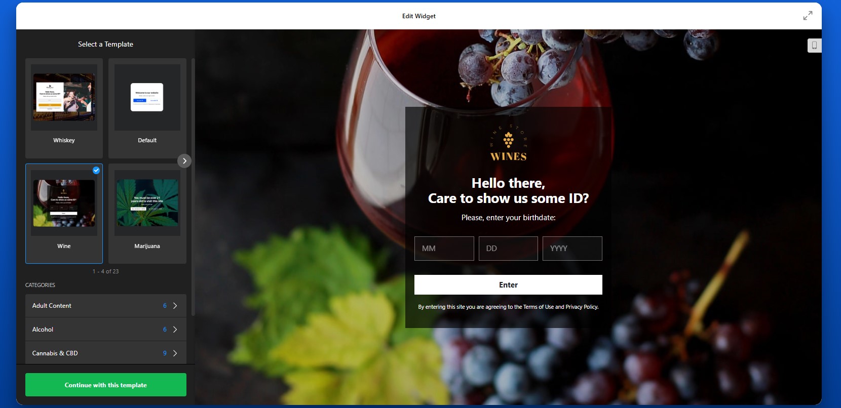
Step 2: Choose the Verification Method
Next, select how visitors will confirm their age. You can choose a simple yes/no confirmation if you want the fastest possible interaction. This works well when your main goal is to clearly communicate restricted access and discourage underage users. If you need a more controlled process, you can use date-of-birth input or age-based selection to make the check more specific.
The method you choose should reflect both your legal requirements and the type of experience you want to create. A faster method reduces friction, while a more detailed one gives you stronger control.
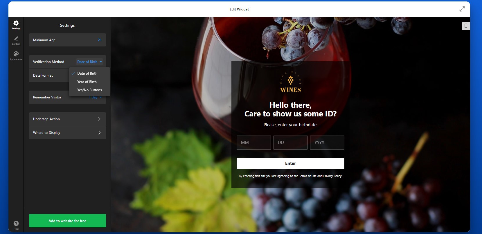
Step 3: Configure Repeat Behavior for Returning Visitors
Next, adjust how the widget behaves for people who have already passed the age check. With cookie memory enabled, verified visitors won’t need to confirm their age every time they return to your website.
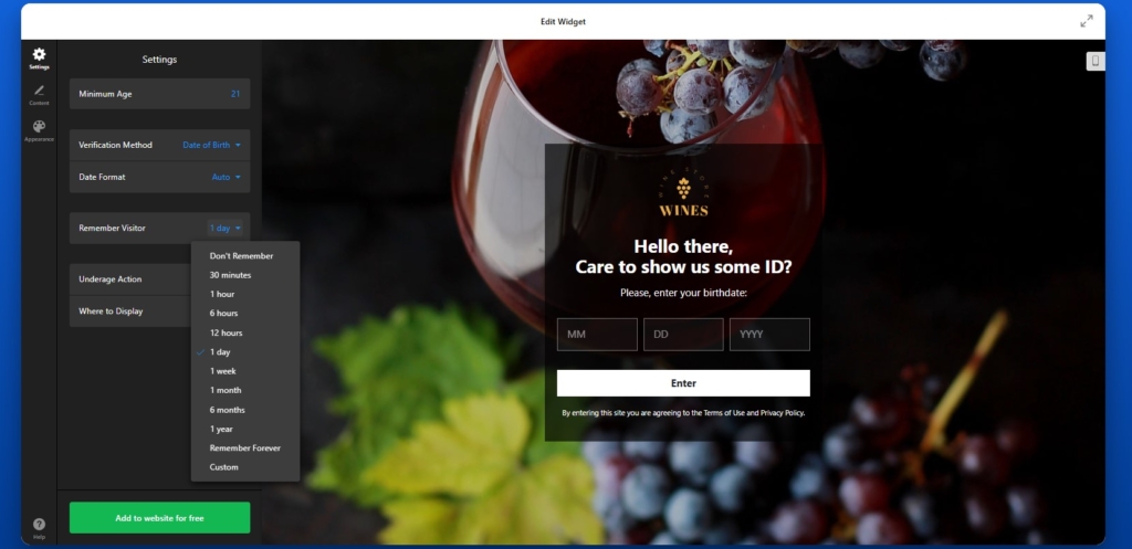
Step 4: Set What Happens After Verification
After the content is ready, define how the app should behave based on the visitor’s response. This is where the age verification popup becomes a real access-control tool rather than just a message.
For users who do not meet the age requirement, you can either show a custom message, or redirect them to another page. That destination could be your homepage, an informational page, or another URL depending on your needs.
You should also decide whether you want the popup to appear on the whole Wix website or only on certain pages. Some businesses need a full-website age gate, while others only need it on selected product pages or specific content sections.
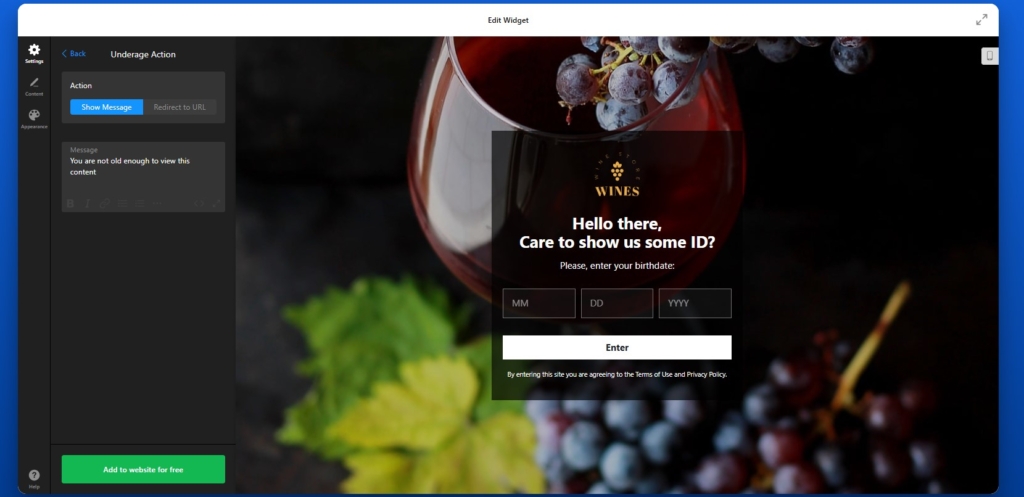
Step 5: Customize the Popup Text and Buttons
Once the verification method is set, move on to the content of the popup itself. This includes the title, explanatory text, confirmation button, and additional information.
Your message should be direct and easy to understand. Visitors should know immediately why the popup appears and what they need to do next. For example, instead of generic wording, you can use text that clearly explains that the website contains age-restricted products or content.
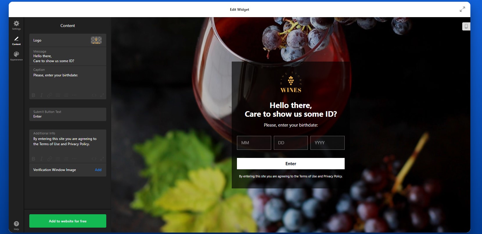
Step 6: Customize the Design
Now move to the design settings and make sure the popup aligns with the look and feel of your Wix website. This includes colors, fonts, buttons, spacing, overlays, and other visual elements.
Your age gate should feel like part of your website, not like an unrelated layer added on top. If the styling is consistent with the rest of your design, users are more likely to trust it and continue smoothly through the process.
This is also the step where readability matters. Make sure the text is large enough, the contrast is strong enough, and the buttons are easy to tap on smaller screens.
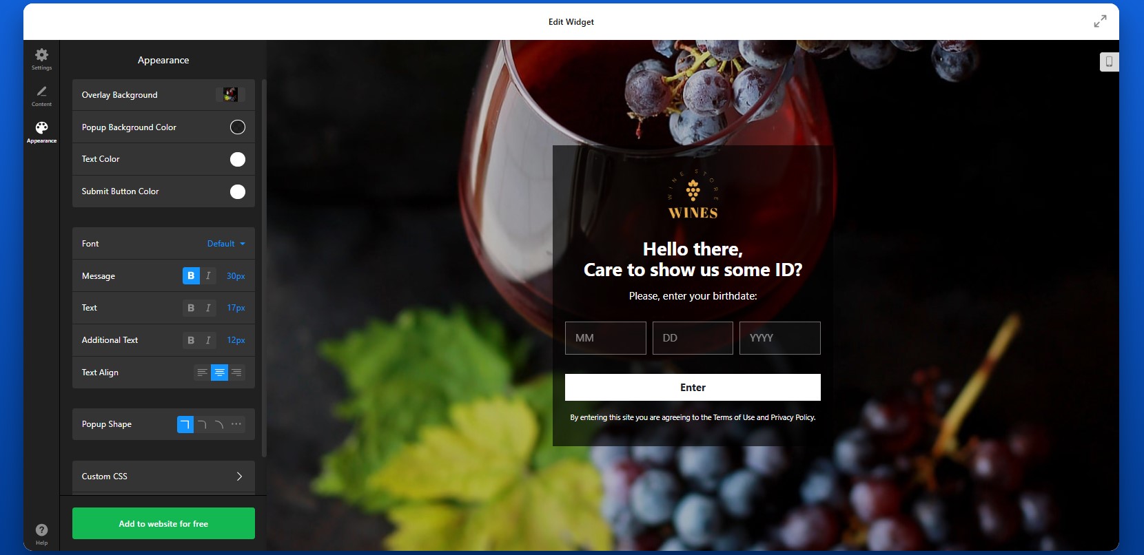
Step 7: Generate the Embed Code
Once your Age Verification is fully configured, click “Add to website for free” to generate the embed code. This code contains everything needed to display the age verification popup on your Wix website. Copy the entire code snippet exactly as shown.
At this point, the configuration work is done and the widget is ready to be installed.

Step 8: Add Age Verification to Wix Website
Now open your Wix editor and navigate to the page or section where you want the Age Verification app to load. In most cases, it is used as an entry popup for the website experience, so you’ll want to place the code where it can apply broadly across the pages you want to protect.
Add an Embed HTML element in Wix, then paste the code into that block. Save your changes and publish the website. Once published, the popup should appear according to the rules you configured in the editor.
After installation, test the full experience carefully.
- If the popup doesn’t appear, confirm that the full embed code was pasted into the correct Wix Embed HTML element and that the page was published after changes.
- If the popup keeps showing to returning visitors, review the cookie memory settings.
- If the layout looks off, check the size of the embed container and test the widget on mobile and desktop.
- If redirects don’t work as expected, recheck the destination URL and the logic you set for denied visitors.
Alternative Solutions to Add Age Verification to Wix
There are a few other ways to add Age Verification to a Wix website, but they vary significantly in flexibility, ease of use, and long-term reliability. While these options can work in simple cases, they often become limiting as your website grows or your compliance needs become more specific.
Wix App Market Solutions
One of the most common alternatives is installing an age verification app from the Wix App Market. These apps are designed to integrate directly with Wix and typically provide a quick way to add a basic popup.
To implement this method, open your Wix editor, go to the App Market, search for “age verification,” and install a suitable app. After installation, through the app interface you’ll configure such popup settings as text, display behavior, and basic design.
This approach is convenient and requires no coding, but it still has some limitations.
- Limited design flexibility compared to fully customizable solutions
- Feature restrictions depending on pricing tiers
- Dependency on third-party app updates and support
Custom Code (JavaScript Popup)
Another option is building your own age verification popup using JavaScript and embedding it into your Wix website through the HTML embed feature.
To implement this, you would create a script that triggers a popup on page load, collects user input (such as confirmation or date of birth), and then controls access based on that input. This script is then added to your Wix website using an Embed HTML element or developer tools.
This method gives you full control over functionality, but it requires technical knowledge and ongoing maintenance.
- Requires coding skills and technical setup
- No built-in interface for easy updates or adjustments
- No automatic improvements, fixes, or compliance updates
Wix Native Popups or Lightboxes
Wix also offers built-in popup (lightbox) functionality that you can adapt for age verification. This is a manual workaround rather than a dedicated feature.
To implement this, you create a lightbox in Wix, design it as an age confirmation popup, and set it to appear when users enter your website. You can add buttons for confirmation and optionally link them to different actions.
While this method is easy to set up, it’s not specifically designed for age verification.
- No true age verification logic (only basic confirmation)
- No built-in cookie memory for returning users
- Requires manual setup for each behavior
- Difficult to scale across multiple pages or use cases
Before choosing a method, it helps to compare them based on real-world factors like flexibility, maintenance, and user experience.
| Feature | Elfsight Age Verification | Wix Apps | Custom Code | Wix Lightbox |
| Ease of setup | Easy | Easy | Hard | Easy |
| Customization | High | Medium | High | Low |
| Design control | Full | Limited | Full | Limited |
| Cookie memory | Yes | Limited | Custom | No |
| Maintenance required | None | Medium | High | Medium |
| Compliance flexibility | High | Medium | Custom | Low |
Each method can work depending on your needs, but they serve very different levels of complexity. Elfsight provides the best balance: it combines ease of use with advanced features, allowing you to scale your age verification setup without increasing complexity or maintenance over time.
Optimization Tips for Your Age Verification Popup
Once your age verification is in place, refining how it behaves and appears can significantly improve both compliance and user experience.
- Choose the right verification method for your industry: If your Wix website operates in a strictly regulated space, use more precise methods like date-of-birth input. For less strict use cases, a simple confirmation can reduce friction while still setting expectations.
- Keep messaging clear and transparent: Explain why age verification is required. When users understand the reason behind the popup, they’re more likely to complete the process without hesitation.
- Match the popup design to your website: Align colors, fonts, and layout with your Wix branding. A consistent design makes the popup feel like a natural part of your website rather than an interruption.
- Use cookie memory to improve repeat visits: Allow verified users to bypass the popup for a certain period. This creates a smoother experience for returning visitors and reduces unnecessary repetition.
- Test display behavior across pages: Decide whether the popup should appear across the entire website or only on specific pages. For example, you may only need age verification on certain product or content sections.
- Ensure mobile usability: Check that buttons are easy to tap, text is readable, and the popup doesn’t block essential navigation on smaller screens. A smooth mobile experience is critical for completion rates.
- Control timing and visibility: Display the popup immediately on entry for compliance-critical websites, or adjust timing to avoid disrupting the user flow where appropriate.
- Review and update settings regularly: As your Wix website evolves or regulations change, revisit your age verification setup to ensure it still aligns with your business needs and legal requirements.
Frequently Asked Questions
Can I choose different types of verification methods?
Can I control what happens when a user fails the age check?
Will visitors need to verify their age every time they open my Wix website?
Can I show the Age Verification popup only on specific pages?
Does the Age Verification app store personal user data?
Conclusion
Adding age verification to your Wix website is a practical step toward protecting your business, meeting regulatory requirements, and creating a clear experience for your visitors from the very first interaction.
With the Elfsight Age Verification app, you can set up a fully functional, branded age gate in minutes. From advanced verification options to cookie-based memory and responsive design, it provides everything you need to balance compliance with a smooth user experience.
If you’re looking for a reliable and scalable way to add age verification to Wix, this approach helps you do it quickly while keeping both your visitors and your business protected.
- Quick Start: Embed YouTube Video in Wix
- Why Add YouTube Video to Wix Website
- Core Features of YouTube Gallery App
- Step-by-Step: How to Add YouTube Video to Wix
- Alternative Solutions: Comparing Options
- Optimization Tips for Your YouTube Videos
- YouTube Gallery Embedding Use Case
- Frequently Asked Questions
- Conclusion
Did you know? 82% of video marketers say that including video on a website helps keep visitors on their web pages and increase sales, making it one of the most effective content formats for influencing decisions.
If you’re building a Wix website, adding video content can dramatically improve how visitors interact with your pages. A single YouTube video can explain your product, showcase results, or answer questions faster than text ever could. However, simply linking to YouTube isn’t enough. When users leave your website to watch a video, you lose control over their experience – and often their attention.
The Elfsight YouTube Gallery app lets you embed YouTube video directly on your Wix website, keeping visitors engaged while giving you full control over layout, design, and content.
- How to embed a YouTube video in Wix quickly without coding;
- How to customize video layouts and presentation;
- Alternative embedding methods and their limitations;
- Best practices to increase video performance on your website.
Let’s start with the fastest way to get your video live.
Quick Start: Embed YouTube Video in Wix
If you want to quickly add a YouTube video to your Wix website, here’s the simplest way:
- Open the YouTube Gallery app editor and select a template.
- Add your YouTube video, playlist, or channel.
- Click “Add to website for free” to generate your embed code.
- Paste the code into your Wix website using the Embed element.
Create your YouTube video app now in the live editor!
Why Add YouTube Video to Wix Website
Embedding videos directly into your Wix pages changes how visitors interact with your content. Instead of relying only on text and images, you give users a more dynamic way to understand what you offer and decide whether to take action.
🎥 Keep visitors on your website
When you embed YouTube videos on your pages, viewers can watch content without leaving your website. This keeps them inside your environment instead of sending them to YouTube, where they might get distracted by other videos. As a result, you maintain control over their experience and keep their attention focused on your content.
📈 Increase time on page
Video naturally encourages visitors to stay longer. Instead of quickly scanning text and leaving, users are more likely to watch a video from start to finish. This extended time on page increases the chances they’ll explore other sections of your website and engage more deeply with your content.
💬 Explain complex ideas faster
Some ideas are simply easier to show than explain. Whether it’s a product demo, a walkthrough, or a service overview, video allows you to communicate more clearly in less time. This reduces confusion and helps visitors quickly understand the value you provide.
⭐ Build trust with visual proof
Seeing real people, real products, or real results builds credibility in a way text alone cannot. Customer testimonials, case studies, and demonstrations provide visual confirmation that your business delivers what it promises, which helps reduce hesitation and builds confidence.
📱 Improve mobile experience
A large portion of Wix traffic comes from mobile devices, where long text blocks are harder to consume. Video offers a more convenient alternative, allowing users to engage with your content quickly and comfortably on smaller screens. This makes your website more accessible and easier to navigate across all devices.
Core Features of YouTube Gallery App
Before embedding videos, it helps to understand what the gallery actually enables and how it improves the way video content is presented on your Wix website.
Below is a breakdown of its key capabilities and how each feature translates into practical use.
| Feature | Practical Use |
| Multiple video sources | Add single videos, playlists, or full channels |
| Auto-sync | Automatically updates when new videos are published on YouTube |
| Layout options | Display videos as grid, slider, or gallery |
| Popup player | Let visitors watch videos in a lightbox without leaving your website |
| Custom styling | Adjust colors, fonts, and layout to align with your Wix design and branding |
| Responsive design | Works across desktop, tablet, and mobile devices |
| Content grouping | Organize videos into categories or tabs for easier navigation |
These features make it possible to move beyond a simple video embed and create a structured, scalable video section that fits naturally into your website design. For the complete feature breakdown, visit the app features page.
Now let’s move on to the full setup process and see how to implement everything.
Step-by-Step: How to Add YouTube Video to Wix
Let’s go through the full process of how to add a YouTube video to your Wix website and place it exactly where it fits best within your layout and content.
Step 1: Choose a Template
Start by opening the YouTube Gallery editor and selecting a template that matches your page structure and content goals. The editor offers different layout options, including grids for showcasing multiple videos, sliders for compact sections, and single-video layouts for focused presentation.
Choosing the right layout at this stage helps you visualize how the video will fit into your Wix page, but you can always adjust it later.
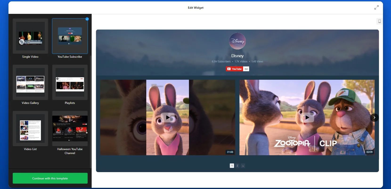
Step 2: Add Your YouTube Source
Once the layout is selected, connect your YouTube content by pasting a video link, playlist URL, or full channel link into the source field. Elfsight will automatically pull in your videos and display them in the preview area. This allows you to instantly see how your content will appear without additional setup.
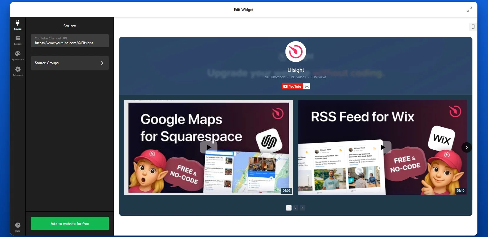
If you’re adding a full channel, make sure to use the full desktop YouTube URL format, such as youtube.com/channel/… or youtube.com/@YourHandle. Shortened links like youtu.be/… won’t work correctly, so always use the full version.
If you want to display a playlist, copy the playlist URL directly from YouTube. Elfsight will automatically show videos in the same order as they appear in that playlist. If you need to change the order, you’ll need to do it inside YouTube itself, as the app reflects that structure.
For more control, you can also add individual video links one by one. This approach is useful when you want to create a curated selection rather than display an entire channel or playlist.
You’re not limited to a single source. You can combine multiple sources within one widget – for example, adding your main channel along with a separate playlist for tutorials or reviews. The app will automatically organize them into tabs, making it easier for visitors to navigate your content.
Step 3: Customize Layout
Once your videos are added, move to the Layout tab to control how they appear on your Wix website. This step is where you shape the overall viewing experience and decide how visitors will interact with your content.
Here, you can choose whether to display the channel header. The header includes your channel name, description, subscriber count, and a “Subscribe” button. Keeping it visible helps drive subscribers directly from your website, while hiding it creates a cleaner, more minimal video section.
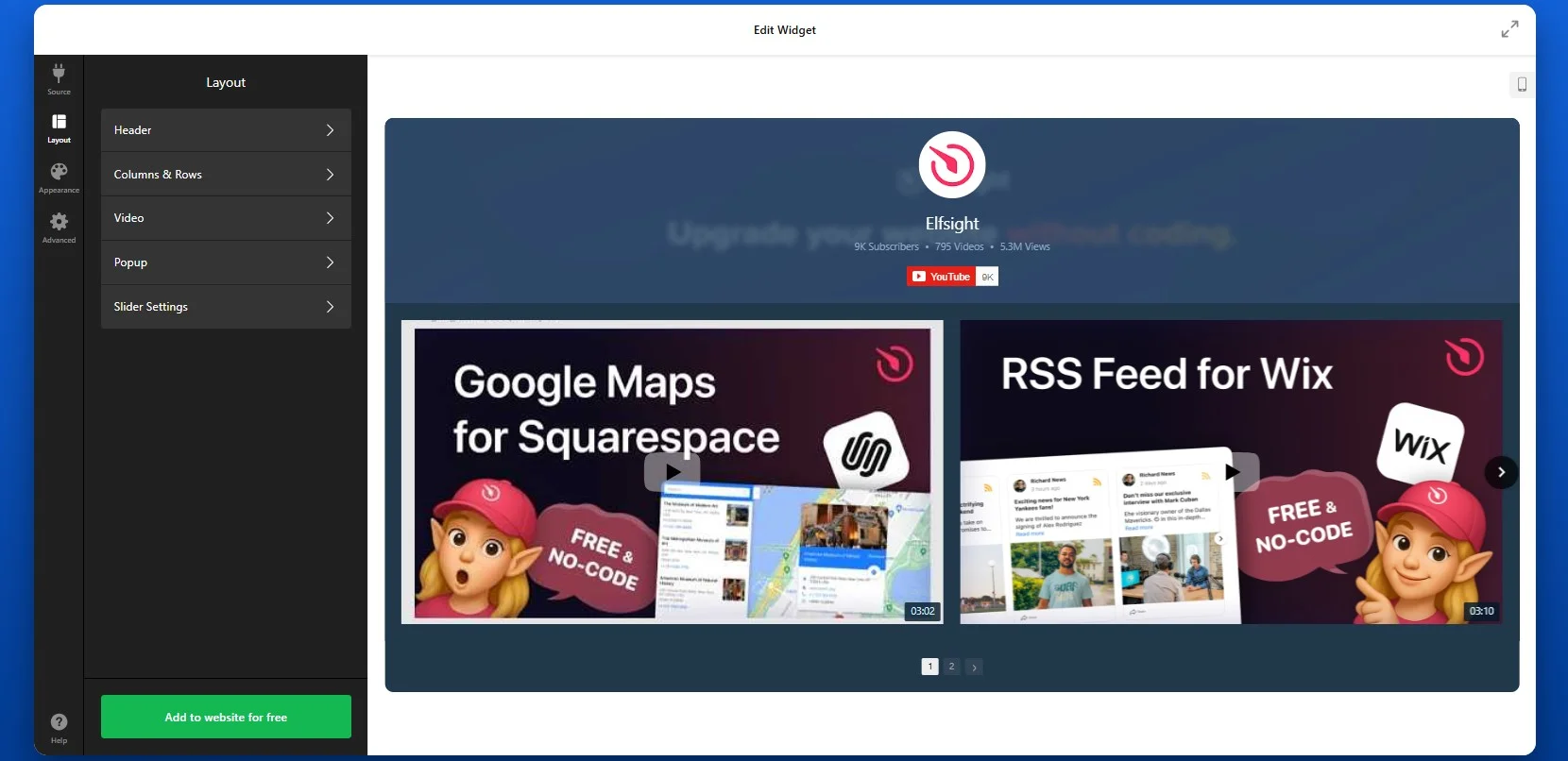
You can adjust how many videos are shown at once, define spacing between elements to match your Wix page design.
Depending on your goal, you can display videos in a classic grid that works best when you want to display multiple videos in a structured way. A cinema-style layout highlights one main video with smaller thumbnails below, which is useful for featured content. A horizontal layout creates a scrolling strip of videos, ideal for compact sections or side placements.
Step 4: Customize Design
Next, adapt the visual style of the widget so it blends seamlessly with your Wix website. This is where you align the widget with your branding.
You can adjust colors, fonts, and visual elements such as backgrounds and hover effects. A consistent design helps the video section feel like part of your website rather than an external element.
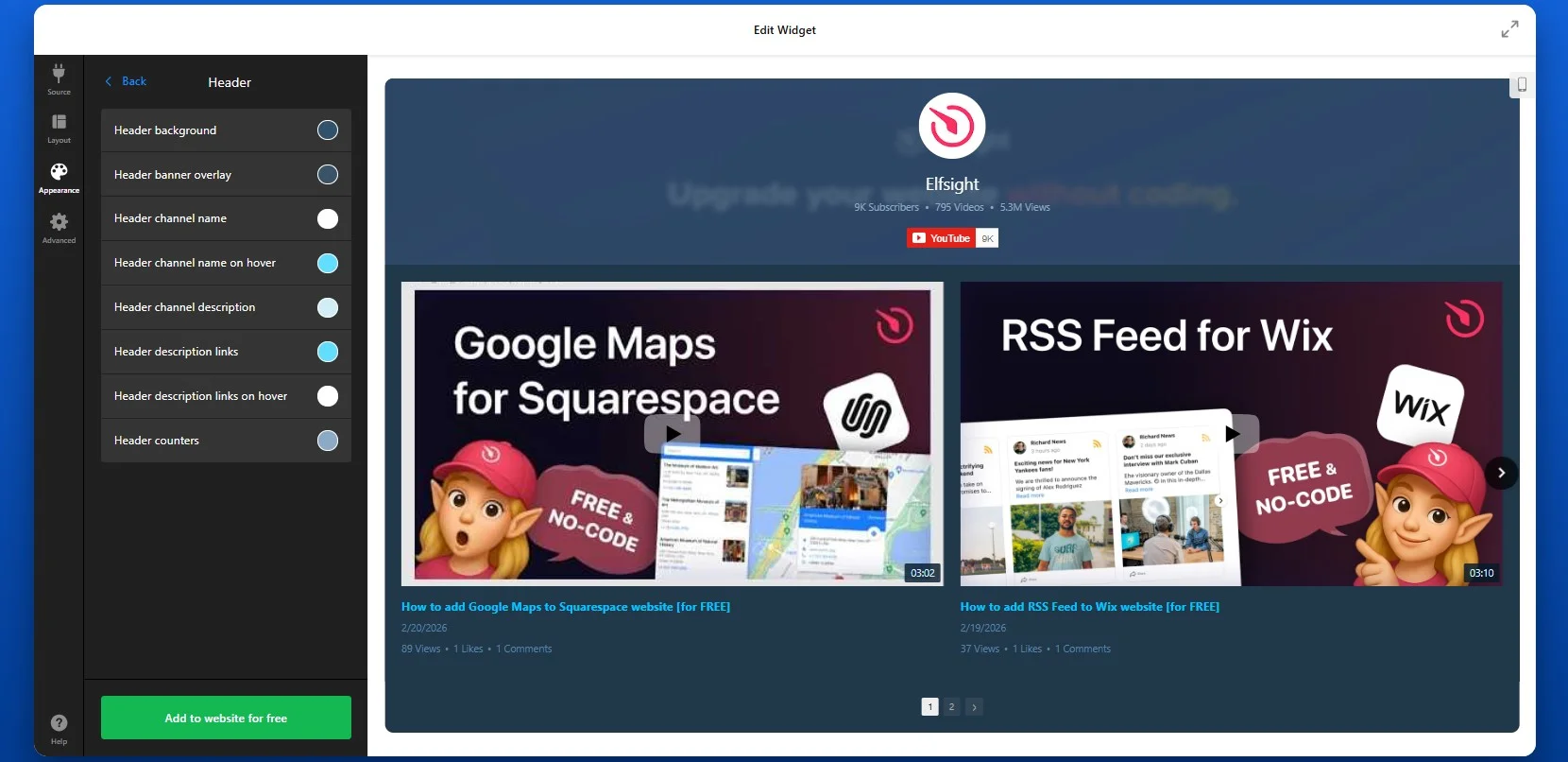
Step 5: Generate Embed Code
When your setup is complete, click “Add to website for free” to generate the embed code.
This code contains everything needed to display your video or gallery on your Wix website. Make sure to copy the entire snippet to ensure proper functionality.
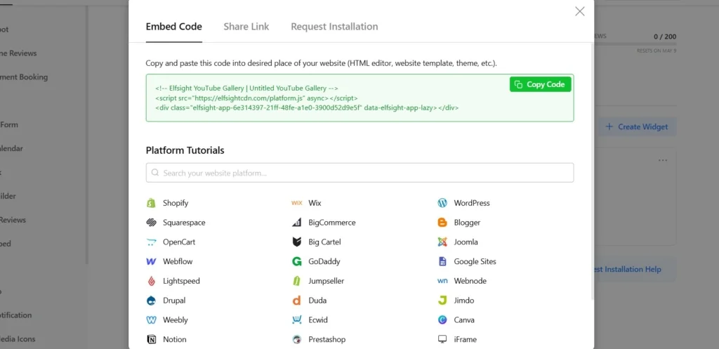
Step 6: Embed YouTube Video in Wix
To embed your YouTube videos in Wix, open your Wix editor and navigate to the page where you want the video to appear. Add an Embed element (such as “Embed HTML”), then paste the code into the provided field.
Once you publish your website, the video will be displayed exactly in that location and will function immediately without further adjustments.
- If the video doesn’t appear, confirm that the embed code was pasted into the correct Embed element in Wix.
- If the layout looks compressed or misaligned, check the width of the container where the app is placed.
- If videos fail to load, verify that your YouTube links are valid and publicly accessible.
Alternative YouTube Embedding Solutions: Comparing Options
There are several ways to add YouTube videos to Wix, but each approach offers a different level of flexibility, control, and long-term usability. While some methods are quick to set up, they often lack the features needed to scale or maintain a polished design across your website.
Wix Native Video Element
Wix provides a built-in video element that allows you to add YouTube videos directly to your page. You simply drag the video element into your layout and paste your YouTube URL.
This method works well for basic use cases where you only need to display a single video quickly. It integrates smoothly with the Wix editor and doesn’t require additional tools. However, as soon as you want to scale beyond a basic embed – such as displaying multiple videos, organizing content, or matching your design more precisely – you may start to encounter limitations.
- Limited layout flexibility, with no advanced gallery or grid options
- No built-in way to organize multiple videos into categories or sections
- Lacks automatic updates from channels or playlists
- Minimal control over styling compared to custom solutions
- Not suitable for content-heavy video sections or scalable setups.
YouTube Iframe Embed
Another option is to use YouTube’s native embed code. You can copy the iframe code from YouTube and paste it into a Wix Embed HTML element.
This approach gives you a bit more control over placement, but it still focuses on individual videos. If you want to display multiple videos, you’ll need to repeat the process for each one, which quickly becomes inefficient.
- Designed for single videos, with no built-in way to organize multiple videos into a gallery or feed
- Requires manual updates – every new video must be embedded individually
- Limited customization options for layout and styling
- No automatic syncing with your YouTube channel or playlist
- Becomes difficult to scale as your video content grows
Before choosing a method, it helps to compare them based on what matters most for your website – flexibility, automation, and ease of seyup and management.
| Feature | Elfsight YouTube Gallery | Wix Native | Iframe |
| Multiple videos | Yes | Limited | No |
| Playlist & channel support | Yes | Limited | No |
| Automatic updates | Yes | No | No |
| Custom design | High | Medium | Low |
| Advanced features (search, filters) | Yes | No | No |
| Ease of setup | Easy | Easy | Medium |
A simple embed might work for a single video, but as soon as you need more control, better design integration, or automatic updates, a more flexible solution like Elfsight becomes important.
Optimization Tips for Your YouTube Video
Once your video is live, small adjustments in placement, structure, and presentation can significantly improve how visitors interact with it.
- Place videos where users notice them first: Position videos near the top of your page or close to key sections like product descriptions or CTAs so they immediately capture attention and guide user behavior.
- Make thumbnails visually clear and relevant: A strong thumbnail helps users instantly understand what the video offers. Use clear visuals and avoid clutter to increase the likelihood of clicks.
- Keep videos focused and concise: Shorter, well-structured videos are more likely to be watched fully. Aim to deliver your main message quickly to maintain attention and reduce drop-off.
- Use multiple videos strategically: Group related videos into playlists or galleries to encourage continuous viewing. This keeps users engaged longer and helps them explore your content without leaving the page.
- Ensure smooth mobile playback: Test how videos display on smaller screens. Make sure controls are easy to use and layouts adapt properly to touch interactions.
- Monitor how users interact with videos: Track performance using analytics to see which videos get the most views and engagement. Use these insights to refine placement, content, and overall strategy.
Real-World Example: Tourism Website Uses Video to Drive Engagement
Andrew Lamb runs Wales Outdoors, a tourism website focused on outdoor experiences across Wales. For this type of business, showing real locations, activities, and experiences is essential – visitors want to see what they’re booking before making a decision.
Before using Elfsight
Lack of visually appealing ways to showcase content in an engaging and structured way.
Challenges keeping visitors engaged long enough to explore offerings.
Limited options to effectively present products to boost sales.
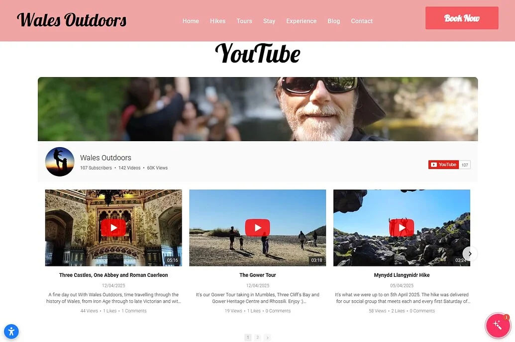
With the YouTube Gallery widget
“Elfsight has been a game changer with widgets that work, work well, and are visually attractive.” – Andrew Lamb
By adding a dedicated YouTube section powered by the YouTube Gallery app, Andrew made his tour videos easily accessible directly on the website. Instead of sending visitors to YouTube, the videos are displayed in an organized gallery where users can browse and watch without leaving the page.
This setup allows potential customers to explore real tour experiences, understand what to expect, and feel more confident about booking.
The result: a more interactive and visually engaging website, longer visitor sessions, and a clearer presentation of tour experiences that helps convert interest into bookings.
Frequently Asked Questions
Can I display multiple YouTube videos, playlists, or channels in one widget?
How can I control which videos appear in my gallery?
Does the YouTube Gallery update automatically when I upload new videos?
Will embedded YouTube videos slow down my Wix website?
Can I customize how YouTube videos look on Wix?
Conclusion
Embedding YouTube videos in your Wix website helps you keep visitors engaged, explain your content more effectively, and increase time spent on your pages. Instead of sending users away to YouTube, you bring that content directly into your website experience – where it supports your goals.
If you want a flexible way to embed YouTube videos on Wix, try the Elfsight YouTube Gallery app and add video content in minutes. With Elfsight, you can display entire channels, playlists, or curated collections in a fully customizable layout. Your content updates automatically, your design stays consistent, and your visitors can browse and watch without ever leaving your website. Create a scalable, organized, and visually integrated video experience for your visitors without adding complexity to your workflow.
- Quick Start: Add Age Verification to Shopify
- Why Add Age Verification to Shopify Website
- Core Features of the Age Verification App
- Step-by-Step: How to Add Age Verification on Shopify
- Other Ways to Add Age Verification to Shopify
- Optimization Tips for Your Age Verification Popup
- Frequently Asked Questions
- Conclusion
If you run a Shopify store that sells age-restricted products – such as alcohol, CBD, or adult goods – age verification isn’t optional. It’s a necessary step to stay compliant and protect your business.
But beyond compliance, age verification also helps set clear expectations for visitors and builds trust by showing your brand takes regulations seriously. The Elfsight Age Verification app makes it easy to create a customizable popup, control user access, and apply it across your entire website in just a few minutes, without any coding required.
- How to add age verification on Shopify quickly without coding
- How to customize age gates and messaging
- Alternative methods and their limitations
- Best practices for compliance and user experience
Let’s start with the fastest way to implement age verification on your Shopify website so you can get it live without diving into complex setup.
Quick Start: Add Age Verification to Shopify
If you prefer a straightforward, hands-on approach, here’s the simplest way to embed age verification on your Shopify store and have it working in just a few minutes:
- Open the Age Verification editor and select a template.
- Customize age rules, text, and design.
- Click “Add to website for free” to generate the embed code.
- Paste the code into your Shopify theme or page and publish.
Create your age verification popup now in the live editor!
Why Add Age Verification to Shopify Website
Adding an age gate does more than block underage users. It directly impacts how your store operates, how visitors perceive your brand, and whether you stay compliant with industry regulations. It becomes a key part of both legal protection and user experience.
🔒 Stay compliant with regulations
Many industries, such as alcohol, tobacco, CBD, and adult products, require age verification before users can access content or make purchases. By adding age verification to your Shopify website, you ensure your store aligns with these legal requirements and reduces the risk of non-compliance.
🛡 Protect your business from liability
Without a proper age gate, your store may be exposed to legal risks, fines, or restrictions. Age Verification acts as a safeguard, helping you demonstrate that you’ve taken reasonable steps to prevent underage access. This is especially important if your business operates across multiple regions with different regulations.
🎯 Set clear expectations for visitors
An age check immediately communicates what your website offers and who it’s intended for. Visitors understand right away whether they can proceed, which reduces confusion and filters out irrelevant traffic before users interact further with your content.
💬 Build trust and credibility
A well-designed verification popup shows that your business takes responsibility seriously. It signals professionalism and compliance, which can increase confidence among legitimate customers and partners.
📱 Maintain a smooth user experience
Modern age verification solutions are designed to be fast and unobtrusive. Visitors can quickly confirm their age and continue browsing without unnecessary friction. When implemented correctly, the process feels like a natural step rather than a barrier.
Overall, Age Verification is a strategic element that helps you protect your business while creating a clear and structured experience for your audience.
Core Features of the Age Verification App
Before setting up your age gate, it’s important to understand what the app can actually do and how these features translate into real control over your Shopify website experience.
The goal is to create a flexible, branded, and user-friendly system that works across different scenarios and regulations rather than just to block access.
Below is a breakdown of the key features and how they apply in practice:
| Feature | Practical Use |
| Multiple verification methods | Choose between simple yes/no confirmation, full date of birth input, or age selection depending on your compliance needs |
| Custom messaging | Tailor the text to match your brand voice and clearly explain why verification is required |
| Redirect options | Send underage visitors to a different page, homepage, or external website |
| Cookie-based memory | Remember verified users so they don’t have to repeat the process on every visit |
| Design customization | Adjust colors, fonts, and layout to match your Shopify theme and maintain visual consistency |
| Device responsiveness | Ensure the age gate works smoothly across desktop, tablet, and mobile devices |
| Flexible placement | Display the popup on entry,on all pages, or on specific ones depending on your strategy |
These features allow you to go beyond a basic age check and create a controlled, branded entry point to your website. Whether you need strict compliance for regulated products or simply want to guide user access more clearly, Elfsight gives you the flexibility to implement it without disrupting the overall experience.
For the complete feature breakdown, visit the app features page.
Now let’s move on to the installation process and see how to implement age verification step by step on your Shopify store.
Step-by-Step: How to Add Age Verification on Shopify
Now let’s go through the full setup process, from choosing the right verification format to embedding the widget into your Shopify store and making sure it works smoothly for your visitors.
Step 1: Choose a Template
Start by opening the Elfsight editor. You’ll see various ready-made templates designed for different types of businesses and compliance needs. Choose the template that best matches your store and the level of control you need.
At this stage, don’t worry too much about visual details. The template is just your starting point, you’ll be able to customize the wording, design, and behavior in the next steps.
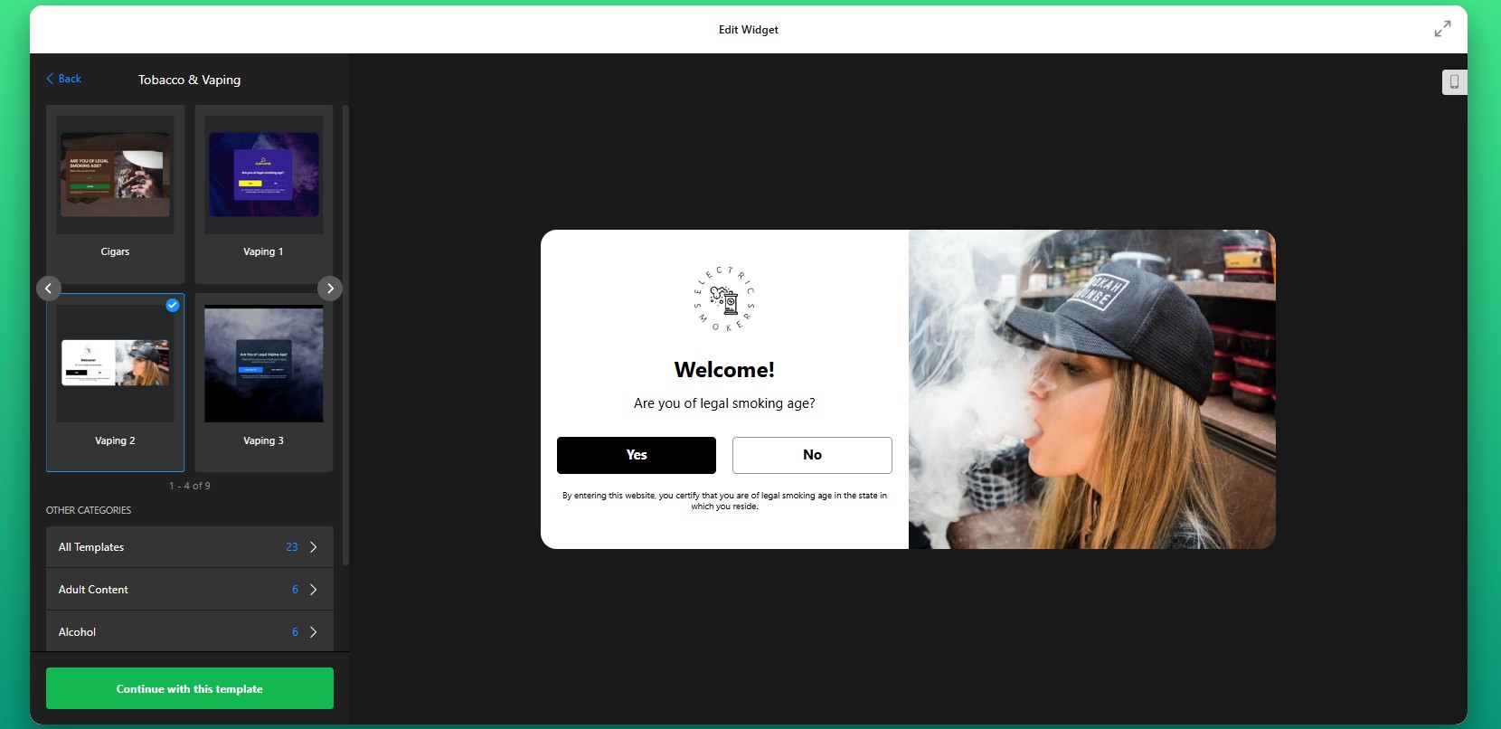
Step 2: Select the Verification Method
Next, decide how visitors will verify their age. This is one of the most important setup decisions because it determines how strict or lightweight the experience will feel.
You can choose a basic yes/no confirmation if you only need a fast acknowledgment before entry. This works well for stores that want a simple compliance layer without adding too much friction. If you need stronger validation, you can use a birth date field or age input to make the process more precise.
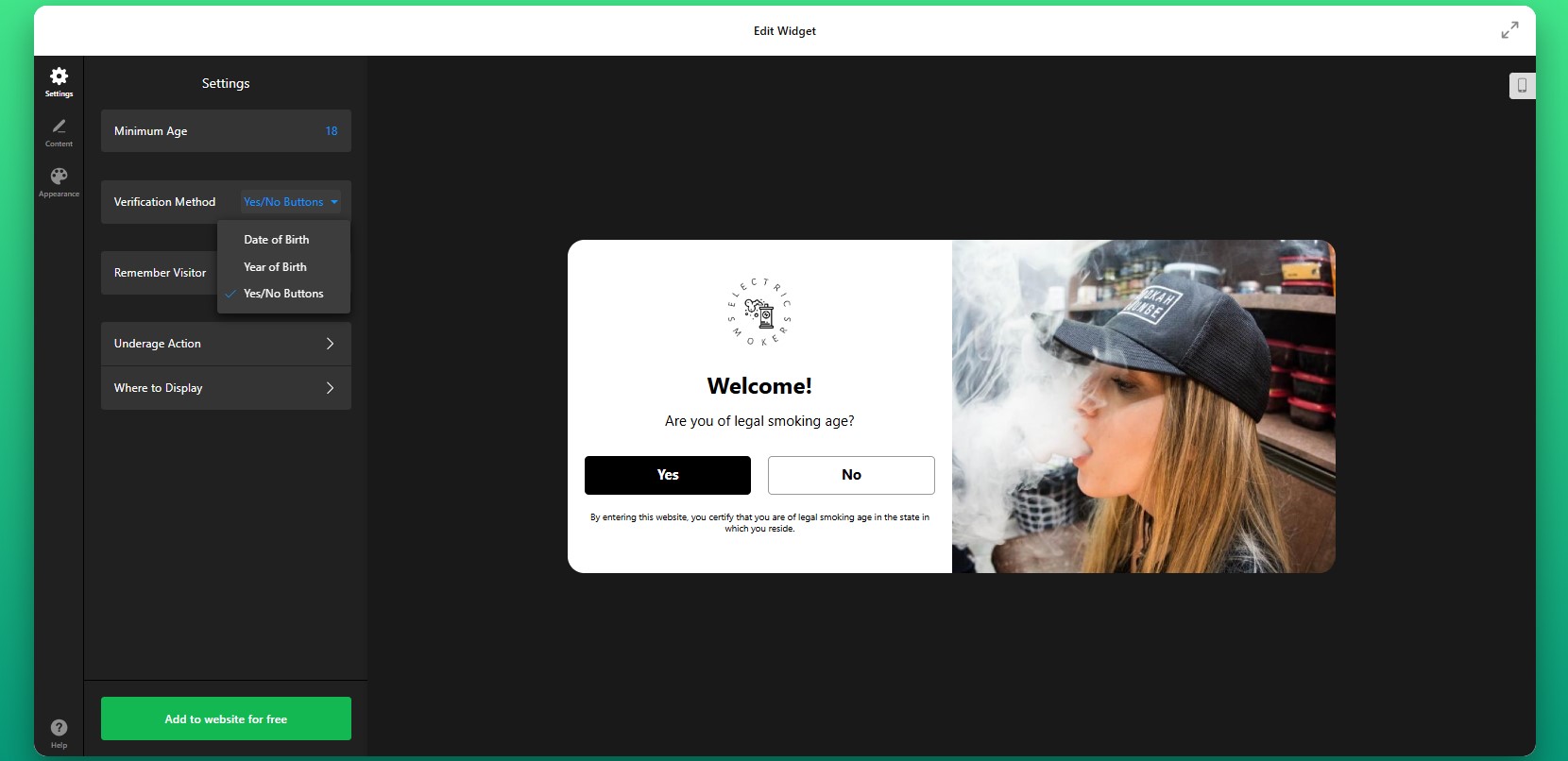
Step 3: Adjust Repeat Behavior
Then decide how often returning visitors should see the popup. Elfsight can remember verified users using cookies, which helps reduce friction for people who have already passed the age check.
This makes the experience much smoother for repeat visitors, especially on stores with loyal customers who browse often. Instead of asking them to confirm their age on every page load, the website can remember their response for a defined period.
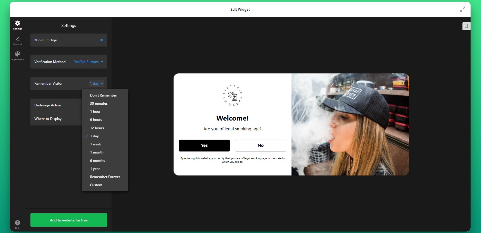
Step 4: Set the Underage Action
Now configure what happens after a user interacts with the popup. This is where you define how the app controls access to your Shopify website.
For users who do not qualify, you can show a custom message explaining the restriction or redirect them to another URL such as your homepage or an informational page.
You can also define whether the app should appear across the full website or only on selected pages. For some stores, it makes sense to gate the entire website. For others, age verification may only be necessary for certain product collections or landing pages.
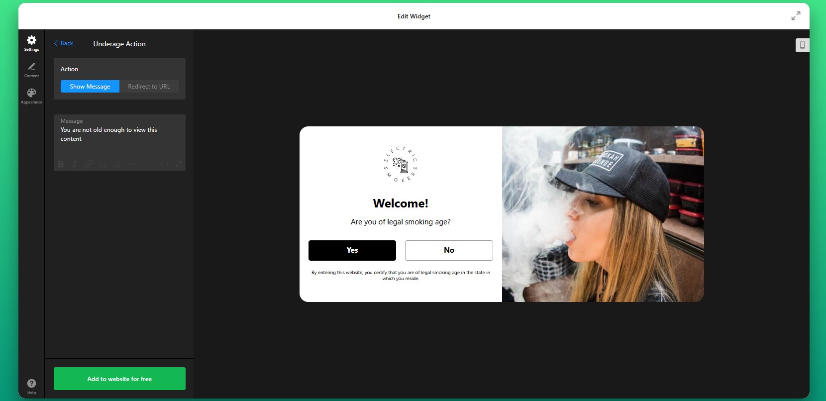
Step 5: Customize the Message
After setting the underage action, edit the popup content so it matches your store’s tone and clearly explains what users need to do. A well-written message makes the popup feel intentional and professional rather than disruptive.
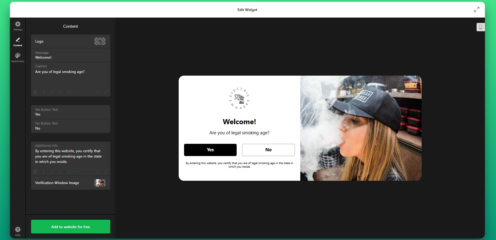
Step 6: Customize the Design
Next, move to the design settings and make the age verification popup feel like part of your storefront rather than an external add-on.
You can adjust colors, fonts, button styles, background overlays, and spacing to align the popup with your Shopify branding.
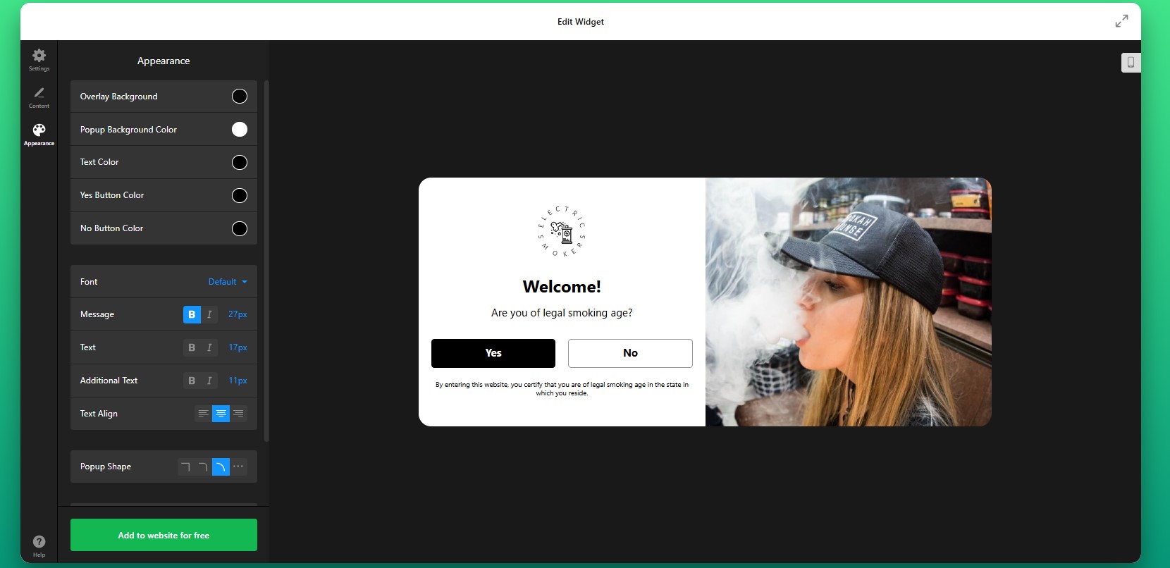
Step 7: Generate the Embed Code
Once your settings are complete, click “Add to website for free” to generate the embed code. Copy the full code snippet exactly as it appears. It usually includes all the elements needed for the popup to load and display correctly. At this point, your age gate is fully configured and ready for installation.
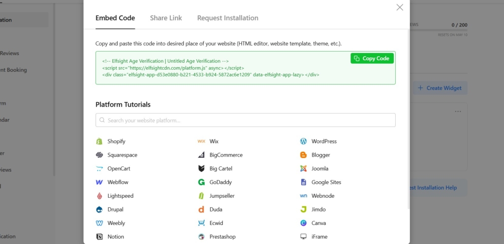
Step 8: Add Age Verification to Shopify
Now open your Shopify admin and go to the area where you want to install the widget. Go to your Shopify theme editor or theme code area, depending on how your store is structured. Paste the embed code into the appropriate section so the widget loads across the pages you want to protect. If you only want to gate specific pages or product sections, place the code accordingly.
After saving the changes, open your live store and test the popup.
- If the popup doesn’t appear, first make sure the full embed code was added to the correct Shopify theme section.
- If verified users keep seeing the popup repeatedly, review your cookie and memory settings.
- If the design looks broken, check for theme styling conflicts or narrow containers affecting the popup layout.
- If redirects don’t work as expected, recheck the destination URL and your approval or denial logic in the widget settings.
Other Ways to Add Age Verification to Shopify
There are other ways to embed age verification on your Shopify store. While these methods can work for basic setups, they often lack the control and ease of use needed for long-term management.
Shopify Apps
One common approach is installing a third-party age verification app from the Shopify App Store. These apps are designed specifically for Shopify and can be added without touching code.
To implement this method, go to the Shopify App Store, search for “age verification,” install a suitable app, and follow its setup instructions. Most apps allow you to configure a popup, define age rules, and enable it across your store.
This method is relatively easy to set up, but it often comes with limitations in customization and performance.
- Limited design flexibility compared to fully customizable widgets
- May add extra load time depending on the app
- Feature restrictions on free plans
- Dependency on third-party app updates and support
Custom Code (JavaScript Age Gate)
Another option is creating your own age verification popup using JavaScript and embedding it directly into your Shopify theme.
To implement this, you would write a script that triggers a popup on page load, collects user input (such as age confirmation), and controls access based on the response. This code is then added to your theme files (usually in theme.liquid or similar).
While this approach gives you full control, it requires technical expertise and ongoing maintenance.
- Requires development knowledge to build and maintain
- Time-consuming to implement correctly
- No built-in UI or customization tools
- No automatic compliance updates or feature improvements
Theme-Based Popups or Scripts
Some Shopify themes include built-in popup functionality or allow you to add scripts via theme settings or third-party integrations.
To implement this, you would either enable a popup feature within your theme settings or inject custom scripts using Shopify’s theme customization tools or script fields.
This method can work for simple cases but is often limited in flexibility and control.
- Very limited customization options
- Not designed specifically for age verification use cases
- May lack proper access control or redirect logic
- Difficult to scale or adapt for different pages
- Dependent on theme capabilities
Before choosing a method, it’s important to compare them based on real-world factors like flexibility, maintenance, and long-term usability.
| Feature | Elfsight Age Verification | Shopify Apps | Custom Code | Theme-Based |
| Ease of setup | Easy | Easy | Hard | Medium |
| Customization | High | Medium | High | Low |
| Design control | Full | Limited | Full | Limited |
| Verification methods | Advanced | Basic–Medium | Custom | Basic |
| Maintenance required | None | Medium | High | Medium |
| Mobile optimization | Built-in | Depends | Manual | Depends |
| Compliance flexibility | High | Medium | Custom | Low |
| Automatic updates | Yes | Yes (app-based) | No | No |
Choosing the right method depends on your needs. But if you’re looking for a reliable, low-maintenance solution that scales with your store, flexibility becomes a key factor. Elfsight provides the best balance of ease, flexibility, and scalability without increasing complexity
Optimization Tips for Your Age Verification Popup
Once your age verification is live, small adjustments can make a big difference in how users interact with it and whether it supports your goals without creating friction.
- Keep the verification process simple: Avoid unnecessary steps or overly complex forms. A clear and quick interaction reduces drop-offs while still meeting compliance requirements.
- Use clear and transparent messaging: Let users know why age verification is required. When visitors understand the reason, they’re more likely to complete the process without hesitation.
- Match the popup to your brand design: Align colors, fonts, and layout with your Shopify theme so the popup feels like a natural part of your website rather than an interruption.
- Enable cookie memory for returning visitors: Allow verified users to bypass the popup on future visits. This improves the browsing experience and prevents frustration for repeat customers.
- Test behavior across devices and browsers: Make sure the popup displays correctly on mobile, tablet, and desktop, and doesn’t interfere with navigation or page loading.
- Control when and where the popup appears: Display the age gate immediately on entry or only on specific pages depending on your strategy. This ensures it appears at the right moment without disrupting the overall flow.
Frequently Asked Questions
What age verification methods are available in the app?
Can I control what happens when a user fails the age check?
Will users need to verify their age every time they visit?
Can I display Age Verification only on specific Shopify pages?
Is the Age Verification app secure and does it store user data?
Conclusion
Adding age verification to your Shopify website is a critical part of how your store operates, protects itself, and communicates with visitors. A well-implemented age gate ensures you meet regulatory requirements while creating a clear and structured entry point for your audience.
With multiple verification methods, customizable design, smart access control, and cookie-based memory for returning users, the Elfsight Age Verification app gives you everything you need to implement verification of visitors’ age without adding complexity. You can control how and where the popup appears, match it to your Shopify branding, and ensure it works smoothly for every visitor.
If you’re looking for a reliable, scalable way to add age verification to Shopify, Elfsight helps you do it quickly, while keeping both compliance and user experience in balance.
- Quick Start: Add Form to Shopify
- Why Add Forms to Product Pages in Shopify
- Core Features of the Form Builder App
- Step-by-Step: How to Add a Form to Shopify
- Alternative Solutions to Embed a Form in Shopify
- Optimization Tips for Your Form Builder
- Form Builder Embedding Use Case
- Frequently Asked Questions
- Conclusion
Did you know? 74% of marketers use forms and almost half of them say forms are their highest-converting lead generation tool, making them essential for capturing customer interest directly on your website.
If you run a Shopify store, collecting customer information is just as important as selling products. Whether it’s inquiries, custom orders, or lead capture, forms play a key role in converting visitors into customers, especially on high-intent pages such as product pages, landing pages, or checkout sections.
However, Shopify’s built-in form options are quite limited. The default contact form works for basic use cases, but it doesn’t offer much flexibility for more advanced workflows, such as multi-step forms or conditional logic. The Elfsight Form Builder makes it easy to add a form to Shopify without coding. You can create fully customizable forms, embed them anywhere on your store, and start collecting data in minutes.
- How to add forms in Shopify quickly using a no-code solution
- How to customize form fields, logic, and design to match your store and use case
- What alternative methods exist and when they fall short for real business needs
- Best practices to increase form submissions
Let’s start with the fastest way to get your form live and start collecting responses right away.
Quick Start: Add Form to Shopify
If you want a fast way to add custom forms to Shopify, here’s the simplest process:
- Open the Elfsight editor and select a template that best meets your needs.
- Customize fields and form structure.
- Click “Add to website for free” to generate your embed code.
- Paste the code into your Shopify page or theme and publish.
Create your form now in the live editor!
Why Add Forms to Product Pages in Shopify
Adding forms isn’t just about collecting data – it directly affects how visitors interact with your store and whether they move forward or leave. When done right, forms become a key part of your conversion flow, helping you capture interest at different stages of the customer journey.
🛒 Capture leads directly on your store
Not every visitor is ready to buy immediately. Some need more information, want to ask questions, or are exploring custom options. Forms let you capture those opportunities instead of losing them. By placing forms across your Shopify website, you turn passive visitors into active leads without relying only on checkout actions.
📈 Increase conversions on product pages
Product pages are where most decisions happen—and also where doubts appear. When you add a form to a product page on Shopify, you give customers a direct way to ask questions, request variations, or clarify details without leaving the page. This reduces hesitation and keeps users moving forward instead of abandoning the session.
💬 Reduce friction in customer communication
Traditional contact methods, such as email links, require extra steps and effort. Forms streamline this process by allowing visitors to submit requests instantly. Everything happens within your website, which keeps the experience smooth and increases the likelihood that users will actually reach out.
🎯 Support multiple use cases across your store
Forms are highly flexible and can serve different purposes depending on your needs. You can use them for contact requests, product customization, booking inquiries, feedback collection, or even post-purchase surveys. Instead of adding multiple tools, a single form builder lets you manage all of these interactions in one place.
📱 Improve mobile experience and completion rates
A large portion of Shopify traffic comes from mobile users. Well-designed forms make it easy to complete actions quickly on smaller screens, with optimized fields and layouts. This reduces drop-offs and helps you capture more responses from users who are browsing on the go.
Core Features of the Form Builder App
Before setting up your form, it helps to understand what functionality is available and how it translates into real use on your Shopify website.
Below is a breakdown of the key features and how they support different business scenarios.
| Feature | Practical Use |
| Drag-and-drop form builder | Create and adjust forms visually without any coding |
| Multiple field types | Collect detailed input such as emails, phone numbers, selections, and files |
| Conditional logic | Show or hide fields based on user responses for more personalized flows |
| Custom styling | Match the form design to your Shopify theme for a seamless look |
| Email notifications | Get instant alerts when someone submits a form |
| Spam protection | Prevent unwanted or automated submissions |
| Multi-step forms | Break longer forms into steps to improve completion rates |
| Integrations | Send collected data to email tools, CRMs, or other systems |
For the complete feature breakdown, visit the app features page.
With a clear understanding of what Elfsight can do, you can now move on to setting it up and embedding it into your Shopify store.
Step-by-Step: How to Add a Form to Shopify
Now let’s go through the complete process of how to add a form to Shopify and embed it exactly where it supports your store, whether that’s a landing page, product page, or custom section.
Step 1: Choose a Form Template
Start by opening the Form Builer app editor and selecting a template that fits your goal. There’s a wide variety of ready-made options designed for different use cases, such as collecting inquiries, handling booking requests, gathering feedback, or generating leads.
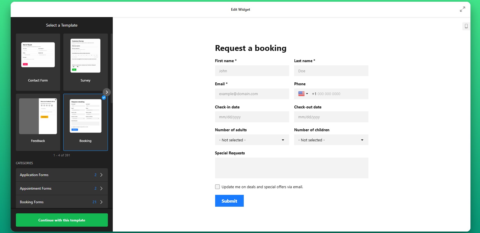
Step 2: Customize Form Fields
You can include simple inputs like names and email addresses, or create more advanced forms with selectable options, file uploads, and multiple-choice fields. The goal is to collect exactly the information you need – nothing more, nothing less – so the form remains easy to complete.
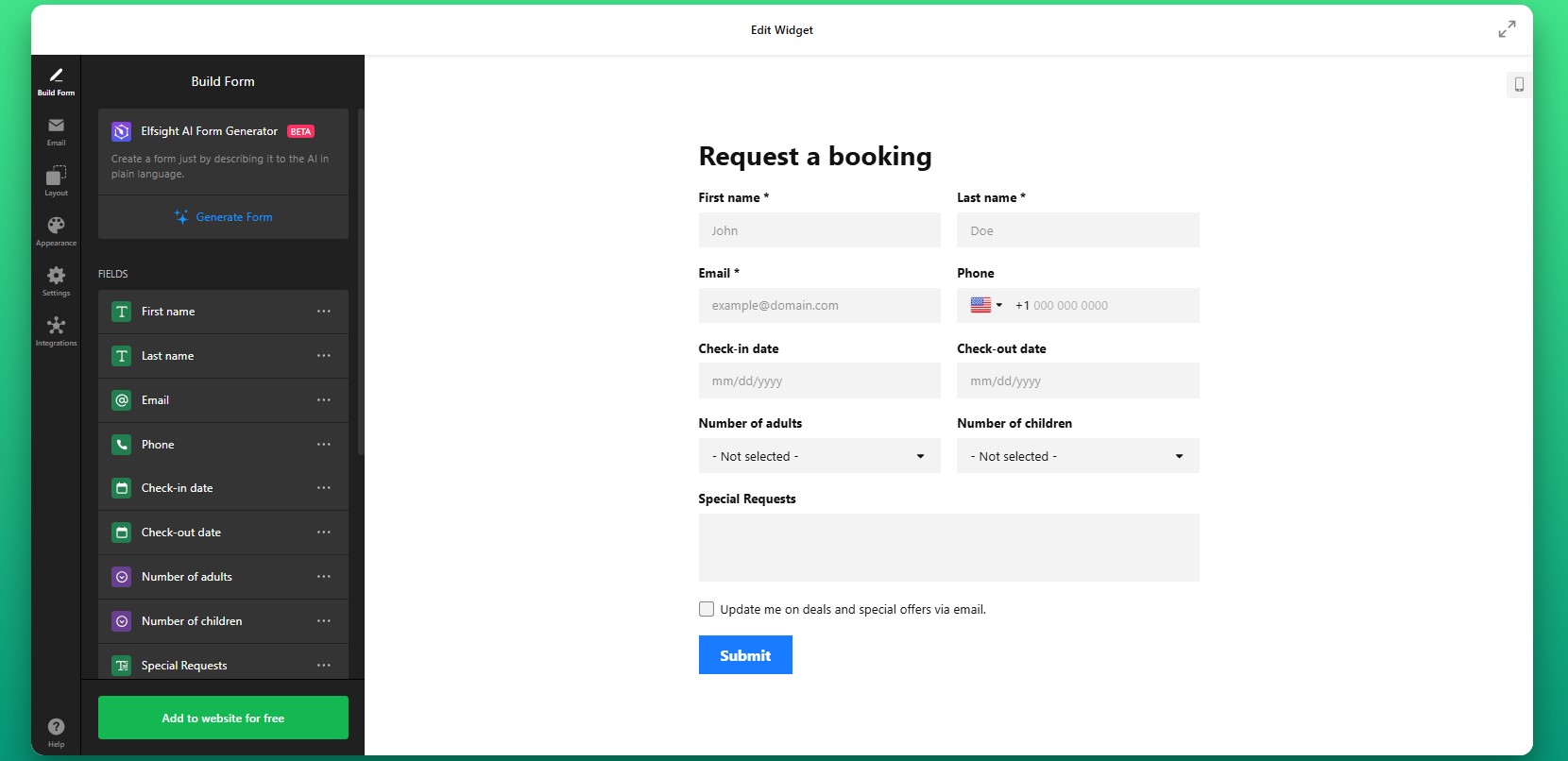
Step 3: Configure Form Behavior
Set how the form behaves after submission. You can define what message users see after submission, choose whether your visitors are redirected to another page, and set up notifications so you’re alerted whenever a new response comes in.
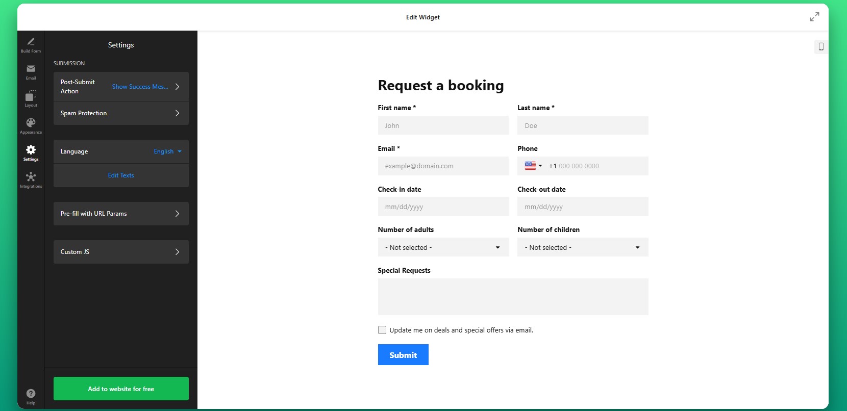
Step 4: Customize Design
Next, adjust the visual appearance of your form to align with your Shopify store’s design. You can refine colors, typography, spacing, and button styles to match your branding. This step is important because consistency builds trust and makes the form feel like a natural part of your website.
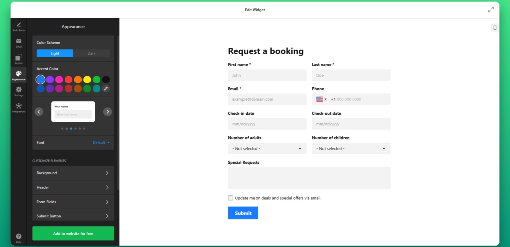
Step 5: Generate Embed Code
Once everything is configured, click “Add to website for free” to generate your embed code. This code contains everything needed to display the form on your Shopify store.
Copy the entire snippet as it appears to ensure the form loads correctly when added to your website.
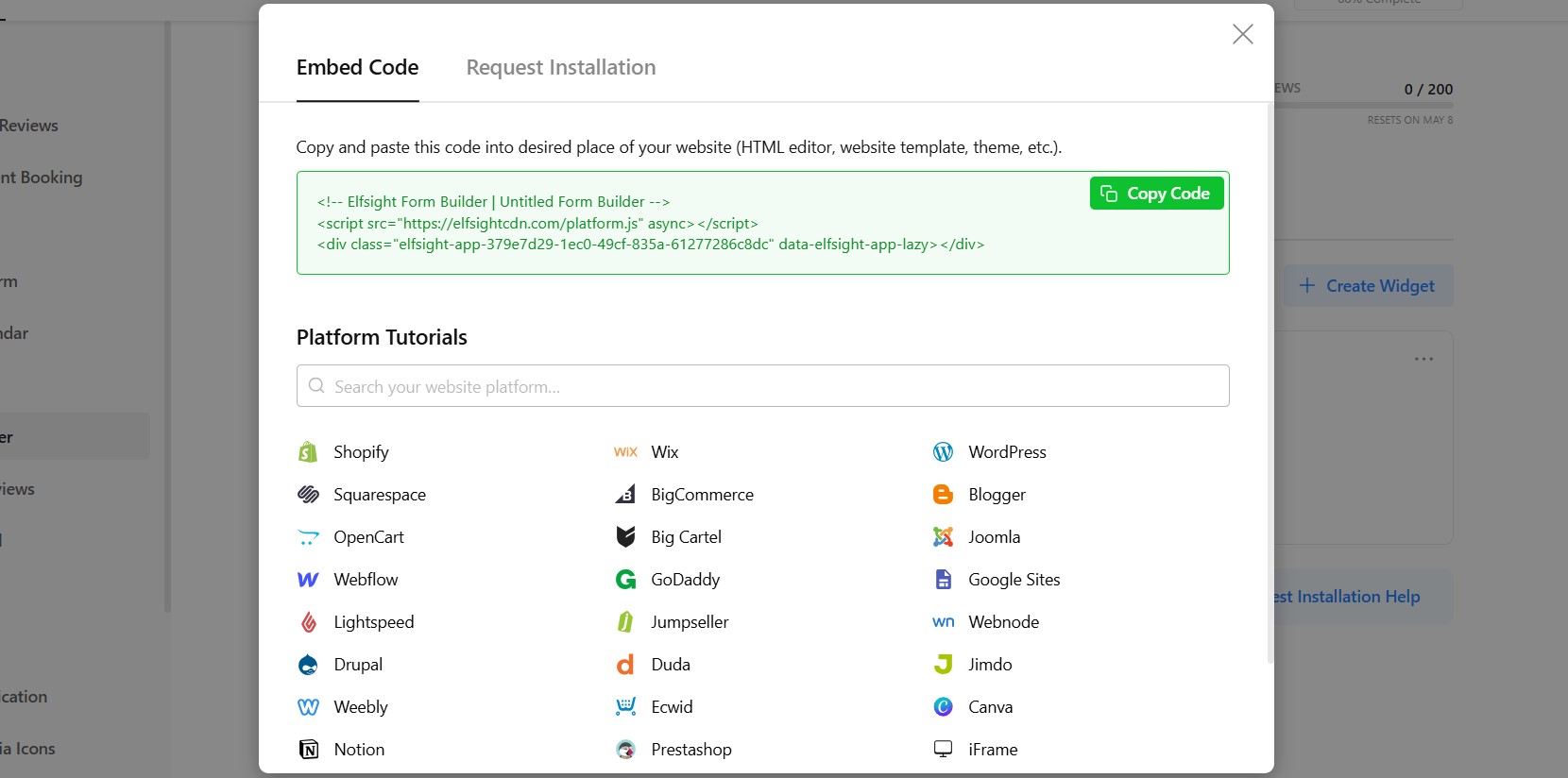
Step 6: Add Form to Shopify Page
To add the form to your Shopify page, go to your Shopify admin, open the page where you want the form to appear. Switch to the HTML or code view and paste the embed code into the desired section.
After saving your changes, the form will appear on that page and be ready to collect submissions.
If you want to add the form to your product page on Shopify, you can place the embed code directly into your theme or use a custom section that allows HTML content.
This approach is especially useful for handling product-specific inquiries, custom orders, or additional customer input directly within the buying experience.
- If the form isn’t visible, double-check that the embed code was pasted into the correct HTML section of your Shopify page.
- If the layout looks off, it may be caused by theme styling conflicts, which can be resolved by adjusting spacing or container width.
- If submissions aren’t coming through, review your notification settings to ensure emails are configured correctly.
- For mobile display issues, verify that the form layout is responsive and not restricted by its container.
Alternative Solutions to Embed a Form in Shopify
There are several ways to add a form to Shopify, but each approach comes with different levels of flexibility, effort, and long-term maintenance. Understanding these differences helps you choose the method that fits your store’s needs rather than running into limitations later.
Shopify Native Contact Form
Shopify includes a basic contact form that can be added through its default templates. To use it:
- Create a contact page template.
- Assign it to a page in your admin panel.
- Customize basic fields.
Manual HTML Form
Another option is to build a form manually in HTML and embed it directly into your Shopify theme. This approach gives you full control over the form’s structure and behavior, but it also requires technical knowledge.
- Write a custom HTML form.
- Add backend handling.
- Embed into theme.
Before deciding which approach to use, it helps to compare them side by side based on what matters most for day-to-day use.
| Feature | Elfsight Form | Shopify Native | HTML |
| Customization | High | Low | High |
| Ease of use | Easy | Easy | Hard |
| Logic & fields | Advanced | Basic | Custom |
| Maintenance | None | Low | High |
This comparison shows a clear trade-off: native solutions are easy but limited, while custom solutions are powerful but require effort. A widget-based approach balances both by providing flexibility without adding complexity.
Optimization Tips for Your Form Builder
Once your form is live, small improvements in placement, structure, and design can significantly increase the number of users who actually complete it.
- Place forms where users are already engaged:
Position your form near product descriptions, pricing sections, or call-to-action buttons so it appears when users are considering their next step. - Keep forms concise and focused: The more fields you add, the higher the chance users will abandon the form. Only ask for information that is essential for your goal.
- Make every field easy to understand: Clear labels and simple wording reduce confusion and help users complete the form faster without second-guessing their input.
- Ensure a smooth mobile experience: Since many Shopify visitors browse on mobile, forms should be easy to navigate, with properly spaced fields and simple input methods.
- Explain why the form matters: Adding a short message about what users get in return, such as a response, quote, or support, can increase completion rates.
- Test different placements and layouts: Moving your form higher on the page or changing its format can have a noticeable impact on how many users interact with it.
Real Use Case: Custom Bike Store Improves Customer Interaction with Forms
Khush runs Kapz, a custom bicycle parts online store, where personalization and customer communication are essential to the buying process. Since many products require custom design input, the website needed a clear and easy way for visitors to submit requests and interact with the business.
Before using Elfsight
Struggled with coding when building key elements like contact forms and banners
Limited ability to create visually appealing and functional sections
Needed a faster way to add interactive elements without technical complexity
With the Form Builder widget
“We were looking for a no-code widget solution for our website – the first one was an announcement bar and then it went from there.” – Khush
By adding a multistep form directly into the website, Khush created a smoother way for customers to leave their reviews right on the website. Also, instead of relying on external communication channels, visitors can now submit their contact information directly within the website.These forms were integrated alongside other interactive elements like galleries, sliders, and social feeds, creating a more dynamic and user-friendly experience.
The result: improved website functionality, faster deployment of new features, and smoother user experience across devices.
Frequently Asked Questions
Can I create different types of forms on my Shopify website?
Does the Form Builder support multi-step forms?
Can I customize what happens after a form is submitted?
Can I integrate form submissions with other tools like email or CRM?
Is there a way to generate forms faster without building them manually?
Conclusion
Adding forms to your Shopify store gives you more ways to capture leads, answer questions, and support customer journeys beyond standard checkout flows. Not every visitor is ready to purchase immediately; some need clarification, want to request custom options, or are simply exploring.
By embedding forms directly into your pages, you create opportunities for interaction exactly where users need them.