
Whether you’re collecting leads, registering new users, or gathering feedback, website forms are one of the most critical interaction points on a website. They often serve as the gateway between a visitor and a conversion — and the way they are designed can either invite users in or push them away.
Effective web forms go beyond simple field placement. They’re strategically crafted to align with user expectations, reduce friction, and gently guide visitors toward completing a task. Poorly designed forms, on the other hand, lead to frustration, drop-offs, and missed opportunities for engagement.
In today’s digital landscape, users expect more than just functionality. They want clarity, speed, and a smooth flow that doesn’t interrupt their intent. By aligning your form design with the user’s natural behavior and expectations, you create a bridge between interest and action.
From aligning your call-to-action with visual hierarchy to eliminating unnecessary fields that clutter the interface, every detail matters. And when done right, these choices contribute to a seamless experience that benefits both the user and the business.
Core Principles Behind Effective Forms
User-friendly web forms aren’t just functional — they’re intuitive, efficient, and aligned with user expectations. Whether you’re designing a short contact form or a complex multi-step registration flow, applying core principles helps reduce abandonment and boost completion rates.
The foundation of web form best practices lies in how information is structured, validated, and presented. When your form feels logical, visually clean, and effortless to complete, users are far more likely to follow through.
Here are the essential strategies to guide your form design:
- Organize fields into logical groups. Keep related questions together (e.g., contact details, preferences, delivery info) to reduce visual clutter. Elfsight’s layout builder supports column-based field grouping and customizable spacing to make this easy.
- Streamline registration workflows. Break long forms into multiple steps using a progress bar. This prevents users from feeling overwhelmed. With Elfsight, you can create multi-step forms with automatic transitions and visual step indicators.
- Use real-time validation and inline error messages. Users shouldn’t have to wait until they hit “Submit” to find out something went wrong. Elfsight forms include dynamic field validation that clearly highlights issues as users type — improving form accuracy and satisfaction.
- Keep the form visually minimal but functionally rich. Use placeholders, smart dropdowns, and conditional logic to avoid clutter while collecting complex data. The Elfsight form builder lets you hide or reveal fields based on user input with no extra coding.
- Follow a natural input order. Sequence fields in the order users expect — for instance, name before email, and email before phone. Resist the urge to ask for too much up front.
- Minimize typing effort. Use checkboxes, radio buttons, or predefined choices instead of open text fields when possible. This speeds up form completion and reduces input errors.
Following these core principles not only improves usability but also supports better conversion rates and stronger user satisfaction. When users feel confident and guided throughout the process, they’re far more likely to complete your form and take action.
Design Best Practices for Web Forms
Design isn’t just about visual appeal — it directly impacts how users interact with your web form and whether they complete it. Clean layouts, mobile responsiveness, and thoughtful spacing can dramatically improve form usability and reduce friction throughout the user journey.
Structure and layout: guide the eye, reduce friction
The way a form is structured visually can either create momentum or introduce friction. Thoughtful layouts reduce cognitive effort and help users scan, understand, and complete the form with confidence.
| Best Practice | Explanation |
|---|---|
| Prioritize alignment | Left-align field labels and inputs to support natural reading flow. Center alignment should be used only for very short elements. |
| Respect whitespace | Use sufficient spacing between sections and fields to improve readability and reduce visual clutter. |
| Use size to signal importance | Highlight important buttons like “Submit” or “Next” using distinct colors and larger padding to draw attention. |
| Limit distractions | Keep unrelated content, pop-ups, and animations away from your form to help users stay focused on completing it. |
| Keep label copy short and clear | Use concise, straightforward field labels. For example, replace long prompts with simple terms like “Email.” |
Clear layout choices reduce hesitation and make every field feel like a logical next step, not an obstacle. This is especially important on longer forms or when asking for personal details.
Responsive and consistent design: mobile-first thinking
As mobile traffic continues to grow, your web form must feel equally intuitive across all devices. Responsive design is no longer a bonus — it’s a baseline requirement for usability.
| Responsive Design Tip | Explanation |
|---|---|
| Adapt to all screens | Ensure your form works smoothly on desktops, tablets, and smartphones. Elfsight forms are built to be fully responsive and automatically adjust to different screen sizes. |
| Use adaptive inputs | Enhance mobile usability with smart input types — like number pads for phone fields or dropdowns for selecting dates. |
| Maintain consistency | Apply the same fonts, button styles, and spacing throughout the form. Consistency supports trust and improves readability. |
| Test on real devices | Go beyond emulators. Check how your form looks and performs on actual phones and tablets to spot usability issues early. |
| Keep call-to-action buttons visible | On long forms, repeat the submit or next button at the bottom of the page to reduce unnecessary scrolling for mobile users. |
By designing with responsiveness and consistency in mind, you ensure users can engage with your forms comfortably — whether they’re using a phone on the go or a desktop at work.
Good form design doesn’t require complexity — just thoughtful execution. By focusing on layout strategies and responsiveness, you ensure your forms look clean, behave intuitively, and convert at a higher rate, no matter where or how they’re accessed.
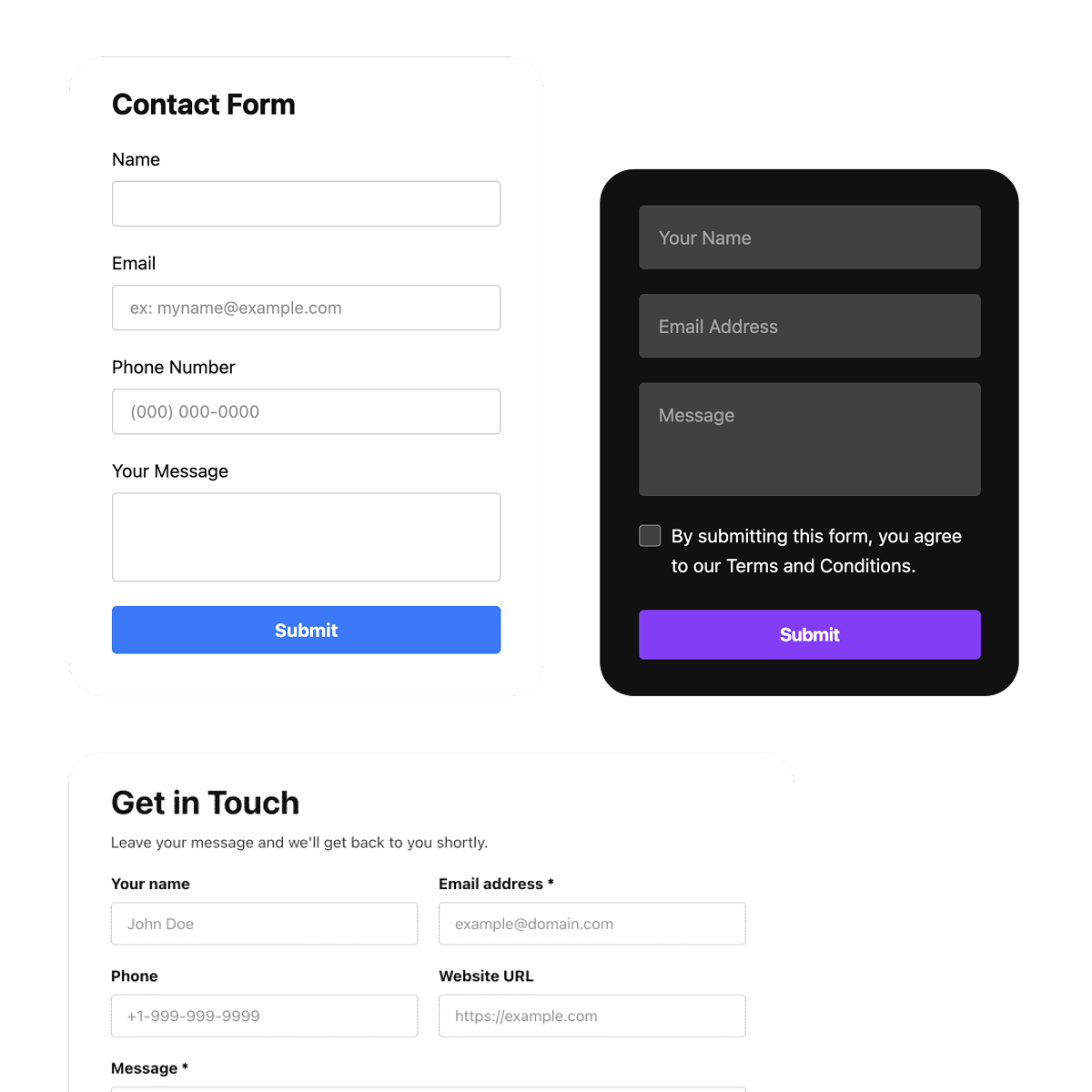
Inspiring Examples of Good Web Form Design
Effective form design is not about adding more — it’s about doing more with less. Whether you’re capturing new leads, onboarding users, or collecting feedback, your form needs to be clear, fast, and engaging. Below are three standout examples that demonstrate the best web forms in action. These categories — registration, contact, and survey forms — show how small improvements in structure, content, and interactivity can significantly enhance results.
Registration Forms: Onboarding With Clarity
Website registration forms are often the first touchpoint in a customer journey, which makes them critical for conversion. A confusing or bloated form can stop the process cold. Instead, smart registration forms focus on essential inputs and a smooth visual flow that keeps users moving forward.
- Ask only for what’s necessary. Stick to high-priority fields like full name, email, and password. Additional info (like phone or address) can be collected later in the process.
- Support field-level validation. Provide real-time feedback when users type — for instance, alert them if their password is too weak or email is invalid before they hit “Submit.”
- Use progress bars or steps. For longer registrations, breaking content into manageable steps can increase completions and reduce overwhelm. Visual indicators show users they’re moving forward.
- Ensure password visibility toggles and auto-focus. Small features like toggling password visibility or jumping focus to the next field improve flow and reduce user effort.
- Keep visual design clean and focused. Minimal layouts reduce distraction and increase clarity. Avoid too many colors, fonts, or design elements.
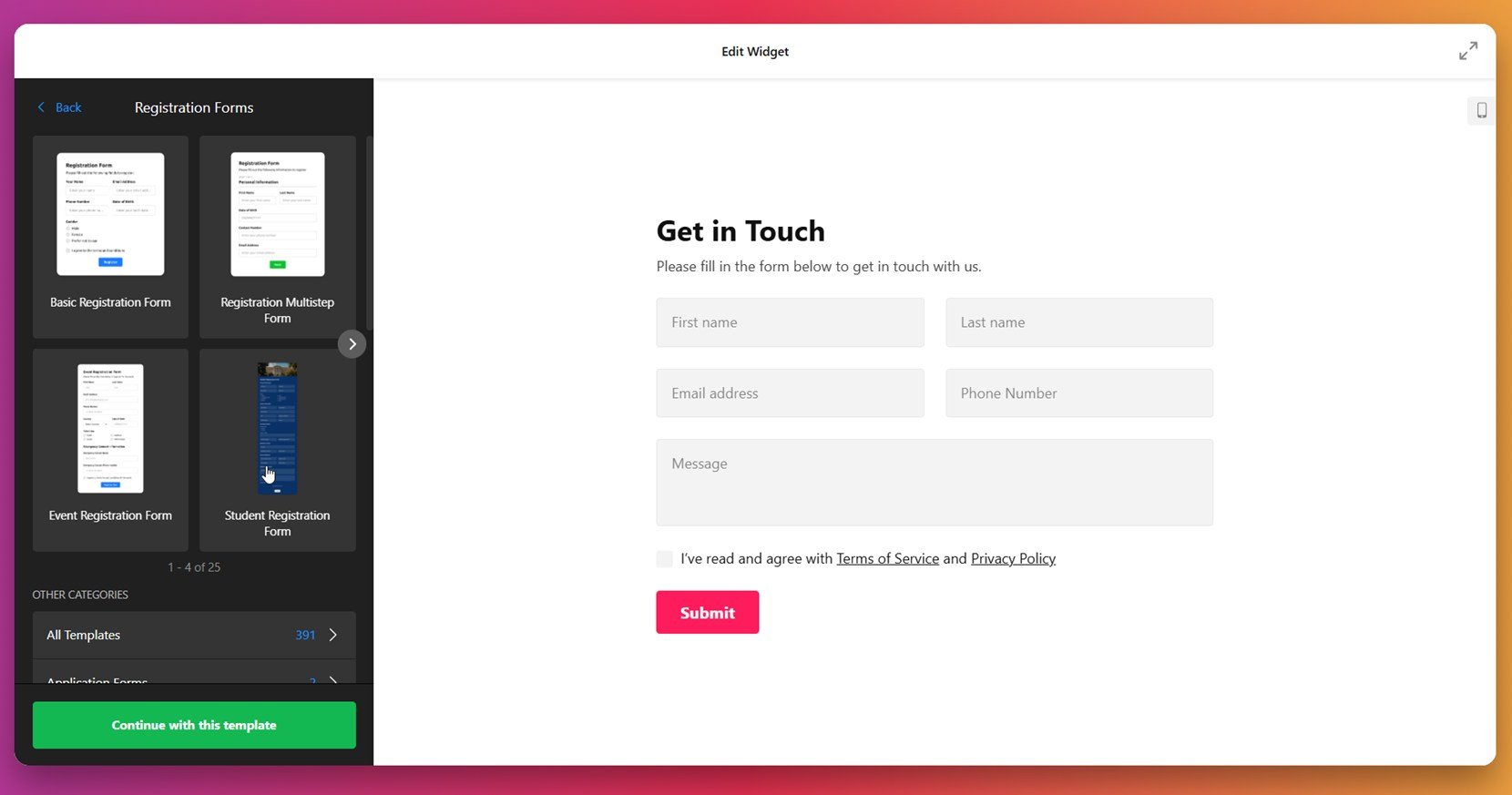
Want to see this in action? Explore the registration form templates. Each design is streamlined to eliminate friction and optimized for mobile onboarding. You can fully customize fields, add progress indicators, and style everything to match your brand — no coding needed.
Contact Forms: Simplicity That Gets to the Point
When someone clicks on your contact form, they usually have a specific purpose — a question, a service request, or a quick follow-up. The goal is to make that exchange feel effortless and focused. A great contact form is simple, inviting, and highly usable on all devices.
- Use 3–5 concise fields. Full name, email, subject, and message are often enough. Asking for too much information discourages users from reaching out.
- Clarify intent with dropdowns or checkboxes. Offer a “Reason for Contact” menu to help you route requests faster. This also reassures users their inquiry will reach the right person.
- Display clear success confirmation. Use thank-you messages or redirect users to a confirmation page, so they know their message was received.
- Optimize for mobile and keyboard navigation. Keep field widths flexible, buttons large enough for touch, and make navigation smooth using the tab key.
- Make it visually welcoming. Use soft colors, rounded corners, and short instructions to give users a friendly, low-stress experience.
Check out the contact form templates. These are built for speed and clarity, with responsive layouts, smart field options, and built-in success messages. Whether you need a basic contact form or one with dropdowns and dynamic routing, Elfsight makes it easy to create one in minutes.
Survey & Quiz Forms: Make Data Collection Engaging
Survey and quiz forms can do more than collect information — they can entertain, inform, and keep users actively engaged. The key to reducing friction in data collection here is interactivity. Instead of displaying 15 questions at once, successful forms break content into logical steps with personalized logic paths.
- Use multi-step layouts with progress indicators. Displaying one or two questions per screen with a progress bar increases completion rates dramatically.
- Apply conditional logic. Customize the flow of questions based on prior answers. For example, follow up only if someone rates a product poorly or shows interest in a service.
- Incorporate visuals or interactive elements. Emojis, icons, or sliders make the experience feel fun and dynamic, especially on mobile.
- Limit open-ended questions. Use radio buttons, scales, or dropdowns to keep responses consistent and easier to analyze.
- Summarize results or outcomes. In quizzes or polls, let users see their results immediately. This adds a layer of instant gratification.
Explore the quiz form templates to see this in action. These forms combine logic branching, progress indicators, and clean layouts to maximize engagement. Whether you’re running a fun quiz or collecting serious feedback, these templates make the process interactive and enjoyable for users — and insightful for you.
These examples show that with the right approach — and the right tools — form design can go far beyond data collection. If you’re ready to create forms that are both functional and beautiful, the next step is learning how to build one for your own website. Let’s walk through the process step by step using Elfsight’s intuitive form builder.
How to Build a Website Form: Step-by-Step
Discover how to turn a blank form into a polished, mobile-ready experience with Elfsight’s advanced Form Builder. In just a few steps, you can create and publish a professional-looking form that functions seamlessly across all devices and integrates smoothly into your website.
- Choose a template. Open the Elfsight editor and browse through various form categories — such as registration, contact, feedback, or event forms. Once you find a design that matches your needs, click “Continue with this template” to begin customizing.

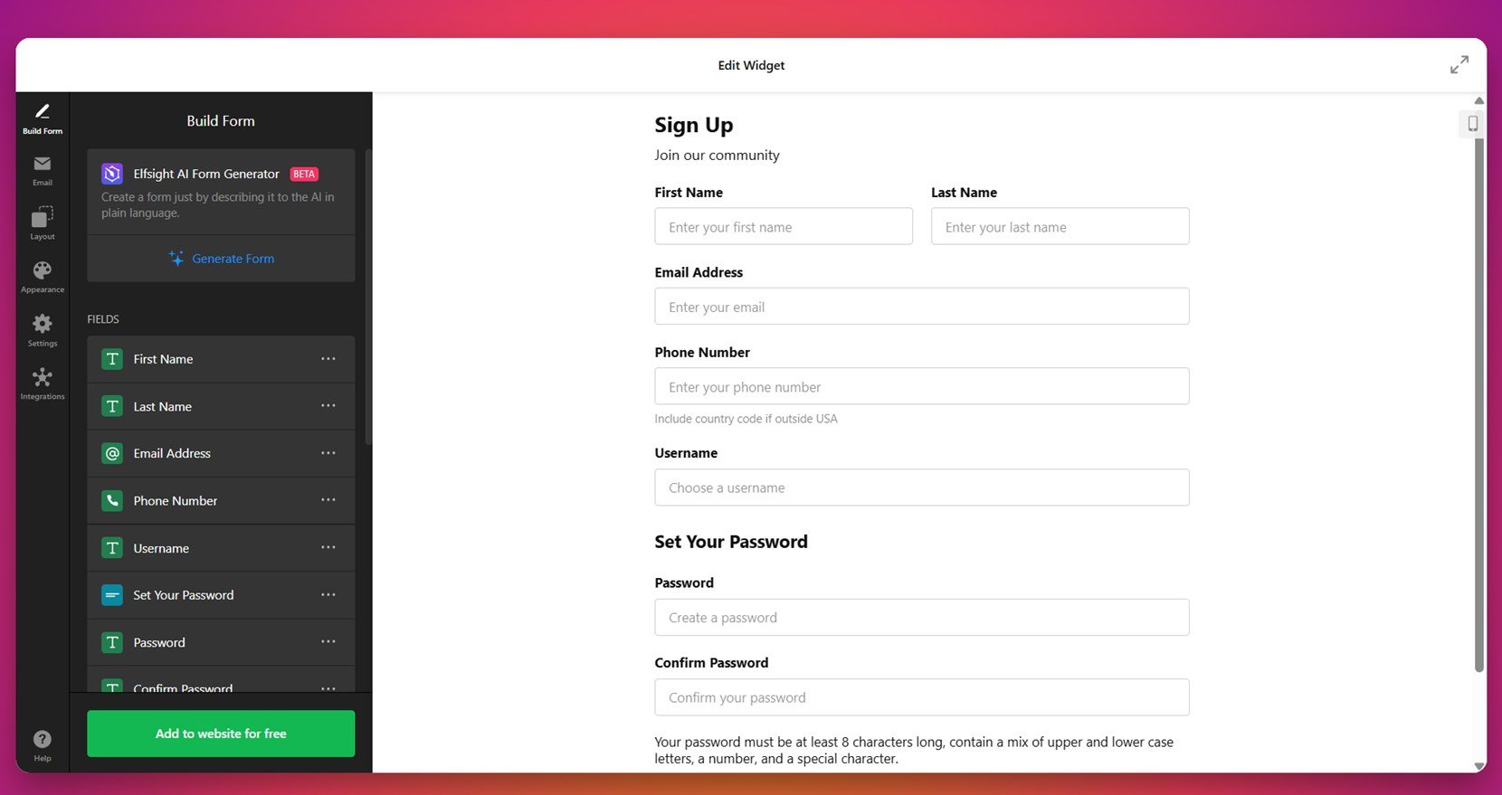
- Build your form. Under the “Build Form” tab, use the drag-and-drop field panel to add inputs like name, email, dropdowns, sliders, or checkboxes. You can also use the “AI Form Generator” to create a form from a simple description, saving time and effort.

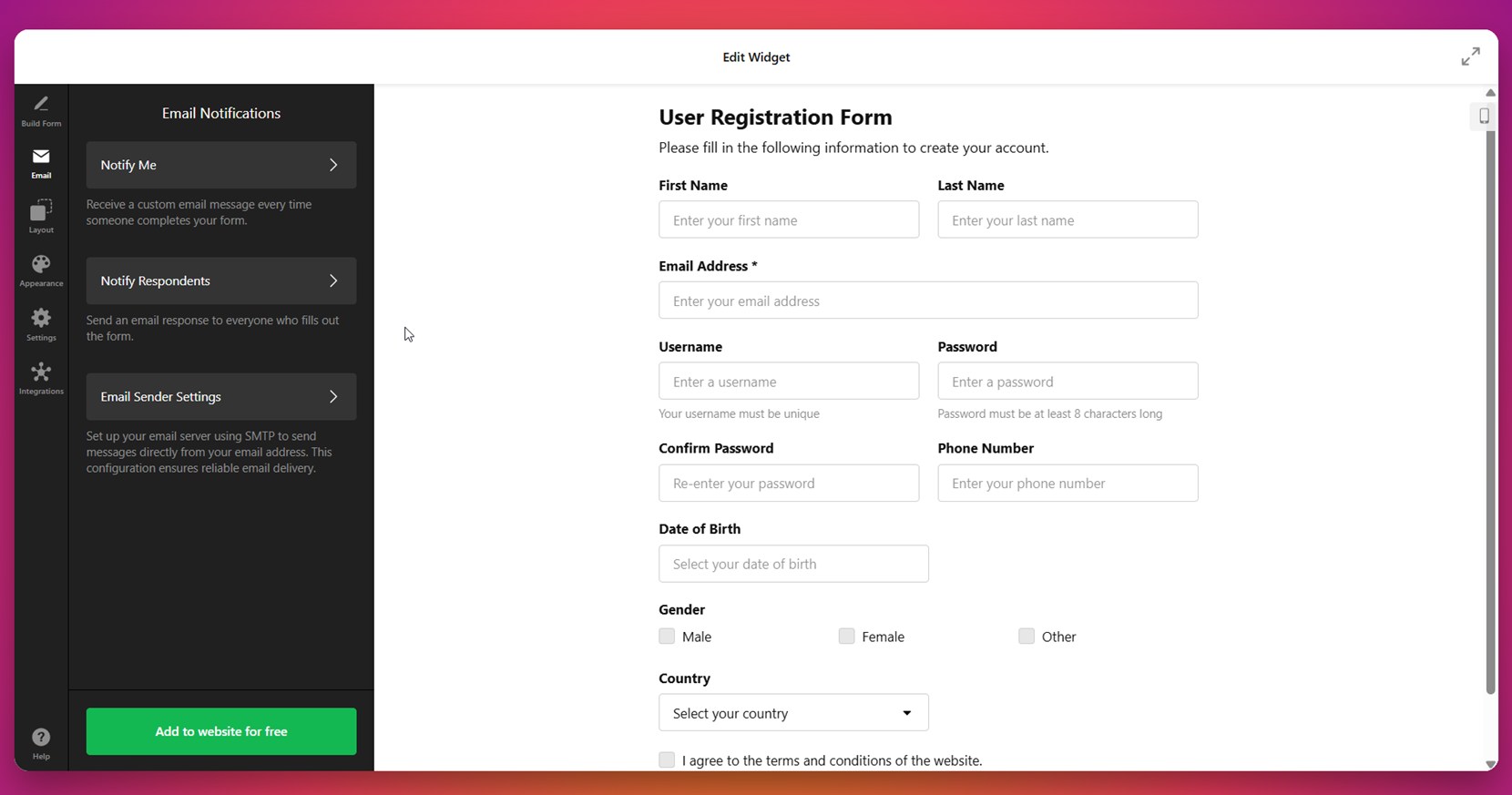
- Configure email notifications. Switch to the “Email” tab to set up who gets notified when someone fills out the form. Choose to alert yourself, your team, or send a confirmation to the user. You can customize sender info, message subject, and the email body for clarity and branding.
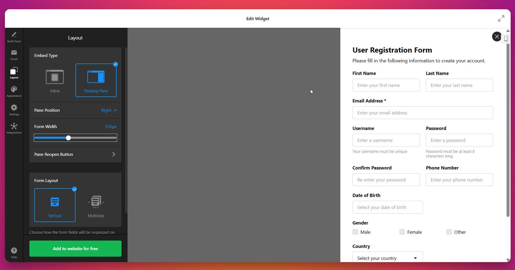
- Adjust layout and structure. In the “Layout” section, pick how the form should display — inline within the content, floating at the edge, or as a multistep process. You can adjust the width and alignment, and choose vertical or horizontal layout modes to support mobile and desktop users alike.

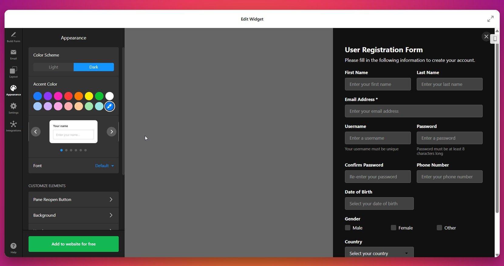
- Style the form. Open the “Appearance” tab to customize the design. Select fonts, colors, background styling, and button shapes. Tailor everything to match your website’s branding, from headline text to section dividers.

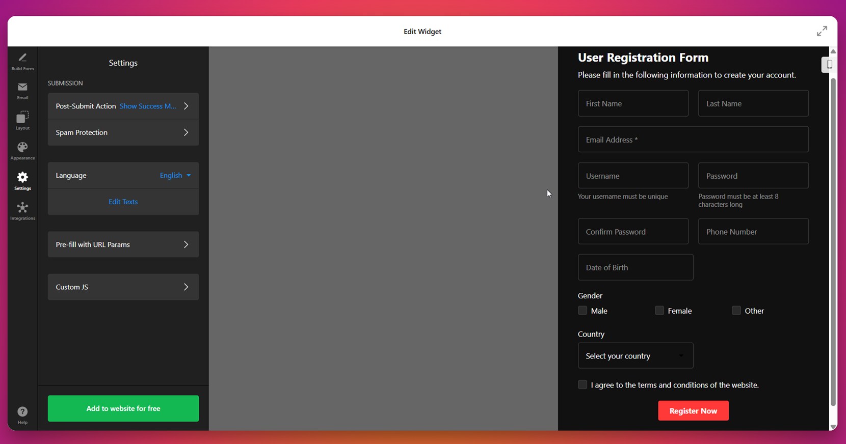
- Tweak behavior and security. Under “Settings”, define what happens after submission. Enable spam protection like CAPTCHA, add custom thank-you messages, redirect users to another page, and enable pre-filled field data using URL parameters.

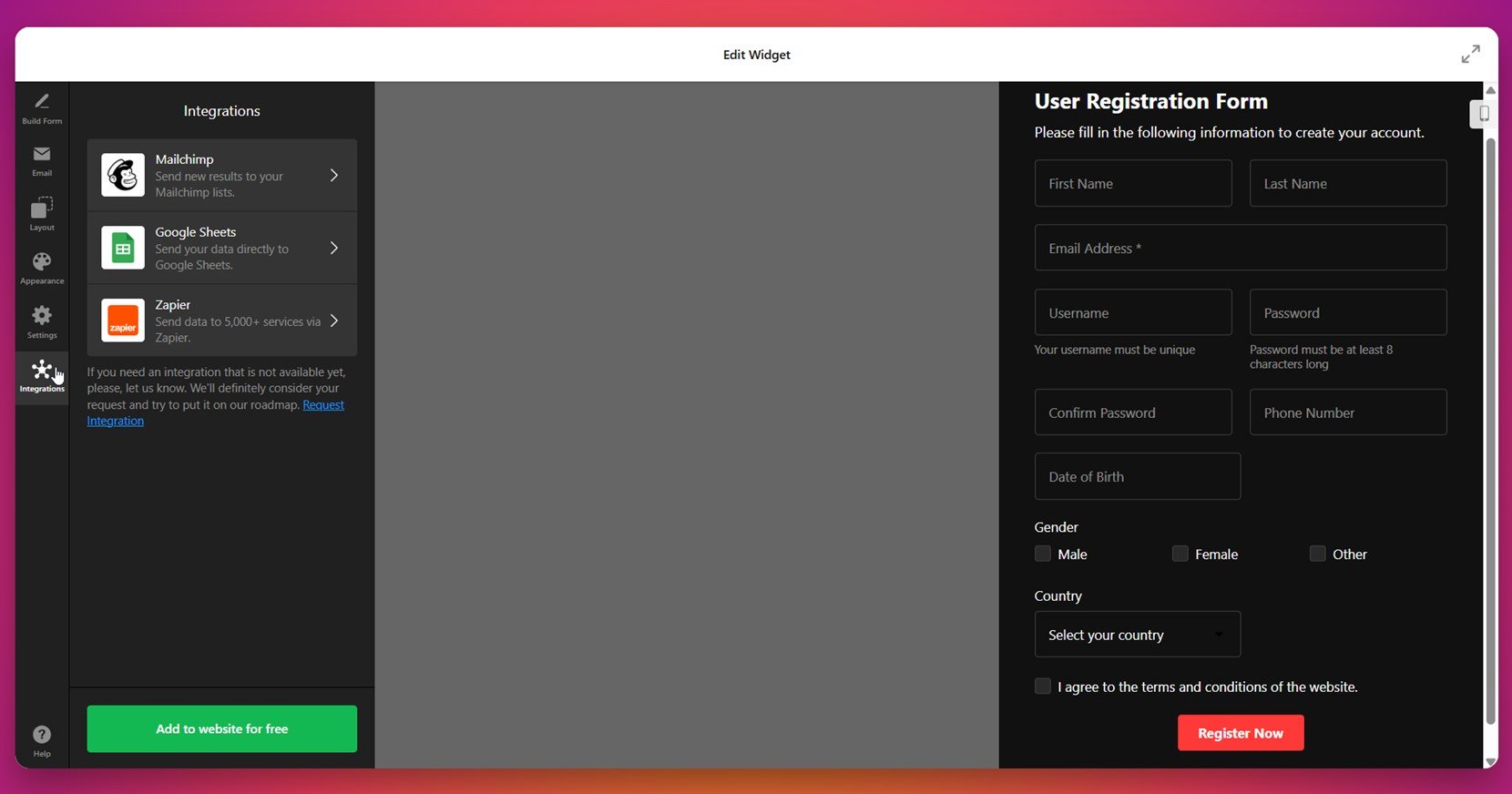
- Connect integrations. In the “Integrations” tab, you can connect your form with external services such as Mailchimp, Google Sheets, or Zapier. This helps automate workflows, collect subscriber data, or push form entries directly to your CRM or project tools.
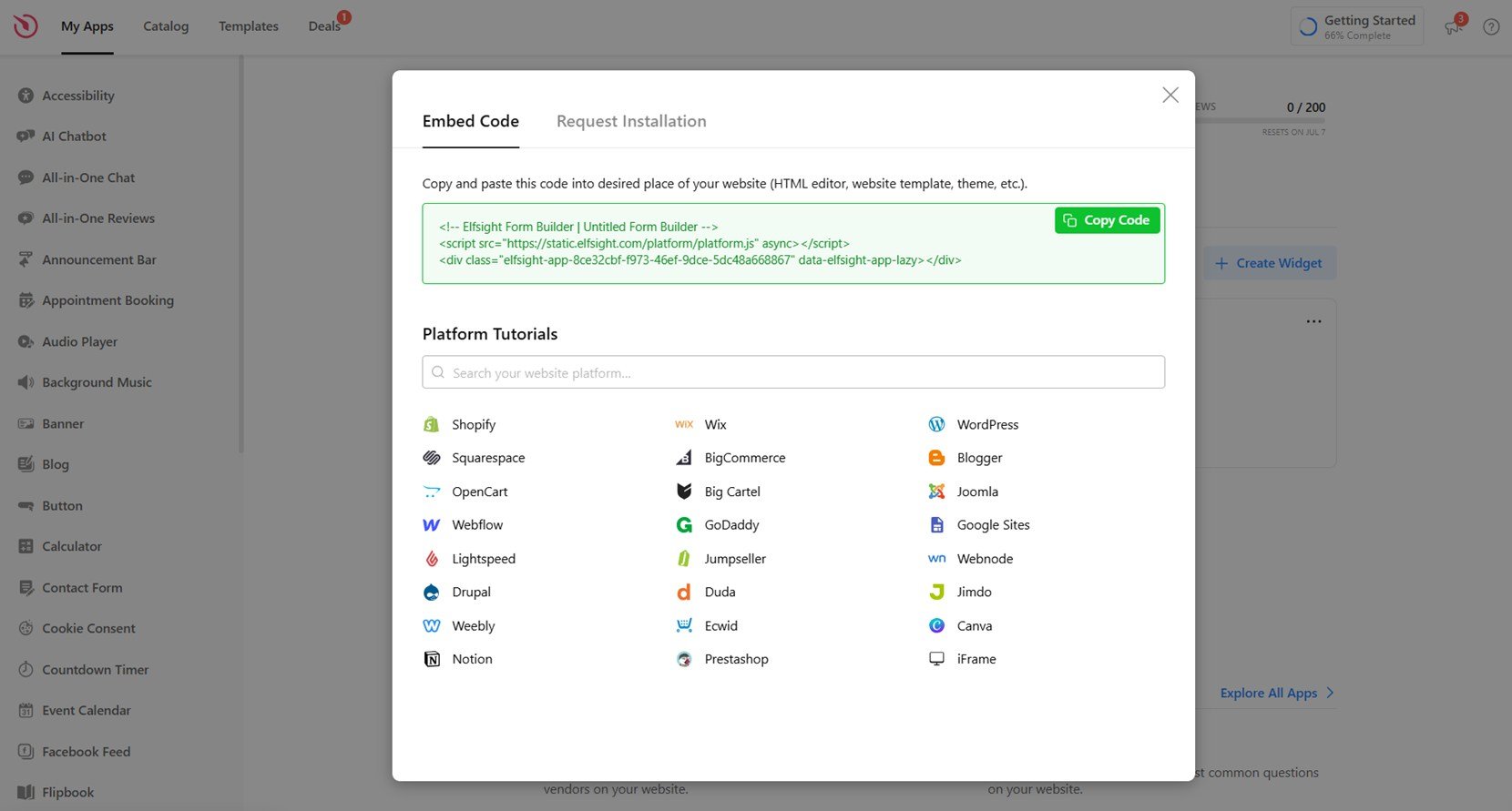
- Embed the form on your website. Click “Add to website for free” to generate your embed code. Copy and paste this code into your website’s HTML section or embed block. Once saved, your form will be instantly live and ready to capture submissions.

Whether you’re collecting signups, feedback, or inquiries, this setup ensures your form is easy to manage and perfectly integrated into your website. With Elfsight, you have full control — from structure to styling to automation — all without touching a single line of code.
Design your web form right now with our intuitive Form Builder!
FAQ
What’s the best way to handle long forms without overwhelming users?
How should forms be optimized for accessibility?
Can I use icons or images inside form fields?
What’s a good post-submission experience to offer?
Should I use inline or floating labels?
Conclusion
Designing the best web forms means balancing clarity, structure, and accessibility. In this article, we started with the importance of effective web form design and how it directly influences user engagement. We explored core principles like intuitive structure, field minimization, and validation practices, then moved into design best practices — covering visual hierarchy, spacing, and responsive layouts that ensure consistency across all devices. Every step focused on creating forms that are accessible, easy to complete, and visually clear — the essential traits of high-performing, user-centric web forms.