One Widget Platform. Unlimited Website Solutions.
Transform your website with the smartest widgets on the market. Elfsight is the industry leader, trusted by millions for AI-powered tools that save time, cut costs, and deliver modern, must-have solutions for any website.
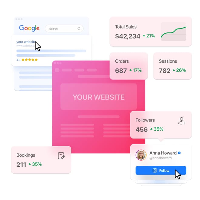
Marketing and Growth
Drive Website Growth with Smart Marketing
Get more traffic, generate leads, and boost conversions with smart widgets. Maximize your website’s potential and fuel unstoppable growth.
Conversion Optimization
Improve Your Website's Conversion Rates
Optimize your website to guide visitors toward action. Our innovative widgets are here to maximize sales potential.
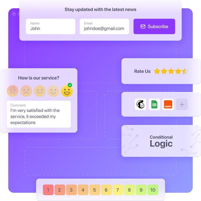
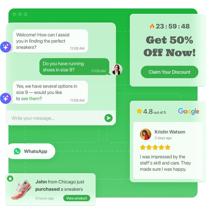
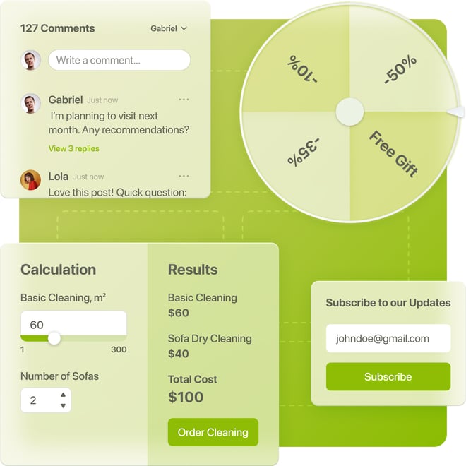
Data Collection
Simple Tools to Collect Anything on Your Website
From messages to bookings, feedback, and emails—our easy-to-use widgets help you gather the information you need without any hassle.
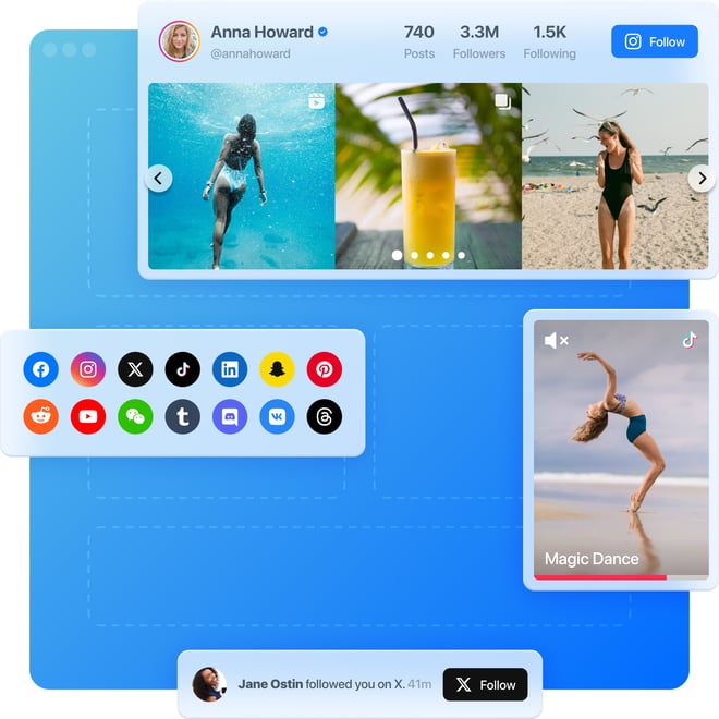
Social Media Growth
Link Your Website to Social Success
Integrate your website with social media to grow followers, likes, and engagement. Make your page a driver of social growth.
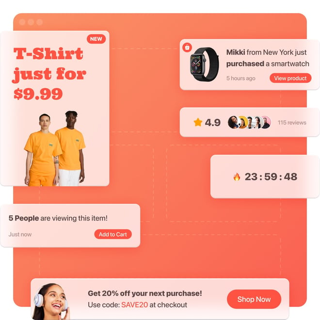
E-Commerce Solutions
Turn Your Online Store into Sales Machine
Boost online sales with seamless shopping experiences. Discover powerful widgets that create urgency, showcase products, and drive conversions on your website.
User Engagement
Make Your Website a Visitor Magnet
Engage, captivate, and retain users with interactive widgets. Keep visitors hooked and coming back for more.
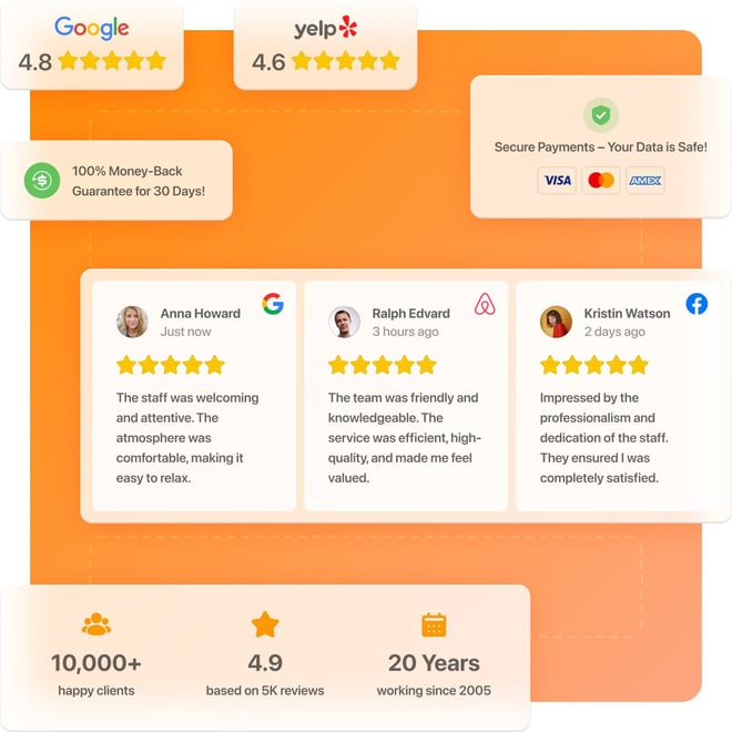
Trust & Credibility
Build Trust Through Your Website
Display real reviews, ratings, and achievements with our user-friendly widgets. Give visitors the confidence to choose you.
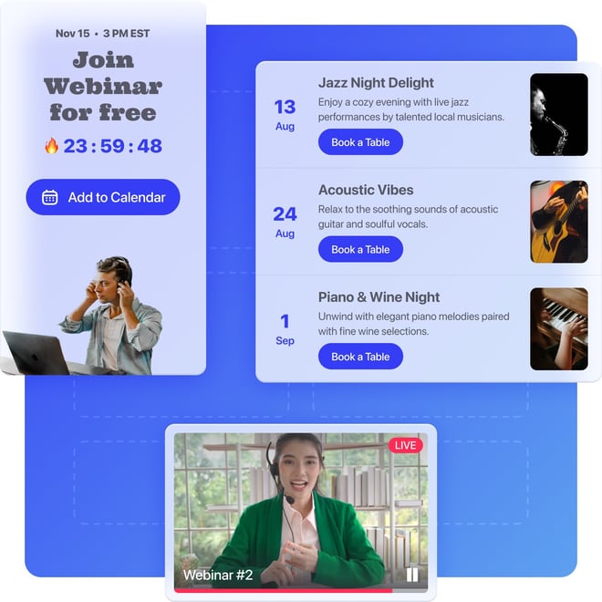
Events & Announcements
Create Buzz with Events on Your Website
Transform your announcements process with our user-friendly widgets. Effortlessly create excitement, ensuring every occasion is well-attended.
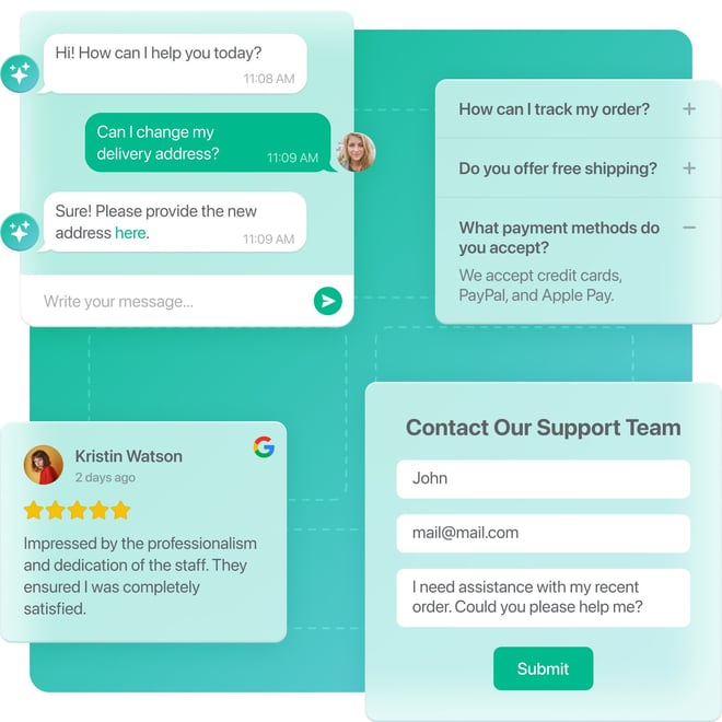
Customer Support
Deliver Next-Level Support on Your Website
Provide real-time support with user-friendly widgets. Improve customer satisfaction and streamline communication on your website.
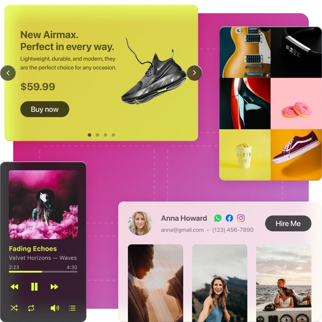
Design and Content
Make Your Website Visually Stunning
Enhance website design, showcase visuals, and bring your brand to life. Use dynamic widgets to share your brand’s personality.
Industries
Ready-to-Use Website Solutions for Any Industry
Small businesses, agencies, and global brands – over 2,000,000 websites use Elfsight’s AI-driven widgets to enhance their online impact