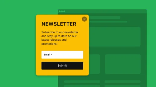
What is a Recent Sales Notification Popup?
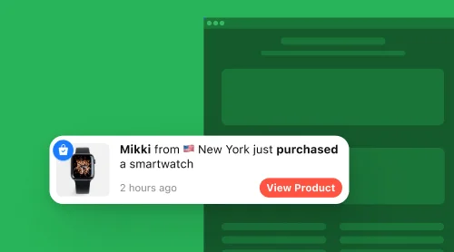
A Recent Sales Notification Popup is an e-commerce marketing tool designed to display real-time-like notifications showcasing recent purchases made by other customers on a website. Typically, it appears as a small notification box that displays information about recent sales, such as the product name, location of the customer, and time of purchase.
The idea behind this tactic is to create a sense of urgency and social proof, which makes it in high demand by many e-commerce businesses nowadays. Catch the attention of website visitors and make them feel like they are missing out on a great deal.
If you’re wondering how to create a Recent Sales Notification Popup for your website and which tools can help you implement it effectively, we’re here to guide you through the process.
Quickest way to create a recent sales notification popup
The easiest way to add Recent Sales notifications to your website is by using a third-party app, like the Sales Notification widget from Elfsight. With this tool, you don’t need coding skills, programming knowledge, or design experience to create a visually appealing popup.
It’s simple, hassle-free, and perfect for anyone looking for a straightforward solution without unnecessary complications. Here’s how you can create a Recent Sales Notification popup in no time:
- Start building your widget in a simple, user-friendly editor.
- Choose the template from the available options, add the notification and start the customization of the design to fit your website.
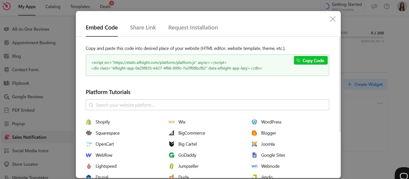
- Get the generated HTML code to embed.
- Paste the code into the HTML area of your website where you want the popup to appear. Save and publish your changes to make the Recent Sales Notification popup live!
That’s it! You can easily create and embed a Recent Sales Notification popup that enhances your site.
Try the editor below to see how effortlessly you can craft a widget tailored to your needs!
How to Create a Recent Sales Notification Popup: Detailed Guide
Let’s walk through the simple steps to create and embed a Recent Sales Notification popup on your website. Follow the step-by-step instructions below to set up a custom widget that suits your needs perfectly.
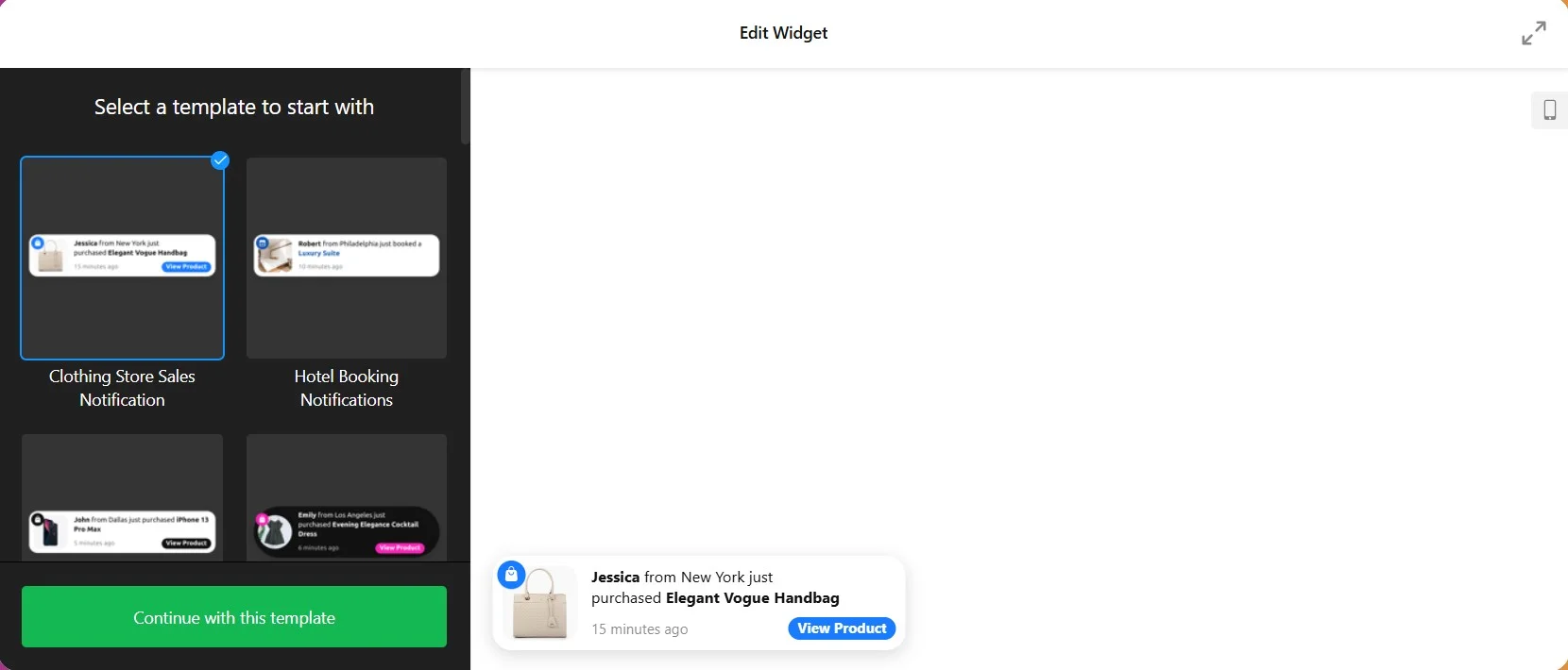
- Select a suitable template
Start by choosing a template that works best for your website’s style and purpose. Elfsight offers a variety of ready-to-use templates to help you get started quickly. - Add notification data
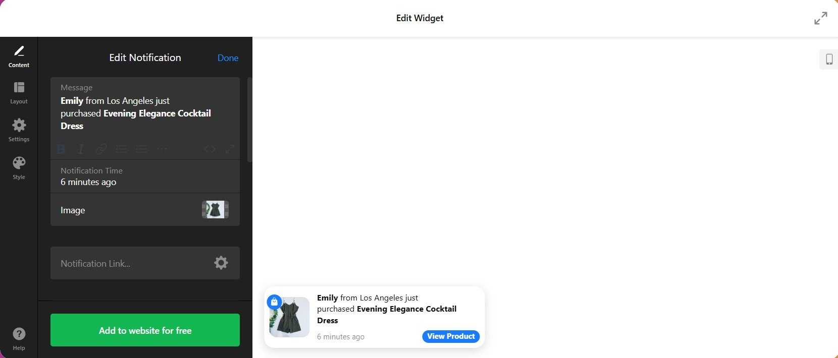
You can showcase details like the product name, customer name and location, and purchase time to make your notifications engaging and relevant. - Customize design and layout
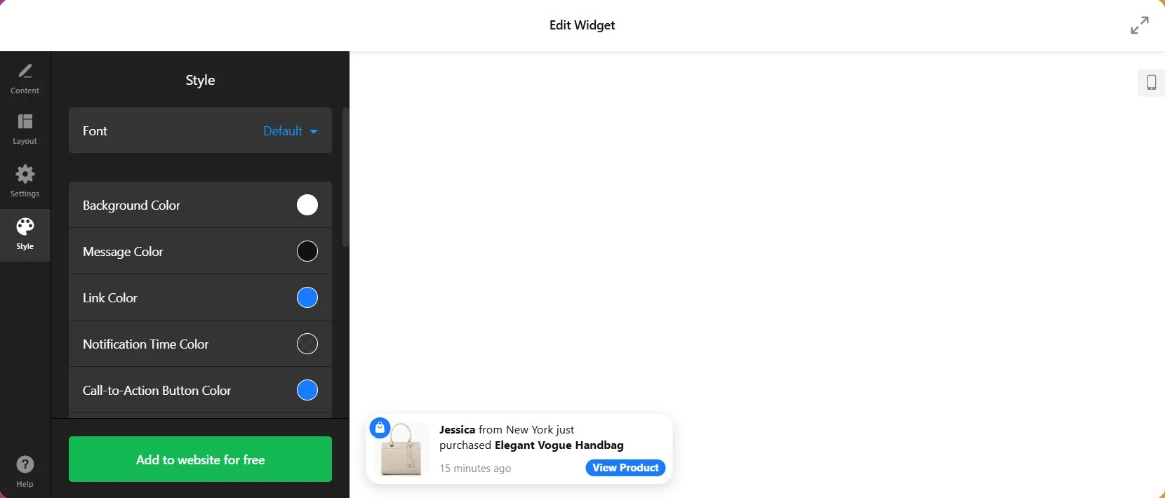
Tailor the widget’s appearance to match your website. Adjust colors, fonts, images, and layout. Add compelling text and visuals to capture your visitors’ attention and create a visually appealing design. - Adjust settings
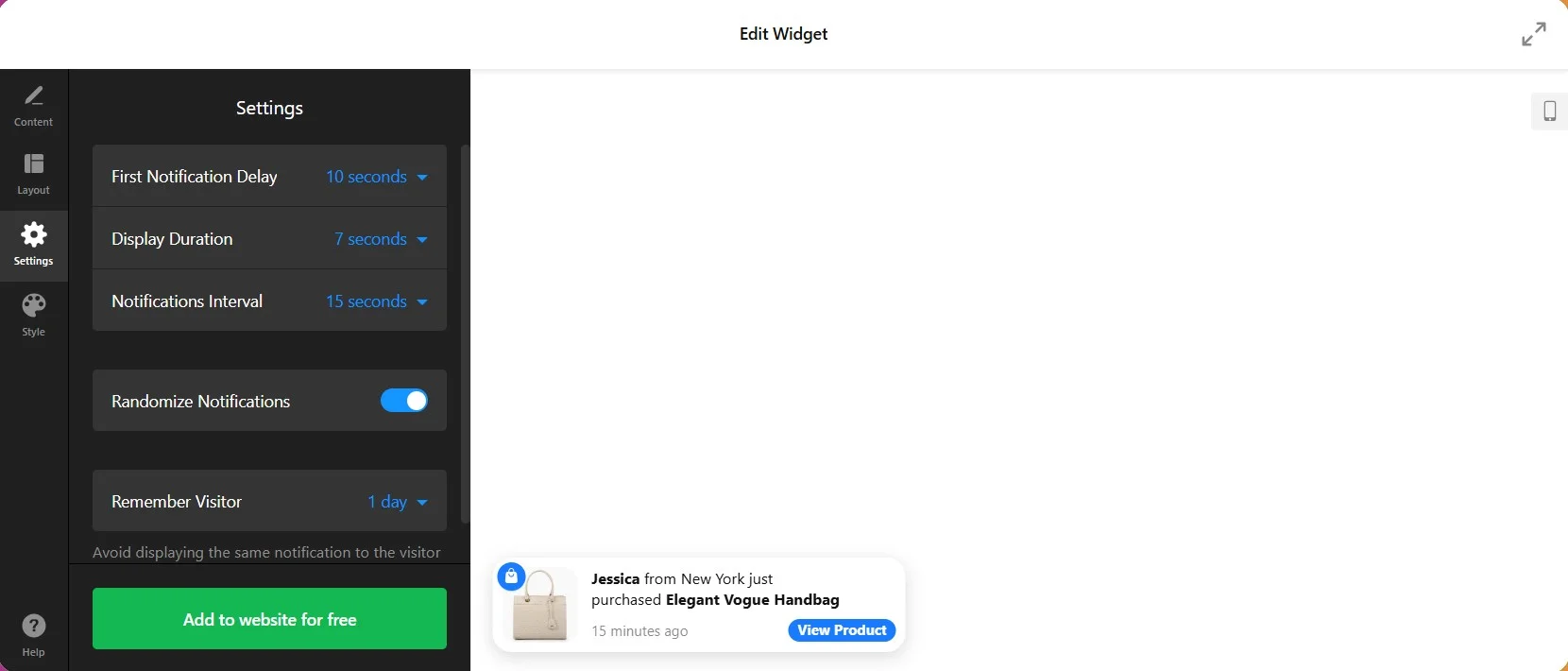
Decide when and where your notification will appear. You can configure the first notification delay, display duration, notifications interval, and target specific pages or devices to ensure the notification reaches the right audience at the right time. - Get the embed code
Once you’re happy with your design, click “Add to website” and “Publish” to generate the HTML code. This unique code is ready to be embedded on your site. - Embed the widget on your website
Insert the HTML code into the desired location on your website’s page. Whether you use WordPress, Shopify, or any other platform, the widget will integrate seamlessly.
By following these steps, you can easily add a Recent Sales Notification popup to your website and start engaging your visitors with dynamic sales updates!
How to Integrate Recent Sales Notification Widget on Your Website Builder or CMS
Most popular platforms are quite friendly to third-party tools, like Elfsight’s widget. We prepared short manuals on how to display recent sales popups on a website of your preference.
Add Recent Sales Popup to an HTML Website
Adding a recent sales notification popup to an HTML website is easy. Just follow these steps:
- Access your website’s backend. Ensure you can edit the HTML code directly.
- Paste the Elfsight widget installation code where you want the notification popup to appear.
- Save your changes and verify the popup is functioning as intended.
Watch this short video to see how you can quickly add the Recent Sales Popup to any HTML-based website.
Add Recent Sales Popup to a WordPress Website
Integrating recent sales notification on WordPress is simple with this quick guide:
- Log in to your WordPress admin panel.
- Navigate to Pages and select the desired page.
- Add a Custom HTML block to the page and paste the Elfsight widget code.
- Click Update to save and preview the popup live on your site.
Add Recent Sales Popup to a Wix Website
To embed a recent sales popup to Wix, follow these steps:
- Open the Wix editor for your site.
- Click the Add button, select Embed Code, and choose Embed HTML.
- Paste the Elfsight widget code in the HTML block.
- Resize and position the widget, then publish your changes.
Add Recent Sales Popup to a Shopify Website
For adding a sales notification popup to Shopify take just a few steps:
- Log in to your Shopify admin panel and go to Online Store > Themes.
- Select Customize, add a new Custom Content section, and choose Custom HTML.
- Paste the Elfsight widget code into the block and save your changes.
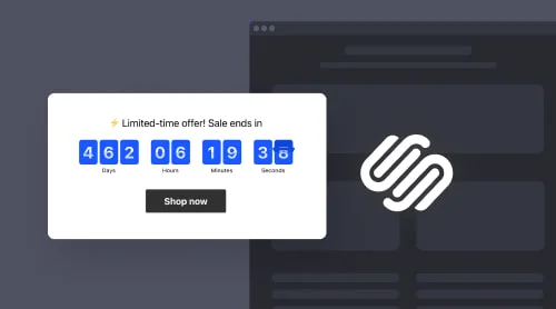
Add Recent Sales Popup to a Squarespace Website
For Squarespace, embedding the sales notification plugin requires a few steps:
- Log in to your Squarespace account and open the editor for your desired page.
- Click Add Section, choose Code, and insert the Elfsight widget code.
- Adjust the placement and save your updates to display the popup.
Add Recent Sales Popup to a Webflow Website
To add a recent sales notification to Webflow, follow this quick guide:
- Log in to your Webflow account and open your site’s editor.
- Drag an Embed element to the desired location on your page.
- Paste the Elfsight widget code in the Embed editor, save, and publish your changes.
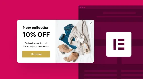
Add Recent Sales Popup to an Elementor Website
Embeding a sales notification to Elementor takes the following quick steps:
- Open the page editor in Elementor via your WordPress admin panel.
- Drag and drop an HTML element onto your page.
- Insert the Elfsight widget code in the HTML field, then update and preview your changes.
These simple steps allow you to display a Recent Sales Notification popup on the most popular platforms without hassle!
Recent Sales Notification Popups Best Practices
Successful companies have mastered the art of implementing Recent Sales popups effectively. Here are the top ten commonly-used practices to follow:
1. Use pre-designed popup templates
One of the practical things you can do is stop creating the popups from scratch. It takes time and lots of effort, skills, and knowledge to make one look professional. It’s much easier to pick a ready-to-use template and to change it a bit rather than learn how to write HTML code.
The Recent Sales Notification popups come in different types and styles, allowing website owners to choose the one that best suits their brand and marketing goals.
2. Create a sense of scarcity and high-volume sales with the popup
Encourage potential customers to take action by adding a call to action. Craft clear and engaging messages that include recent purchase details, urgency-inducing elements, and credibility-building factors like customer locations. The goal is to guide potential customers towards action and reinforce their purchasing decision.
Remember to keep the message short, clear, and engaging to maximize its impact and effectiveness of your popups.
3. Be strategic with popup timing
Display the Recent Sales Notification popups at the right moment, such as when users reach particular pages, add items to their cart, or exhibit exit intent. This approach maximizes engagement without disrupting user experience.
Strike a balance between using the Recent Sales notification effectively and avoiding overly intrusive or annoying experiences for your website users. Regularly analyze the popup’s performance and gather feedback to make adjustments as needed.
4. Your popup positioning matters
The placement of the Recent Sales Notification popup on a website depends on your goal and the user experience you want to create. Whether it’s in the bottom right corner, across the screen, or as a sidebar notification, the positioning should enhance visibility and not interfere with main content.
Test different placements and analyze user behavior to determine the most effective and space-friendly approach for your particular website.
5. Clean and attractive popup design
Ensure your recent sales popup is clean and has a visually appealing design. Use simple layouts, eye-catching visuals, and legible text that aligns with your website’s aesthetics. Mobile responsiveness is also critical to maintaining effectiveness across different devices.
The ultimate goal of the design is to attract attention and provide relevant information for free.
6. Add a call-to-action button to your popup
A compelling call-to-action button on the Recent Sales Notification popup. is essential. It should be clear, such as “Shop Now” or “Learn More,” and direct users towards the desired action, whether it’s purchasing or exploring related offers.
The choice of call-to-action button text depends on the specific context of your HTML website, the nature of the product or service being promoted, and the action you want visitors to take. Try different free options to see which call-to-action button generates the most conversions for your website.
7. Spice things up in the popup with emojis
When creating Recent Sales Notification popups, it is important to use emojis that convey a sense of excitement and positivity.
However, make sure you don’t overuse emojis in order not to distract from the primary message. Also avoid confusing symbols that may be misinterpreted by your target audience.
Explore 40+ Best Notification Templates
Benefits of Using Recent Sales Notification Popups
Using the free Recent Sales Notification popups on your website or online store can provide several benefits:
| High level of credibility | Builds trust by showing real-time purchases, proving your business’s authenticity. |
| Increased conversions | Encourages action by leveraging FOMO when visitors see others actively buying. |
| Fostering a sense of community | Creates a feeling of belonging by showcasing other satisfied customers. |
| Psychological influence | Uses social proof to nudge visitors into following others’ buying behavior. |
| Drive repeat purchases | Promotes up-sells or cross-sells to encourage existing customers to buy again. |
It’s worth noting that while Recent Sales Notification popups can be effective, it’s essential to use them responsibly and ensure that the notifications are genuine. Try not to harm potentially your brand’s reputation.
Conclusion
Recent Sales Notification popups are a proven way to boost conversions, build trust, and improve your website’s customer experience. By learning how to create a recent sales notification using the Elfsight widget, you can easily design and customize these popups to suit your needs. Take advantage of their flexibility and benefits to turn your visitors into loyal customers.
Need More Info?
We hope this guide helped you understand how to create a recent sales popup for your website. If you’re looking for more details or need assistance, feel free to reach out. At Elfsight, we’re committed to providing simple and effective no-code widgets tailored to your business needs.
Explore our thriving Community, where users share ideas, tips, and success stories. Have suggestions or feature requests? Add them to our Wishlist — your feedback drives our innovation and ensures we deliver the best tools for your website. Find out more about the Sales Notification widget in our Help Center.
With the right implementation, you can significantly impact the website’s success and drive more sales!


