Today, having an accessible website is more than just a legal requirement — it is a crucial step toward creating an inclusive digital world. Accessibility ensures that every user, including those with disabilities, can interact with web content effectively, without obstacles. Whether navigating with a keyboard, using a screen reader, or adjusting visual settings, accessible design offers equal opportunities for everyone to engage with online information and services.
In this guide, we’ll explore real-world examples of accessible websites, highlight essential accessibility features, and share best practices for achieving compliance with standards like the Americans with Disabilities Act (ADA) and European Accessibility Act (EAA). From showcasing successful designs to analyzing common mistakes, this article will equip you with valuable insights to create a website that is not only compliant but genuinely user-centered.
Key Website Accessibility Features
Accessibility features make a website usable for everyone, regardless of ability. They remove digital barriers and optimize navigation for accessibility, ensuring that users with disabilities can easily interact with the content.
Several key accessibility features ensure that a website can meet the needs of diverse users. By incorporating the following elements, you create a more inclusive and user-friendly digital environment for everyone:
- Keyboard-friendly navigation. Ensure that all interactive components — such as forms, buttons, and menus — are fully operable without a mouse, supporting users who rely on keyboard commands.
- Screen reader optimization. Use semantic HTML elements and provide descriptive ARIA labels to help screen readers interpret content accurately and guide users through the page structure efficiently.
- High-contrast visuals. Maintain strong color contrast between text and background to improve readability for users with low vision, color blindness, or when viewing under challenging lighting conditions.
- Alt text for images. Provide meaningful alternative text descriptions for images, icons, and other visual elements so that users relying on screen readers can fully understand the visual context.
- Clear and consistent structure. Organize content using logical heading hierarchies, structured lists, and intuitive menus to make navigation predictable and easy to follow for all visitors.
- Adjustable text sizes. Allow users to easily resize text without breaking the layout, ensuring that content remains readable and visually accessible across different devices and personal preferences.
A well-organized heading structure benefits people who prefer scanning content quickly, while high-contrast text improves readability in various lighting conditions. Prioritizing accessibility from the ground up leads to better engagement, improved SEO performance, and a wider reach.
Examples of Accessible Design and Web Layouts
A strong accessible user interface focuses on clarity, ease of navigation, and intuitive interaction. Accessible web design examples typically prioritize the following elements to ensure a smoother experience for all users:
| Feature | Description |
|---|---|
| Logical navigation structures | Menus, links, and buttons are easy to locate, presented consistently, and fully operable via keyboard navigation. |
| Clear call-to-action buttons | Important actions are highlighted with clearly labeled, adequately sized buttons that are easy to access without precise cursor movement. |
| Minimalist and user-friendly forms | Forms use clear labels, logical tab orders, and provide error messages or hints to support assistive technology users. |
| Visible focus indicators | Interactive elements show a visible outline or styling when navigated by keyboard, helping users identify their location on the page. |
| Accessible multimedia content | Videos include captions and transcripts; audio content has text alternatives to support users with auditory impairments. |
Applying Universal Design Principles
Universal design principles focus on creating layouts that can be accessed, understood, and used to the greatest extent possible by all people, regardless of age, ability, or status. Key principles applied in accessible web design include:
- Flexibility and responsiveness. Designs that adapt seamlessly to various devices, orientations, and text scaling preferences without losing functionality.
- Consistency and predictability. Uniform color schemes, layout patterns, and navigational structures across all pages.
- Clarity and simplicity. Minimal clutter, sufficient whitespace, and clear distinction between content sections enhance readability and comprehension.
- Perceptible information. Important content is conveyed clearly through multiple sensory channels (text, visuals, sound) when possible, without relying solely on color or sound.
By thoughtfully applying these design elements and principles, web designers can create experiences that empower users with a wide range of abilities. Good accessible website design is rooted in empathy, anticipating user needs and removing obstacles before they arise.
How to Make Your Website Accessible: Simple Solution
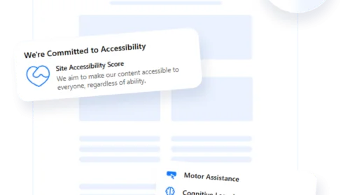
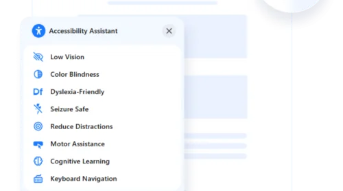
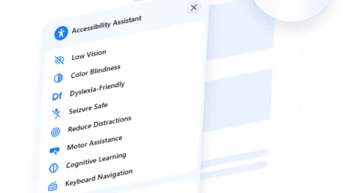
Ensuring your website complies with EAA standards is straightforward with the Elfsight accessibility widget. This intuitive, no-code tool helps you deploy a complete digital accessibility service with ease. Featuring ready-made assistive modes and a built-in auditing system, it addresses core items on the legal accessibility checklist and enhances the overall user experience.
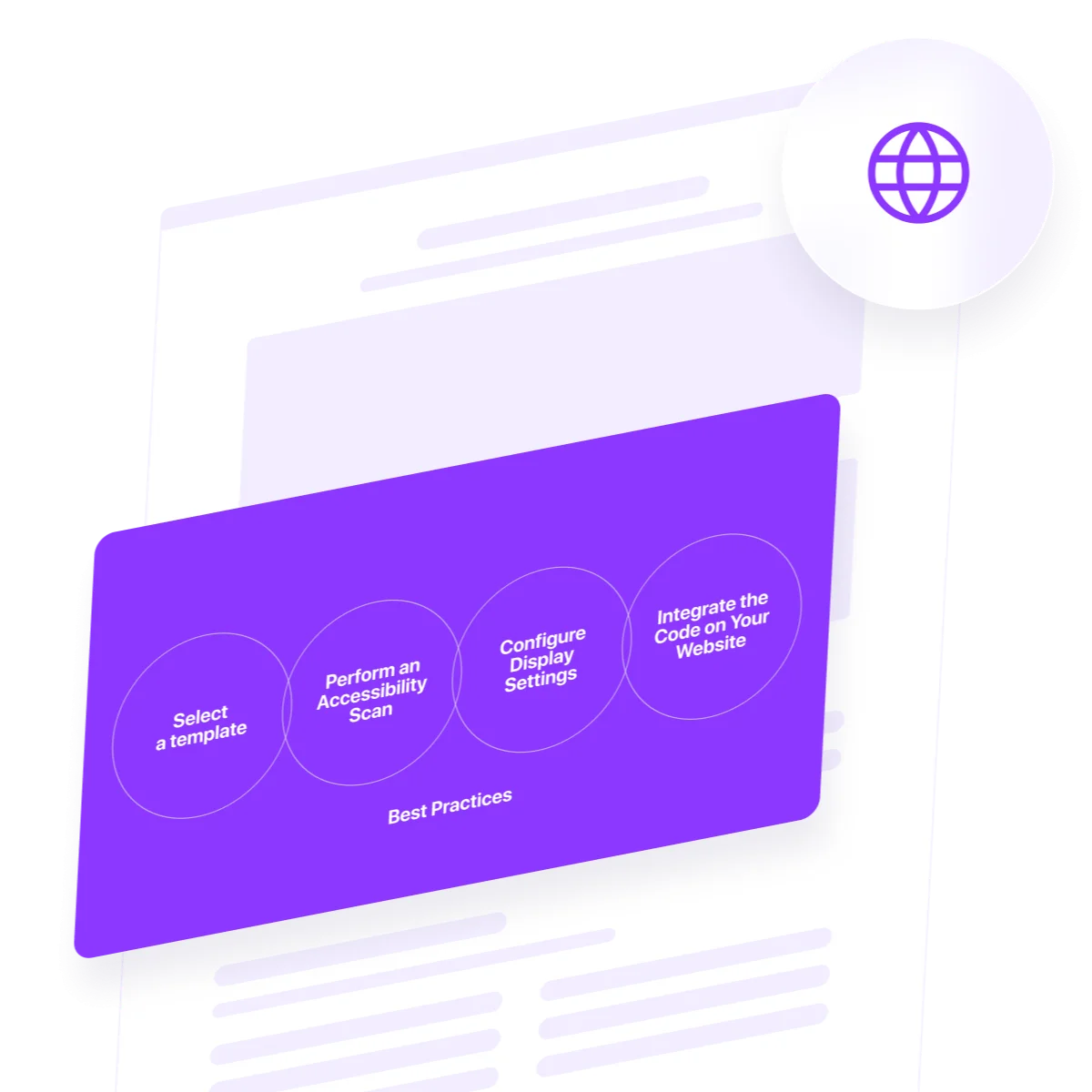
Here’s how to configure and launch the accessibility widget through the Elfsight editor:
- Select a Template. Launch the Elfsight editor and pick a template. Click “Continue with this template” to begin customizing.
- Perform an Accessibility Scan. On the welcome screen, input your website’s URL and click “Check”. The built-in tool scans for compliance issues and provides a summary of accessibility performance.
- Configure Display Settings. Open the “Settings” tab to adjust language, button behavior, widget positioning, and how long user preferences are remembered. Advanced users can also add Custom CSS or JavaScript for greater flexibility.
- Integrate the Code on Your Website. Click “Add to website for free” to get your embed code. Copy the snippet and place it in your website’s backend — preferably just before the </body> tag. Save and publish to activate the widget across all pages.
Once installed, your website will be equipped with a dynamic accessibility solution that helps satisfy EAA requirements and improves usability for all visitors. Elfsight’s solution is ideal for teams without coding expertise — letting you implement accessible design quickly and effectively.
See the widget in action – build your own in 1-2-3!
Good Examples of Accessible Websites
To understand how accessibility principles are successfully applied in the real world, it helps to explore websites that set the standard. Below are some of the most accessible websites that have built truly disability-friendly digital experiences. These accessible website examples demonstrate how thoughtful design choices and responsive layouts can remove barriers for all users and create a more inclusive digital landscape.
BBC News
BBC News remains a global benchmark for accessible journalism online. Every aspect of its design accommodates users who rely on alternative navigation methods. The website offers full keyboard functionality, enabling users to tab through articles, menus, multimedia players, and forms without ever requiring a mouse.
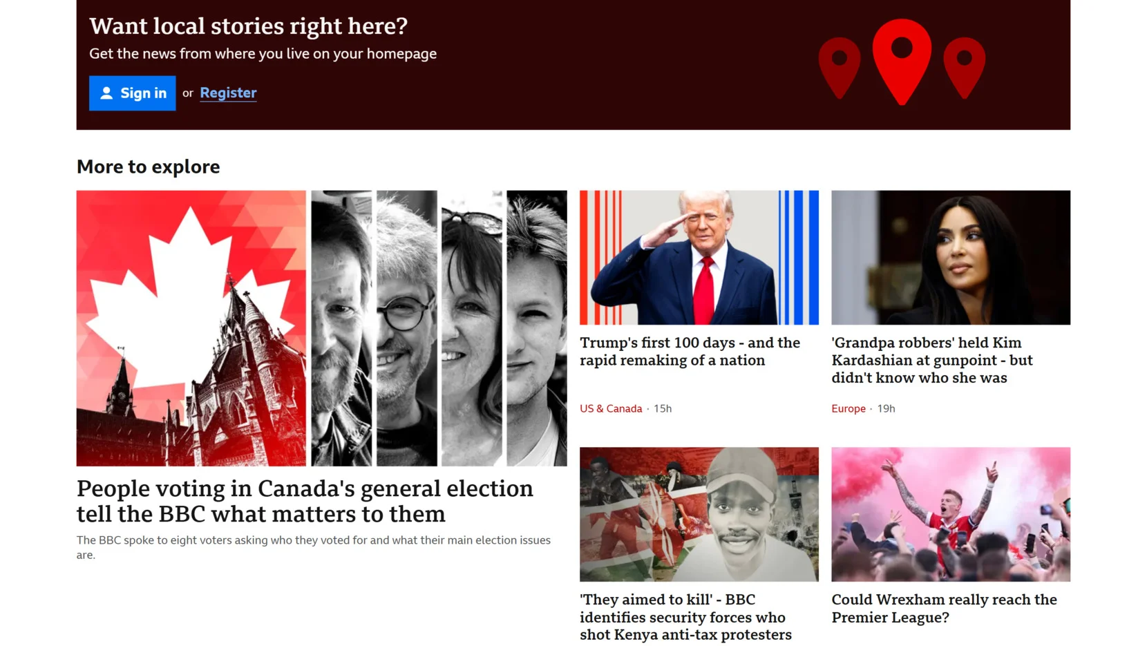
Clear focus indicators highlight the active element on the page, making it visually easy to track movement through the interface. Additionally, the use of semantic HTML ensures seamless integration with screen readers, while page layouts maintain readability even with text zoomed up to 200% without breaking the structure.
- Keyboard navigation support. Every page element is accessible using keyboard-only controls, ensuring users with motor impairments can fully navigate the website.
- Visible focus indicators. Interactive components like links, buttons, and form fields show distinct outlines when focused, aiding users in identifying their position easily.
- Screen reader optimization. Consistent use of heading levels, landmarks, and ARIA attributes helps assistive technologies convey page content accurately and efficiently.
Vasa Museum
The Vasa Museum’s digital presence exemplifies cognitive accessibility principles. Recognizing that users with cognitive and memory-related disabilities require clear navigation, the website offers structured breadcrumb trails that show exactly where a visitor is within the content hierarchy.
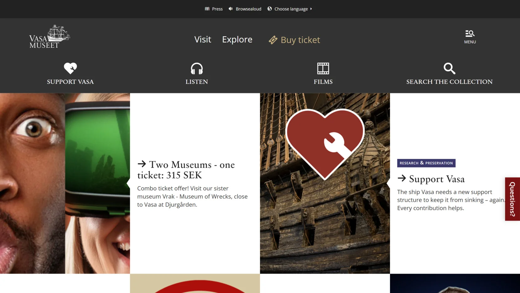
Each page is clean and minimalistic, reducing cognitive load by removing distractions like excessive links, flashing elements, or unnecessary popups. Additionally, consistent iconography and simple language throughout the website help visitors quickly understand actions and information without confusion.
- Breadcrumb navigation. Every page displays a breadcrumb trail, helping users maintain orientation and easily retrace their steps through multi-level navigation.
- Minimalist design layouts. Content is broken into manageable sections with limited distractions, enhancing focus for users with cognitive impairments.
- Simple, multilingual content. Plain language is used consistently, and the website provides easy-to-access language options for international users.
Scope (UK Charity)
Scope’s website demonstrates how visual accessibility can empower a broad spectrum of users. The color palette maintains extremely high contrast ratios, exceeding WCAG AA and AAA requirements, which makes text easily readable even under difficult visual conditions.
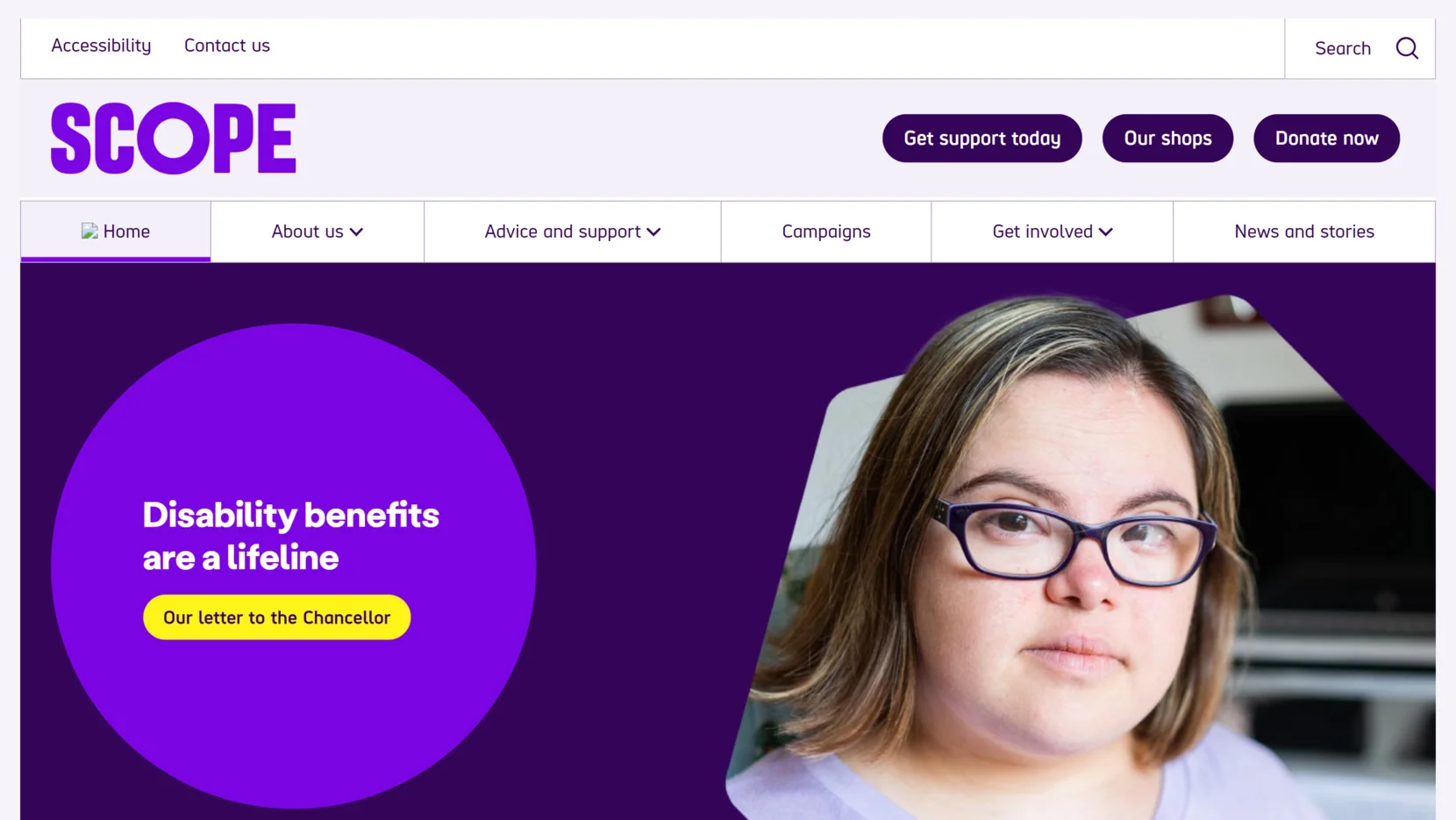
Navigation menus are straightforward, featuring large touch targets and unambiguous labeling, allowing easy access by users with both visual and motor impairments. Furthermore, alternative text is meticulously written for all images, icons, and functional graphics, ensuring that non-visual users still receive complete information through screen readers.
- High-contrast color schemes. Text and background colors have strong contrast, ensuring visibility for users with low vision or color blindness.
- Large, well-labeled interactive elements. Buttons, links, and form fields are large enough for easy selection and accompanied by clear textual cues.
- Extensive use of alt text. Descriptive alternative texts are applied to all non-text elements, making images and icons fully understandable through screen readers.
Apple
Apple’s commitment to accessibility is deeply ingrained in its digital ecosystem. The Apple website is built with semantic HTML, allowing assistive technologies like screen readers to accurately interpret and narrate content flow. Interactive media, including product videos and guided tours, are consistently accompanied by closed captions and detailed transcripts.
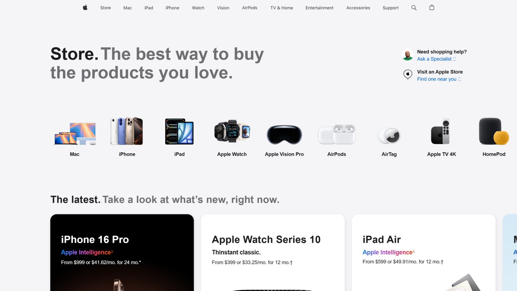
Accessibility extends to responsive design as well: font sizes can be enlarged dramatically without breaking layouts, and all interactive elements like sliders and product selectors remain fully functional with both keyboards and screen readers.
- Semantic HTML and ARIA attributes. Proper use of HTML5 structural elements and ARIA labels ensure screen readers navigate content logically and informatively.
- Inclusive multimedia content. Videos and animations are supplemented with captions and transcripts, supporting users with auditory disabilities.
- Scalable, responsive text. Users can enlarge text up to 200–300% without losing functionality or disrupting layout coherence.
GOV.UK
GOV.UK is the flagship example of accessible government services online. Its design philosophy revolves around simplicity and clarity, making public information accessible to the broadest possible audience. Content is structured hierarchically, beginning with clear page titles and proceeding with logical headings and paragraphs.
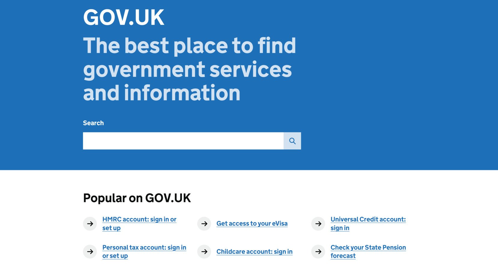
The use of plain English writing minimizes misunderstanding, making complex legal or administrative information easier to digest. Every page is fully navigable using keyboard commands, and all focus states are clearly styled, ensuring that users can navigate intuitively without ever needing a mouse.
- Logical content hierarchy. Structured use of headings and paragraph divisions improves both scanning for readers and navigation for screen reader users.
- Plain language communication. Information is presented in clear, simple English, accommodating users with lower literacy levels or cognitive impairments.
- Full keyboard accessibility. All interactive elements, forms, and navigational structures are fully operable through keyboard controls alone.
These examples demonstrate that achieving accessibility is not simply about compliance but about designing with real people’s diverse needs in mind. By focusing on inclusive navigation, readable content, and user-centered design, these disability-friendly websites prove that accessibility enriches the digital experience for everyone.
ADA Compliant Website Examples and Best Practices
Building a website that complies with the Americans with Disabilities Act (ADA) is crucial for ensuring equal access to digital information and services. ADA compliant website examples show how thoughtful design, adherence to WCAG accessibility standards, and proactive usability practices can create experiences that serve everyone, regardless of ability. Below are two outstanding examples that illustrate how ADA website design principles are successfully implemented.
The White House
The White House website stands as a model of accessibility excellence for public institutions. Every element is meticulously designed to comply with WCAG 2.1 Level AA standards, ensuring that users with visual, auditory, cognitive, and motor disabilities can interact with content easily.
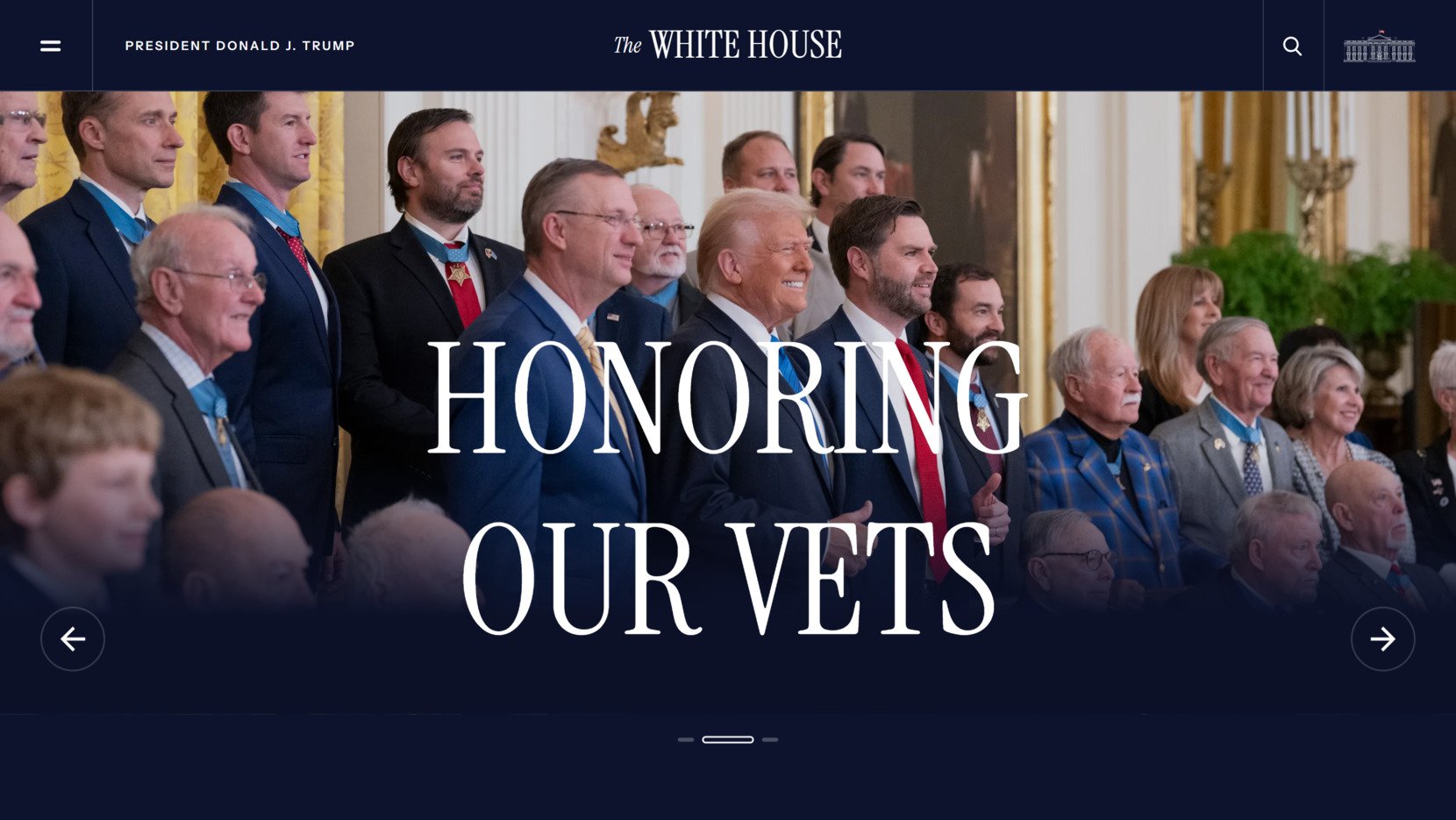
Text alternatives are available for all visual media, focus indicators are prominent for seamless keyboard navigation, and ARIA landmarks guide screen reader users efficiently through complex sections. Even when users adjust text size, change contrast, or navigate without a mouse, the website remains fully functional and user-friendly.
- Full WCAG 2.1 compliance. Incorporates success criteria for text alternatives, navigability, distinguishable content, and input assistance.
- Robust keyboard navigation. Every navigable component, from the main menu to interactive infographics, can be accessed without a mouse.
- Screen reader-optimized structure. Proper headings, skip links, and ARIA regions are employed to create a logical reading flow.
CNN
CNN demonstrates how a complex multimedia-heavy website can still meet ADA accessibility requirements without sacrificing user experience. The platform emphasizes providing full video transcripts and captions, allowing users with hearing impairments to access news coverage independently.
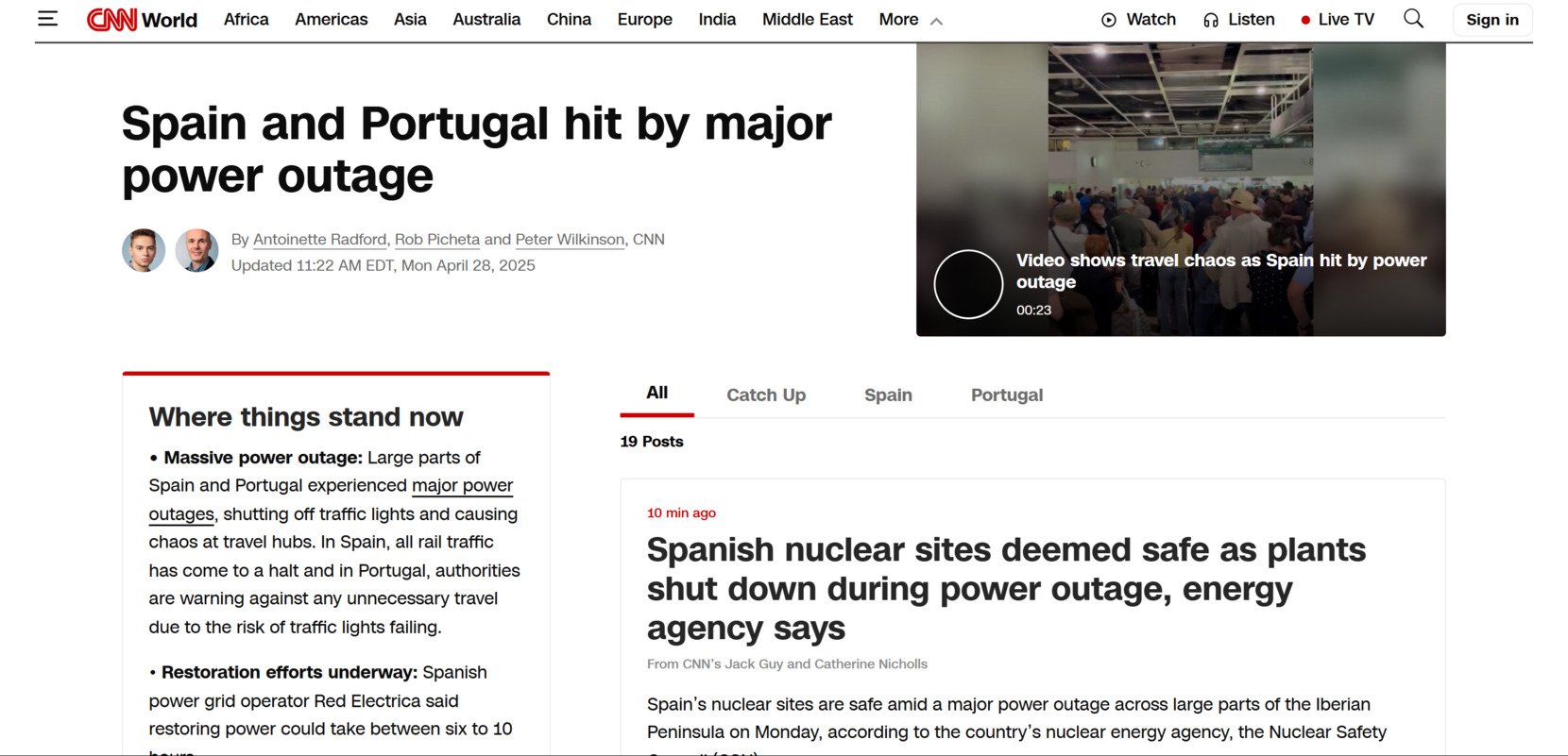
Navigation menus and interactive content such as video players are fully operable by keyboard. In addition, page layouts are clean and structured semantically, enabling screen readers to efficiently narrate articles, multimedia, and breaking news alerts without confusion or missing content.
- Comprehensive video accessibility. Every video segment includes transcripts and captions, ensuring news content is available to users with auditory disabilities.
- Keyboard-accessible multimedia controls. Users can pause, play, and navigate videos and galleries entirely using keyboard commands.
- Assistive-technology friendly content structure. Semantic HTML ensures compatibility with screen readers, making articles and multimedia accessible and navigable.
Checklist for ADA Compliant Website Design
- Ensure all non-text content has descriptive text alternatives (alt text, labels, captions).
- Structure content logically using headings, lists, and proper HTML5 elements.
- Make sure that all functionality is operable via a keyboard.
- Provide users with options to adjust text size and contrast without losing content functionality.
- Use ARIA roles, landmarks, and labels appropriately to enhance screen reader navigation.
- Test regularly with real assistive technology and conduct accessibility audits.
ADA compliance in website design goes beyond ticking boxes — it involves building user experiences that prioritize inclusivity at every step. The White House and CNN websites exemplify how adopting the WCAG accessibility standards not only fulfills legal requirements but also builds trust, improves usability, and ensures that digital spaces are open to all.
EAA Compliant Website Examples and Helpful Tips
The European Accessibility Act (EAA) expands digital accessibility requirements across the European Union, ensuring that products and services — including websites — are usable by people with disabilities.
EAA compliance is centered around universal accessibility principles, focusing on removing barriers and promoting inclusive web design for everyone. While the act officially targets businesses serving EU markets, its accessibility standards offer valuable guidelines for any organization aiming to create a more accessible online experience.
Below are two digital accessibility examples of websites that align with the EAA’s high standards, demonstrating how thoughtful design can fulfill legal requirements while enhancing usability for all users.
European Central Bank (ECB) Website
The European Central Bank website serves as a prime example of EAA-aligned accessibility in action. The platform is designed with cognitive accessibility in mind, offering structured navigation systems and consistent layouts that simplify browsing.
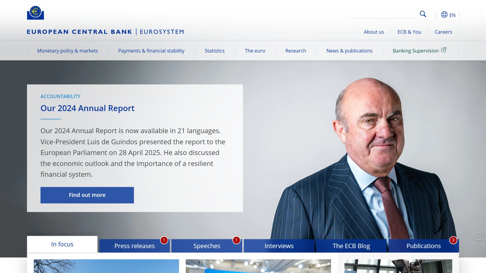
Multilingual support is fully integrated, allowing users to easily switch between major European languages without losing context. Additionally, the ECB’s use of scalable text and high-contrast options ensures that users with visual impairments can customize their reading experience while maintaining content structure and usability.
- Consistent navigation structure. Menus, links, and pathways are organized logically to aid comprehension and reduce cognitive strain.
- Multilingual access. Visitors can seamlessly switch between multiple official European languages from any page without navigation errors.
- Text scalability and contrast. Text can be resized, and visual contrast adjusted, maintaining clear readability across devices and preferences.
European Parliament Website
The European Parliament’s website demonstrates comprehensive alignment with the EAA’s core digital accessibility goals. Text resizing features are integrated without sacrificing layout integrity, empowering users to customize text display according to their needs. Color contrast settings ensure that users with low vision or color blindness can easily distinguish visual elements.
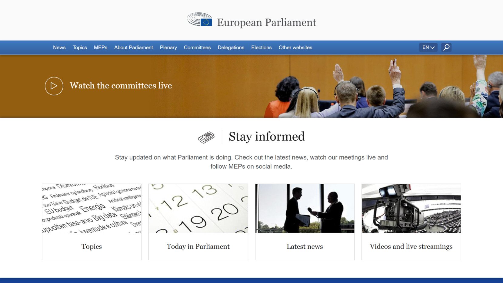
The website also offers a fully multilingual interface, respecting the linguistic diversity required by European standards. Every interactive element follows universal accessibility principles, making navigation straightforward for users of all abilities.
- Text resizing compatibility. Visitors can adjust font sizes without losing functionality or encountering horizontal scrolling issues.
- Strong color contrast. Text and critical UI elements maintain high contrast ratios for enhanced readability.
- Full multilingual support. Content is available in multiple languages with intuitive language selection options on every page.
Key Steps to Achieve EAA Accessibility Compliance
- Provide adaptable layouts that remain functional under text scaling and different screen resolutions.
- Offer multilingual access with accessible language selectors integrated into every page.
- Ensure that interactive elements have sufficient contrast and are operable via both keyboard and assistive technologies.
- Implement breadcrumb trails and clear hierarchical navigation structures to improve orientation.
- Regularly review content for readability, simplicity, and consistency across language versions.
Meeting EAA compliance is not only about fulfilling legal obligations — it represents a commitment to inclusive digital spaces where every user, regardless of language or ability, can participate fully. Websites like the European Central Bank and the European Parliament show that accessible design principles benefit all users and strengthen the online presence of organizations serving global audiences.
Inaccessible Website Examples
Understanding what leads to inaccessible websites is just as important as studying good design practices. Many digital platforms still face significant challenges with usability for people with disabilities, often due to oversights in design and development processes.
Here are two hypothetical examples of websites with bad accessibility practices, illustrating common mistakes and providing solutions to help improve accessibility for all users.
Example 1: Online Retailer Website
Many retail websites still fail to meet even basic accessibility standards. A lack of attention to screen reader compatibility and poor focus management can severely impact users with disabilities, making it difficult for them to browse, find products, or complete purchases independently.
| Accessibility Issue | Recommended Solution |
|---|---|
| Missing alt text on product images | Add descriptive alternative text to all images, especially those conveying essential information like product photos. |
| Keyboard traps in navigation menus | Ensure that all menu items are fully navigable via keyboard without users getting stuck or losing focus. |
| Improper heading structure | Use clear, sequential heading levels (H1, H2, H3) to organize content logically for screen reader users. |
| Low color contrast for CTA buttons | Increase contrast between text and button backgrounds to meet WCAG 2.1 contrast minimums for readability. |
These accessibility failures create major barriers for users with visual, cognitive, and motor disabilities. For instance, without alt text, visually impaired shoppers relying on screen readers cannot understand what products are being displayed.
Keyboard traps frustrate users who navigate without a mouse, sometimes making sections of the website completely inaccessible. Such oversights not only harm user experience but can also lead to significant revenue losses and legal risks for the retailer.
Example 2: Local Government Website
Government websites are expected to be highly accessible, yet many still struggle with accessibility compliance. Poor navigation structures, confusing layouts, and missing ARIA labels create significant barriers for users who rely on assistive technologies like screen readers.
| Accessibility Issue | Recommended Solution |
|---|---|
| Missing labels on form fields | Attach clear, descriptive labels to all form inputs to enable accurate screen reader interpretation and improve usability for everyone. |
| No skip navigation links | Implement a “Skip to main content” link at the beginning of each page to allow quick bypassing of repetitive navigation menus. |
| Inconsistent link styling | Ensure that all links are visually identifiable (e.g., underline) and clearly distinguishable from regular text without relying only on color. |
| Complex layouts with poor focus order | Design linear, logical content flows and ensure the tabbing order matches the visual reading order for assistive technology users. |
Accessibility gaps on government websites can have severe consequences, especially since these websites often provide critical information and services. Without proper labels, screen reader users may be unable to submit forms or complete important tasks like registering to vote or applying for benefits.
Missing skip links force users to manually tab through every menu item repeatedly, causing unnecessary frustration. Ensuring proper structure is not just about compliance — it ensures that public information remains accessible to everyone.
Examples of websites with bad accessibility practices highlight how small oversights can significantly impact usability for people with disabilities. Recognizing these challenges — and designing solutions proactively — is the first step toward achieving full accessibility compliance and delivering a truly inclusive digital experience.
Conclusion
Looking at accessible website examples across industries — from government services to global technology leaders — clearly shows that inclusive web design is not just a best practice; it is essential for creating meaningful digital experiences.
Prioritizing responsive accessibility practices such as keyboard navigation, semantic structure, high contrast visuals, and multilingual support helps remove barriers for millions of users around the world. Whether complying with the ADA, the EAA, or internal organizational standards, focusing on accessibility is a critical part of building a more inclusive digital future.