Pricing Table Features
Elements to help find the best deal
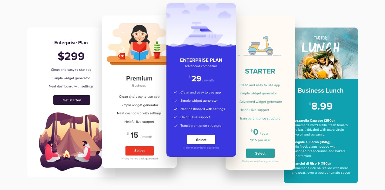
Set the elements with all the information your prospective customers need, so they can find what they’re looking for fast and make a payment right away.
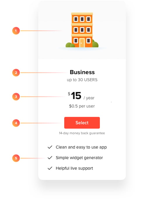
1. Picture. Visualization is important. Add images and they will create connection to your offers in users’ minds. Thus you can achieve better understanding and increase emotional value of your offers.
2. Title. It all starts with the name. Create the right titles for your offers that will reflect the main idea and speak the language of your audience to be clear and memorable.
3. Price. An essential element. Set the value of your offers clearly and add all details.
4. Button. An integral part. Place the button that will redirect users to the page where payment is done.
5. Features. The essence of the offer. Describe it to the fullest, let your customers know what they pay for and leave no doubts or questions.
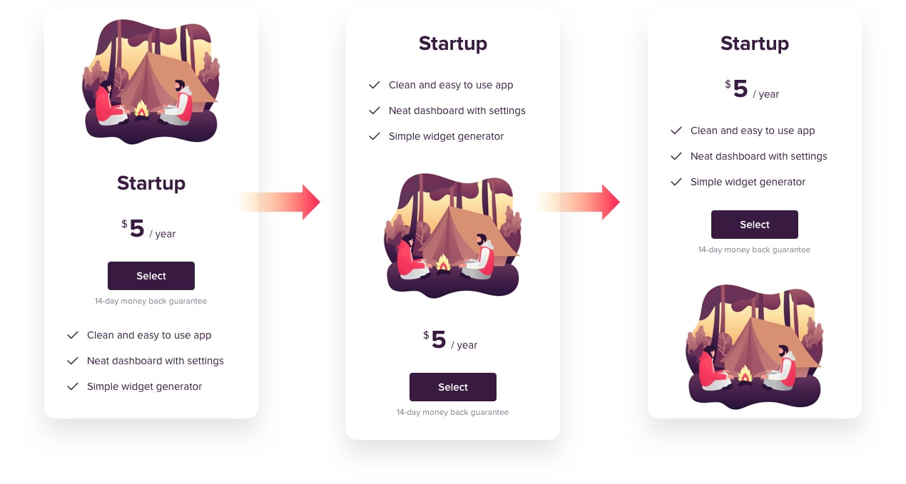
Flexible organization of the elements
Elfsight Pricing Table has flexible design of the columns, and you can change it right in the editor. You are free to set all the column elements in the order that you need for your pricing by drag-and-drop, or hide any of them by switching it off just in one click.
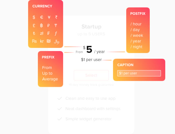
Build your price smartly
Elfsight Pricing Table allows you to show much more than just numbers. Our price element includes a box for prefix to indicate your price range, for example, “Up to”, or “From”; a price postfix that you can use to set the period of payment; and caption where you can show additional info. Our app has a library of about 100 currencies with symbols to make it handy for you and your clients.
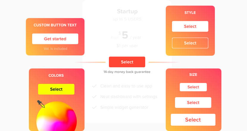
Make the button noticeable
The button is the final step toward the purchase, so make it irresistible. In one click, you can vary the size from S to L, depending on your needs. Choose Outline or Filled button style and pick the colors of the button and its caption out of the whole spectre.
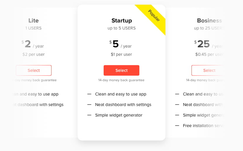
Put accents to your content
When you show an offer, which targets the biggest part of your potential clients or which is the most profitable for you, it’s essential to focus visitors’ attention on it. Make the corresponding column featured, applying this option in the Content tab, and the column will have a bigger size. You can also put a ribbon with text on it to catch the visitors’ eye.
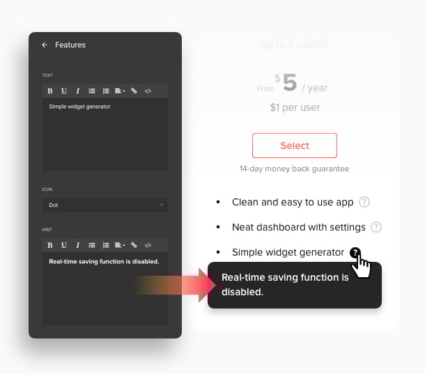
Show more info with hints on hover
Use hints to show more information about features. Just type your text in the Hint box in the settings of the column. A question mark icon will show next to the feature, and users will see all the additional info when hovering on the icon. Thus you will make interface clean, yet tell more about your offers.
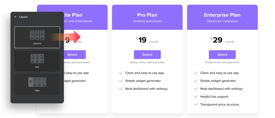
Columns layout for individual offers
If you offer several individual products or plans that differ in their types and features, you may want to accentuate their difference and show them as a range, not a grade. In this case, try Columns layout. It displays the offers as separate columns with a gutter, so you will demonstrate a full variety of free-standing products.
Grid design to show comparisons
When your offer includes a grade of plans, more and more loaded with advantages, it would be a good idea to put a focus on it. Grid layout will get this done perfectly! It shows columns as a single unit, so you can make them look a grade, where the number of benefits grows from offer to offer, convincing to choose the richest one.
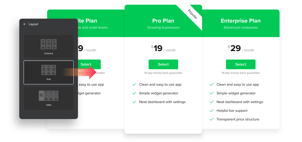
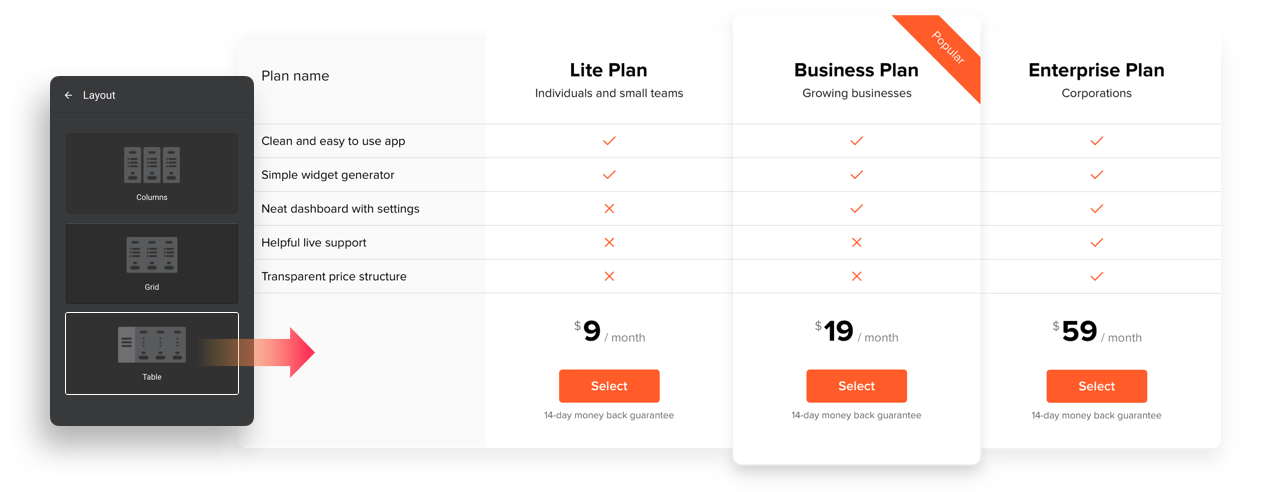
Table layout for maximum information
Would like to boast about all the advantages of your offers but don’t want to put too much text into the table? We have a perfect solution for this! Choose Table layout and you will only have to list all the features once – in the table head. The columns will only show a tick or cross sign depending on whether the feature is present on the plan or not.
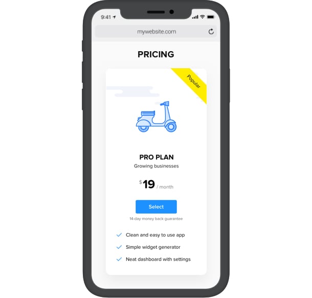
Mobile responsive interface for the comfort of your users
Our app is adaptive to the screen resolution and automatically adjusts on various devices to look its best. For example, you will see the columns change the layout from horizontal to scrollable vertical if you try mobile option in the editor. Tablet interface makes the columns narrower and more compact.
4 balanced table skins
Elfsight Pricing Table offers you to choose one of the four well-designed skins, allowing to create a really trendy look. From more color-intense and dynamic to minimalist and clean – all the skins allow for color variations, so you can use all your taste and talent in shaping your widget.
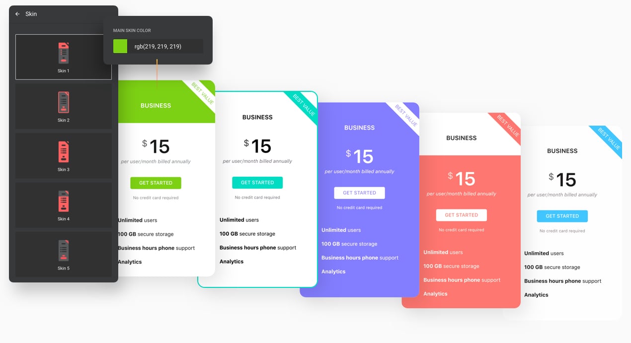
Style details that matter
Paint every element of the table individually to make it look uniform or to place the right accents: background, fonts, buttons, prices and many more can have a custom color. The title have adjustable font size and weight. Arrange the shape of the table, showing or hiding its borders and choose sharp or round angles – all these are small yet integral parts of the look.