Best Real Estate Website Builder
How to create a Real Estate website from the scratch or upgrade the one you’ve already built on the basis of any CMS or website builder
Define your prospective website tasks
Every single site serves as a resolution of some particular problem and always has an intended audience. First, it is important to determine all the tasks you are going to cover. Commonly, real estate websites are intended on having the following elements:
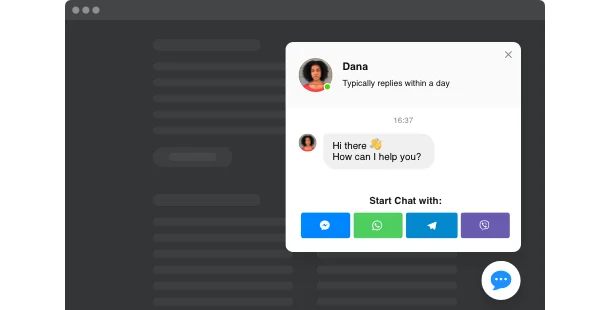
Stay fast to contact
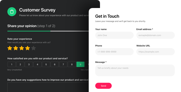
Collect customers’ data
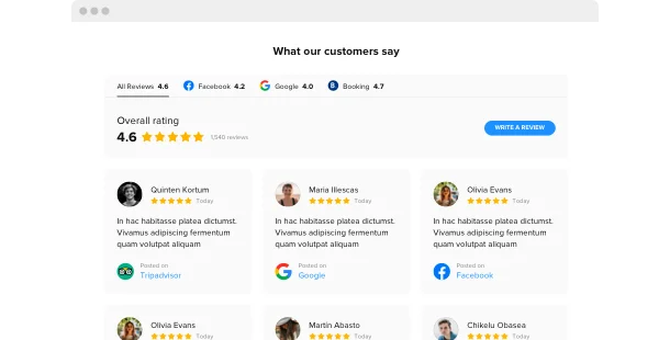
Prove your credibility
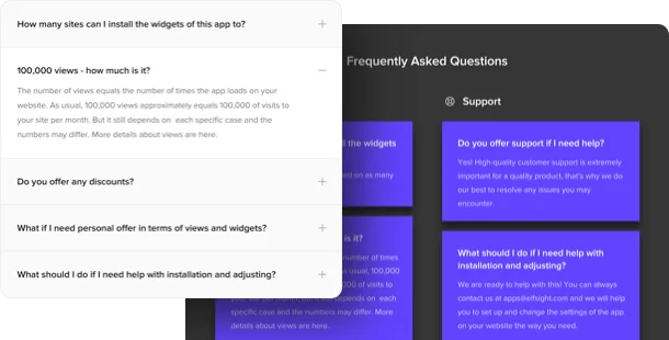
Anticipate users’ questions
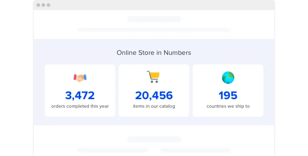
Share your agency success
Showcase the best offers

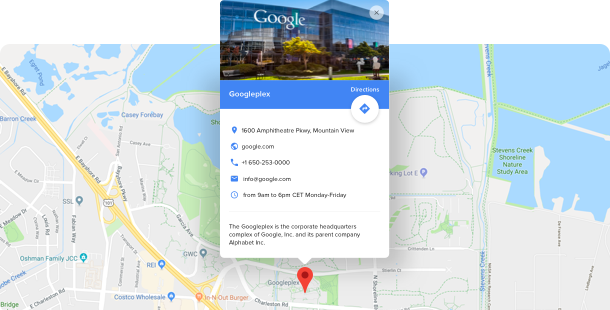
Point the location of a place
Pick the most relevant website platform
All sites are built on the ground of some platform – for instance, a website builder. They suit practically everyone as they make it much easier to build your site without programming. Most of the time it’s less costly to employ a site builder than to hire a proficient software engineer. You can begin with choosing the most suiting builder from the list below, then choose a template for your prospective real estate website – and you’re half-way through!
Wix
WordPress
Squarespace
Overall ratings
Build your perfect website applying the most relevant website builders. Looking at the comparative chart below, you may dig into the influential aspects of the platforms and choose the one that entirely meets your needs for the coming site.
| Squarespace | WordPress | Wix | |
| Free Plan | trial | free | free *limited functionality |
| Paid From (mo.) | $12.00 | free | $13 |
| Overall | 4.4 out of 5 | 4.3 out of 5 | 4.2 out of 5 |
| Quality of Support | 8.5 | 7.7 | 7.9 |
| Ease of Setup | 8.8 | 8.1 | 7.9 |
| Templates | 10+ | 1000+ * most are paid | 75+ |
| Our widgets for Platforms | Widget List | Plugin Catalog | App library |
Just after you select a Site Builder for shaping Real Estate website, always pay attention to overall functionality and best value for money. Employ a trial period or free version to do a check of the platform. This is the best way to reveal if the Website Builder is surely as comfortable and practical as they say about it.
Real Estate website examples
Examine a list of the most popular Real Estate templates. They all have specific structure, elements and design. Select the most convenient Real Estate style concept for your inspiration.
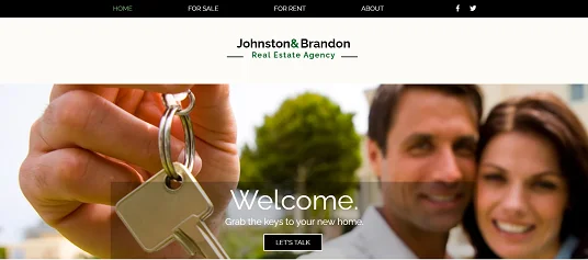
Example 1: Real Estate Agency website
With this template, you’ll surely get a face to your brand! The best website builder for real estate investors has spectacular colors without being heavy and makes it easy to read what the site is about.
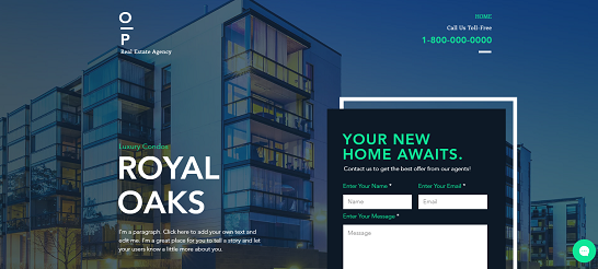
Example 2: Real Estate Landing Page website
This is a multipurpose template website builder for real estate investors that’s an exceptional idea to make your brand grow! Accompanied by several widgets, it will unquestionably assist you to stand out against your competition.
Example 3: Real Estate Company website
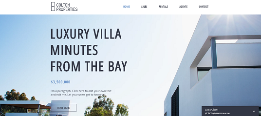
This splendid template website builder for realtors motivates you to find out more about the products and services provided. It also has an admirable visual style that shows an adaptable arrangement.
Fill in your Real Estate site
Right after you’ve selected your website platform and a preferable template, it’s time to construct your site pages to suffuse them with information and widgets to cover all the tasks described STEP 1. Normally, a site has the following pages:
Homepage →
Make the main page of your website look catchy. Add a carousel with your best offerings or several spectacular background images. Showcase happy clients’ testimonials and display some impressive business stats.
Listings →
This section is all about your offers. Build an impressive gallery of the estate you have for sale or rent so they would make a strong first impression on your potential clients. Make the pictures appear in a pop-up to create a whole visual tour across any pace.
Neighborhoods →
It’s no secret that most times people usually look for an accomodation in a particular area to live near their office, kids’ school, or parents’ house. Give them the opportunity to search the home in a particular neighborhood they are interested in. You can also add a mark on Google Maps to show the location of places for sale.
Seller →
Stay easy to contact for your potential seller clients by dedicating a separate website section to them. Place a detailed form here to make your potential client tell you about their estate for sale in detail. Collect all the information you need for future cooperation.
About →
Present your real estate agency to your clients. Describe your professional principles and note why they should work with you among others.Here you can describe the history of your business, it’s main working directions and introduce your team members or yourself, if you work as an independent agent. Let this page present you the best way.
Contact →
Fill out this section with complete information about the ways to contact you. Let people contact you at once with a chat window right on this page. Provide your working email address, phone number, links to your agency social media accounts and messengers. Don’t forget to add a contact form not to miss any client.
Test and launch!
Before your website goes live, you definitely need to assure yourself everything works as it should. This handy checklist will help you not to skip a single important step.
-
Test your mobile efficiency.
Nowadays it’s greatly important that your website works and looks excellent on smartphones for more than half of your visitors will browse it with their smartphones.
-
Attach your logo.
If you haven’t got it, create it using a logo generator, for instance, Tailor Brands.
-
Connect your domain.
If you haven’t obtained it when you worked with the website builder, you definitely need to buy it. Use GoDaddy to begin with.
-
Check the functionality.
All carousels, popups, CTAs or share buttons should work in a proper manner, otherwise, users will leave your website in a bit of a hurry.
-
Announce your new website launch on social media.
Make the online audience into real clients. Add a link to your site to your social networks accounts in order that your subscribers could see it.
-
Done! 🏆
Congratulations! You’re a website owner. Go share the link to your site with friends and clients and start collecting the feedback – it will aid you to get more visitors. And don’t stop enhancing your content and functionality to achieve even greater success.
