Best Church Website Builder
How to create a Church website from the scratch or upgrade the one you’ve already built on the basis of any CMS or website builder
Designate your future website goals
Every single website is a resolution of a specific issue and has a core audience obligingly. For a start, it is important to sort out all the tasks you want to cover. Normally, church websites are aiming to have the following elements:
Expand the content on your Church site builder
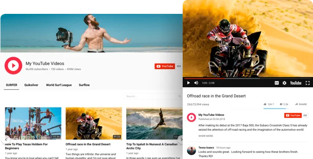
Make online giving easy

Welcome your future visitors
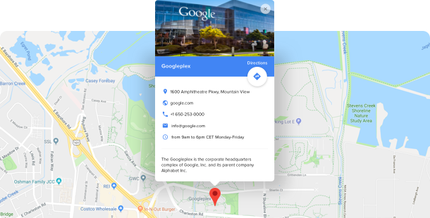
Stay closer to your congregation

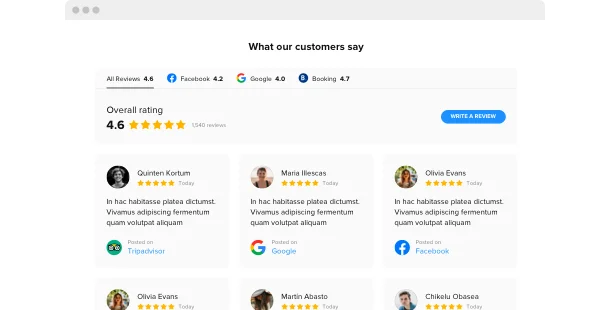
Let people know what your members say
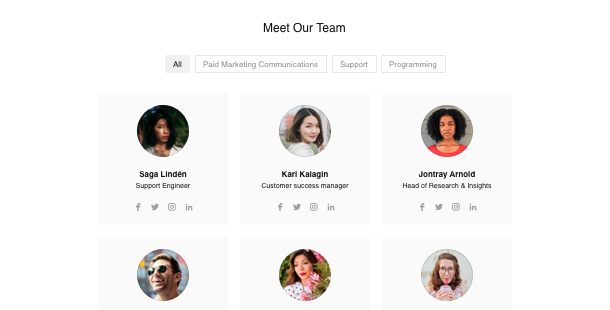
Show your leaders’ profiles
Select a website platform
All websites are created on the basis of some platform – for instance a site builder. They suit approximately every website owner as they make it much easier to shape your own website without coding skills needed. Most times it’s less costly to make use of a website builder than hire an experienced programmer. You can begin with finding the most preferable builder from a list below, then pick a template for your future church site – and you’re half-seas-over!
Squarespace
WordPress
Wix
Overall ratings
Form your flawless website utilizing the best Church site builders. Using the comparison table below, you can look over the necessary characteristics of the platforms and select the one that entirely fits your needs for the coming website.
| Squarespace | WordPress | Wix | |
| Free Plan | trial | free | free *limited functionality |
| Paid From (mo.) | $12.00 | free | $13 |
| Overall | 4.4 out of 5 | 4.3 out of 5 | 4.2 out of 5 |
| Quality of Support | 8.5 | 7.7 | 7.9 |
| Ease of Setup | 8.8 | 8.1 | 7.9 |
| Templates | 10+ | 1000+ * most are paid | 75+ |
| Our widgets for Platforms | Widget List | Plugin Catalog | App library |
Just as you decide upon a Website Builder for creating a Church website, always draw attention to take notice of overall performance and good value for money. Employ a free trial period or free version to build a church website to test the platform. This is one of the best ways to find out if the website builder is true as user-friendly and useful as they say about it.
Church website examples
Look over a list of well-known Church templates. They all have unique structure, parts and design. Pick the most suitable Church style concept for your motivation.
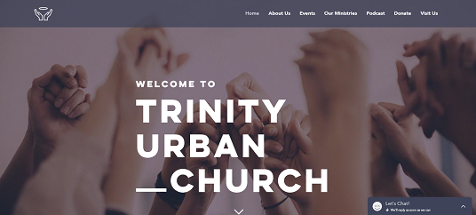
Example 1: Urban Church website
This template is perfect for uniting your church community on the Internet. Light and concise, add upcoming events, necessary information and much more.

Example 2: The Girls’ Choir website
Submit your lice church website on this beautiful internet template! Add a description and all necessary information for the congregation. You can set donation widgets, church service schedule, and location into the template.

Example 3: Church website
Build an online presence for your church or faith organization with this warm and friendly template. Convenient text boxes give you ample room to detail your story, ministry, and services.
Fill in your church site
When you’ve picked your site platform and a suiting template, it’s time to create church website pages to suffuse them with content and plugins to supply all the tasks from STEP 1. Generally, a site has the following pages:
Homepage →
Try to make this page eye-catching, as this is the first page your website visitors are going to land on. Make a statement here about your mission, charity programmes and pursuits. You should also place here a gallery of your church exterior and interior pictures, introduce your leaders to the audience, and show some reviews of your regular members.
Events →
This page should highlight the most important occasions of your community. Separate them into sections: sunday services, ministries, events. Provide a short description for each category, make sure to add locations and times. Don’t forget to include an on-line broadcasting option for your services.
About →
People want to know more about your church before visiting it. Make this introduction more personalized, placing your leaders’ short biographies, interactive social feed, and show your location. It’s also a good idea to explain the purpose of your church and write it’s brief history.
Next Steps →
This page is made to set the expectations of your newcomers. Describe the way your services proceed, the style of your worship, and how long do they proceed. It can also be useful to place here a welcoming video.
Sermons →
Get closer to your audience online by putting your sermons on the separate section of your website. You can put them as a library of text transcripts, a playlist of audio tracks, or a gallery of youtube videos. You can also combine all three forms of content delivery.
Contacts →
Fill in this page out with full information about the ways to contact the representatives of your church. Give here their working email addresses, phone numbers, links to your church social media accounts and messengers. Mark the location of your church on Google Map for a better reachability.
Test and launch
Before your site gets off the ground, you have to assure yourself everything works as expected. Our useful checklist will aid you not to overlook a single significant step.
-
Test your mobile performance.
Presently it’s highly important that your website works and looks excellent on mobile devices since more than half of your users will open it with their smartphones.
-
Add your logo.
If you still haven’t got one, create it using a logo generator, like, Tailor Brands.
-
Connect your domain.
In case you haven’t got it while using the website builder, you have to buy it separately. Use GoDaddy to begin with.
-
Review the functionality
All carousels, pop-ups, CTA buttons or share buttons are obliged to work in due course, otherwise, your users will leave your site in a rush.
-
Announce your site launch on social media.
Transform the online audience into real clients. Add a link to your website to your social networks accounts to the end that your subscribers could see it.
-
Done! 🏆
Congratulations! Now you’re a site owner. Now share the link to your site with friends and favorite clients and begin collecting the feedback – it will aid you to obtain more clients. And don’t stop upgrading your content and functionality to achieve even greater success.
