Improve Mobile Website


All You Need to Make Your Website Halloween-Ready

Explore Additional Use Cases for Your Goals
15 Best Tricks on How to Improve Website on Mobiles
Having a website optimized for smaller screens is no longer a luxury – it’s a necessity. A seamless mobile experience can drastically improve user engagement, boost conversions, and grow business.
This guide will explore 15 proven ways to transform your website into a mobile-friendly powerhouse. From basic design principles to incorporating Elfsight’s handy widgets, we’ll equip you with the knowledge and tools to create an exceptional mobile user experience.
1. Embrace responsive design
Responsive design is the foundation of a great mobile experience. It ensures that your website adapts seamlessly to any screen size: a smartphone, tablet, or desktop.
A responsive website automatically adjusts the layout, images, and text to fit the device’s screen. It eliminates the need for users to pinch, zoom, or scroll horizontally, creating a frustration-free experience.
🎯 Tips:
- Use a responsive design framework like Bootstrap or Foundation.
- Test your website on different devices and browsers to ensure optimal viewing.
- Minimize the use of Flash content, as it often doesn’t work well on mobile devices.
2. Prioritize speed and performance
Slow loading times are a major turn-off for mobile users. Ensure your website loads quickly by optimizing images, minimizing code, and using a reliable hosting service.
Fast loading times directly translate to happier customers who are more likely to stay on your website and engage with your content.
🎯 Tips:
- Compress images to reduce file size without sacrificing quality.
- Minimize HTTP requests by combining files and using a content delivery network (CDN).
- Use a caching plugin to store website data locally for faster access.
3. Optimize navigation
Make navigation simple and intuitive for mobile users. Use a clear menu structure with large, easy-to-tap links.
Consider using a hamburger menu to conserve screen space and prioritize important navigation options.
🎯 Tips:
- Keep your menu concise and easy to navigate.
- Use clear and descriptive labels for menu items.
- Consider using a sticky header for easy access to navigation.
4. Enhance content readability
Mobile users are more likely to skim content than read long blocks of text. Use short paragraphs, headings, and bullet points to break up content and make it easier to read.
Ensure sufficient white space and contrast to improve readability on smaller screens.
🎯 Tips:
- Use clear and concise language.
- Use headings and subheadings to organize content.
- Use bullet points and numbered lists to break up text.
5. Use large fonts
Mobile users are more likely to read content on a smaller screen. Ensure your font size is large enough to be easily readable, even on smaller screens.
Use a font that is easy to read and clear in different sizes.
🎯 Tips:
- Use a minimum font size of 16 pixels for body text.
- Use a larger font size for headings and subheadings.
- Use a sans-serif font that is easy to read on screens.
6. Implement touch-friendly buttons
Mobile users are used to interacting with touchscreens. Ensure your buttons are large enough to be easily tapped with ample spacing between them.
Consider using a touch-friendly button library to guarantee a smooth user experience.
🎯 Tips:
- Use a button library that is optimized for touch devices.
- Make sure buttons are at least 44 pixels wide.
- Provide clear visual feedback when a button is pressed.
7. Turn on lazy loading
Lazy loading defers loading images until they are needed (i.e. when they come into view). This technique can significantly improve initial load times on mobile devices.
🎯 Tips:
- Apply lazy loading only on images below the fold.
- Test performance improvements after implementation.
- Ensure images load smoothly as users scroll down.
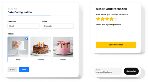
8. Provide “Call to Action” button
A prominent “call to action” (CTA) button can encourage users to take the next step, whether it’s making a purchase, signing up for a newsletter, or contacting you. Ensure it is clear, concise, and easy to find on mobile devices.
🎯 Tips:
- Use action-oriented language like “Shop Now,” “Learn More,” or “Contact Us.”
- Place your CTA button in a prominent location on your website.
- Ensure the button is large enough to be easily tapped.
💖 Elfsight recommendation: Explore our blog for insights on how to create a button and improve user experience on your website.
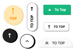
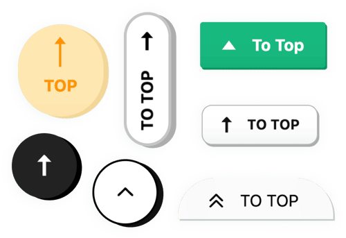
9. Consider “Back to Top” button
For longer pages, it can be helpful to provide a “back to top” button. It allows users to quickly return to the top of the page without having to scroll all the way back up.
This is a simple yet powerful feature that improves navigation and overall user experience.
🎯 Tips:
- Place the button in a prominent location.
- Use a clear visual indicator that it’s a “back to top” button.
- Ensure the button is easily tappable on a mobile device.
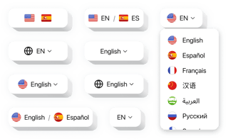
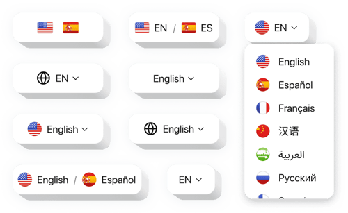
10. Enable website translator
If you cater to an international audience, a website translator is essential. Allow visitors to view your website in their preferred language, creating a more inclusive and welcoming experience.
🎯 Tips:
- Choose a reliable translation service.
- Make sure the translation is accurate and grammatically correct.
- Allow users to easily switch between languages.
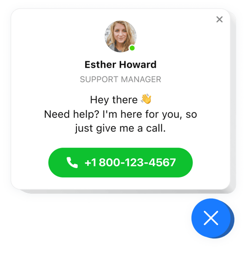
11. Include a click-to-call button
A click-to-call button allows mobile users to directly call your business from their device, eliminating the need to enter your phone number manually.
It is a convenient feature that can increase call volume and lead to more business.
🎯 Tips:
- Place the button in a prominent location on your website.
- Ensure the button is clearly labeled with your phone number.
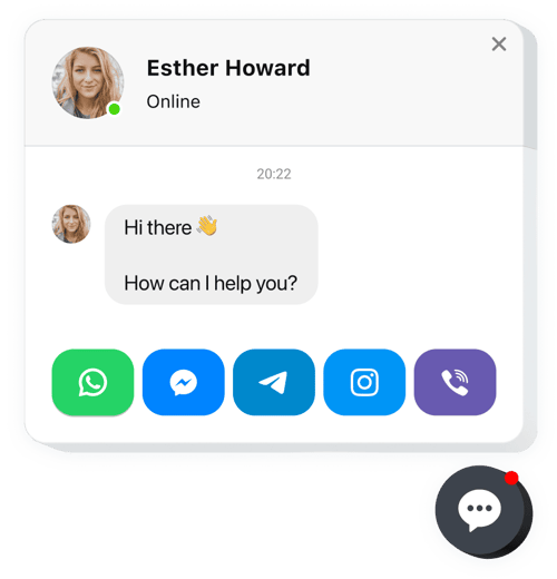
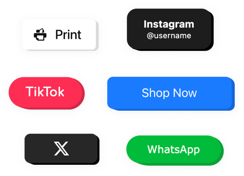
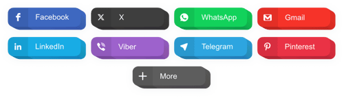
12. Encourage social sharing
Social media sharing buttons make it easy for users to share your content with friends and followers. It can help you reach a wider audience and increase brand awareness.
🎯 Tips:
- Include social sharing buttons for popular platforms like Facebook, Twitter, and Instagram.
- Place the buttons prominently on your website.
- Use clear and concise call-to-action language for the buttons.
13. Showcase social media profiles
Displaying your social media icons allows users to find and follow your brand on various platforms. This helps establish your online presence and encourages engagement.
🎯 Tips:
- Include icons for your most active social media platforms.
- Place the icons in a prominent location on your website.
- Consider using a hover effect or animation to make the icons more interactive.
💖 Elfsight recommendation: Dive into our post to discover how to create icons and showcase your social media presence on a website.
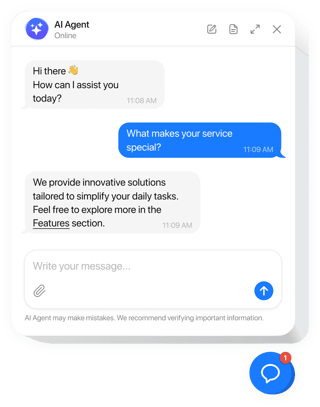
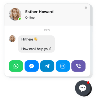
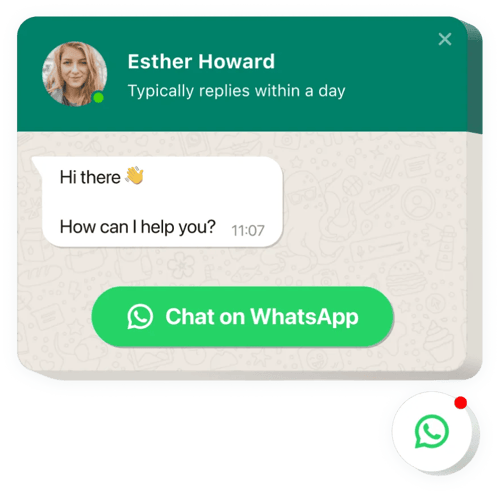
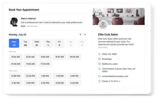
14. Leverage WhatsApp chat
Integrating a chat feature like WhatsApp can significantly enhance customer support. Users can ask questions or seek assistance without leaving your website, improving overall satisfaction.
🎯 Tips:
- Make the chat option visible but not intrusive.
- Respond promptly to inquiries to keep users engaged.
- Use automated messages for common questions to save time.
💖 Elfsight recommendation: Don’t miss our blog post on how to add a WhatsApp chat and facilitate seamless communication with your website visitors.
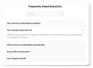
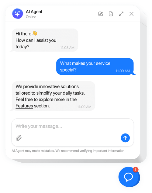
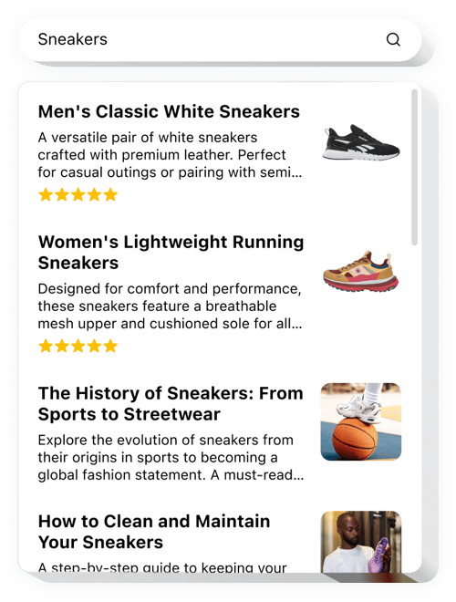
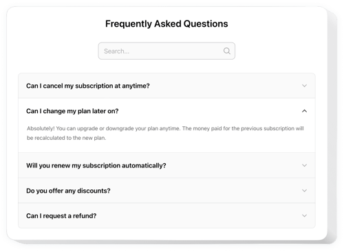
15. Enhance search functionality
A robust search feature can significantly improve navigation on your mobile website. Users should be able to find what they’re looking for quickly without scrolling through pages of content.
🎯 Tips:
- Implement an auto-suggest feature that predicts user queries.
- Ensure search results are relevant and well-organized.
- Place the search bar prominently at the top of the page.
💖 Elfsight recommendation: Visit our blog to discover tips on how to add a search box and enhance your website’s capabilities.
FAQ
How to embed widgets to improve mobile website?
Embed the widgets on your website by completing these 3 straightforward steps:
- Personalize the template. Apply visual changes in the online builder to match your preferences.
- Get the embed code. Save the completed work and copy the generated installation code.
- Add the code to your website editor. Sign in to your website’s admin area, insert the code into the desired section, and refresh the page. Success!
What website builders and CMS are compatible with widgets?
Almost all website builders are compatible with our plugins. Check out some of the popular ones:
Squarespace, Wix, HTML, Webflow, WordPress, Shopify, Elementor, Google websites, GoDaddy, iFrame, and many others.
Can I use Elfsight widgets for free?
Definitely. Elfsight showcases five subscription plans, with the Free option available. It features all you need for personalization and configuration. However, as you move up to a higher plan, the more thrilling bonuses you get.