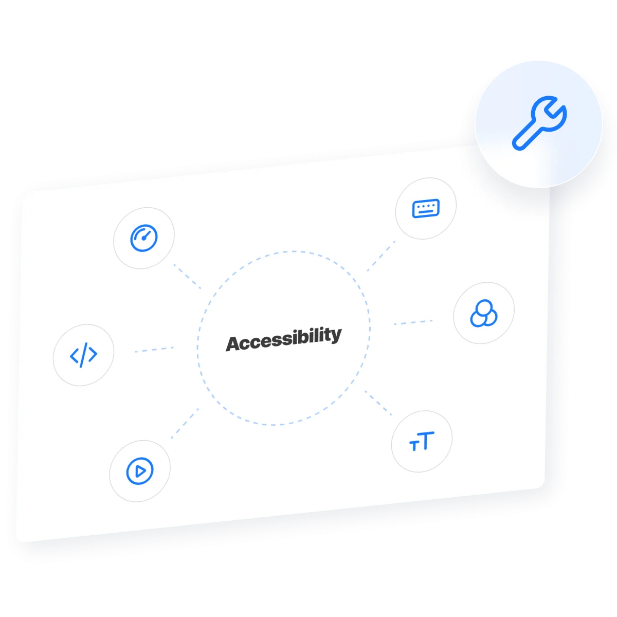
Website accessibility issues are more than just technical glitches — they represent real barriers for millions of users. Inaccessible content excludes people with disabilities from accessing information, completing purchases, or navigating digital services effectively. As the web becomes increasingly essential to daily life, ensuring accessibility is no longer optional — it’s a responsibility.
At the core of web accessibility is the principle of universal design — creating online experiences that work for everyone, regardless of ability. Whether it’s a screen reader user trying to access a form or someone with limited motor skills navigating a menu, a truly inclusive website accommodates diverse needs.
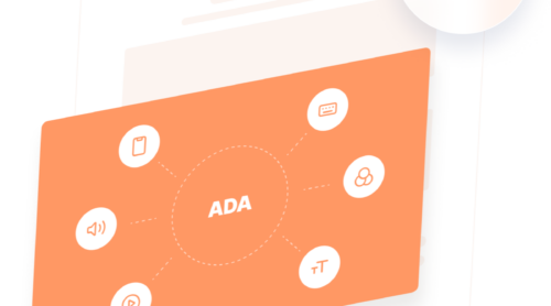
Two major regulatory frameworks set the standard: the ADA (Americans with Disabilities Act) in the United States and the EAA (European Accessibility Act) in the European Union. Both require websites to follow inclusive design practices. Failing to comply can result in legal action, financial penalties, and loss of public trust.
- ADA: Applies to public and private U.S. businesses, requiring them to make digital spaces accessible.
- EAA: Mandates accessibility for digital products and services across EU member states.
Ultimately, accessible design leads to improving online usability for everyone — not just users with disabilities. It creates faster, more navigable, and user-friendly websites, benefiting businesses through increased engagement and conversions.
Common Website Accessibility Problems
Web accessibility problems are far more than minor inconveniences — they represent structural flaws that can prevent entire groups of people from accessing online content. These issues primarily affect individuals with visual, hearing, motor, and cognitive impairments, but also impact users facing temporary barriers such as broken limbs, poor lighting, or older devices. By overlooking accessibility, businesses unintentionally exclude millions, reducing their audience and risking regulatory action.
Under both the ADA and EAA, digital services are expected to meet the standards outlined in the Web Content Accessibility Guidelines (WCAG) 2.1, levels A and AA. These standards ensure inclusive design across various technologies and devices. Still, many websites continue to repeat the same accessibility mistakes — errors that could be easily prevented with proactive design and testing.
1. Missing or Inadequate Alt Text
Images are a core component of web design, but when they’re missing descriptive alt attributes, screen reader users are left in the dark. This is particularly damaging on e-commerce websites, where users rely on image descriptions to understand product visuals. Even logos or icons can confuse users when left unlabeled, leading to missed information or failed conversions.
alt="") so screen readers can skip them.2. Poor Color Contrast
Color contrast affects how readable text is against its background. Insufficient contrast disproportionately affects users with low vision or color blindness, but it also hinders readability on mobile screens in bright environments. WCAG 2.1 requires a minimum ratio of 4.5:1 for normal text and 3:1 for large text. Yet many brands fail this standard due to trendy color palettes that prioritize style over usability.
3. Keyboard Navigation Failures
Not all users navigate with a mouse or touchscreen. Many rely on a keyboard or assistive tech like sip-and-puff devices or voice controls. If your menus, buttons, or pop-ups cannot be accessed via Tab, Shift+Tab, Enter, and Esc keys, those users are effectively locked out of your website. Testing for keyboard access is one of the most basic and effective accessibility checks you can perform.
4. Lack of Focus Indicators
Focus indicators are outlines or highlights that show which interactive element is currently selected. When developers remove these indicators for aesthetic reasons, they break the experience for users who rely on keyboard navigation. Without a visible cue, it’s impossible to know where you are on the page — especially in complex forms or navigation menus.
5. Unlabeled or Incorrectly Labeled Form Fields
Forms are a common source of frustration. Fields that don’t have <label> elements or use placeholder text instead of visible labels confuse screen reader users. Without clear context, users may submit incorrect information or abandon the form altogether. Proper labeling is also crucial for mobile users and anyone with cognitive disabilities who benefits from structured guidance.
6. Ambiguous Link Text
When a screen reader lists every link on a page, “Click here” or “Read more” becomes meaningless. Link text should be unique and contextually descriptive, indicating exactly where the user will be taken. Clear labeling improves navigation and helps all users understand your website’s structure.
7. Inconsistent Heading Structure
Headings help users and assistive technologies understand the organization of your content. Skipping heading levels (e.g., jumping from <h2> to <h4>) or using them out of order creates confusion. Headings should reflect a clear hierarchy and be used to break up long sections of content meaningfully.
8. Multimedia Without Captions or Transcripts
Audio and video content must include captions and transcripts to be accessible. Without them, users who are deaf, hard of hearing, or simply in a quiet environment cannot consume the content. Auto-captioning services are a good start, but manual edits are often required for accuracy and synchronization.
9. Auto-Rotating Content and Timed Interactions
Features like carousels, countdown timers, or modal dialogs can disrupt the user experience if they change without warning. Users need to be able to pause, stop, or adjust timing. Otherwise, those with slower motor responses or screen reader users may not have enough time to process the content before it disappears.
These web accessibility problems are widespread but avoidable. They often stem from outdated design practices, lack of testing, or not understanding how people with disabilities use the web. The good news is that each issue listed here can be resolved with proper planning, testing, and a commitment to inclusive design.
Examples of Websites With Bad Accessibility
Many businesses across industries unknowingly run websites with bad accessibility, often failing to meet the basic standards required by laws such as the ADA in the U.S. or the EAA in the EU.
While no industry is immune, certain patterns emerge depending on the type of service offered and the digital experience provided. Below are three common examples of accessibility failures by industry, along with overlooked features and how to fix them.
E-Commerce Businesses 🛒
Online stores often prioritize branding and visual design over functionality — resulting in user interfaces that are difficult to navigate for people with disabilities. Common accessibility issues include:
- Product images without alt text, making it impossible for screen reader users to understand what’s being sold.
- Non-keyboard-accessible navigation menus, filtering tools, and checkout forms.
- Low-contrast promotional banners that make it hard to read prices or product names.
Media and Entertainment Platforms 🎬
Entertainment websites — such as those for film, music, or streaming — tend to rely heavily on visual content and media-heavy designs. However, they often neglect essential accessibility features:
- Videos without captions or transcripts, excluding deaf and hard-of-hearing users.
- Carousels and modals that rotate automatically and can’t be paused or controlled via keyboard.
- Inconsistent heading structures, which confuse users navigating with screen readers.
Media-rich websites must consider cognitive load and control — autoplay features can disrupt users with ADHD, autism, or screen readers.
Educational Institutions 🎓
Online learning platforms, universities, and training providers are often legally required to provide accessible digital content, yet frequently fall short in areas such as:
- Course materials (PDFs, videos) that are not compatible with screen readers.
- Form fields in registration or grading systems that lack clear labels or instructions.
- Navigation paths that break or loop endlessly when using keyboard tabbing.
For educational platforms, accessibility is a legal and moral obligation — it ensures equal access to learning and advancement opportunities.
Commonly Overlooked Accessibility Features
Regardless of industry, many websites fail in the same core areas during accessibility audits. These oversights are often unintentional but result in serious compliance risks and poor user experiences.
- Color contrast. Brand palettes that look stylish but don’t meet readability standards.
- Non-descriptive links. Phrases like “Click here” offer no context for screen reader users.
- Form validation. Errors that appear visually but aren’t announced to assistive tech.
- Missing skip navigation. Forces keyboard users to tab through every menu on every page.
- Modal dialogues. Overlays that trap focus and don’t close with the Escape key.
Each of these issues not only affects compliance under the ADA and EAA but also creates frustration for real users — leading to abandoned sessions, negative feedback, or even legal complaints. Addressing them early is a smart move toward both inclusivity and sustainability in digital design.
How to Spot Issues on Your Website
Before you can fix accessibility issues for websites, you need to know what’s broken. Fortunately, a combination of manual methods and automated tools makes it possible to uncover both obvious and hidden problems. Whether you’re building a new website or evaluating an existing one, identifying issues early ensures a smoother, more inclusive experience for all users — and supports compliance with ADA, EAA, and WCAG 2.1 guidelines.
Here’s a step-by-step approach to detecting the most critical accessibility issues:
Start With Automated Accessibility Audit Tools
Automated tools are a great starting point for quickly detecting common violations, such as missing alt attributes, color contrast errors, or unlabeled form fields. These tools crawl your pages and produce detailed reports that highlight WCAG failures.
- WAVE (WebAIM): A browser-based tool that flags common accessibility errors and explains their impact.
- Accessibility Insights (by Microsoft): Offers guided checks and compliance scoring against WCAG standards.
- Lighthouse (Chrome DevTools): Includes an Accessibility tab that evaluates pages directly in the browser.
- axe DevTools: A robust developer-friendly tool that integrates with most browsers and IDEs.
Perform a Keyboard-Only Navigation Test
Users with motor disabilities or visual impairments often rely on keyboards instead of mice. You can simulate this experience by navigating your website using only the Tab, Enter, Shift + Tab, and Esc keys. This will help identify:
- Hidden or missing focus indicators
- Broken tab order (elements skipped or repeated)
- Trap areas where the keyboard cannot move forward or backward
Use a Screen Reader for a Realistic Experience
To evaluate readability for screen readers, try using software like NVDA (free for Windows), VoiceOver (built into macOS), or JAWS. Listen to how your content is read aloud. Pay attention to:
- Whether images are announced properly
- How headings and navigation landmarks are read
- Whether form fields and buttons have clear labels
If you’re confused or frustrated while listening, imagine how a visually impaired visitor might feel. Fixing these usability issues is key to offering equal access and reducing bounce rates.
Check Color Contrast and Visual Clarity
Verify that all text has sufficient contrast with its background. This is crucial for users with low vision, color blindness, or those browsing in bright environments. Tools like WebAIM’s Contrast Checker help you meet WCAG’s 4.5:1 minimum ratio for body text.
Run a Full Compliance Scan
For a comprehensive audit aligned with both ADA and EAA standards, consider running full accessibility scans using services like Siteimprove, Tenon, or UserWay. These tools simulate assistive tech interactions and provide remediation suggestions tailored to legal frameworks.
Once issues are identified, prioritize them based on severity and user impact. Errors that block navigation, obscure content, or prevent interaction should be addressed first. By actively spotting these accessibility barriers, you’re laying the foundation for a more inclusive, legally compliant, and user-friendly website.
Fixing Web Accessibility Problems
After identifying website accessibility issues, the next step is to build a plan for addressing them. Accessibility isn’t just a checklist — it’s a mindset that blends usability, technical compliance, and inclusive design. By following a structured approach, you can align your website with WCAG 2.1 A/AA standards and meet legal requirements under the ADA and EAA.
Your Accessibility Fix-It Plan
Here’s a practical action plan that covers the most critical areas to review and remediate:
- Add descriptive alt text for images
Make sure every meaningful image has accurate alt text. Decorative visuals should have empty alt=”” attributes so they’re skipped by screen readers. - Use semantic HTML structure
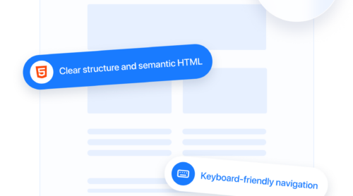
Organize your content using proper heading levels (h1 through h6), lists, tables, and landmark elements to make content navigable and logical. - Label all form fields properly
Include <label> tags or ARIA attributes for every input field, so users understand what information is required — especially with screen readers. - Improve color contrast
Use tools to ensure your text and background combinations meet at least a 4.5:1 contrast ratio. Don’t rely on color alone to communicate meaning. - Enable full keyboard navigation
Ensure users can reach and interact with every link, menu, button, and modal using only their keyboard. Add :focus styles to show active elements. - Provide captions and transcripts
For all videos and audio content, include closed captions or downloadable transcripts to support deaf or hard-of-hearing users. - Fix navigation challenges
Use ARIA landmarks (e.g., role=”navigation”, role=”main”) and skip links to help users jump to key sections without tabbing endlessly. - Avoid inaccessible widgets or plug-ins
Use third-party tools that support accessibility standards or are customizable to meet WCAG requirements.
Embed the accessibility widget to your website
Use the steps below to integrate the accessibility widget and activate key tools that help your website stay compliant and welcoming to all visitors.
- Select a starting design. In the Accessibility widget editor, begin by choosing one of the available templates. Click “Continue with this template” to move forward with customization.
- Run an accessibility scan. Go to the “Check” tab and input your website URL. The system will assess your page for accessibility barriers and point out issues that may require attention. Please note: this functionality is exclusive to Pro plans and higher.
- Customize the widget settings. Open the “Settings” section to fine-tune options such as language, visibility across devices and pages, widget alignment, and duration of stored user preferences. You can also inject your own CSS or JavaScript for advanced personalization.
- Add the widget to your website. Click the “Add to website for free” button at the bottom, then copy the provided embed code from the “Embed Code” tab. Paste it into your website’s HTML or embed block where you want the widget to appear.
Once installed, the widget immediately enhances accessibility across your content, helping users with various needs navigate your website more easily while ensuring alignment with global compliance standards.
Want to see how the widget works in real time? Try it now!
Include Accessibility in Your Workflow
Fixing issues once isn’t enough. To maintain a compliant and inclusive website over time, embed accessibility into your ongoing development process:
- Run audits regularly — every time you deploy major updates or redesigns.
- Use accessibility checklists as part of your QA process.
- Train your team in accessibility best practices — from designers to developers.
By following this action plan, you’re not just fixing issues — you’re making digital content inclusive by design. It’s a long-term investment in user trust, search visibility, and legal security that pays off over time.
Tips to Avoid Website Compliance Issues
Many accessibility violations stem from small, preventable errors — often made during rushed launches or overlooked during updates. While full compliance requires long-term planning, you can avoid the most damaging ADA compliance mistakes by building awareness around key areas of risk and using smart, supportive tools to bridge the gap.
Below are essential tips to help reduce risk, stay aligned with ADA and EAA standards, and support compliance with accessibility requirements across your website:
- Use a front-end accessibility widget. Widgets can instantly improve contrast, font size, and keyboard support — serving as a helpful overlay while deeper code-level fixes are in progress.
- Provide captions and transcripts for all media. Videos and audio content must include closed captions and alternative text formats to ensure equal access for users with hearing impairments.
- Label all form inputs with clear, programmatic connections. Use <label> tags or ARIA attributes to associate form fields with descriptions, so screen readers can interpret them correctly.
- Design with sufficient color contrast. Ensure text is clearly readable against background colors, meeting at least a 4.5:1 contrast ratio as required by WCAG 2.1 for body text.
- Don’t rely on color alone to convey meaning. Use icons, text, or symbols alongside color to avoid confusion for users with visual impairments or color blindness.
- Make sure all navigation works without a mouse. Every button, dropdown, link, or menu should be fully operable using only a keyboard, without traps or dead ends.
- Ensure consistent focus indicators. Users navigating with keyboards need to see where they are on the screen. Maintain visible outlines or highlights around focused elements.
- Eliminate inaccessible third-party elements. Avoid using widgets, pop-ups, or embedded tools that don’t meet accessibility standards — or replace them with accessible alternatives.
- Conduct regular accessibility scans and manual testing. Use a mix of automated tools and manual audits with real assistive tech like screen readers and keyboard navigation to spot hidden issues.
- Build accessibility into every phase of your workflow. From design mockups to QA, accessibility should be a shared responsibility across your entire team.
Following these tips will help you avoid the most common compliance pitfalls, reduce risk of legal action, and enhance user experience for everyone. Most importantly, it positions your brand as inclusive, proactive, and future-ready.
FAQ
Alongside practical tips and action plans, many businesses have specific questions about accessibility implementation and compliance logistics. Below are answers to frequently asked questions that haven’t been covered yet but are crucial for ensuring a smooth, compliant experience across your entire website.
Do I need to make every page on my website accessible?
What’s the difference between WCAG levels A, AA, and AAA?
Do I need to add an accessibility statement on my website?
Can an accessibility widget help me pass an audit?
How often should I test my website for accessibility?
Final Thoughts
Addressing accessibility issues for websites is not a one-time fix — it’s a continuous process that evolves with your platform, your users, and the standards that govern digital inclusivity. From identifying barriers in navigation and content to using tools like Elfsight’s accessibility widget as a support layer, each step contributes to improving online usability for everyone.
True accessibility goes beyond checklists — it reflects a brand’s values and its commitment to equity. As regulations like the ADA and EAA continue to define expectations, forward-thinking businesses must embed accessibility into every design decision, content update, and user interaction. The payoff is lasting: a broader reach, stronger user loyalty, and digital spaces that remove — not create — barriers to inclusion.


