What is Mobile Popup?
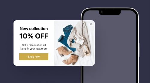
Mobile popups often refer to an effective advertisement tool that appears straight on the website page from a mobile device. They are meant to provide additional information, promote exclusive offers, or encourage users to take a specific action: subscribing to a newsletter, making a purchase, or availing of a discount.
They can’t slip under users’ radars by appearing as a graphical overlay or small-box notification overlaying on top of the website content. And there is no mystery—they are really hard to miss!
Let’s investigate the whole concept surrounding the creation of Mobile popups and get our answers on how to embed them on a website.
Create a Mobile Popup for Your Website using Elfsight Widget
If you’re looking for the easiest way to create a Mobile popup for the website, we have a solution—the Popup widget from Elfsight. It takes minutes to build and seconds to embed. Why? Well, it doesn’t require coding knowledge, tech background, or design skills. It’s all quite intuitive.
On top of that, this widget is mobile-friendly. So it gives you the needed versatility and freedom without unwanted twists and turns. Here’s what it takes to do:
- Log in to your existing Elfsight account or sign up for a free account to get full dashboard access.
- Select the Popup widget from the Apps Catalog.
- Begin the magic of customization.
- Copy the unique HTML code to embed on your website.
- Insert the code of your Mobile popup into the website editor and save all the changes!
Off the top of our heads, this is easy, right? Try to repeat it yourself and discover the unlimited amount of built-in features.
How to Embed a Mobile Popup on Website using Elfsight Widget?
Embedding a Mobile popup on your website with Elfsight Widget is a straightforward process. So we are ready to introduce you to a step-by-step guide and help you get started:
Step 1: Get authorized to your Elfsight account to open the popup widget
This step is the start of our journey. Begin by visiting the Elfsight website and signing up for a free account, granting you full access to all product features. If you already have a profile, log in to the dashboard using your registered email address and password.
Step 2: Locate the Popup plugin
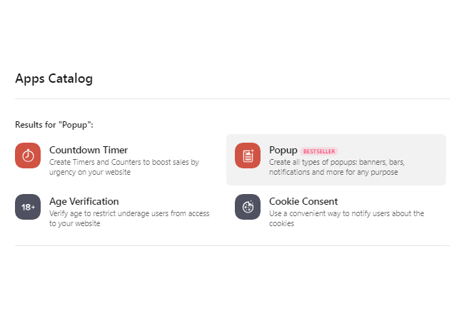
After logging in, search for the Popup widget. Type the name in the search bar of the Apps Catalog and choose the appropriate product.
Step 3: Select the pre-designed popup template
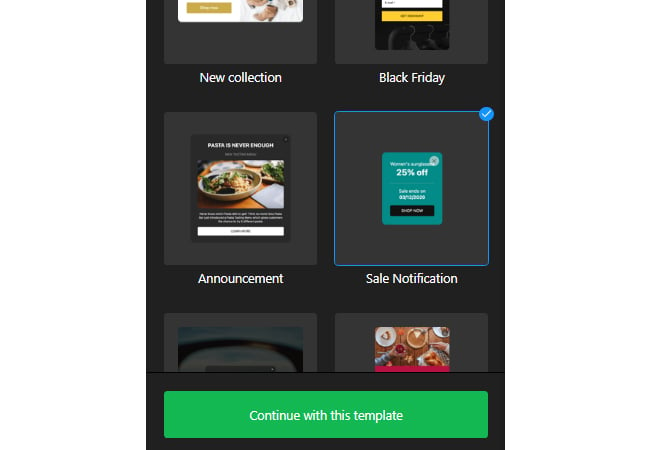
Explore the extensive collection of Popup templates. Feel free to pick the template that best aligns with your website’s style and business goals.
They are all mobile responsive—no troubles way ahead.
Step 4: Personalize your Mobile popup
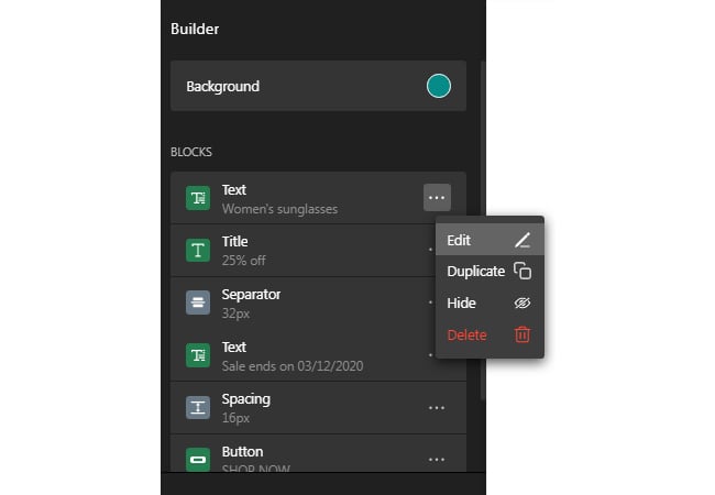
Get started by customizing your widget with a vast range of free features: custom blocks, text, colors, fonts, images, videos, layout, background, etc. Take advantage to create a remarkable call-to-action message, memorable visuals, and never-forgettable headlines.
Step 5: Configure popup display settings
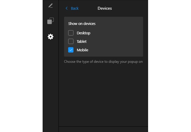
With Elfsight, you can specify which devices can or cannot display your popup. Go to the Devices menu and checkmark the needed options.
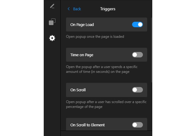
Step 6: Finish setting up popup triggers
Do the clever trick to make the popup appear in the right place and right time. Face multiple trigger options and choose the ones that work for you: on page load, on scroll, on click, on exit intent, and many more.
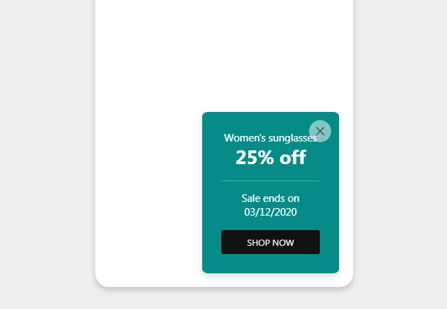
Step 7: Take a final look of your popup in the mobile mode
Before finalizing your changes by clicking Publish, take a look at the preview screen to ensure that your Mobile popup is looking great.
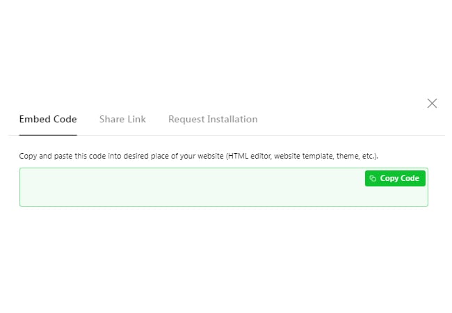
Step 8: Get and copy the code to embed the popup
Once you are satisfied with your Popup widget, receive the auto-generated code to embed on your website.
Step 9: Embed the popup on your website
To witness your Mobile notification in action, insert the obtained code into the website editor and save the modifications!
When you complete these steps, the Mobile popup should be up and running on your website! And now, let’s get to the part where you will discover the secret of successful notifications.
Mobile Popup Best Practices
To make the most out of your Mobile notifications and have successful outcomes, it’s better to follow best practices. Here are seven tips to help you create effective and user-friendly Mobile popups:
Popup practice #1: Get to know your audience better
Understanding your target audience and business goals before you embed a Mobile popup on the website is crucial for a few reasons:
- Relevance. Knowing your target audience allows you to tailor the popup’s message and design to resonate with them. Let the Mobile notification provide value and be relevant to their interests and needs.
- User experience. You can create a Mobile popup that enhances the user experience instead of interrupting it. Align it with the preferences and common behavior patterns to avoid annoying or intrusive notifications that might negatively impact your revenue and website metrics.
- Conversion optimization. Having clear business goals helps determine the specific action you want users to take interacting with the Mobile popup. Whether signing up for a newsletter, downloading an eBook, or making a purchase, understanding your goals allows you to optimize the notification’s functionality.
- Personalization. Using segmentation and targeting methods, you can show Mobile notifications to different user groups based on their preferences, demographics, or habits.
To achieve the best outcomes and refine your strategy based on the mentioned points, you can use any marketing research technique: GROW model, 5W by Mark Sherrington, etc.
Popup practice #2: Keep in mind the popup positioning for mobiles
When you embed a Mobile popup on your website, consider the following layout positions:
- Slide-in. Placing the popup at the bottom ensures it doesn’t interfere with the main content and allows visitors to focus on the website content before encountering it. This position can be effective for capturing attention without being intrusive.
- Center of the page. A Mobile notification positioned in the center can grab immediate attention, but it may obstruct the main website content. Consider using this position for high-priority messages or when you want visitors to take immediate action.
- Corner popups. Corner popups have two placements: at the top or bottom corners of the screen. This position ensures that the main content is not fully obstructed, allowing visitors to dismiss the notification while still noticing it.
- Floating or scrolling popups. These popups move and stay fixed at a particular position as users scroll through the page. It’s a less intrusive option that keeps the message visible without covering the entire screen.
And here’s a small tip: ensure it doesn’t disturb user experience or impede content accessibility via mobile devices.
Popup practice #3: Make your Mobile popups meaningful
The Mobile popup’s message should be clear, compelling, and aligned with your business goals before you embed it on a website. The specifics usually depend on your objectives, target audience, and the action you want them to take. However, here are some key elements and message ideas to consider:
- Attention-grabbing headline. Start with a catchy headline that immediately captures the user’s attention. Use persuasive language and make it relevant to the value proposition or offer you are presenting.
Examples:
- Get 30% off storewide! Don’t miss out – shop now!
- Discover our new arrivals!
- Don’t miss our exciting giveaways!
- Hurry! Limited inventory is available.
- Clear and concise copy. Keep the text in your popup short and to the point. Use straight-to-the-point sentences to convey the main message effectively. And try to avoid jargon or complex language that may confuse or overwhelm the user.
Examples:
- Get our free recipe book and prepare delicious meals in no time!
- Forgot something? Complete your purchase and enjoy free shipping!
- Upgrade your style with our premium selection of [Product names].
- Benefit-oriented language. Highlight the benefits or value users will receive by engaging with the Mobile popup on your website. Clearly communicate how it can solve a problem, save time, or provide exclusive access to something valuable.
Examples:
- Subscribe to the newsletter to never miss our updates!
- Join our community for the latest news and trends in [your industry].
- Follow us on Instagram to get behind-the-scenes content.
- Register for our upcoming webinar and learn from industry experts.
- Strong call-to-action. Let the phrase speak for itself: signing up for a newsletter, making a purchase, or exploring an offer. Use action words that create a sense of urgency or excitement.
Examples:
- Don’t miss our exciting giveaways! Follow us on Twitter to win the best prize.
- Unlock your creativity with our 24-hour free design templates. Download now!
- Flash sale! Take advantage of our special discounts before time runs out!
- Transparency and credibility: If your Mobile popup requires users to provide personal information or subscribe to a service, communicate the safety and outline any terms or conditions associated with their interaction.
Remember to customize your message based on the brand identity, the target audience’s interests, and the tone of your website. Monitor the performance and feel free to make adjustments based on your needs.
Popup practice #4: Timing is everything
When it comes to embedding Mobile notifications on your website, you should also think about time: when to draw your potential customers in? Well, there is no specific fixed timing for Mobile popups, as it depends on various factors: the nature of your website, the purpose, and your end goal.
However, here are a few suggestions to be mindful about:
- Delayed trigger. Embed a delay before showing the notifications, allowing your users some time to explore the website or perform a specific action. This way the popup doesn’t immediately interrupt their browsing experience.
- Exit-intent popup. Consider triggering a popup when users show an intention to leave your website, such as moving the cursor toward the end browser’s close button or the back button. It gives them an opportunity to engage before leaving.
- Session duration. Implement a popup to appear after users have spent a specific duration of time on your website. Give them enough time to familiarize themselves with your content before being presented with a notification.
Remember, it’s essential to ensure the popup is easy to dismiss or close. It shouldn’t interfere with the overall usability and readability of your mobile website. Monitoring user behavior and different timings can help you find the optimal timing.
Popup practice #5: Test different triggers
Carefully choose triggers that enhance the user experience rather than annoying or disrupting visitors. Here are some possible triggers to use:
- Time delay. Set a specific time delay before the notification appears, allowing users to engage with your website content before being presented with the popup.
- Scroll depth. Set the Mobile notification to appear after the user has scrolled to a certain depth on your website. It indicates an actively engaged audience with your content, making them more likely to respond positively to the popup.
- Exit intent. Activate the popup when visitors attempt to leave your website, displaying a last-minute offer or an invitation to subscribe for updates.
- Click-based triggers. Showcase the popup when a user clicks on a specific link, button, or element. Not only does it indicate their genuine interest in a particular topic or action but also raises the chances to increase your revenue.
Always maintain the performance and user response to your Mobile notifications. Let them be well-received.
Popup practice #6: Add eye-grabbing visuals and emojis to draw attention
If you want to embed visuals and emojis into Mobile popups, here’s a list of options you can use to blend them nicely with your brand’s tone and style:
- Product images. If your popup promotes a specific product or service, including high-quality images can help generate interest and convey value.
- Illustrations and emojis. Incorporating custom graphics or emojis can add a touch of creativity and uniqueness to your Mobile popup. It can also add extra special excitement related to your message.
For example, you include the following:
- 😳 — smiley emojis create a friendly, positive, and inviting atmosphere in your popup.
- 👍 — it is a popular choice to indicate approval, encouragement, or a positive response. Emphasize the benefits or value of your offer.
- 😍 — it expresses admiration, interest, or appeal. And it can be effective when promoting special deals, exclusive content, or limited-time offers.
- ✔ — the checkmark signifies completion, success, or confirmation. It indicates that a user has successfully subscribed, signed up, or completed an action.
- 🎉 — it draws attention to specific elements or calls to action within your popup.
- Background imagery or video. Choose appealing visuals that resonate with your brand and create a pleasant backdrop. But the biggest rule here is that they should be relevant and relate to the content or offer you are presenting.
- Icons. Utilize icons to visually represent actions or benefits. For example, use a shopping cart icon if your popup encourages users to make a purchase or a mail icon for newsletter sign-ups.
- Brand logo. Embed your logo in the popup to raise brand recognition and establish trust with your audience.
The choice of visuals and emojis should stand by your brand personality and its norms. It’s crucial to keep a consistent visual style that doesn’t overwhelm or take users by surprise.
Popup practice #7: Try out a call-to-action button
When embedding call-to-action (CTA) buttons for Mobile notifications, make them visually appealing, easy to tap on mobile devices, and effectively guide users to take the desired action.
Here are some types of CTA buttons suitable for Mobile popups:
- Clear and action-oriented buttons. Use concise and straightforward text that clearly communicates the action users will take when they click the button.
- Benefit-driven buttons. Instead of generic CTAs, highlight the specific benefits users will receive by clicking. Here are some of the examples: “Unlock Time-Limited Sake,” “Get Your Step-by-Step Guide,” or “Join Our Community.”
- Urgency-based buttons. Urgent language can generate a fear of missing out (FOMO) and prompt users to click the CTA. Take a look at these button phrases: “Get Offer,” “Watch Now,” or “Don’t Miss Out.”
- Social proof buttons. Leverage social proof to boost user confidence and engagement. Embed popup buttons such as “Join Thousands of Satisfied Customers,” “See What Others Are Saying,” or “Join Our Community.”
- Icon-based buttons. Utilize visually recognizable icons to convey actions without relying solely on text. Examples include shopping cart icons for “Add to Cart,” envelope icons for “Contact Us,” or play signs for “Watch Video.”
Ensure that your CTA buttons are large enough to be easily tapped on mobile devices. Place them prominently within the popup, using white space and visual hierarchy to draw attention and guide users towards it.
Plus, keep in mind your brand’s style, target audience, and the overall aesthetic of your website when choosing the right CTA buttons for your Mobile popups.
Benefits of Using Mobile Popups on Websites
Using Mobile popups on websites can offer several benefits:
| 1. Capture attention | Mobile notifications can grab website users’ attention: they appear directly on their screens. It is practical for highlighting promotions, offers, or important announcements. |
| 2. Increase conversion rates | By strategically placing Mobile popups, you can prompt users to take specific actions: joining a mailing list, making a purchase, or downloading an app. It boosts your conversion rates and drives more engagement. |
| 3. Personalize user experience | Mobile notifications are perfect for delivering personalized content to website visitors based on their preferences, behaviors, or demographics. It can make them feel more connected to your brand. |
| 4. Provide important information | Popups are handy for communicating time-sensitive information or crucial updates to your audience. Use them to tell about limited-time offers, massive changes within your company, event plans, etc. |
| 5. Optimize for mobile users | Mobile notifications are optimized to work on mobile devices to improve user engagement and overall satisfaction. It promises a seamless experience for users accessing your website on their smartphones or tablets. |
| 6. Reduced cart abandonment | By offering personalized incentives or reminders, popups can reduce cart abandonment rates and boost overall sales. |
Final Thoughts on Creating Mobile Popup
The idea to embed Mobile popups is an effective strategy for capturing user attention, driving engagement, and increasing conversions on your website. Following the outlined steps and tips, you can create responsive notifications using the Elfsight widget and leverage their numerous benefits. Remember to employ best practices and do lots of experiments to optimize their effectiveness.
Check out more information about the Popup widget via these sources below:
Embrace the power of Mobile notifications and take your website’s sales and engagement to new heights!


