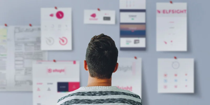
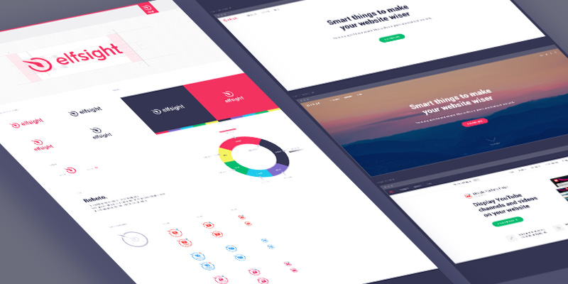
Our team decided to edit company’s logo and we burn with the desire to share our accomplished redesign work. That’s why we wrote this tiny article. Moreover, it might possibly come in handy for those who begins to think about changing company’s logo.
by
Andrey Kozinskiy
Share:
Share on Facebook
Share on X
Share on LinkedIn
Share on WhatsApp
Copy Link
One year… Just over a year ago we released our first ever product InstaLink for WordPress on Envato market. This was a starting point for new business goals and achievements. Elfsight created new plugins, developed additional versions for other CMS platforms and released plenty of updates for existing plugins within the next year.
All our work was and is still accompanied by the impetuous desire to introduce relevant and high-quality products to developers all over the world. Products, which will allow taking a look at usual things from a different angle.
Elfsight plugins continue developing to the utmost owing to our customers. Exactly you help us make progress in our products by leaving comments, reviews and offering new ideas. Plugins move forward and so does the whole company. In addition, such company should have the appropriate sign. So our team decided to edit company’s logo.
Get ready, this article is all about how Elfsight decided to develop its new logotype.
Changes Drive Development
Company grows and conquers new peaks. In order to stay on top of its market, the company should always have an eye on its competitors, market conditions and trends. Qualitative change is an important and irreversible process of any development. Therefore, we are ready to present you absolutely new Elfsight.
Everything starts from the idea
Refreshing company’s logotype is intended to represent our aspiration for changing and getting better all the time. The new Elfsight design aims to emphasize our style so that all our products could have a brand name.
First of all, let’s find out how we came to the final version of our new logo.
The Idea of Redesign
How audience, customers and users treat us? Will they keep our company in mind after a quick glance at our logo? Do they understand what is presented in our logotype? And what the hell does this half-face elf mean? It turned out that it might be rather difficult to see the idea in our logo without additional explanation.
Old Elfsight logo and its disadvantages
Okay, we will reveal our little secret: elf image, which looks ahead and whose face is illuminated in the light, pretends to be a metaphor about wisdom, purposefulness, beauty, sophistication. It is even similar to the image of Elfsight CEO but that’s not the point…
As we thought, all these associations reflects our old logotype. Well, the concept seems clear in theory. Unfortunately, take your chance and try to catch this complicated idea in practice.
After analyzing our logo, reading appropriate articles, professional guides and analyzing successful and failed cases of logo redesigns, our team started correcting mistakes of youth. Here are main requirements, which we set for our renewed logo:
Company’s name should attract audience, be easy-to-read and more noticeable than a mark
Simple and clear geometry is needed, the overall logo should be memorable, stay in customer’s mind
Logo should be flexible. It can be used in different colors, save its readability independently of its size
Significant but not radical changes. There should be continuity of the old logo
Ability to use new logo in our products as a quality mark. Plus, it should be easily noticeable and attractive among other product icons
Foremost, we started discussing our old logotype and tried to pick out several major disadvantages of the previous work created by our insanely talented (or just insane – we haven’t yet decided ourselves) designer.
It Has Lots of Weak Points, Carl!
Previously, we were falling into ecstasy each time we take a look at our old logo. So cool and original it seemed to be. If someone had the same feeling, we are pretty much on the same wavelength 😉 But! When analyzing the old “artwork” we marked out the following weaknesses, which can be missed on the first try:
Icon of half-face elf is difficult to interpret from the audience’s point of view. We find out that lots of people don’t understand what is presented in our logo
The name of our company is difficult to read because of uppercase letters
Logo’s elements transform the whole logotype into pixel mashup while reducing its sizes
It’s almost impossible to use our logo in other color schemes. For example, the inverted variant loose its light effect and our logo becomes even less clear
There is no connection between elf icon and ELFSIGHT caption. It looks like they are parts of different logos
The standard color of our logo is a little bit dirty. It is muted, shaded and toned down and, as a result, the logotype has “dirty” coloring. Feels like more natural and bright color would be a better solution
Old doesn’t mean bad, right? That’s why some elements of our old-fashioned logo were transferred to the new prototype. In other words, we left one very significant and easily adaptive part – elf ear.
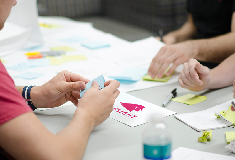
After confirmation of all requirements to the new logotype and review of disadvantages of the old one we had to deal with the most fierce (as regards team discussion) and complicated (as regards making a decision) stage – development of the future Elfsight logo. All in all, we faced two task levels, namely:
First level – what does the icon has to be and what should it be associated with? In other words, we must get the idea of our logo to our clients
Second level – we have to choose the font for company’s name
As you can guess, level №1 was the most challenging to complete and included almost impassable boss at its end. However, our team plays in a cooperative mode. We were able to move to the next level thanks to the persistence of all team!
Building New Logo
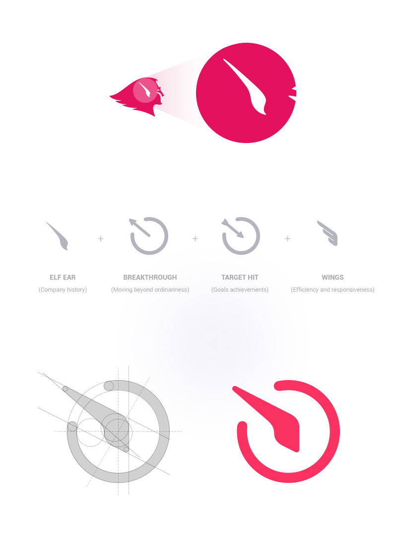
In order to create a new logo we started from associations, which can describe our team. Thus, a correctly adjusted logo would be able to show easily our audience, who we are and how we behave to our work. You can see what we’ve got on the next picture.
Concept of the brand-new Elfsight icon
In total, we’ve got the noticeable, accurate and eye-catching Elfsight icon. We relied on four main conceptions during its creation:
Elf ear – a tribute to company’s history, how it all started. Of course, we didn’t want to lose our unique face during the rebranding process in no circumstances as we’ve already had a good reputation on plugins market
Breakthrough icon – it shows audience that Elfsight company moves beyond ordinariness and strives to present a whole new experience in plugin development
Arrow icon – hitting your target, achieving results. Our products allow customers to realize their goals
Wings icon – mobility of Elfsight company and its efficiency. We do our work quickly and efficiently for the good of our clients and our team is always at the forefront of all events and trends in our professional sphere.
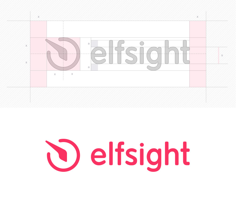
Half the work is done! The final touch is font. We were arguing about its size for a while, should it has lower-case or upper-case letters. By taking into account peculiarities of our name and by experimenting with sizes and shapes, the team chose the smooth font, which will be easy-to-read due to the usage of lower-case letters.
Meet new Elfsight!
Do you want to see what has turned out as a result? Though you’ve probably seen the new logotype on Envato, no one canceled an intrigue, even if it’s small and so obvious.
That’s What We’ve Got
We’ve put a puzzle together and received the following result, which you can check on the next picture. By the way, there you will also view the logo in progress with marking.
All-new all-different Elfsight logotype
The smooth font reflects mildness of the icon and, for now, they became a single whole. The logotype is built in accord with general geometrical rules and it looks clear, brightly and friendly. What do you think?
Moreover, we succeeded in tracing new Elfsight logo to the icons of all our products. We placed the products sign inside the company’s icon and decrease the size of styled elf ear (yep, elf is till with us) and placed it on the border of product’s updated sign.
Branding of Elfsight products by using new logo
This way we were trying to make our products look unique and recognizable.
What’s Your Feeling?
A great deal of work has been done in the field of logotype redesign. We shared our own experience with you and hope that there are points, which everyone can emphasize for himself. If a certain eminent company took our approach to logo redesign in its interests, well, we would probably retrain for brand agency 😉
Our work is done here and we are moving on. Who knows what awaits us in the future, but one thing can be said for sure – we will make maximum efforts to provide you with the best ideas that make your website wiser.
We will be very glad if you share your thoughts!
Of course, your opinion is important for us. You might think that our previous logo was better or just want to say some good words towards our company? Therefore, don’t hesitate to leave comments concerning our new logo below.