Every effective website needs a reliable way for visitors to reach out — and that’s exactly where contact forms come into play. Whether it’s for customer inquiries, service requests, or collaboration offers, a thoughtfully built form serves as a digital bridge between you and your audience.
More than just a method of communication, contact forms are a key part of the email submission interface on any modern platform. They guide visitors through a seamless interaction, helping you collect valuable leads while maintaining a professional image.
From simple question boxes to interactive feedback modules, the diversity of website contact form examples shows just how adaptable and strategic these elements can be.
- Improves user experience. A structured, intuitive form eliminates friction and makes it easy for users to send inquiries or requests without confusion.
- Minimizes spam risks. Unlike displaying a raw email address, a form can include CAPTCHA, filters, and required fields to protect against bots and unwanted messages.
- Captures actionable data. With customizable fields, you can gather specific information such as service needs, timelines, or contact preferences — streamlining follow-up and conversions.
In this article, we’ll walk through real-world contact form design ideas and explore how smart design choices can make your forms more inviting and effective. Let’s dive in.
Why Contact Forms Matter
While the primary goal of a contact form is communication, its real value goes far beyond that. An effective form acts as a strategic tool for improving the lead capture experience, guiding users toward meaningful interaction while delivering you actionable information.
From quick inquiries to detailed service requests, there are many ways a contact form can function. Understanding the types of forms available helps you choose the right structure for your business needs and audience expectations.
Below are some of the most common contact us form examples you’ll find across different websites:
| Type of Form | Purpose |
|---|---|
| Basic inquiry forms | Used for general communication, typically including name, email, and message fields. |
| Support request forms | Designed for customer or tech support with dropdowns to categorize issues and streamline help requests. |
| Service booking forms | Allow users to schedule appointments or consultations by selecting time slots and service types. |
| Feedback or testimonial forms | Collect user opinions, reviews, and ratings to improve credibility and service quality. |
| Multi-step forms | Break complex processes like project briefs or quotes into multiple easy-to-follow steps for better usability. |
A sample contact form for website use should not only collect the right data but also feel intuitive and non-intrusive. A good visitor messaging area builds trust and reinforces your brand tone, whether formal or conversational.
As you explore how different businesses approach form design, you’ll notice patterns and creative twists that make them stand out. Let’s take a closer look at some of the most inspiring contact form examples and what makes them work.
Examples of Contact Forms
Contact forms are essential for facilitating communication between your website and its visitors. A well-designed contact form not only collects information efficiently but also enhances user experience and encourages engagement. Below are five exemplary contact form templates from Elfsight that combine functionality with user-friendly design.
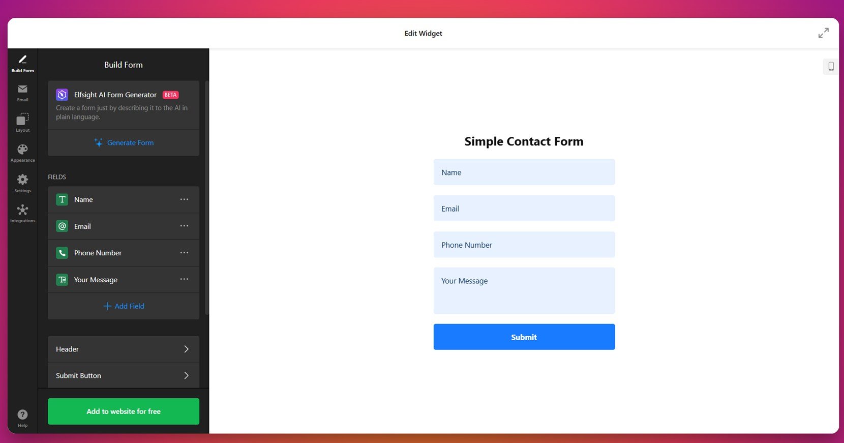
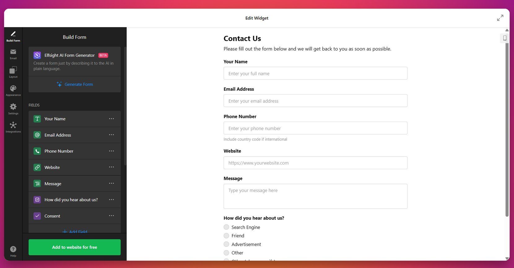
1. Basic Contact Form
Perfect for general inquiries, the Basic Contact Form includes just the essential fields: name, email, and message. This makes it ideal for portfolios, freelancers, or small businesses looking to provide a quick and simple communication channel.
You can personalize this form with your logo, button text, and color scheme, allowing it to blend naturally into your website design. It’s especially useful when you need a no-fuss solution that invites users to reach out without overwhelming them.
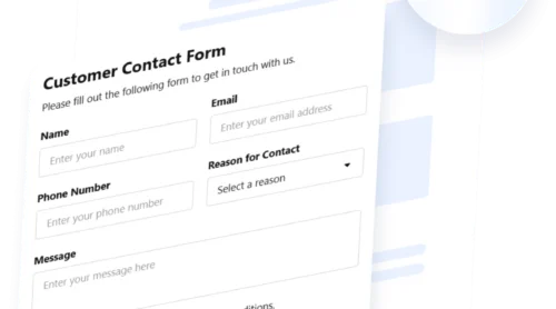
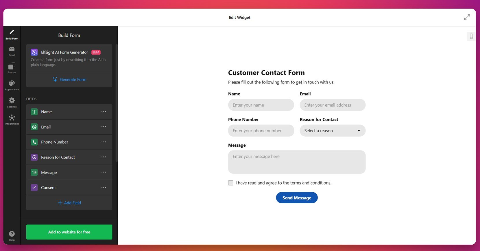
2. Customer Contact Form
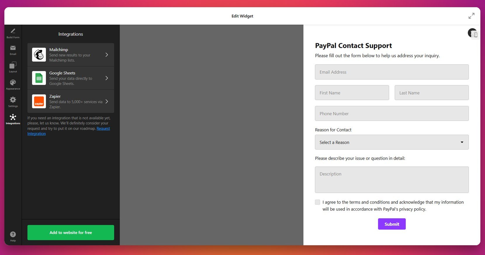
The Customer Contact Form is built for businesses that deal with high volumes of inquiries or multi-purpose requests. It features additional fields for phone numbers, subjects, or customizable dropdowns to help route messages more effectively.
This template works well for service-based companies, consultants, and eCommerce support teams. It offers robust customization options and a professional appearance, helping you streamline customer communication and save time managing incoming requests.
3. Drop Down Contact Form
For organizations that need to sort and respond to specific types of messages, the Drop Down Contact Form offers an elegant solution. A categorized dropdown helps users select topics like “billing”, “technical support”, or “sales”, so their message gets to the right person faster.
This form is ideal for customer support workflows and teams with multiple departments. You can edit dropdown options, rearrange fields, and style it to match your brand — all while improving response times and customer satisfaction.
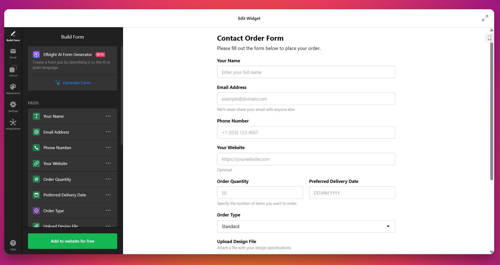
4. Contact Order Form
The Contact Order Form bridges the gap between communication and ordering. It’s perfect for small stores, boutiques, or B2B service providers who want users to describe what they need without a full eCommerce checkout.
You can add product-type dropdowns, quantity fields, and a message box for details. This flexible layout makes it easy to collect and process requests efficiently, even if you don’t have a traditional order flow in place.
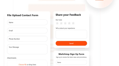
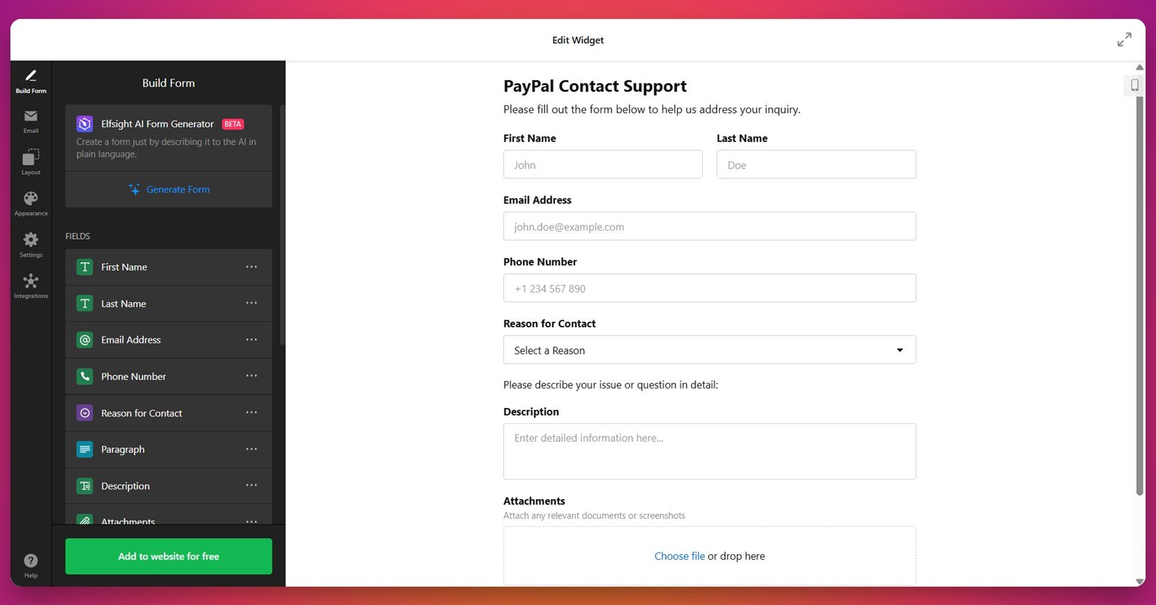
5. File Attachment Contact Form
Sometimes, users need to share more than just text — and that’s where the File Attachment Contact Form shines. It allows users to upload documents, images, or screenshots directly through the form, making it great for customer support, project proposals, or hiring inquiries.
Drag-and-drop functionality, file type limits, and mobile responsiveness make this form both powerful and easy to use. It’s particularly effective for creative agencies, tech support, or legal services that require additional context from the user.
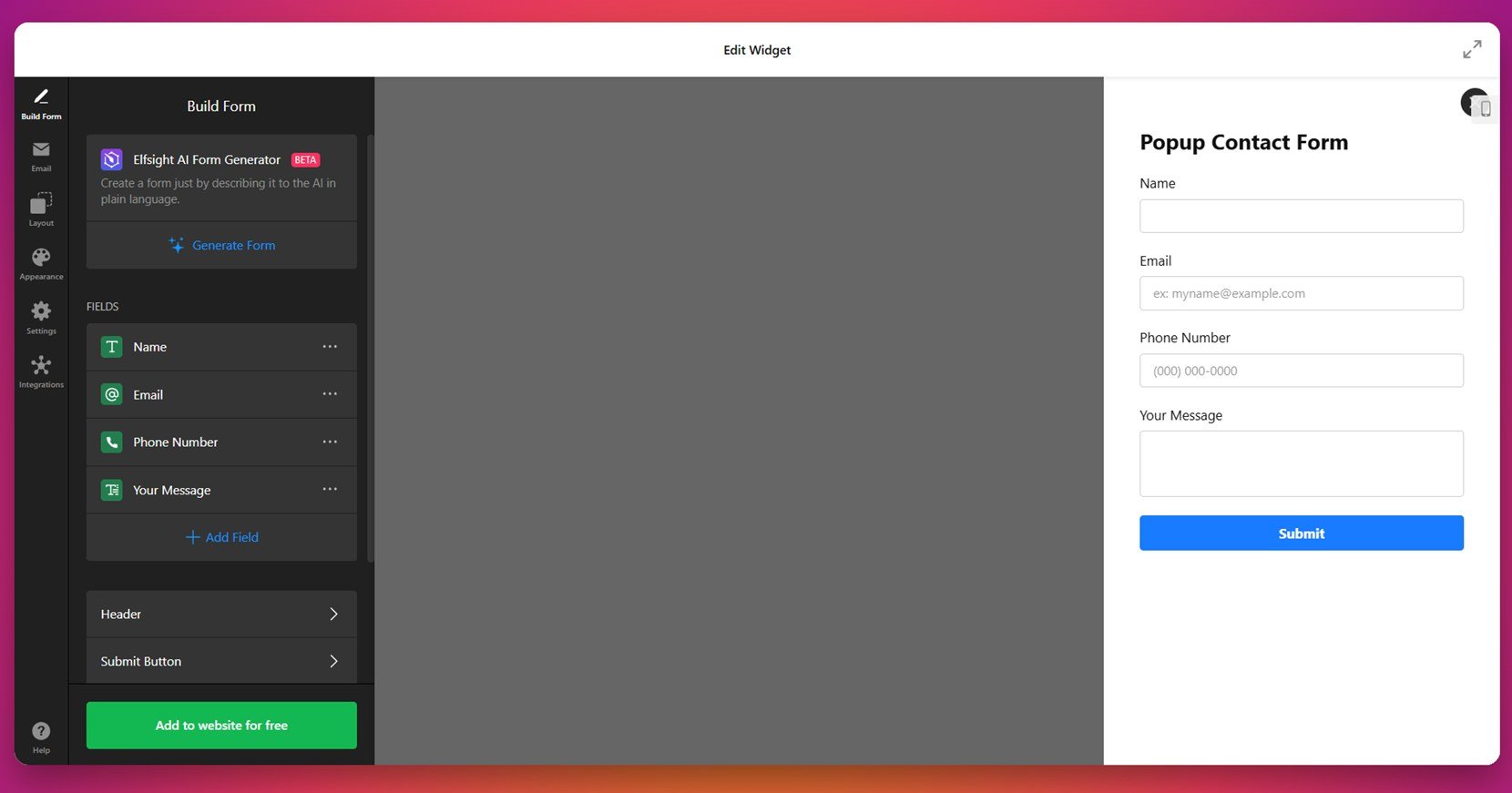
6. Floating Contact Form
The Floating Contact Form is designed for constant accessibility. It appears as a discreet button or icon fixed to the screen edge and expands when clicked. This makes it a great fit for businesses that want users to reach out at any point during their browsing experience.
This form is ideal for increasing form visibility without taking up valuable page space. You can fully customize its position, style, and animation, making sure it doesn’t interfere with your website layout while still improving user engagement.
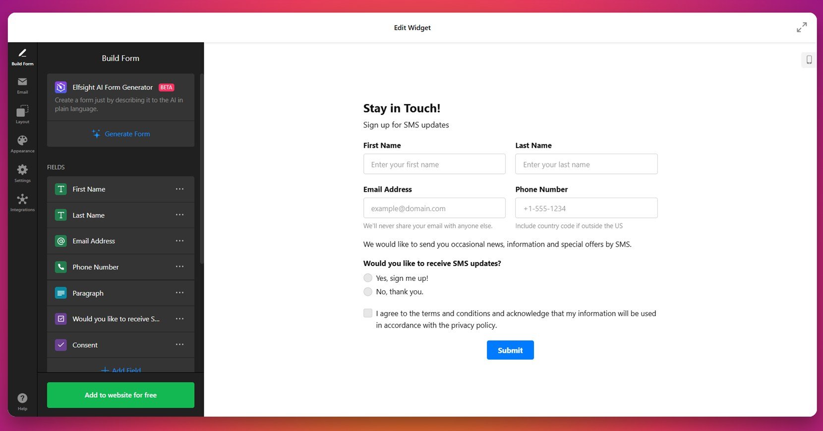
7. SMS Contact Form
The SMS Contact Form is tailored for users who prefer quick, mobile-first communication. Instead of traditional email follow-ups, this form is designed to collect phone numbers and initiate conversations through SMS.
It’s perfect for appointment reminders, order confirmations, or personalized service interactions. You can customize message prompts, add consent checkboxes, and ensure full compliance while keeping communication efficient and direct.
8. Auto Reply Contact Form
The Auto Reply Contact Form instantly sends a confirmation message to users after submission, letting them know their inquiry has been received. This small touch reassures visitors and sets expectations for follow-up.
This form is especially useful for businesses handling high volumes of messages or teams with longer response times. It enhances user trust, improves the customer experience, and can be customized with branded messaging or helpful next steps.
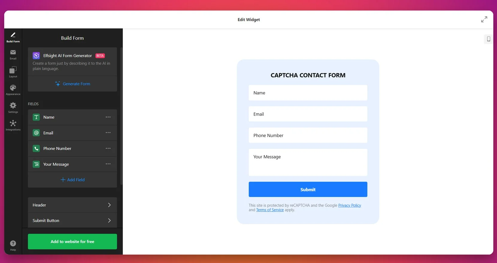
9. Captcha Contact Form
Security and spam prevention are the focus of the Captcha Contact Form. It includes a CAPTCHA verification field to ensure only real users submit requests — protecting your inbox and improving data quality.
Ideal for any business receiving a high volume of messages, this form balances simplicity with protection. You can customize the CAPTCHA type, adjust field layouts, and maintain a sleek design while boosting form security.
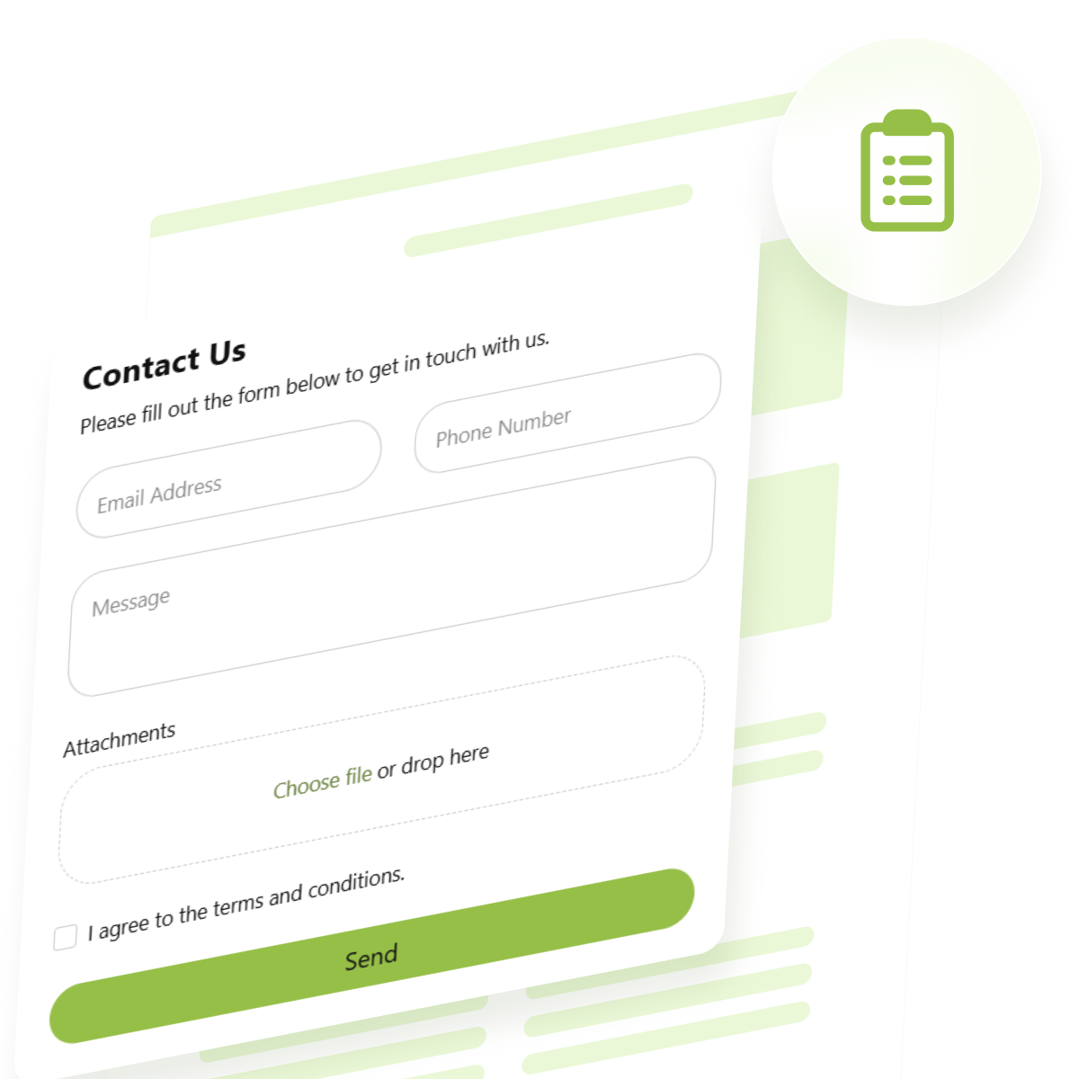
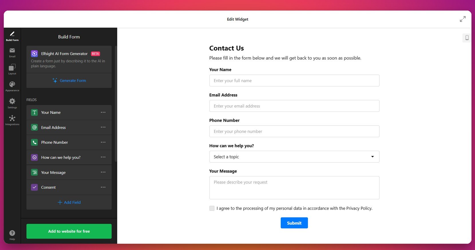
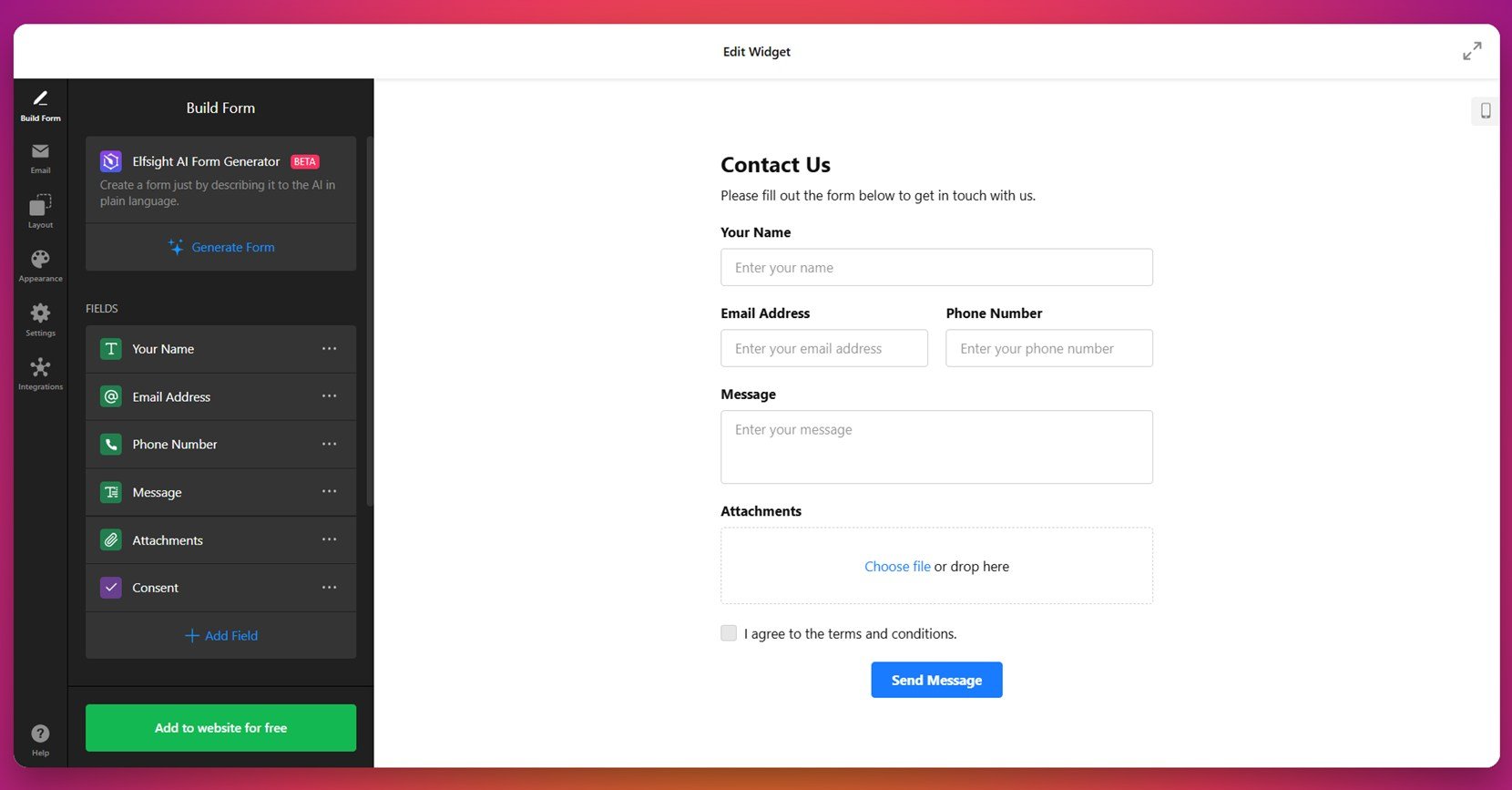
10. Contact Us Form
The Contact Us Form is a well-rounded, ready-to-use layout designed for clear and direct communication. It features essential fields like name, email, phone number, and message, making it ideal for businesses of all types looking to encourage customer outreach.
This form is simple to customize with different layouts, visual styles, and optional fields. Whether used on a contact page or as a floating widget, it’s effective in providing visitors with an easy way to connect while maintaining a clean, professional appearance.
Each of these templates exemplifies how thoughtful design and user-centric features can create contact forms that not only look professional but also perform effectively. By selecting a template that aligns with your website’s goals, you can enhance user interaction and streamline communication.
Creative Contact Form Ideas
A great contact form does more than just collect names and messages — it can reflect your brand, increase engagement, and even spark delight. Whether you’re building from scratch or enhancing an existing layout, here are some smart contact form ideas that push functionality and creativity forward.
Fresh Ideas to Improve Your Contact Us Form Design
- Gamify the form experience. Use progress bars, animated transitions, or interactive steps to make multi-page forms more engaging.
- Use icons instead of labels. Minimalist designs with icons help keep the layout clean and guide users intuitively.
- Enable voice or audio input. Let users record quick voice messages directly within the form — ideal for mobile users or support requests.
- Include visual feedback. Add checkmarks, animations, or friendly success messages after submission to make users feel confident their message was received.
- Add toggle switches or sliders. Make input field customization more dynamic by letting users rate services or choose preferences visually.
As you experiment with new design elements, remember to keep the form accessible, responsive, and easy to understand. The most effective forms are those that blend creativity with clarity — where every field has a purpose and every interaction feels effortless.
Up next, we’ll explore the best practices that guide high-performing contact form design, helping you strike the perfect balance between aesthetics, usability, and conversion potential.
Best Practices for Form Design
After exploring creative ideas, it’s important to bring structure and usability into focus. Even the most imaginative design needs to follow key form interaction patterns to work smoothly. These modern contact form design principles help ensure that your form is easy to use, functional across devices, and encourages completion.
Layout and Visual Hierarchy
A good layout directs the user’s attention without overwhelming them. Use ample spacing, clear field groupings, and readable font sizes. Align labels consistently and keep the number of required fields to a minimum.
Mobile Optimization
Mobile users should be able to complete the form with one hand. Use responsive design, large touch targets, and autofill-friendly fields. Your contact form web design inspiration should prioritize seamless experience across screen sizes.
Accessibility Considerations
Include labels for screen readers, ensure proper contrast, and support keyboard navigation. Accessible forms not only widen your audience but also improve overall clarity and performance.
Feedback and Confirmation
Use real-time validation to help users fix errors as they go. Show a confirmation message after submission and send an email copy if appropriate — this aligns with best UX practices for messaging and builds user trust.
Call-to-Action Placement
Place the submission button where users expect it — usually at the bottom-right — and use clear, action-oriented language like “Contact Us” or “Request Info”. Consider using color contrast to make it stand out.
By applying these best practices, you create a contact form that not only looks great but works efficiently for everyone who uses it. Next, let’s look at how to embed and implement these forms effectively across your website.
How to Add a Contact Form to a Website
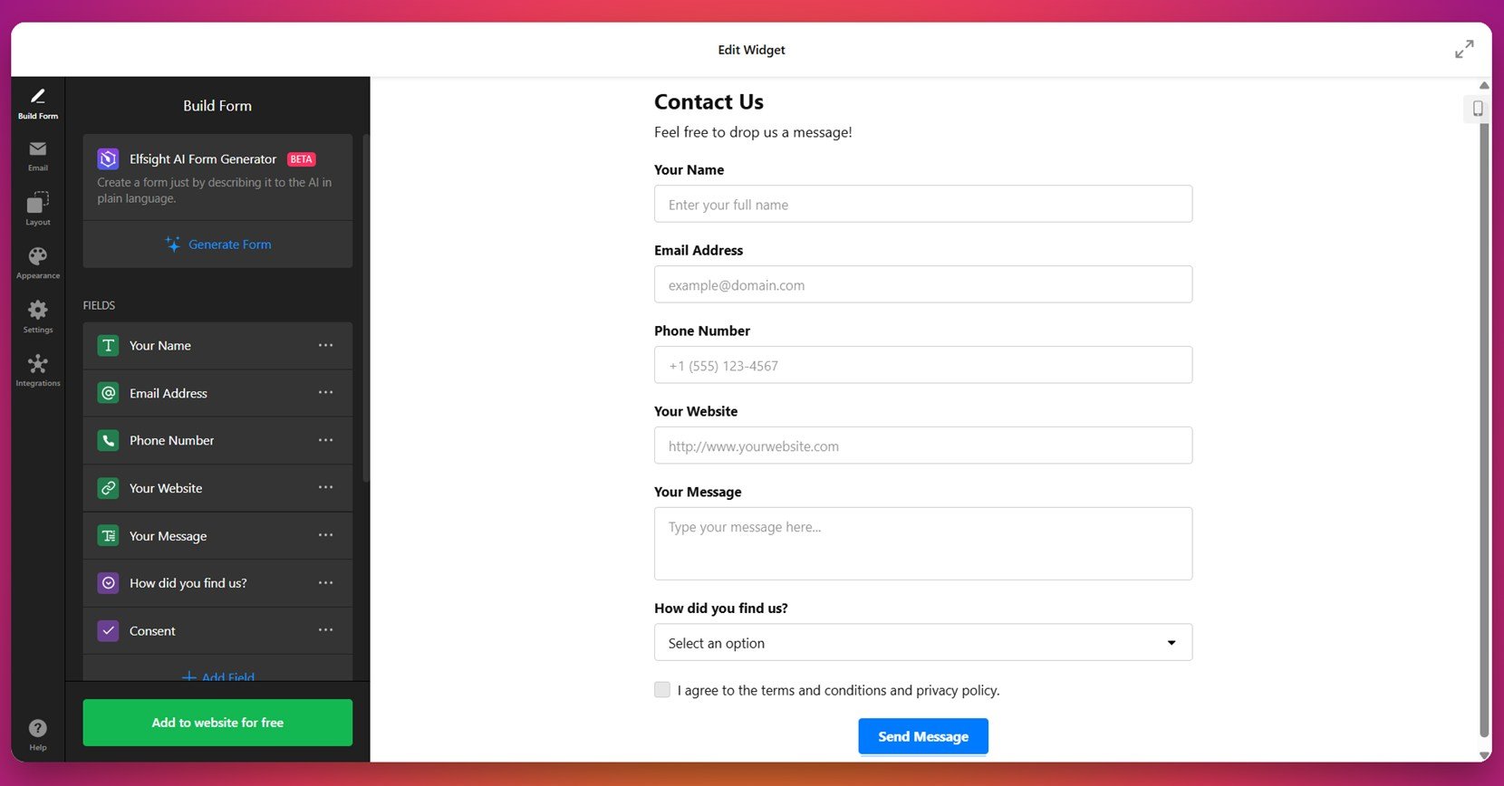
Once you’ve crafted the perfect layout and user experience, the next step is to bring your contact form design to life on your website. Elfsight’s widget-based builder allows you to create and embed a fully functional, visually aligned, and responsive form without touching a line of code.
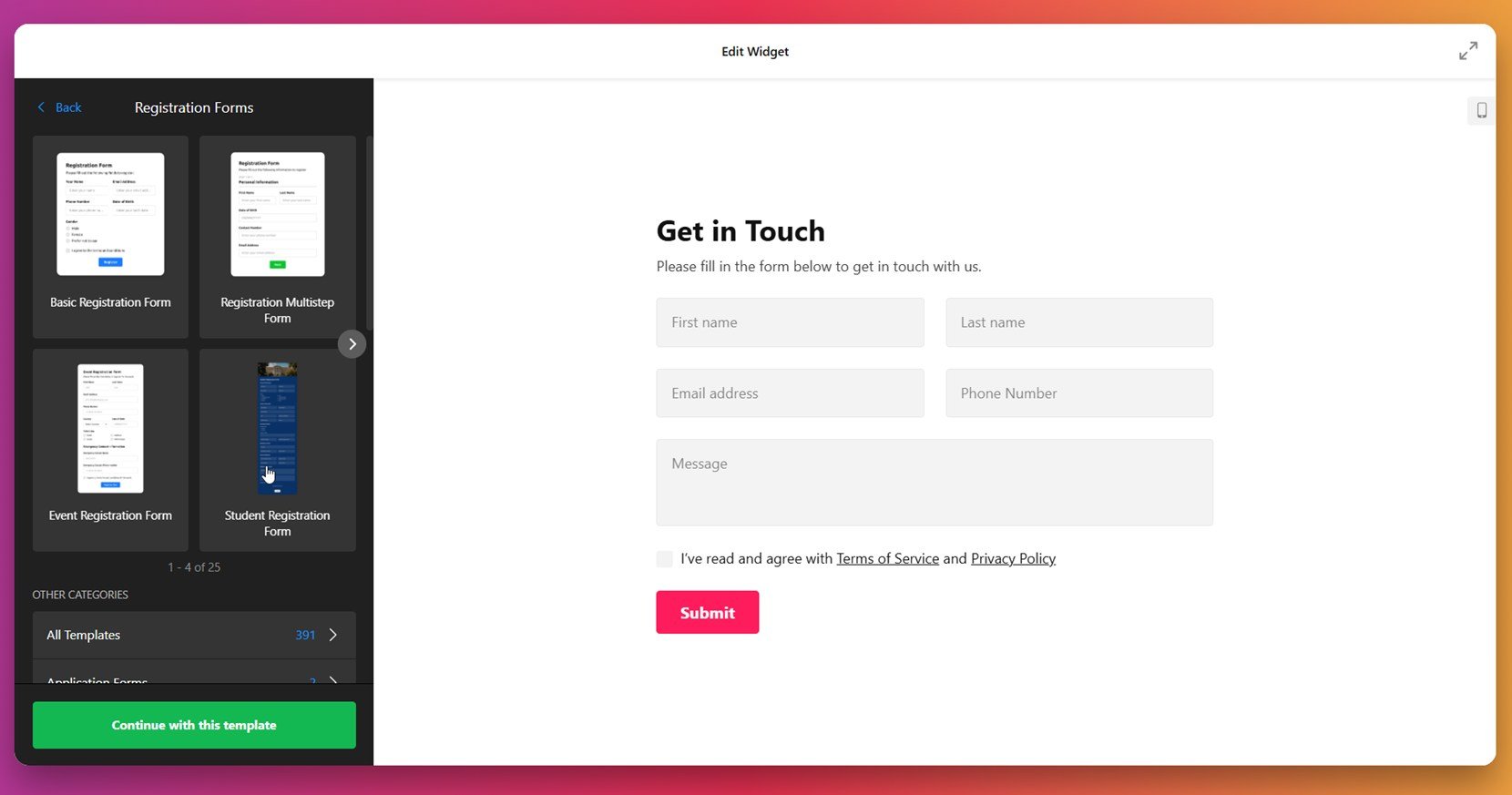
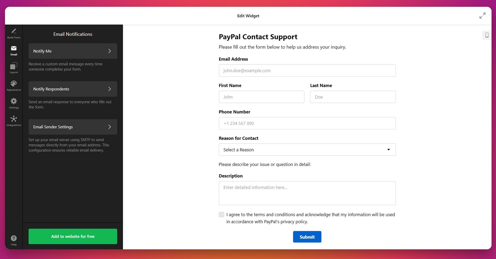
- Select a sample contact form template. In the Elfsight editor, browse pre-designed layouts that align with your communication goals. When ready, click “Continue with this template” to open the form editor and begin shaping it to your brand.

- Customize your fields with precision. Use the “Build Form” panel to drag in name, email, dropdowns, date pickers, and file upload fields. Through thoughtful input field customization, you ensure each field serves a clear purpose without overwhelming users.

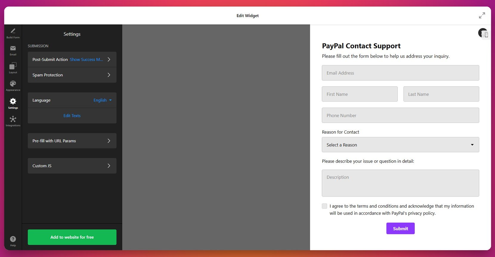
- Set up automated email responses. Under the “Email” tab, define who receives submissions and what message users see after sending. Use “Notify Me” and “Notify Respondents” options, and fine-tune delivery behavior in the “Email Sender Settings”.
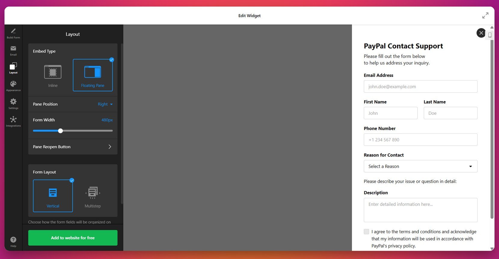
- Adapt the layout for different placements. Visit the “Layout” tab to explore Inline or Floating Pane formats. Whether placing the form in a sidebar, footer, or as a popup, you can control width, alignment, and spacing to ensure it fits your website structure.

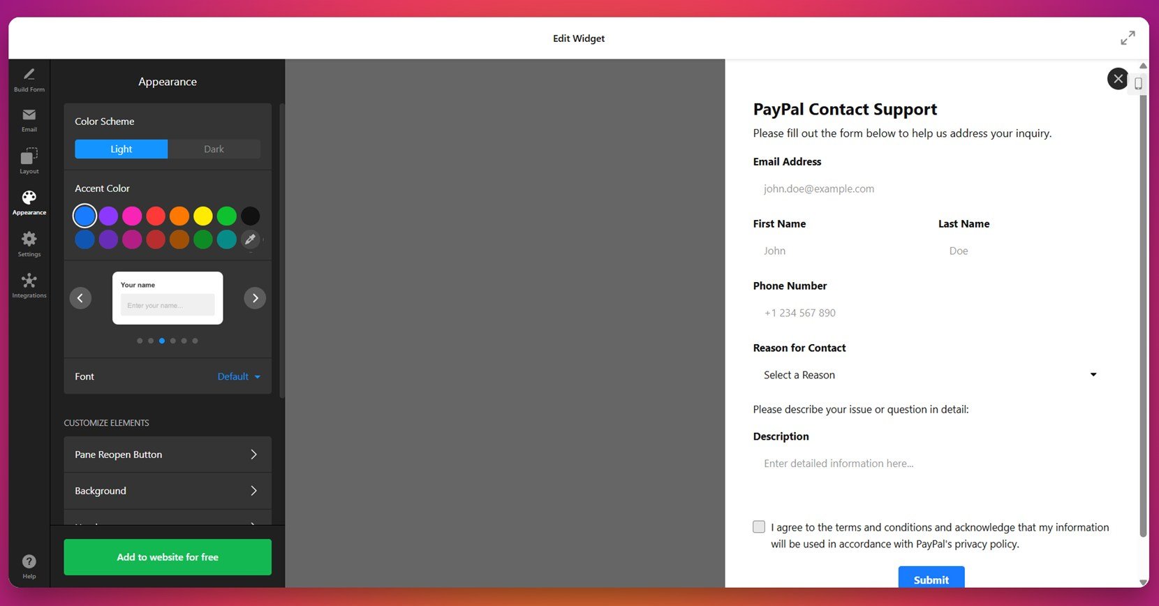
- Match your form with your brand style. In the “Appearance” section, apply your colors, fonts, and themes to create a seamless design. A consistent visitor messaging area reinforces trust and professionalism across your entire website.

- Optimize mobile responsiveness and interactions. Through the “Settings” tab, activate mobile-optimized behaviors like touch-friendly buttons, responsive field sizing, and scroll control — ensuring a smooth experience across all devices.

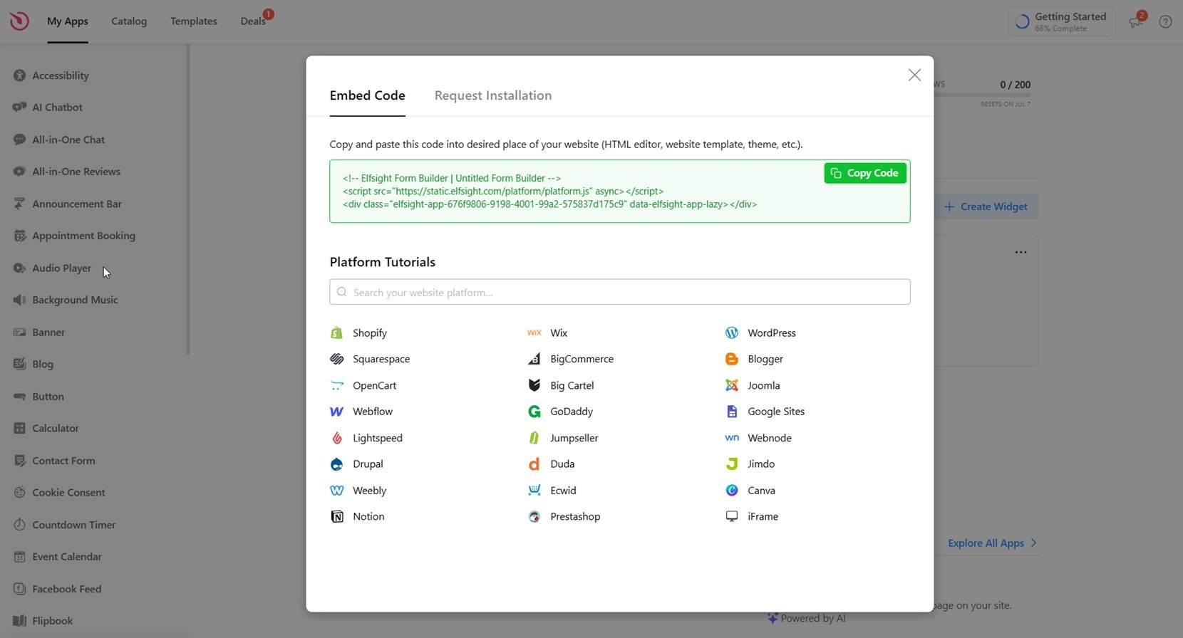
- Connect your form with essential tools. Head to the “Integrations” panel to link Google Sheets, Mailchimp, or Zapier. These integrations automate data flow, making your form not only functional but also efficient for your workflow.
- Embed the form where it performs best. Once finalized, click “Add to website for free” to generate your embed code. Paste it into a WordPress Custom HTML block — or any compatible builder — to display your form exactly where it will convert best.

By combining ease of integration with flexible styling, Elfsight helps you turn a simple contact form into a polished, high-performing asset. Whether it lives in your homepage hero, contact page, or floating footer, your form can enhance interaction without disrupting the design.
No more wrestling with code or plugins — Elfsight empowers you to build modern, sleek, and interactive forms that serve your business goals. Whether you’re collecting inquiries, scheduling consultations, or accepting attachments, you can launch your form in just a few clicks.
See the form builder in action right – create a form in minutes!
How to Measure Form Success
Once your form is live, it’s essential to evaluate how well it performs. Even the most attractive contact form design ideas can fall short if they don’t convert or engage users effectively. Measuring performance helps you identify strengths, spot friction points, and refine your form for better results.
Below is a breakdown of useful metrics to assess your website contact form examples and ensure they’re delivering value:
| Metric | What It Tells You |
|---|---|
| Conversion Rate | Shows the percentage of users who completed the form after viewing it. Key indicator of how effective your lead capture experience is. |
| Drop-Off Points | Reveals where users abandon the form. Helps you pinpoint which steps or fields are creating friction. |
| Field Interaction Tracking | Analyzes which fields users engage with or skip. Offers insight into how intuitive your form interaction patterns are. |
| Error Rate | Tracks how often users experience validation issues. High error rates suggest confusing labels or overly strict rules. |
| Submission Timing & Devices | Identifies when and where users submit your form. Helps optimize design and targeting for mobile and desktop users. |
Performance measurement turns assumptions into actionable insights. With consistent tracking, you can refine your design, test new approaches, and ultimately boost the success of every form you publish.
Let’s wrap things up with a few key takeaways to help you move forward with confidence.
Final Thoughts
Designing a successful contact form is about much more than just collecting names and emails. It’s a blend of functionality, user experience, and brand alignment. From selecting the right contact us form example to ensuring responsive layout, every choice contributes to a stronger web engagement section. When backed by performance tracking and thoughtful design, your contact form becomes a critical asset for communication and lead generation.
Whether you’re building a minimalist form or a detailed questionnaire, the principles remain the same: prioritize clarity, ensure usability across devices, and create a smooth email submission interface. Use real-world contact form web design inspiration to refine your layout, experiment with field customization, and continuously measure results. The right contact form doesn’t just look good — it works hard for your business, 24/7.