In today’s digital space, businesses are always looking for ways to improve how they connect with their audience. One of the most efficient methods is through survey forms. Whether you’re collecting opinions, measuring satisfaction, or doing research, a well-designed form helps streamline data collection methods while keeping your visitors engaged.
But why are survey forms so essential? Simply put, they give your audience a voice. Instead of guessing what your users want, you can gather honest, real-time input directly from your website visitors. This data can then be used to make informed decisions and improve your offerings.
Here are several reasons why integrating survey forms into your website is a smart and strategic decision:
- Opens a direct feedback channel. Gives visitors an easy way to share thoughts, opinions, and concerns without friction.
- Improves decision-making. Provides businesses with data-backed insights that help guide product, content, and service improvements.
- Builds trust and transparency. Shows users that their input is valued and that the business is open to dialogue.
- Boosts engagement and retention. Encourages users to spend more time interacting with the brand, strengthening loyalty over time.
- Supports targeted marketing efforts. Helps segment audiences and tailor offers based on feedback and preferences.
These benefits highlight why understanding the best survey form examples is more than a design choice — it’s a strategic move. As we explore real-world inspiration and tactics, you’ll see how survey forms are powerful tools for audience engagement tactics and long-term growth.
What Makes a Website Survey Effective
An appealing layout alone won’t guarantee that users complete your survey. To achieve high completion rates and gather quality insights, your form must balance aesthetics, clarity, and functionality. The foundation of effective survey lies in creating an intuitive experience that guides the user from start to finish without confusion or fatigue.
User-friendly survey form design isn’t about being minimal for the sake of design trends — it’s about creating a form that feels effortless to complete. Poor formatting, overwhelming questions, or lack of responsiveness can drive users away before they hit “Submit”.
Key elements of an effective survey form include:
- Clear question structure. Use question formatting techniques that group similar topics together and use simple language. Each question should have a clear purpose.
- Logical flow. Organize questions in a sequence that feels natural. Start with easier, broader questions and lead toward more specific or optional ones.
- Optimized layout. Make sure the form works smoothly across all devices. Mobile-friendly interfaces are essential, especially as many users interact with forms on smartphones.
- Progress indicators. If your form is longer, let users know how far along they are. This improves transparency and encourages completion.
- Minimal distractions. Keep the interface clean and distraction-free. Avoid excessive text, unnecessary animations, or overly complex input types.
Ultimately, response rate optimization hinges on understanding user behavior. When survey forms feel seamless, users are more likely to complete them — and provide honest, valuable responses.
Inspiring Survey Form Examples for Websites
When it comes to designing creative survey forms, the best inspiration often comes from real-world examples. These carefully crafted layouts highlight how thoughtful visual form aesthetics, interactive form components, and customizable UI elements can shape the user’s experience and boost participation rates.
Below are some standout survey form examples that showcase different use cases, from collecting customer feedback to evaluating employee engagement. Each one demonstrates a distinct approach to both function and design, making them ideal references when planning your own survey strategy.
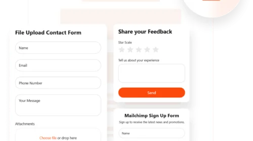
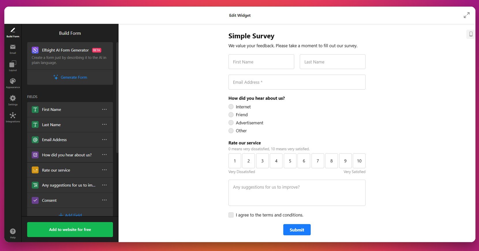
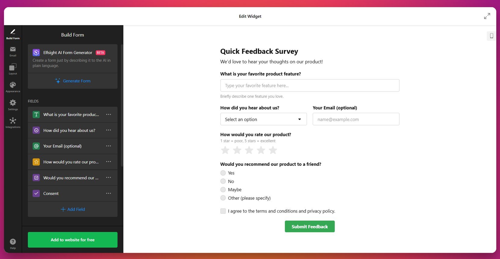
1. Simple Survey Form
The Simple Survey Form is designed for quick, straightforward interactions. With a clean interface and minimal text, it invites users to share basic feedback or opinions without overwhelming them. This type of form works especially well when you want to avoid drop-offs by eliminating visual clutter or excessive steps.
It’s ideal for bloggers, small business owners, or landing pages that require brief check-ins or pulse surveys. The benefits lie in its simplicity — fast completion time, low barrier to entry, and user-friendly navigation make it a go-to format for high participation rates in casual feedback scenarios.
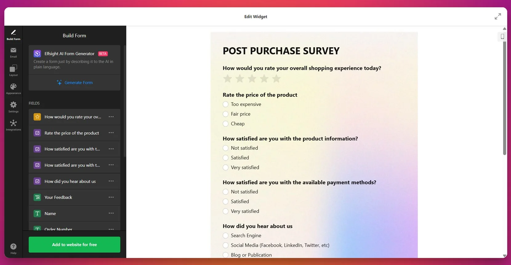
2. Post-Purchase Survey
The Post-Purchase Survey is tailored for online stores and service-based platforms that want to capture the customer’s immediate thoughts after a transaction. With features like star ratings, short answer questions, and delivery satisfaction prompts, it offers structured insights when user impressions are at their most vivid.
Brands in ecommerce, SaaS, or subscription services will find this form especially effective in gathering timely feedback on shipping, checkout experience, and product satisfaction. Implementing this form helps improve future purchases, identify friction points, and build long-term customer relationships.
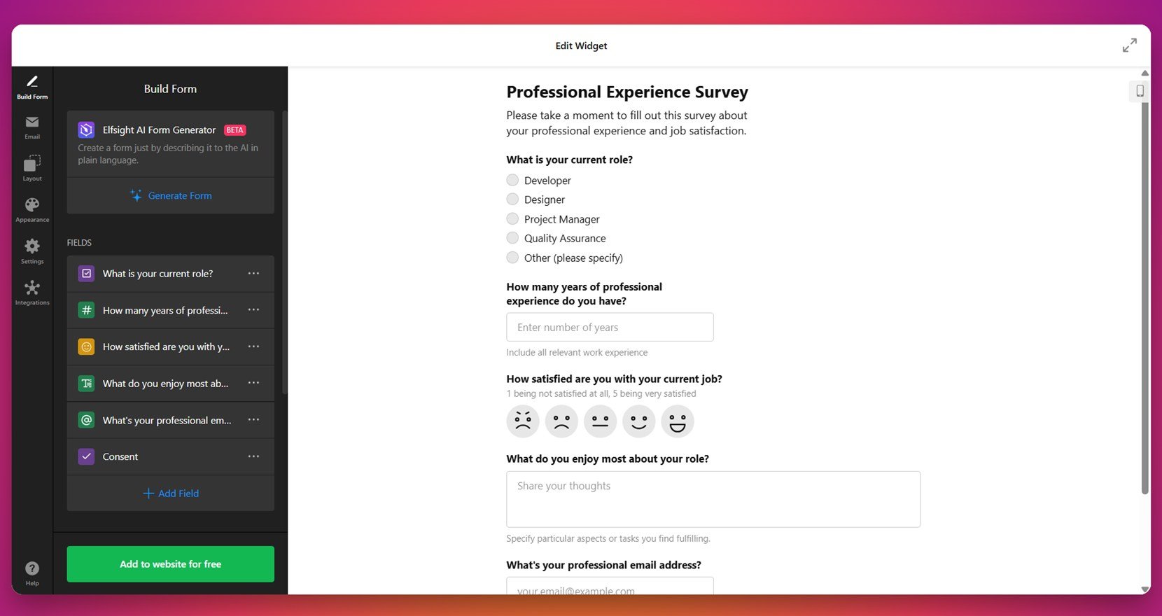
3. Survey Quiz
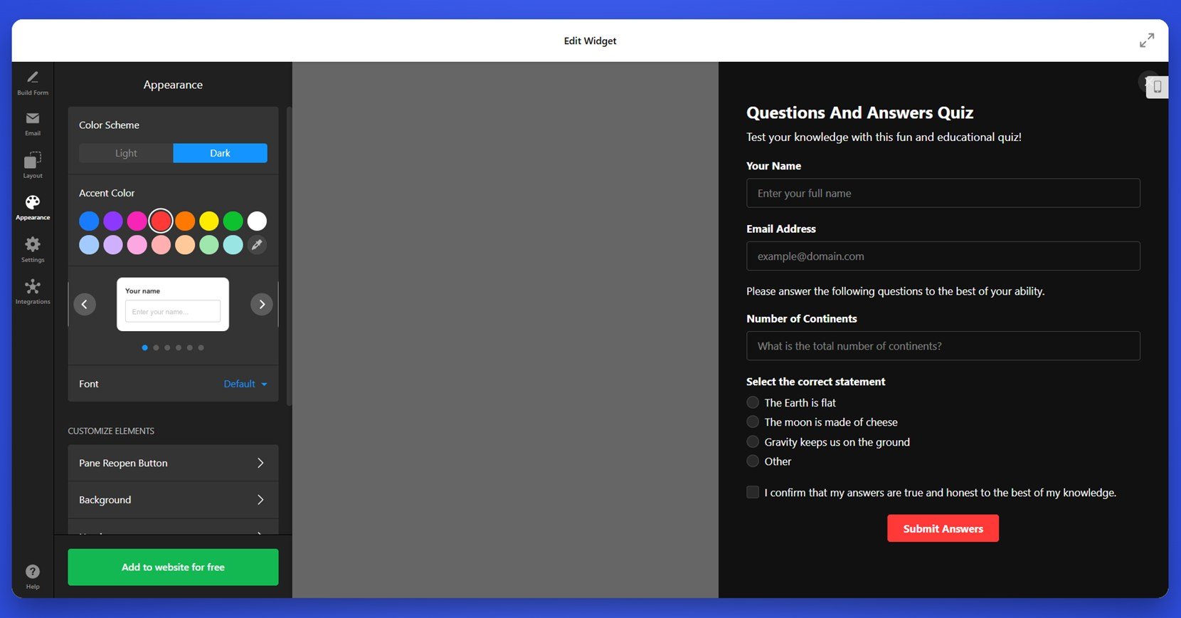
The Survey Quiz is a dynamic, interactive form that turns data collection into a playful experience. Instead of a traditional layout, it uses quiz logic with sliding scales, multiple-choice questions, and instant result generation. This gamified format encourages users to engage more deeply while still delivering actionable insights to the website owner.
It’s a perfect fit for industries like online coaching, product discovery, content marketing, or personal branding. Businesses can use it to generate leads, segment users, or offer personalized suggestions based on how respondents answer. The quiz format improves time on page and boosts overall engagement.
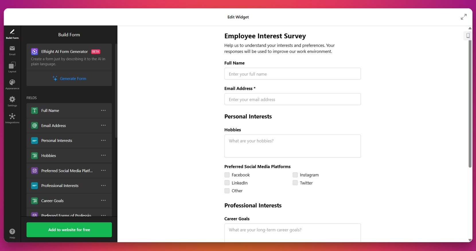
4. Employee Interest Survey
The Employee Interest Survey is designed to help organizations understand the personal and professional preferences of their teams. It includes multiple sections for different topic categories, offers optional responses, and uses an intuitive layout that encourages honest answers without pressure.
HR professionals, school administrators, and nonprofit managers can use this form to plan team-building events, wellness programs, or internal initiatives. Its primary benefit is employee-centric planning based on real input, which contributes to better morale and long-term retention strategies.
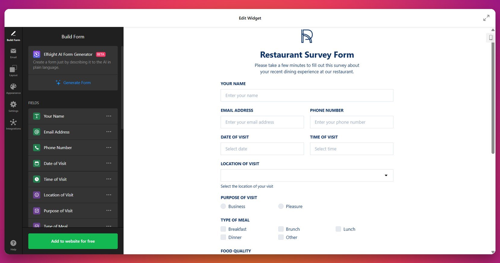
5. Restaurant Survey
The Restaurant Survey is crafted for the hospitality industry, where customer impressions of food, service, and atmosphere matter greatly. The form features star ratings, dropdown selections, and short comment sections that help collect feedback across various aspects of the dining experience.
Restaurants, cafes, hotels, and catering services can use this to track performance trends and gain insight into customer satisfaction. The visual layout is approachable yet polished, making it easy for guests to respond while maintaining a professional tone that reflects the brand’s identity.
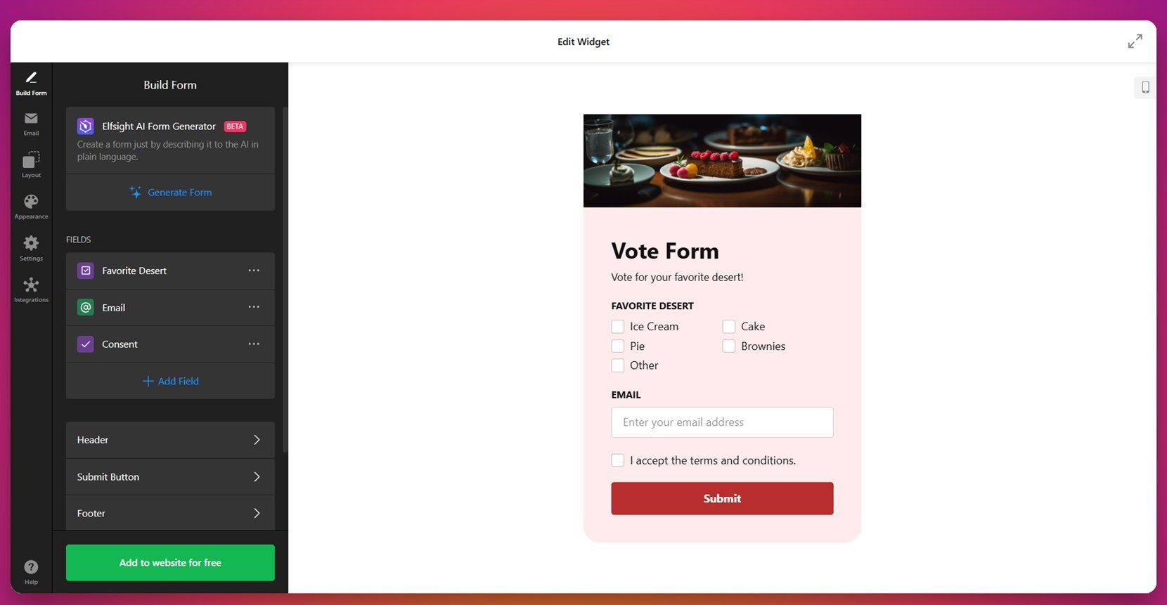
6. Vote Form
The Vote Form is a single-question format that allows users to cast a quick vote on a topic. It eliminates unnecessary input fields and focuses on clarity and speed. The layout is simple but visually strong, emphasizing the available choices in a prominent and accessible way.
This format is great for online publications, content creators, or product teams looking to crowdsource opinions on features or content. It promotes interaction with minimal commitment, making it ideal for time-sensitive decisions or community engagement initiatives.
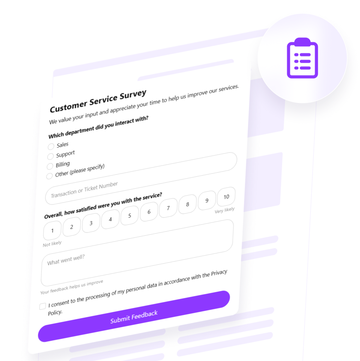
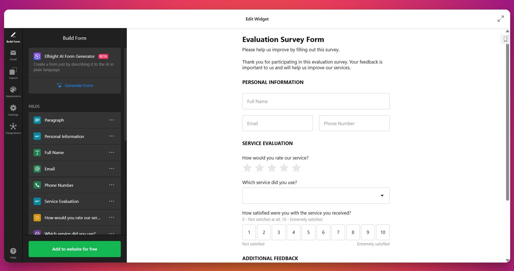
7. Evaluation Survey
The Evaluation Survey is ideal for collecting structured feedback on events, training sessions, or performance reviews. It balances numeric scales, dropdowns, and open-ended fields to allow for both quantitative and qualitative input, ensuring well-rounded results.
This form is especially useful for educators, professional coaches, and business consultants who need thorough assessments from their audiences. By collecting deeper insights in a standardized format, it helps inform future improvements and enhances decision-making processes.
8. Popup Survey
The Popup Survey appears on-screen as an overlay, triggered by scroll behavior, time delay, or exit intent. It’s a non-intrusive way to ask for quick feedback without redirecting users away from the main content. With a modern layout and mobile-friendly controls, it maximizes visibility while minimizing disruption.
This format is highly versatile — ideal for SaaS platforms, personal blogs, or marketing campaigns aiming to capture feedback or intent in real-time. Its biggest benefit lies in its timing: delivered at just the right moment, popup surveys can boost conversion rates and collect actionable data with minimal effort.
These professional survey form examples prove that form design is more than an aesthetic choice — it’s a strategic decision that influences how people interact with your brand. From functionality to form, each example offers takeaways you can apply to your own survey strategy.
How to Create a Website Survey: Quick Solution
Once your layout and user experience are thoughtfully planned, the next step is bringing your survey form design ideas to life on your website. With Elfsight’s widget-based form builder, you can create and launch a fully functional, responsive survey form — without writing a single line of code.
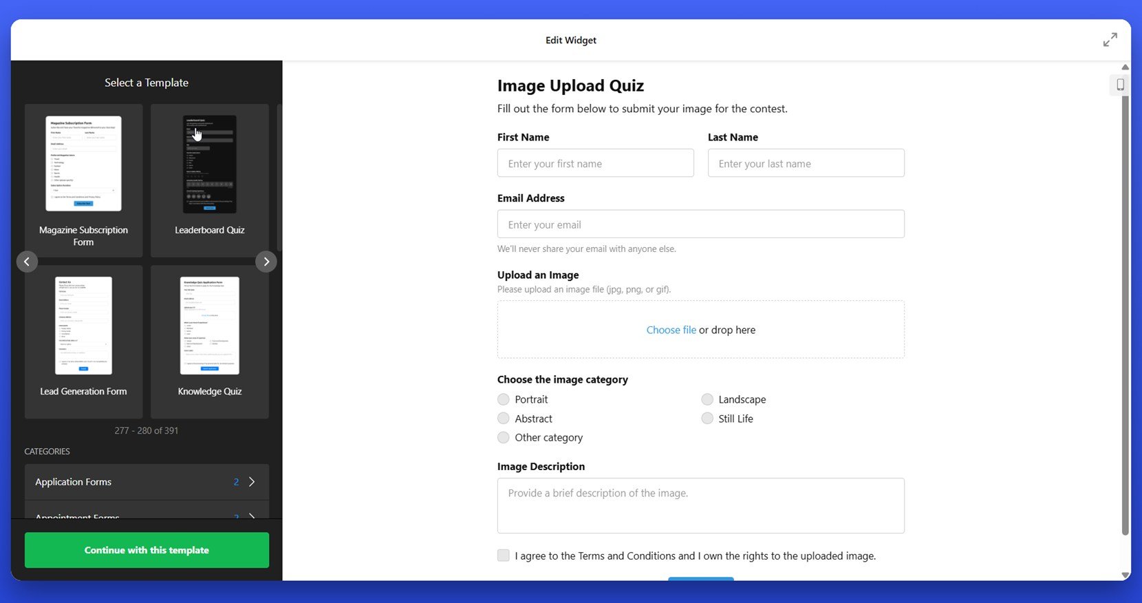
- Select a sample survey template. Inside the Elfsight editor, you’ll find pre-made layouts tailored to different use cases. When you find one that fits, click “Continue with this template” to enter the customization interface.

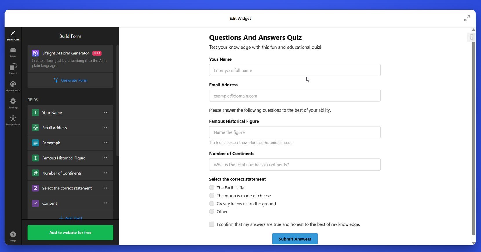
- Customize your questions with clarity and intent. In the “Build Form” panel, add and arrange question types like text fields, rating scales, dropdowns, and sliders. Each field can be tailored to collect focused responses without overwhelming your participants.

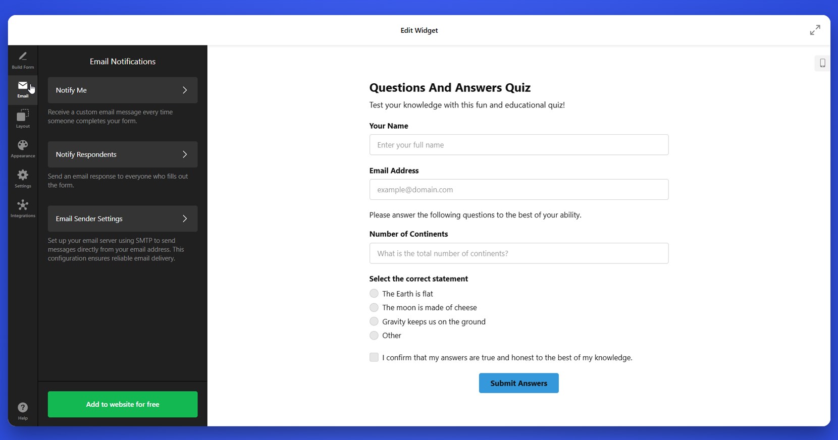
- Set up email notifications and confirmation messages. Within the “Email” tab, define who receives the responses and customize what users see after submitting the form. Use “Notify Me” for internal updates and “Notify Respondents” to acknowledge participants. You can adjust delivery settings under “Email Sender Settings” for greater control.

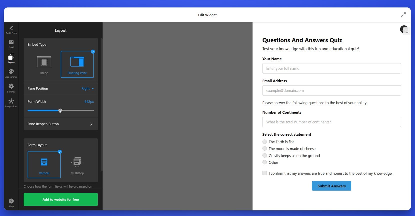
- Control layout and placement flexibility. Visit the “Layout” tab to choose how your survey appears — inline with content or as a floating window. Whether embedded in a footer, fixed to a sidebar, or triggered as a popup, you can modify width, alignment, and padding to suit your website’s structure.

- Apply your brand style for consistency. The “Appearance” section allows you to customize fonts, button shapes, and colors to align with your brand identity. This visual cohesion helps reinforce trust and polish across the user journey.

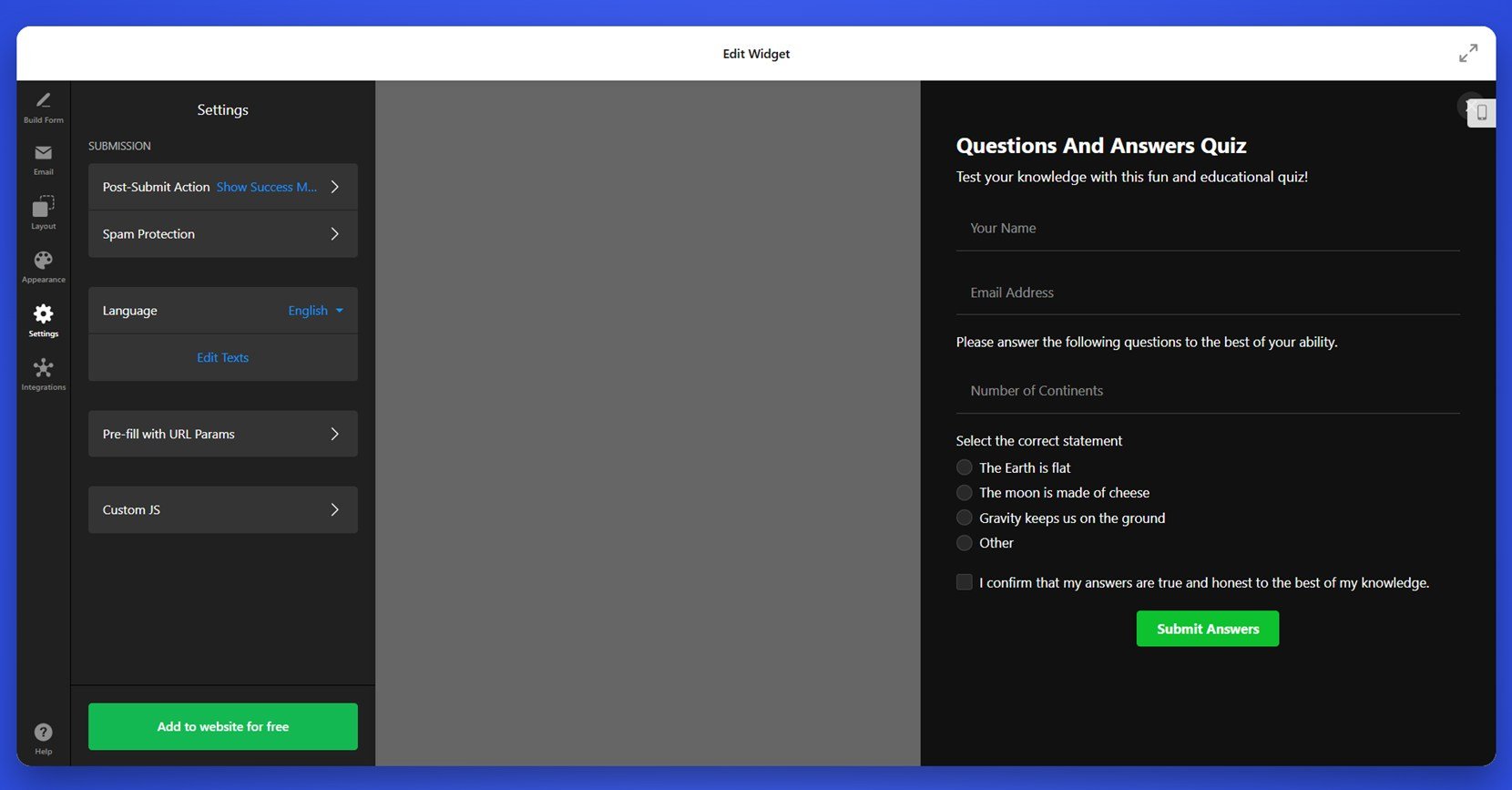
- Optimize for mobile use and accessibility. Under “Settings”, you can activate features like responsive field resizing, tap-friendly buttons, and smooth scrolling behavior. These adjustments ensure a frictionless experience on smartphones and tablets.

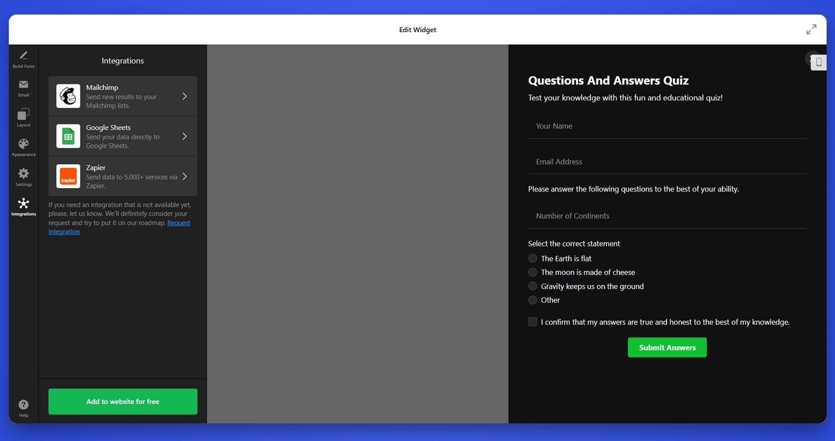
- Integrate with essential third-party platforms. In the “Integrations” panel, connect tools like Google Sheets, Mailchimp, or Zapier. These integrations automate data flow and help transform your survey into a valuable piece of your marketing or analytics pipeline.

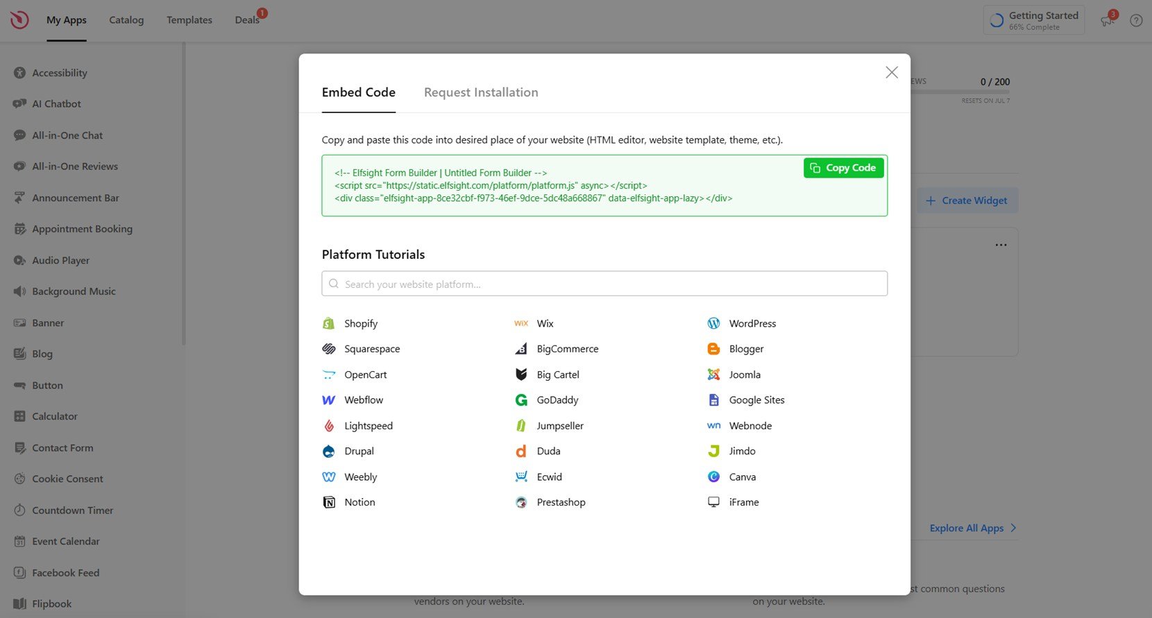
- Publish where it performs best. When your form is complete, click “Add to website for free” to generate the embed code. Paste it into your CMS or builder using an HTML block to place your form exactly where it will receive the most attention.

With Elfsight’s easy-to-use builder, you can design modern, interactive surveys that feel like a natural extension of your website. Whether you’re collecting opinions, testing product ideas, or measuring satisfaction, your form can work silently in the background — gathering data while staying beautifully integrated with your content.
No more plugins or custom coding — just sleek, fully functional surveys ready to help you make smarter decisions and create better experiences for your audience.
Build your survey today — fast, simple, and code-free!
Tips for Your Website Survey Design
Once you’ve seen what works in practice, it’s time to apply those survey form design ideas to your own website. Great design goes beyond colors and shapes — it’s about shaping the experience. A thoughtful form layout should guide the user through questions smoothly, visually align with your brand, and invite interaction at every step.
Today’s modern survey form layouts focus on clarity, speed, and responsiveness. Users expect seamless functionality across devices, which means your survey must look and perform flawlessly on both desktop and mobile screens. Design isn’t just visual — it’s functional and psychological.
Here are a few principles to keep in mind when designing your next survey form:
- Keep it visual. Use icons, progress bars, and strategic spacing to improve visual form aesthetics and reduce perceived effort.
- Use smart structure. Break long surveys into steps or sections to avoid overwhelming users and maintain audience engagement.
- Prioritize mobile UX. Opt for large tap areas, clear fonts, and auto-adjusting layouts to create mobile-friendly interfaces.
Staying current with design trends helps your form feel familiar and trustworthy. Consider using light animations, collapsible fields, or even embedded logic to personalize the experience. When every design decision supports clarity and usability, your survey becomes an extension of your brand — one that users are happy to engage with.
Common Mistakes and How to Avoid Them
Even with the best intentions, it’s easy to fall into some of the most frequent survey form design pitfalls. These errors often go unnoticed but can drastically reduce response rates, frustrate users, or lead to incomplete or inaccurate data. Understanding what to avoid is just as important as knowing what to include.
Poor design decisions can harm the overall user input experience and reduce trust in your brand. To keep users engaged and responses meaningful, steer clear of the following survey errors and use the suggestions to correct them:
| Mistake | Impact | Solution |
|---|---|---|
| Too many questions | Leads to fatigue and high drop-off rates | Keep surveys short and focused on one goal |
| Ambiguous or biased wording | Produces unclear or misleading results | Use neutral, specific language for every question |
| Unclear navigation or layout | Users may abandon the form mid-way | Design a clear, intuitive flow with visible progress |
| No mobile optimization | Makes the form difficult to use on phones or tablets | Use mobile-friendly interfaces with responsive design |
| Too many required fields | Frustrates users and slows completion time | Only require fields that are absolutely necessary |
| No thank-you or confirmation message | Leaves users uncertain whether submission succeeded | Always display a clear thank-you message or redirect |
| Overuse of open-ended questions | Makes users spend more time thinking and typing | Balance open text with dropdowns and ratings |
By spotting and correcting these issues early, you improve both the quality of your data and the likelihood that users will complete the form. A frictionless, user-centered experience leads to more honest responses — and ultimately, better decision-making.
Conclusion
By recognizing common missteps and focusing on user-first design, you’re now equipped to build survey forms that don’t just function — but truly perform. From layout and structure to visual polish and responsiveness, each element plays a role in shaping a smooth user input experience. The best survey form examples show us that even small design decisions can impact how users engage, how much feedback they’re willing to provide, and how confident they feel while doing so.
As you move forward with your own forms, keep in mind the importance of clarity, accessibility, and relevance. Whether you’re collecting feedback, evaluating services, or learning more about your audience, effective survey form designs can dramatically improve your data collection methods and overall audience engagement tactics. A well-crafted survey doesn’t just gather answers — it builds trust, encourages action, and opens the door to better decisions across your entire website experience.