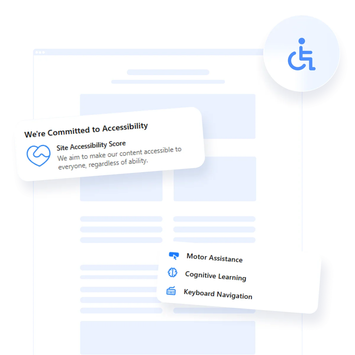
Creating an inclusive online experience is no longer optional — it’s required by law. If you are wondering how to make your website accessible, it starts with understanding the foundations of inclusive web design. At its core, an accessible website ensures that all users, including those with disabilities, can easily perceive, navigate, and interact with your content.
To create a fully accessible experience, your website must follow the four core principles of accessibility, as defined by the Web Content Accessibility Guidelines:
- Perceivable. Content must be presented in ways users can recognize easily, including alternatives like alt text for images.
- Operable. All interface components and navigation must be usable via keyboard and assistive technologies.
- Understandable. Information and interface must be clear, readable, and predictable.
- Robust. Content should be compatible with current and future technologies, including screen readers and alternative input devices.
Understanding the importance of website accessibility for disabled users goes beyond meeting technical standards — it’s about empowering individuals and providing equal access to digital spaces. For many people with visual, auditory, motor, or cognitive disabilities, a well-designed website can be the bridge to information, services, and opportunities that might otherwise remain out of reach.
What Makes a Website Accessible
It’s important to realize that accessibility isn’t just a checklist — it’s about ensuring your digital space is usable by everyone, regardless of their abilities. A truly inclusive website offers an assistive browsing experience that removes obstacles for people with various disabilities, allowing them to interact with content independently and comfortably.
Accessibility measures can support users with a variety of disabilities:
| Type of Disability | Key Accessibility Solutions |
|---|---|
| Visual disabilities | Screen reader compatibility, alternative text for images, high contrast modes, keyboard navigation |
| Auditory disabilities | Closed captions for videos, audio transcripts, visual alerts for important sounds |
| Motor disabilities | Keyboard-friendly navigation, accessible buttons, larger clickable areas, form field labeling |
| Cognitive and learning disabilities | Simple navigation structures, clear language, consistent layouts, text-to-speech options |
Key Accessibility Laws to Know
Ensuring your website is accessible isn’t just about enhancing usability — it’s often a legal requirement. Two major laws set the standard for digital accessibility:
Americans with Disabilities Act (ADA): Enacted in the United States, the ADA mandates that businesses must make their digital platforms accessible to people with disabilities, treating websites like public accommodations under the law.
European Accessibility Act (EAA): Applicable across the European Union, the EAA requires that a wide range of digital products and services, including websites, meet standardized accessibility criteria to ensure equal access for all citizens.
To build a strong foundation for accessibility, follow these important guidelines:
- Implement an ADA compliance checklist. Meeting ADA website standards (or EAA regulations if you’re Europe-based) ensures coverage of essential accessibility areas, reducing the risk of missing critical needs.
- Design for assistive technologies. Proper semantic HTML, ARIA roles, and structured content allow screen readers and other tools to interpret your website correctly.
- Offer multiple ways to interact. Ensure your website can be fully navigated through keyboards, adaptive switches, and voice recognition technologies.
- Use visual design thoughtfully. Prioritize readable fonts, appropriate text sizes, high contrast, and avoid flashing content that could trigger seizures.
- Provide text alternatives. Every non-text element, such as images, audio, or video, should have an equivalent text-based description or caption.
Accessibility Design Practices to Follow
Implementing smart accessibility website design choices not only benefits people with disabilities but also improves usability and clarity for everyone. These foundational accessibility practices play a key role in building inclusive, user-centered digital environments.
Below are the most effective techniques to support web design accessibility from the ground up:
- Use semantic HTML. Properly structure your website using header tags (<h1> through <h6>), lists, and landmark elements. This ensures screen readers and assistive tech can interpret the hierarchy and context of content.
- Choose accessible typography. Opt for legible fonts with clear shapes and avoid overly stylized typefaces. Apply accessible typography choices such as a minimum font size of 16px, adequate line height (1.5x), and proper spacing between characters and lines.
- Ensure clear and descriptive links. Avoid vague link text like “click here” or “learn more”. Use descriptive labels that clearly explain the purpose of the link, especially when presented out of context by a screen reader.
- Optimize contrast ratios. Apply contrast ratio optimization between foreground (text) and background colors to meet WCAG minimums (4.5:1 for regular text, 3:1 for large text). This helps users with low vision and color blindness read content with ease.
- Enable full keyboard navigation. Every interactive element — menus, buttons, forms, sliders — must be usable via keyboard alone. This supports users with motor impairments and those who rely on keyboard-driven tools.
- Maintain consistent layout and navigation. Repetition in layout patterns helps users with cognitive or memory-related conditions understand how to interact with the website more quickly and with less confusion.
- Minimize motion and flashing. Avoid rapid flashing content, autoplay videos, or complex motion unless essential. If used, always provide options to pause, reduce, or disable motion for those with vestibular disorders or photosensitivity.
- Label and group form fields correctly. Each input must have a programmatically linked label. Use fieldsets and legends to group related fields, improving clarity for screen reader users and reducing input errors.
- Provide feedback for interactive elements. Inform users of success, errors, or changes in state using accessible cues (e.g., ARIA live regions, visual icons with text, or focus indicators).
Improve Accessibility on Your Website
Already have a live website and wondering how to improve accessibility of a website without starting from scratch? Good news — we’ve got the tips for you right here! Whether you’re catching up to legal standards or enhancing usability, focusing on key elements will ensure your content is inclusive, modern, and compliant.
Checklist for Enhancing Existing Accessibility
| Task | Why It Matters |
|---|---|
| Run an accessibility audit | Helps identify issues with structure, contrast, labels, and screen reader compatibility using tools like WAVE or Lighthouse. |
| Verify semantic structure | Improves navigation and interpretation by screen readers by using correct HTML elements like <main> and <nav>. |
| Improve alt text and image descriptions | Allows users with visual impairments to understand images through meaningful, contextual alternative text. |
| Update link and button labels | Descriptive labels improve clarity and ensure all interactive elements are understandable when read in isolation. |
| Apply the ADA compliance checklist | Ensures your updates align with legal accessibility standards, covering design, input, navigation, and readability. |
| Review color usage and contrast | Contrast ratio optimization makes text easier to read for users with low vision or color blindness. |
| Make all forms accessible | Proper labeling and error messages allow users to fill out forms using assistive tech or keyboard navigation. |
| Test with screen readers | Simulates real-world conditions to uncover skipped content, poor labeling, and non-functional navigation paths. |
Make Your Website Navigable for All
One of the most critical steps in making your website accessible is ensuring that people with different types of disabilities can navigate it with ease. Each group of users interacts with the web in different ways.
1. Support users with visual impairments
Visitors with low vision or blindness often rely on screen readers to navigate digital content. However, screen readers depend on how well your code is structured. A beautiful design doesn’t matter if the content isn’t properly labeled or ordered in the code. Ensuring screen reader compatibility is a baseline requirement — not an extra feature.
- Use semantic HTML to define page structure. Elements like <header>, <nav>, and proper heading levels help screen readers present information logically.
- Label form fields clearly and associate them with their inputs using <label> elements and ARIA attributes when needed.
- Provide meaningful alt text for all images, icons, and infographics to describe their content or purpose.
- Ensure that all content is accessible using only a keyboard, and avoid hidden or hover-only elements that block access.
These practices help screen reader users understand page content in the right order, with full context, and without getting lost or missing key elements.
2. Enhance navigation for users with motor disabilities
People with mobility challenges may be unable to use a mouse or touchscreen. Instead, they depend on keyboard commands or assistive input devices. Keyboard navigation standards become essential to ensure access and independence when browsing a website.
- Make sure all interactive elements — menus, links, buttons, and forms — are reachable using the Tab and Shift + Tab keys.
- Provide visible focus indicators, such as outlines or background color changes, to show users where they are on the page.
- Design buttons and clickable targets with enough size and spacing to prevent misclicks.
- Avoid keyboard traps by allowing users to enter and exit modals, menus, or dropdowns using keys like Escape or Tab.
These adjustments allow users to navigate with confidence and avoid frustration caused by inaccessible or non-functional elements.
3. Improve clarity for users with cognitive disabilities
Users with cognitive challenges — such as ADHD, dyslexia, or memory impairments — often benefit from streamlined interfaces and clear content presentation. Reducing mental load is key to helping these visitors stay engaged and complete tasks without confusion.
- Keep menus and page layouts consistent across your entire website to reduce the need to re-learn interface elements.
- Write in plain language with short sentences and simple vocabulary whenever possible.
- Use clear visual hierarchy: bold headlines, bullet points, and adequate spacing between sections improve focus.
- Break complex processes, like checkout or form submissions, into logical, easy-to-follow steps with progress indicators.
These improvements enhance comprehension and reduce friction for a wide range of users — including those who don’t identify as disabled but still benefit from simpler interactions.
Enhance digital inclusion with Elfsight
To accelerate these upgrades without technical hurdles, consider adding the Elfsight accessibility widget. This powerful tool provides on-page controls like text size adjustments, high contrast modes, keyboard support, and screen reader enhancements — all installable with a few clicks and no custom coding.
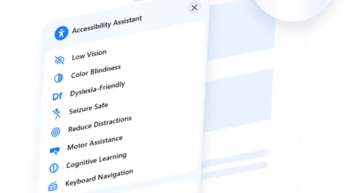
- Predefined profiles for users with Dyslexia, Low Vision, or Color Blindness
- Accessibility checker to monitor compliance and usability
- Universal compatibility and support for 20+ languages
- Adaptable style settings and widget positioning
Here’s how to install the widget quickly and easily:
- Design your widget. Use the widget editor to choose your preferences.
- Copy your unique code. Hit “Add to website for free” and grab your embed snippet.
- Embed on your website. Paste the code into your website’s editor or global footer.
Ensure your website is accessible to all — launch your compliance widget!
Avoid Common Accessibility Pitfalls
Even with the best intentions, many website owners still struggle with how to make a website more accessible. Small oversights can result in major usability problems — especially for users who rely on assistive technology.
Here are some of the most frequent accessibility mistakes — and what you should do instead:
| Common Mistake | Why It’s a Problem | What to Do Instead |
|---|---|---|
| Missing alternative text | Screen readers can’t describe images, leaving users with no context. | Always add meaningful alt attributes that reflect image purpose. |
| Low color contrast | Text may be unreadable for users with low vision or color blindness. | Use contrast ratio optimization tools to meet WCAG standards (4.5:1). |
| Inconsistent heading structure | Improper heading order confuses screen reader navigation. | Follow a clear hierarchy from <h1> to <h6> without skipping levels. |
| Keyboard-only traps | Users can’t exit modals or dropdowns using a keyboard. | Ensure full keyboard navigation and proper focus management. |
| Unlabeled form fields | Assistive technologies can’t identify field purpose. | Use programmatic labels and associate them with each input element. |
| Poor font choices | Decorative fonts reduce readability and cause fatigue. | Use accessible typography choices with clear, scalable fonts and generous spacing. |
| Color-only instructions | Users who can’t distinguish colors miss important cues. | Reinforce color cues with icons, text, or placement indicators. |
Conclusion
As you’ve seen, learning how to make your website accessible goes far beyond ticking off a checklist. It’s about creating an inclusive user experience that adapts to real-world challenges faced by people with disabilities. From thoughtful design and compliant structure to smart tools and ongoing testing, every choice you make contributes to a more open, usable web.
Website accessibility for disabled users isn’t just about meeting legal standards — it’s a fundamental step toward treating all users with equal respect and care. Whether you’re building from scratch or making improvements, the journey toward accessibility is one of progress, empathy, and continuous learning. Start small, stay consistent, and always keep real users at the center of your design decisions.


