Getting traffic to your website is one thing. Turning it into leads you can follow up with is another, and that job often falls to a single lead capture form. Whether that form pulls its weight comes down to a handful of design decisions, beginning with a question that’s surprisingly hard to answer: what counts as a good conversion rate? It depends entirely on what you measure.
This guide grounds that answer in current benchmark data, then works through the levers that move conversion, from field count and field type to multi-step design, button copy, and mobile. Each comes with what the evidence actually supports, so you can build a lead form matched to your goal, whether that’s raw volume or better-qualified leads.
- “Good” form conversion: ~6.6% for landing pages vs ~1.7% for whole-site forms.
- 55% of people who reach a form drop it – it’s the default, not the exception.
- Field type and low friction matter more than field count for form completion.
- Shorter forms might get more responses but result in lower-quality leads.
- Multi-steps help 7+ field forms, not short ones where steps add unnecessary friction.
What counts as a good conversion rate?
A lead generation form does one job: it turns an anonymous visitor into a contact you can follow up with. That spans everything from a one-field newsletter signup to a multi-field sales lead form, which is exactly why there’s no single “good” conversion rate for one.
Dedicated landing pages vs. whole-site forms
A benchmark report analyzing 41,000 landing pages puts the median conversion rate at 6.6% across industries — from 3.8% in SaaS to 12.3% in events and entertainment, with financial services at around 8.4%. That number is solid, but it describes optimized, single-purpose landing pages built to convert, not your sitewide contact form.
Measure across an entire website instead, and the picture changes. First-party data from a marketing-attribution platform (110M+ sessions and 5M+ conversions) puts the overall rate at 5.13% and the B2B website median at around 2.9%, which splits roughly into a 1.7% form rate and a 1.2% phone-call rate. This counts every visitor, including low-intent traffic that lands on a page and leaves without acting.
The distinction is simple: A purpose-built landing page with one offer and one CTA should aim for that 6.6% median, and clearing 10% is genuinely strong. A general contact or lead gen form living among your normal pages will convert at a lower rate: 1.7–3% is normal rather than broken.
Benchmark ranges by goal type
Before zooming into specific offers, it helps to see the main benchmarks side by side. How far the “right” rate shifts depends entirely on what’s being measured:
| Benchmark source | What it measures | Typical rate | Read it as |
|---|---|---|---|
| Landing-page report (Q4 2024) | Optimized dedicated landing pages | 6.6% median | Best-case target for a single-offer page |
| Whole-site analytics (2026) | All forms across a B2B site | ~1.7% form rate | Realistic for a sitewide form |
| Practitioner ranges (2026) | By offer type | 1.8–15% | Friction sets the band |
| Demo-form report (2025) | B2B qualified submissions | 66.7% book a meeting | Qualification, not raw capture |
Within those bands, the offer behind the form matters more than the sector it sits in. Practitioner ranges, organized by what the form asks the visitor to do, make a useful gut check:
- E-commerce forms tend to land around 1.8–3%.
- SaaS and B2B lead-gen forms typically fall in the 2–5% range.
- Free-trial signups run much higher at 5–15% (low commitment).
B2B demo and booking forms behave differently again. One analysis of roughly 4 million form submissions found that 66.7% of qualified submissions went on to book a meeting — well above the rough 30% many teams treat as average.
Why most form visitors never submit
Building a lead capture form that converts isn’t about chasing a number; it’s about removing friction at every step a visitor takes, from the first field to the submit button.
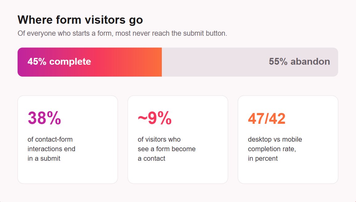
Only about 45% of visitors who start a form complete it, which means roughly 55% abandon. For contact forms specifically, only 38% of people who interact with the form submit it, and once you count everyone who sees it but never engages, the visitor-to-contact conversion rate drops to around 9%.
Device explains part of the gap. Desktop completes forms at 47% versus 42% on mobile, even though mobile accounts for the majority of traffic — a split that also appears in landing-page data, where desktop edges out mobile (12.1% vs 11.2%). The lower-converting channel is the one most of your visitors use.
How to build a lead-gen form that converts
The levers that move form conversion are well known, but they’re usually presented as a flat checklist of rules. They work better as a sequence of friction decisions, and knowing how to create a lead generation form for your business mostly comes down to making each one well.
Choose the right fields
Field selection is where most of a form’s friction lives, and it breaks into two questions that often get blurred: how many fields to include, and which ones. The second matters more than the first.
How many fields?
What you ask for turns out to matter far more than how much you ask for.
The belief that fewer fields always mean more conversions traces back to an often-cited early analysis of 40,000+ landing pages, in which completion rates dropped as the number of fields increased. Current form-analytics data tell a softer story: across large samples, field count and completion show almost no relationship, so the number of inputs doesn’t determine whether a form is completed.
Which fields?
Field type is where the differences show up. Single-line text fields barely dent completion, while text areas and dropdown menus depress it more sharply, and asking for a phone number or precise location pushes it down further. Matching the field to the answer keeps friction low: a dropdown for a fixed set of options, a single line for a name.
Decide between more leads and better leads
Match the form to your goal — raw volume or qualified leads — and build accordingly.
A form that asks only for an email address captures far more contacts than one that asks for company size and budget, and most of those extra contacts won’t be ready to buy.
It makes sense to run longer forms for first-time visitors, accepting a lower completion rate to get “fewer, but better, leads” its sales team can prioritize. The counterpoint cuts both ways: a free-text “message” field lowers conversion, but it also filters out spam and low-intent submissions, so stripping it out can flood you with junk leads.
The smart structure resolves the argument instead of picking a side: keep the visible form short to maximize starts, then gather the rest later. Returning visitors can be progressively profiled with new fields, and enrichment tools can fill in firmographic data you didn’t ask for.
Use multi-step for longer forms
When a form genuinely needs many fields, splitting it into steps helps. Showing a few fields at a time with a progress bar reduces the cognitive load of facing a wall of inputs, and starting with an easy question builds momentum that carries people through the harder ones.
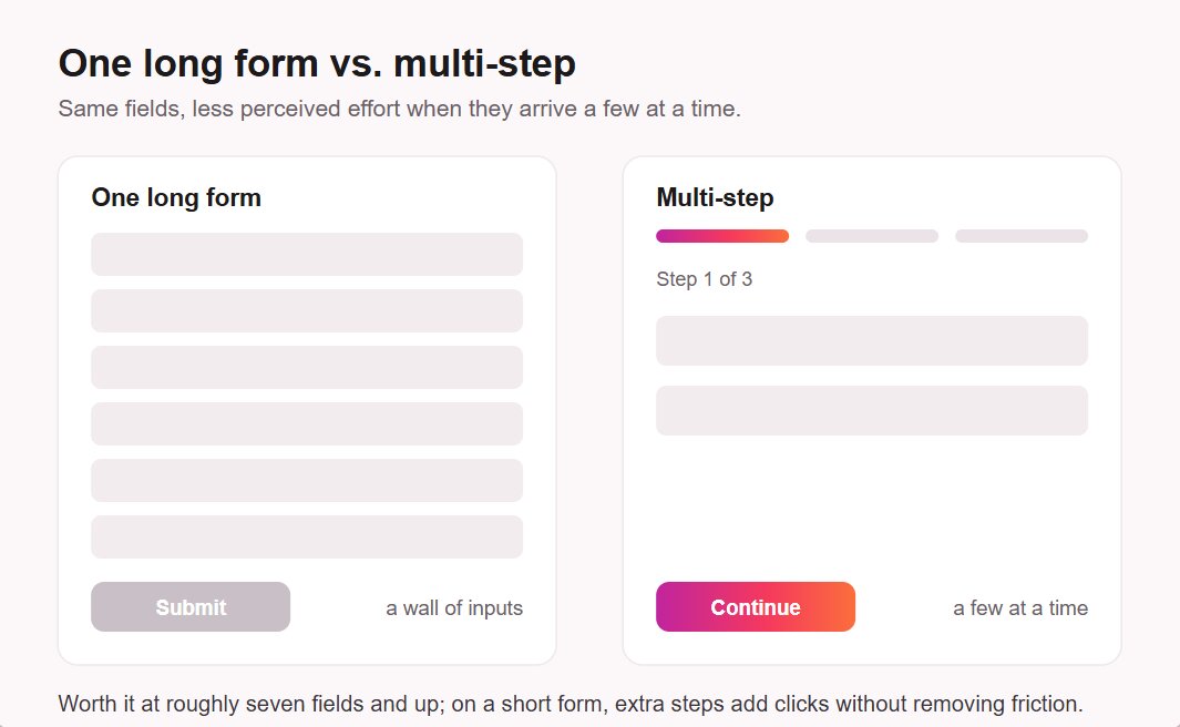
Multi-step pays off mainly on longer forms, roughly seven fields and up. On a three-field form, it adds clicks without removing any real friction and can lower completion. The underlying principle, borrowed from checkout research, is that total field count drives abandonment more than the number of steps does — though that work studies checkout flows rather than lead forms, so treat it as a guide rather than a rule.
Write a specific, benefit-led CTA
The submit button is the last point of friction, and generic labels waste it. A button labeled “Submit” tells the visitor nothing about what they get, whereas benefit-led copy like “Get my free quote” or “Send me the guide” restates the value at the moment of commitment. The 40,000-page analysis noted earlier found “Submit” buttons underperformed more descriptive ones.
Keep the label in the first person and the action concrete. “Start my free trial” reads better than “Submit request,” and it should match whatever you promised above the form. Consistency between the offer and the button reassures people they’re getting exactly what they expected.
Use a single-column layout
Layout affects speed, and speed affects completion. Single-column forms are completed faster than multi-column forms because the eye follows a single vertical path rather than jumping between columns and missing fields. For anything beyond a name-and-email capture, one column is the safer default.
Real-time validation belongs in the same category. Flagging an error the moment it happens, rather than after the visitor hits submit, removes the friction of backtracking and keeps people moving forward. Inline checkmarks on valid fields do the same reassurance work in the other direction.
Add trust signals and spam protection
Two elements reduce hesitation right where people decide whether to trust you with their data. A short, visible privacy note — plus a consent checkbox when you collect personal data — is both legally expected under regimes like GDPR and reassuring to users, some of whom actively look for it before submitting. Over-asking, by contrast, signals risk and depresses completion.
Spam protection does double duty. Tools like reCAPTCHA keep bot submissions out of your pipeline, protecting both your time and the quality of your lead data, while a light-touch check rarely bothers real visitors. It’s one of the few form decisions almost everyone agrees on.
Design mobile-first
Mobile carries most web traffic, yet forms convert lower there than on desktop — the 42%-versus-47% completion gap noted earlier is the form-level symptom. The fix is to design for the smaller screen first rather than shrinking a desktop form to fit. A few practices make the difference, in rough priority order:
- Use a single column so fields stack naturally on a narrow screen.
- Keep typing to a minimum by favoring dropdowns, toggles, etc.
- Size touch targets generously so buttons and fields are easy to tap.
- Trigger the right keyboard for each field.
- Match the form to one goal — raw volume or qualified leads.
- Ask for the field types you’ll use, not simply the fewest fields.
- Split into steps only when the form runs long (≈7+ fields).
- Label the button with the benefit, not a generic “Submit.”
- Lay the form out in a single column.
- Show a consent checkbox and turn on spam protection.
- Design for mobile first.
For very high-touch or complex interactions, a conversational alternative can outperform a static form, as we cover in our chatbot lead-generation guide. For most pages, a well-built form remains the simplest path.
Lead capture templates that work
The fastest way to build an effective form is to start from a proven pattern rather than a blank page. Different goals call for different structures, and matching the form type to the job is half the work.
Below are the key lead generation form examples and their specifics:
| Form type | Goal | Must-include fields | Best placement |
|---|---|---|---|
| Newsletter signup | Volume email capture | Email only | Blog sidebar, footer, above the fold |
| Gated content/ebook | Qualified leads for an asset | Name, email, sometimes company | Dedicated landing page, after the pitch |
| Demo or quote request | Sales-ready B2B leads | Name, work email, company, need | Pricing page, product page |
| Contact form | General inquiries | Name, email, message | Contact page, footer |
| Event registration | Attendee capture | Name, email, ticket type | Event landing page |
Placement should follow intent. A simple email field can sit above the fold, while a higher-commitment form usually performs better lower on the page after the offer is explained, or as an exit-intent popup for time-sensitive offers.
A good lead generation form template gives you the layout, field types, and validation already wired up, so you only change the labels and the offer. If you’re starting from scratch, the same field and layout principles apply when building a website form from the ground up.
Building lead-gen forms without code
Every lever in this guide is something you can set up without touching code, and a form-builder widget handles the rest. Elfsight’s Form Builder is a no-code option whose features line up with the practices above, point for point:
| Best practice | In Elfsight Form Builder |
|---|---|
| Choose the right field types | A wide range of fields, including dropdowns, consent checkboxes, signatures, and a phone field with country selection and validation |
| Keep the visible form short | Conditional logic shows or hides fields based on earlier answers |
| Use multi-step for longer forms | A built-in multi-step layout with a progress bar |
| Write a benefit-led CTA | Fully customizable submit-button text |
| Use a single-column layout | Inline or floating-pane placement with a single-column vertical layout |
| Add trust signals and spam protection | A consent field, an optional privacy footer, and invisible reCAPTCHA |
| Design mobile-first | Responsive, auto-adapting rendering across desktop, tablet, and mobile |
| Start from a proven pattern | 200+ ready-made templates or an AI generator that drafts from a prompt; routes to Google Sheets, Mailchimp, Zapier, and Make.com |
Build your own lead generation form in the interactive editor below ↓
Frequently asked questions
What is a lead capture form?
What are some common lead form examples?
What's the difference between a lead form and a sales lead form?
How long should it take to fill out a lead capture form?
Do lead capture forms need GDPR consent?
Can I A/B test a lead capture form to improve it?
How much does it cost to build a lead generation form?
Where to start with lead forms
A lead capture form that converts isn’t the shortest one you can build or the one that hits some universal benchmark — it’s the one matched to what you’re measuring and stripped of friction at every step. Decide first whether you want raw volume or qualified leads, then size the form to that goal: a single email field for reach, or a few well-chosen fields for sales readiness.
From there, the build is straightforward. Keep the visible form short, ask for the right field types rather than the fewest, use multi-step only when the form is genuinely long, write a button that restates the offer, and design for mobile first. Start with a proven template, watch where people drop off, and adjust one thing at a time — that’s how a form goes from collecting a trickle to bringing in leads you can actually use.
Key references
- Unbounce — Conversion Benchmark Report (Q4 2024). https://unbounce.com/conversion-benchmark-report/
- Ruler Analytics — Conversion Rate by Industry (2026). https://www.ruleranalytics.com/blog/insight/conversion-rate-by-industry/
- Zuko — 25 Conversion Rate Statistics You Need (updated Mar 2026). https://www.zuko.io/blog/25-conversion-rate-statistics-you-need
- HubSpot — Which Types of Form Fields Lower Conversions (40,000-page analysis). https://blog.hubspot.com/blog/tabid/6307/bid/6746/which-types-of-form-fields-lower-landing-page-conversions.aspx
- Lucky Orange — What Is a Good Conversion Rate? (2026). https://www.luckyorange.com/blog/posts/good-conversion-rate
- Chili Piper — Form Conversion Rate Benchmark Report (2025). https://www.chilipiper.com/post/form-conversion-rate-benchmark-report