Making a website accessible for blind and visually impaired users means designing with intention — ensuring that everyone, regardless of their visual ability, can perceive, navigate, and interact with your content. Accessibility requirements go beyond aesthetics; they are about building an experience that removes barriers and promotes digital equality.
Accessible websites integrate a range of features such as text alternatives for images, semantic HTML, intuitive navigation, and support for assistive technologies for blindness. These aren’t just technical upgrades — they form the foundation of inclusive digital experiences.
- Text alternatives. Images, buttons, and icons must include descriptive alt text for screen readers.
- Keyboard operability. All interactive elements should be usable without a mouse.
- Consistent layout. A predictable structure makes navigation easier for assistive software.
- Readable structure. Use headings, lists, and landmarks to provide clear page hierarchy.
When you prioritize accessibility for people with vision impairments, you’re not just following standards — you’re creating an inclusive environment that respects every user’s ability to engage with your content.
Why Accessibility Matters More Than Ever
Making a website accessible isn’t just a courtesy — it’s a fundamental shift in how we think about digital inclusion. Whether you’re running a small business or managing a global platform, your audience likely includes people with visual impairments. Ignoring accessibility means turning away users who want to engage, purchase, or participate.
For blind users, accessing a website without accommodations can be frustrating or even impossible. Lack of clear navigation, missing image descriptions, and poorly structured content are more than inconveniences — they’re digital barriers.
Embracing blind accessibility for websites removes those obstacles and extends a universal invitation to your content.
- Social Impact. Accessibility fosters independence, dignity, and inclusion for users who rely on screen readers or alternative navigation methods.
- Business Value. Accessible websites reach broader audiences, increase customer loyalty, and boost brand reputation.
- Legal Standards. Following accessibility-compliant design practices helps reduce legal risk and demonstrates commitment to equality.
When you improve website accessibility for visually impaired people, you aren’t just enhancing usability — you’re actively building a better, fairer web for all.
How Blind and Visually Impaired People Use the Web
Blind and visually impaired users don’t browse the web visually — they listen to it, feel it, and interpret its structure through software and hardware. This shift in perspective transforms how we must think about designing digital experiences. To create accessible websites, we need to understand how users interact with them when visual information isn’t an option.
Screen Readers: Listening to the Web
Screen readers like JAWS, NVDA, or VoiceOver convert digital content into spoken output. As the user moves through the page, the software reads out headers, lists, links, and buttons. For a website to be compatible, the content must be semantically structured — using proper headings, landmarks, and labels — to ensure the information is read in the correct order and context.
Keyboard-Only Navigation: Navigating Without a Mouse
Many blind users navigate using a keyboard alone, moving from element to element with the Tab key or using keyboard shortcuts provided by assistive software. If your website relies on hover effects, drag-and-drop, or clickable components that aren’t accessible via keyboard, you’re creating a dead-end.
Tactile Feedback Devices: Reading Through Touch
Refreshable Braille displays translate digital text into tactile Braille patterns. These devices allow users to read line by line, character by character, using their fingertips. However, they rely heavily on accurate content structure — broken layouts, pop-ups, or images without descriptions can interrupt or confuse the reading experience.
When designing with accessibility in mind, it’s not enough to ask if content “looks right”. You need to ask: Can it be heard, navigated, and felt? That’s how blind users engage with your content — and that’s how truly inclusive design is measured.
Common Barriers on Non-Accessible Websites
Despite growing awareness, many websites still create frustrating or impassable experiences for blind and visually impaired users. These issues typically stem from a lack of semantic structure, insufficient labeling, or purely visual design thinking. Recognizing these barriers is essential if you aim to create a blind-friendly website design.
| Barrier | Impact on Blind Users | Example |
|---|---|---|
| Missing or vague alt text | Images are skipped or read as “graphic,” offering no useful description or meaning to screen reader users. | Alt=”image123.jpg” instead of Alt=”Customer smiling while using a laptop” |
| Improper heading structure | Disorients screen reader users who rely on headings to navigate page sections efficiently. | Using <div> for headings instead of <h2>, or skipping from h2 to h4 |
| Keyboard traps | Users can become stuck in modals or navigation elements if they can’t tab out, breaking their flow. | Popups that open without a way to exit using Tab or Esc key |
| Generic link text | Lack of context prevents users from knowing where the link will take them when it’s read aloud independently. | “Click here” instead of “Download the accessibility checklist” |
| No ARIA roles or landmarks | Screen readers can’t distinguish between navigation, content, or sidebars, making orientation difficult. | Missing role="navigation" or aria-label="Main content" in page layout |
When you understand the consequences of these barriers, it becomes clear that blind website accessibility practices are about far more than code — they’re about designing a usable, respectful experience for everyone.
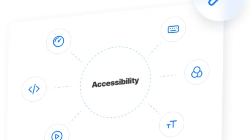
Key Features That Make a Website Accessible
Once you understand the barriers blind users face, the next step is to design solutions into your content. An accessible website for the blind is one where layout, structure, and interactivity are intentionally crafted to support screen readers, keyboard users, and those with partial vision.
Below are the essential visually impaired accessibility features every modern website should include.
- Clear heading hierarchy: Use logical, sequential heading levels (h1 to h4) so screen readers can interpret the page structure easily.
- Descriptive alternative text: Every image should include alternative text descriptions that communicate purpose — not just content. Decorative images should be marked accordingly to avoid clutter.
- Keyboard navigation support: Ensure that all menus, modals, and forms can be accessed via keyboard-only web navigation with visible focus states.
- Screen reader compatibility: Use semantic HTML and ARIA roles to clearly label regions, buttons, and inputs, enabling screen readers compatibility.
- Flexible text scaling: Design for scalable font sizes without breaking the layout — this supports users with low vision or zoomed displays.
- Accessible forms: Use label elements, error messages, and focus feedback to ensure users can understand and complete form fields independently.
If you’re looking for examples to emulate, many leading organizations have embraced these features. The U.S. Government portal, W3C’s Web Accessibility Initiative, and major educational platforms are excellent models of what accessible websites for blind and visually impaired users can look like. Their success lies in simplicity, clarity, and full compatibility with assistive tools.
Upgrade your website accessibility with Elfsight
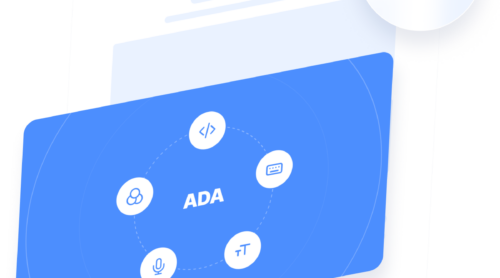
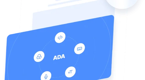
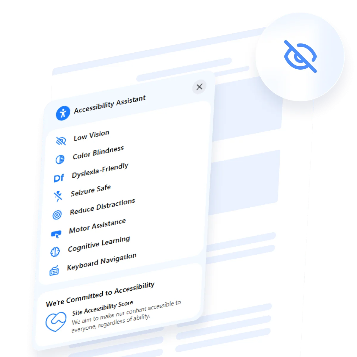
To simplify implementation, consider using an automated accessibility solution such as the accessibility compliance widget. It adds essential features like text resizing, contrast adjustments, and keyboard navigation aids — helping ensure your website aligns with ADA, EAA, and WCAG guidelines without complex manual coding.
- Prebuilt accessibility profiles for Color Blindness, Low Vision, Dyslexia, and more
- Built-in analyzer to review accessibility effectiveness
- Compatible with all major platforms and available in 20+ languages
- Fully adjustable layout, color scheme, and position settings
Here’s how to embed the widget on your website in minutes:
- Customize your widget. Open the editor and select the accessibility features you want to include.
- Copy the integration code. After setup, click “Add to website for free” to get your code snippet.
- Embed it on your website. Insert the code into your HTML or designated embed field.
Get started right now and start building a more inclusive digital environment today!
Best Practices for Inclusive Web Design
Understanding how to make your website accessible to the blind goes beyond individual features—it’s about applying a mindset of inclusive design from the start. Every part of your interface should communicate clearly, behave predictably, and support the unique needs of users who rely on screen readers and keyboard navigation.
By following these proven practices, developers can create user-friendly navigation for blind visitors and maintain accessibility for websites without sacrificing visual appeal or performance.
1. Use semantic HTML structure
Write markup that reflects the meaning of your content. Use elements like <main>, <nav>, <header>, and properly nested headings (h1 to h4) to help screen readers understand the content hierarchy.
2. Design with keyboard access in mind
Ensure all interactive elements — menus, modals, forms — are reachable via keyboard. Provide visible focus indicators and avoid relying solely on hover effects or mouse actions.
3. Include ARIA attributes when needed
When native HTML isn’t enough, use ARIA roles and properties such as aria-label, aria-hidden, or aria-live to convey essential context to screen readers.
4. Keep layout consistent and predictable
A stable layout helps users build a mental model of your website. Keep navigation in the same place, maintain consistent styles, and avoid layout shifts between pages.
5. Use high-contrast, legible typography
Make sure your text stands out from the background. Use sufficient contrast ratios, large enough font sizes, and avoid thin or overly decorative fonts.
6. Test content flow with screen readers
Listen to your pages using screen readers like NVDA or VoiceOver. If something sounds confusing, awkward, or out of order — it probably needs improvement.
How to Stay Compliant and Test Your Website
Following accessibility best practices is essential — but ensuring your website meets official standards and works as expected for blind users requires regular testing. Achieving visually impaired website compliance means adhering to accessibility frameworks like the WCAG (Web Content Accessibility Guidelines) and conducting hands-on evaluations of how your content performs with assistive technology.
If you want to make your website accessible to blind users in practice — not just in theory — follow this process to check for issues and stay compliant.
- Read and apply WCAG standards. WCAG 2.1 and 2.2 outline criteria like perceivability, operability, understandability, and robustness. Familiarize yourself with levels A, AA, and AAA compliance based on your accessibility goals.
- Conduct automated accessibility audits. Tools like Axe, WAVE, and Lighthouse can scan your pages for common violations such as low color contrast, missing alt attributes, or incorrect heading structure.
- Run screen reader testing. Use screen readers like NVDA (Windows) or VoiceOver (Mac) to hear how your content is read aloud. Ensure that menus, buttons, and links are described clearly and in the correct order.
- Test with keyboard-only navigation. Go through your entire website using only the Tab, Shift+Tab, Enter, and arrow keys. If you get stuck anywhere, keyboard-dependent users will too.
- Review with real users or specialists. Where possible, consult accessibility experts or individuals from the blind community to test real-world usability and point out friction that automated tools may miss.
By combining automated tools with user-focused testing, you’ll meet WCAG standards more effectively and create a more resilient digital experience. Accessibility is a process — not a one-time task — and regular accessibility audits help keep your content inclusive, compliant, and future-ready.
Conclusion
Staying compliant is only part of the journey — true accessibility comes from understanding, empathy, and consistent practice. From choosing the right markup to supporting screen readers compatibility and maintaining ADA-compliant design practices, each decision plays a role in building a blind-friendly website design that’s functional and empowering.
An inclusive digital experience isn’t just a bonus — it’s a responsibility. By committing to accessibility from the earliest design stages through ongoing testing and optimization, you ensure that no one is excluded.